Monday morning, 9:12 a.m. The growth chart is on the screen, and nobody in the room is asking the same question. The PM wants to know whether onboarding improved. Design wants to know why the same confusion keeps showing up in support tickets. Engineering wants to know whether the spike is real or just tracking noise. The dashboard is full of numbers, but the team still lacks a shared view of what happened.
That pattern shows up in healthy companies and struggling ones alike. Teams collect events, pageviews, funnels, and replay data, then walk into planning with five tabs open and nothing concrete enough to drive a decision. Raw analytics answer reporting questions. Product teams still need a deliverable they can review together, challenge, and act on.
That is where user session analysis earns its keep.
A session is only one unit of behavior. It captures a visit, not a customer story. One user can generate several sessions across a day or a week, and that distinction matters because repeat attempts can look like engagement when the product causes rework. I have seen teams celebrate rising activity, then realize later that people were getting stuck, leaving, and coming back to finish something that should have worked the first time.
The strategic issue is not data collection. It is translation. Good teams turn session analysis into artifacts that travel well across product, design, engineering, QA, and support. A funnel with an owner. A journey map annotated with friction points. A replay review clipped to a bug ticket. A cohort view attached to a retention decision. The value is not the chart itself. The value is the shared object the team can use to decide what changes next.
That is also why this work pairs naturally with experimentation. Once a session-based artifact makes the problem visible, the team can test a fix with clearer hypotheses and cleaner success criteria. A/B testing best practices become far more useful when they are tied to a specific behavioral artifact instead of a vague goal to improve conversion.
The sections that follow focus on seven types of session analysis, framed as team deliverables rather than analytics techniques. That shift sounds small. In practice, it is what turns raw behavioral data into alignment, prioritization, and shipped product changes.
1. Funnel Analysis & Drop-off Detection
A leadership review is about to start. The signup rate looks healthy at the top of the funnel, activation is down, and three teams are telling three different stories about why. Product says onboarding is too long. Marketing says traffic quality slipped. Engineering says the tracking is broken. A good funnel artifact settles that argument fast because it gives the team one path, one owner, and one next decision.
That is the standard. A funnel is not just a chart for reporting conversion. It is a working deliverable the team can pass between product, design, engineering, and growth without losing the thread. The best version focuses on one business moment that matters, such as signup to activation, trial to first value, or checkout to payment confirmation.
The first decision is definitional. Count the steps the same way across teams, and be explicit about whether you are analyzing users or sessions. Session views are useful for finding friction inside a visit, but they can distort the business picture when repeated attempts inflate apparent engagement, as noted earlier. I have seen teams chase the wrong fix because one person was reading a user funnel and another was reading a session funnel.
A strong funnel artifact usually includes three parts:
- Primary path: The exact sequence being measured, with the largest drop-off called out clearly.
- Segment split: A comparison that explains materially different behavior, such as new versus returning users, mobile versus desktop, or self-serve versus sales-assisted.
- Decision note: A short statement of what changes next, who owns it, and what result would confirm the fix worked.
That last piece matters more than teams expect.
If the funnel ends at observation, it usually dies in the dashboard. If it ends with a decision, it enters the roadmap.
There is another trap here. Session-based conversion can make a weak variant look like a win. As shown in Statsig’s analysis of session-based metrics, a variant improved per-session conversion by 1.1% but reduced sessions per user by 5%, and the true per-user impact ended up negative, falling from 5,000 to 4,800 transactions in a test with 100,000 users per group. That is why the funnel artifact needs to name its unit of analysis directly in the title or subtitle, not buried in a dashboard filter.
Teams also get better results when they pair funnel analysis with the product flow that produced it. A drop between steps is more actionable when the team can compare it against documented user experience flows and see whether the actual sequence matches the intended one. When teams pair funnel review with A/B testing best practices, they make better calls because the hypothesis, the metric, and the product change stay tied to the same artifact.
The practical goal is simple. Produce a funnel someone can carry into a planning meeting, point to a specific break in the path, and attach to a concrete product change. That is how drop-off analysis stops being reporting and starts driving decisions.
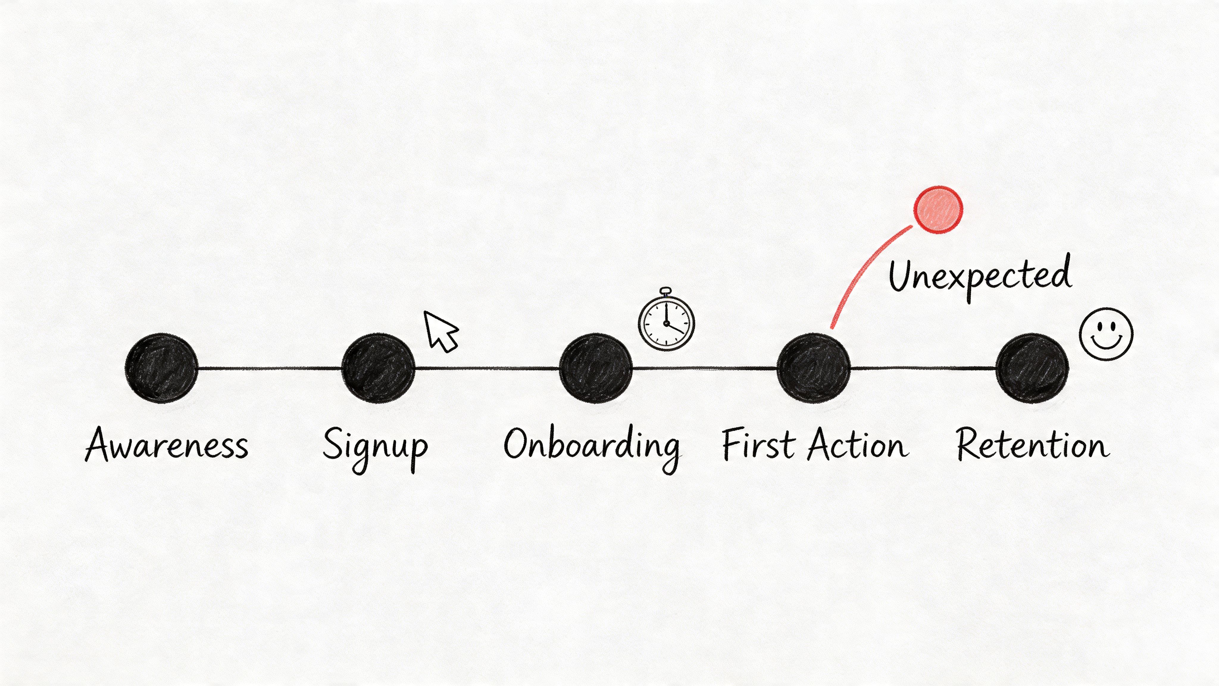
2. User Journey Mapping with Behavioral Data
Journey maps often fail for one boring reason. They describe the product people designed, not the one users experience.
A real journey artifact starts with behavior, then overlays intent. You’re not documenting a tidy happy path. You’re mapping where users hesitate, backtrack, skip, return later, or take a route nobody expected. That’s where product truth lives.
One underserved move here is using session data earlier, before handoff. The point isn’t only to inspect behavior after launch. The point is to turn observed paths into design inputs. The gap shows up clearly in Vexo’s discussion of analyzing user paths, which points to a recurring problem: teams see non-obvious loops in funnels and meaningful drop-offs from screen errors, but still have to manually translate those insights into design system changes and prototypes.
What makes a journey map actionable
Teams improve the quality of this artifact when they include:
- Expected path versus actual path: Where the wireframe assumed one route and users took another.
- Moments of friction: Error states, repeated loops, and exits that cluster around the same screen.
- Cross-functional notes: Design implication, PM implication, and engineering implication on the same page.
That last part matters more than people think. A journey map should reduce interpretation drift. Designers should see hierarchy issues, PMs should see priority, and QA should see where to create test cases.
A grounded map also accounts for the fact that some paths span multiple visits. One user might browse in the morning and come back later, which creates separate sessions under common analytics definitions. If you only read a single session in isolation, the journey can look irrational when it’s deliberate.
The best teams connect these maps back to user experience flows, because a flow diagram built from live behavior is far more useful than one inherited from a kickoff deck.
Journey maps earn their keep when they change a design review from opinion to evidence.
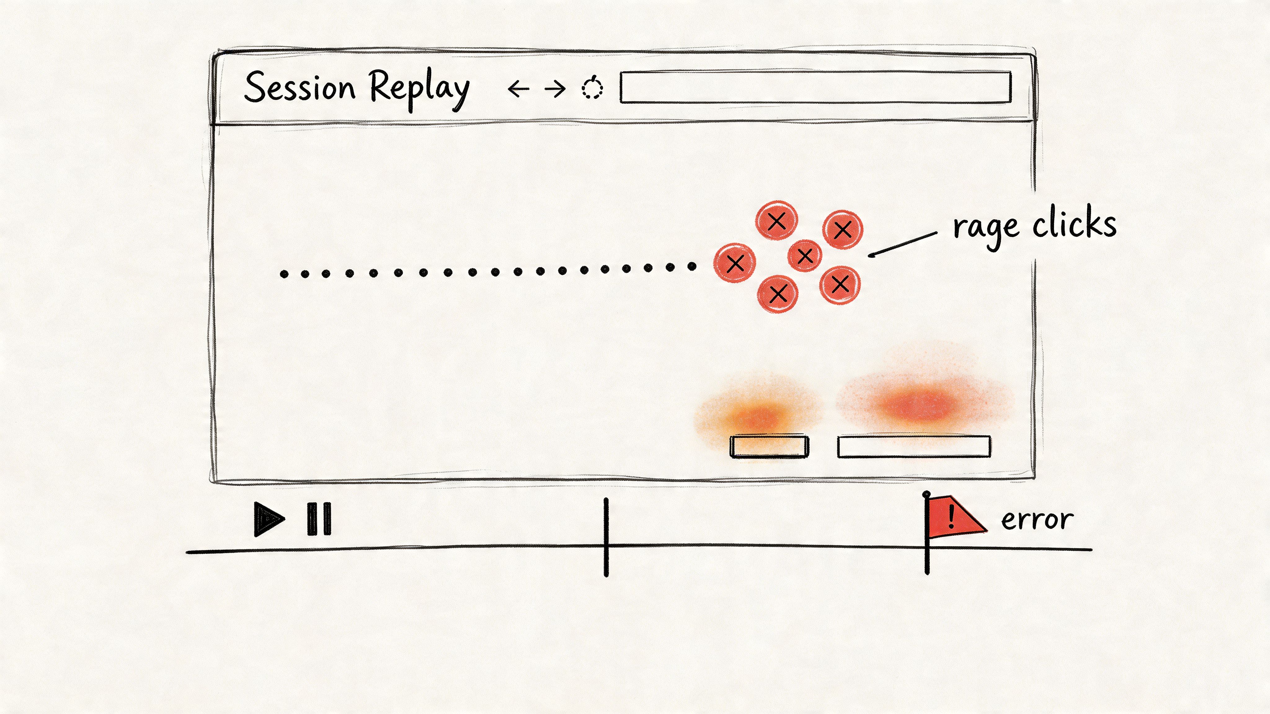
3. Session Replay & Interaction Pattern Analysis
A design review stalls. One person blames copy, another blames load time, engineering suspects a device-specific bug, and support keeps forwarding the same complaint with no clean reproduction steps. Then a 30-second replay hits the screen. The user taps a gesture-based control, nothing obvious happens, they tap again, then back out.
That clip becomes the artifact.
A replay is useful because it turns a vague complaint into something a team can circulate, annotate, and act on. Product sees where intent broke. Design sees the affordance problem. Engineering sees the failure state in sequence instead of in isolation.
Here’s the visual kind of artifact that teams rally around:
One of the clearest examples comes from UXCam’s examples of user behavior analytics, which describes a mobile app where segmentation, heatmaps, and session replays exposed a broken gesture-based button. In that same UXCam example, 40% of sessions failed at that step before the redesign, and after the team switched to explicit taps, bug-related tickets dropped 65% while task completion rose from 72% to 94% within two weeks.
That is the standard to aim for. A replay program should produce evidence a team can prioritize, not a warehouse of videos nobody watches.
The replay artifact that works in practice is a short, labeled clip with enough metadata to survive handoff:
- The exact friction event: dead click, rage click, failed gesture, repeated form attempt, or backtrack loop.
- The segment attached: new user, returning user, device type, traffic source, or support-linked account.
- The likely implication: copy issue, affordance issue, latency issue, bug, or flow mismatch.
- The owner and next action: design revision, QA test case, engineering fix, or PM follow-up.
That last field matters. Without it, session replay turns into theater.
UXCam also notes in that same source that rage clicks can be flagged at over 5 clicks per second, which gives teams a concrete threshold for review instead of a fuzzy definition of frustration. Teams can then cluster those clips, compare patterns across segments, and decide whether the issue belongs in bug triage, usability cleanup, or a larger flow change. If you want to connect replay review with broader segmentation work, this is also where AI tools to segment users by behavior patterns can help teams sort recurring interaction failures faster.
If you need a reference point on tooling, Fullstory is one well-known option in this category.
A good explainer helps teams align on what they’re seeing, so it’s worth grounding this work in a shared understanding of behavioral analytics.
4. Cohort Analysis & Behavioral Segmentation
Aggregate metrics are polite liars. They smooth over the exact differences that matter.
If one segment is thriving and another is failing, averages will hide it. That’s why cohort artifacts belong in every serious user session analysis workflow. They show who behaves differently over time, not just what happened in the product overall.
The cohort artifact is especially valuable when privacy constraints are real. Plenty of enterprise teams can’t rely on full identity-rich tracking, and they still need to understand engagement, crash sequences, and regional behavior. That gap is central to Session’s write-up on analytics and anonymity, which highlights the operational challenge of learning from usage patterns while maintaining anonymization and zero-retention expectations.
Segments that usually reveal something useful
You don’t need exotic modeling to get value. Start with cohorts people can act on.
- Lifecycle cohorts: New users versus returning users.
- Acquisition cohorts: Organic, paid, partner, or sales-assisted.
- Behavioral cohorts: Users who completed a core action versus users who stalled before it.
The trade-off is straightforward. The more segments you create, the easier it becomes to spot noise and mistake it for a pattern. Teams get in trouble when they slice data into tiny buckets and then assign product strategy to randomness.
Signal to watch: if a segment can’t lead to a distinct onboarding, design, or support action, it probably doesn’t deserve its own cohort.
The strongest modern use of segmentation is operational, not decorative. Support uses it to triage issue-heavy groups. PMs use it to prioritize which path deserves redesign first. Designers use it to understand whether friction belongs to a specific device context or user maturity level.
When the team wants to go deeper, AI tools to segment users by behavior patterns can speed up the clustering work, but the judgment call still belongs to the product team. A segment only matters if it changes what you build.
5. Feature Adoption & Usage Pattern Analysis
A feature launch isn’t the moment of truth. The first pattern of use is.
I’ve seen teams celebrate release day, then spend weeks defending a feature nobody integrated into their routine. Adoption artifacts stop that theater. They show whether a feature got discovered, tried, repeated, and connected to a meaningful user outcome.
This artifact works best when it separates three conditions that often get mashed together: users didn’t find the feature, users found it but didn’t understand it, or users used it in a way the team never intended. Those are different product problems, and they require different responses.
What to include in the adoption artifact
The most useful format is short and comparative:
- Discovery signal: Did users encounter the feature at all during a session?
- First-use path: What happened right before and right after first use?
- Repeat behavior: Did usage recur in later sessions, or was it a one-off experiment?
That repeat behavior matters because session counts can create false confidence. Product teams often see a lot of interaction and assume that means value. Sometimes it means users are circling a feature because they can’t finish the job.
The wider economic pattern is simple. Companies keep shipping features because roadmap output is visible. Users only reward features that reduce effort or improve outcomes. That mismatch is why adoption work has to be tied to behavior, not launch theater.
A practical move here is to pair usage analysis with support and research notes. If users keep finding a feature but abandon it after a confusing screen, the problem isn’t awareness. It’s comprehension. If they never encounter it during natural workflows, the problem is placement.
When teams are refining interfaces around new capabilities, consistency matters more than novelty. Features adopted fastest usually feel native to the product’s existing language, not imported from a trend deck.
6. Session Duration & Engagement Quality Analysis
A PM pulls up the dashboard after a redesign and sees average session length drop. Panic starts fast. Then the support queue stays quiet, task completion holds, and sales stops hearing complaints about that workflow. The shorter sessions were a win.
That is why duration needs its own artifact. Time spent is a weak signal on its own, but paired with outcome and behavior, it becomes a practical decision tool the whole team can use. The deliverable here is not a single chart. It is a short engagement quality readout that shows whether time in product reflects momentum, confusion, or passive dwell.
I want this artifact to answer one question clearly. What kind of time are users having?
A useful version usually includes:
- Outcome by session length: Which ranges correlate with task completion, abandonment, or support visits?
- Active vs idle time: Did users keep interacting, or did the session stay open while work stalled?
- Looping behavior: Did they revisit the same screen or step multiple times before leaving?
- Segment differences: Do new users, power users, and high-value accounts show different engagement patterns?
This framing protects teams from a common mistake. They treat longer sessions as proof of engagement when those sessions are expensive forms of friction. I see this often in B2B products. Users tolerate awkward flows because they have to finish the job, not because the experience is good. If the artifact shows long sessions with repeated backtracking and weak completion, the product is creating labor.
Short sessions can be healthy too. A two-minute visit that ends with a completed task, no retries, and no help-seeking is stronger than a twenty-minute session full of hesitation. Analysts need to label that difference clearly so design, product, and support are looking at the same reality.
As noted earlier, session-based metrics can also distort the story when repeat behavior from the same users drives the aggregate. That matters here because engagement quality should reflect user-level value, not just accumulated time. Teams working on this problem often pair duration analysis with retention signals or AI solutions for reducing user churn to spot when "high engagement" is really slow-moving dissatisfaction.
The strongest artifact is simple enough to share in a planning meeting. One page. A distribution of session lengths, a view of active versus idle time, examples of high-friction long sessions, and a recommendation. Keep the language concrete. Remove two-step approval. Surface status earlier. Cut this loop. That is what turns raw session time into product action.
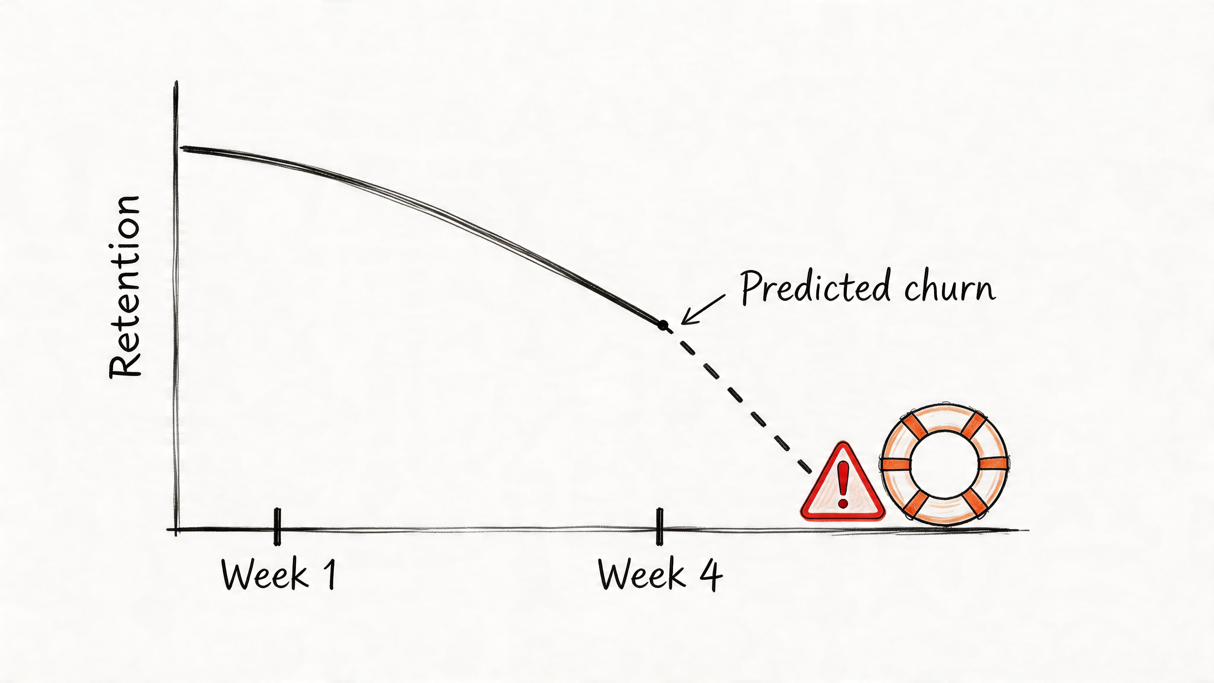
7. User Retention & Churn Prediction Analysis
Retention artifacts answer the hardest product question: who came back, who didn’t, and what happened right before the break?
Churn is often treated as an outcome metric. Mature teams treat it as a sequence. They look for the sessions that predicted departure, not just the month the account disappeared. That shift changes everything because it makes retention a product problem, not just a lifecycle marketing problem.
The strongest retention artifact usually combines cohort view, pre-churn session evidence, and a hypothesis for intervention. A line chart alone won’t do much. But a retention curve paired with the last meaningful path before drop-off can move a roadmap item to the top of the queue.
One practical caution matters here. If your churn view is built on session-level wins, it can point you in the wrong direction. As noted earlier, Statsig’s experiment example showed how a variant that looked positive on a session basis still produced a negative per-user impact once repeat visit behavior changed. Retention work falls apart when the measurement unit doesn’t match the business reality.
What a retention artifact should reveal
A solid retention package gives the team three things:
- Who is at risk: A cohort or behavior pattern that returns less reliably than expected.
- What preceded risk: The session features common before disengagement, such as confusion, delay, or repeated failure.
- What to test next: Onboarding change, UX adjustment, bug fix, or intervention sequence.
Retention work gets sharper the moment you stop asking “how do we get users back?” and start asking “what made staying feel costly?”
When teams want to operationalize that thinking, AI solutions for reducing user churn can help surface patterns faster, especially across larger product surfaces. But the enduring lesson is old-fashioned: the best predictor of churn is often a frustrating experience the team already has enough evidence to fix.
7-Point User Session Analysis Comparison
| Method | Implementation complexity | Resource requirements | Expected outcomes | Ideal use cases | Key advantages |
|---|---|---|---|---|---|
| Funnel Analysis & Drop-off Detection | Medium, event instrumentation and funnel definitions | Analytics platform, event tracking, sufficient traffic | Clear stepwise conversion rates and top drop-off points | Onboarding, checkout, conversion optimization | Quantifies friction, prioritizes high-ROI fixes |
| User Journey Mapping with Behavioral Data | High, combines quantitative and qualitative integration | Session replays, analytics, user research time | Holistic maps of actual user paths and divergence from expectations | Complex multi-step flows, cross-channel products, alignment workshops | Reveals unexpected paths and contextual pain points |
| Session Replay & Interaction Pattern Analysis | Medium, setup straightforward, analysis labor-intensive | Recording infrastructure, privacy controls, analyst time | Contextual "how" of user actions and concrete usability evidence | Debugging UX issues, form abandonment, rage-click investigation | Shows real user behavior, provides persuasive qualitative proof |
| Cohort Analysis & Behavioral Segmentation | Medium–High, requires cohort logic and tracking over time | Historical data, segmentation tooling, analytics infrastructure | Segment-specific retention, LTV, and behavior trends | Retention strategy, targeted marketing, feature impact by segment | Exposes variation hidden in aggregates, enables targeted interventions |
| Feature Adoption & Usage Pattern Analysis | Medium, feature event tracking and longitudinal measures | Event instrumentation, time for adoption curves, analytics | Adoption curves, discovery vs. usability issues, engagement lift | New feature launches, rollout strategy, product-market-fit checks | Identifies valuable features vs. unused ones, guides onboarding |
| Session Duration & Engagement Quality Analysis | Medium, needs composite scoring and nuanced interpretation | Interaction metrics, analytic models, device segmentation | Session quality scores, identify stuck vs. efficient sessions | Content apps, productivity tools, measuring true engagement | More informative than raw time metrics, better predictor of retention |
| User Retention & Churn Prediction Analysis | High, predictive modeling and longitudinal tracking | Large historical dataset, ML/modeling expertise, targeting systems | Churn predictions, at-risk segments, measurable retention levers | Subscription/SaaS, high-LTV products, lifecycle management | Early warning for churn, prioritizes retention with business impact |
From Analysis to Artifact
These seven methods matter because they produce things a team can carry.
A funnel report travels into a planning meeting. A behavior-based journey map gets attached to a PRD. A replay clip ends an argument about whether a bug is “edge case” noise or a real product problem. A cohort view gives support, design, and product the same picture of who is struggling. That’s the shift. User session analysis becomes valuable when it turns into a deliverable, not when it sits in a tool.
This is what I mean by artifact thinking. Dashboards are passive. Artifacts are opinionated. They frame the question, preserve context, and force the team to react to the same evidence. That sounds small, but at scale it changes how organizations make decisions. Fewer debates drift into taste. More work gets tied to observable behavior.
There’s also a systems angle here. Product organizations are full of local incentives. Growth wants lift. Design wants clarity. Engineering wants stability. Support wants fewer mysteries. Raw analytics let each function tell its own story. Artifacts create a shared object that all of them can inspect. That’s why they’re so effective. They reduce interpretation spread.
One credible way to think about this discipline comes from the academic side of session identification. Early web analytics research examined session boundaries through inter-event regularities, and that framing still matters because the unit you choose shapes the decisions you make. If you confuse users, sessions, and pageviews, the story gets distorted before the discussion even starts.
The next move doesn’t need to be ambitious. Pick one upcoming feature or one broken flow and create one artifact from it. Build a single funnel with a decision note. Map one journey using live behavior, not assumptions. Clip three replays that show the same pattern. That’s enough to change the conversation.
In short, the goal isn’t to master every technique at once. It’s to stop letting data haunt your meetings and start making it useful.
If your team is trying to connect analytics, flows, prototypes, design systems, and product artifacts in one working loop, Figr is one option built for that kind of workflow.
If you want user session analysis to produce decisions instead of screenshots, take a look at Figr. It helps product teams turn live product context, analytics signals, flows, edge cases, and design system constraints into artifacts they can ship against.
