Monday morning, 8:57 a.m. The QBR starts in three minutes, the deck has too many slides, and half the charts answer questions nobody in the room is asking. A PM is still tweaking labels. A VP wants a clean story. Finance wants variance explained. Engineering wants context. Leadership wants decisions.
That tension is why most quarterly business reviews feel heavier than they should.
A good quarterly business review template doesn't just organize slides. It changes the job of the meeting. Instead of performing competence with backward-looking charts, you use the quarter to surface what changed, what it means for the product, and what trade-offs the team should make next. Last week I watched a PM at a growth-stage SaaS company walk into a review with solid data and leave with no decisions, because the deck was built to report activity, not frame choices.
That’s the primary failure mode.
The Philosophy of an Action-Oriented QBR
Most QBRs are built like compliance documents. They prove work happened. They summarize projects. They list metrics. They rarely change what the team does on Tuesday.
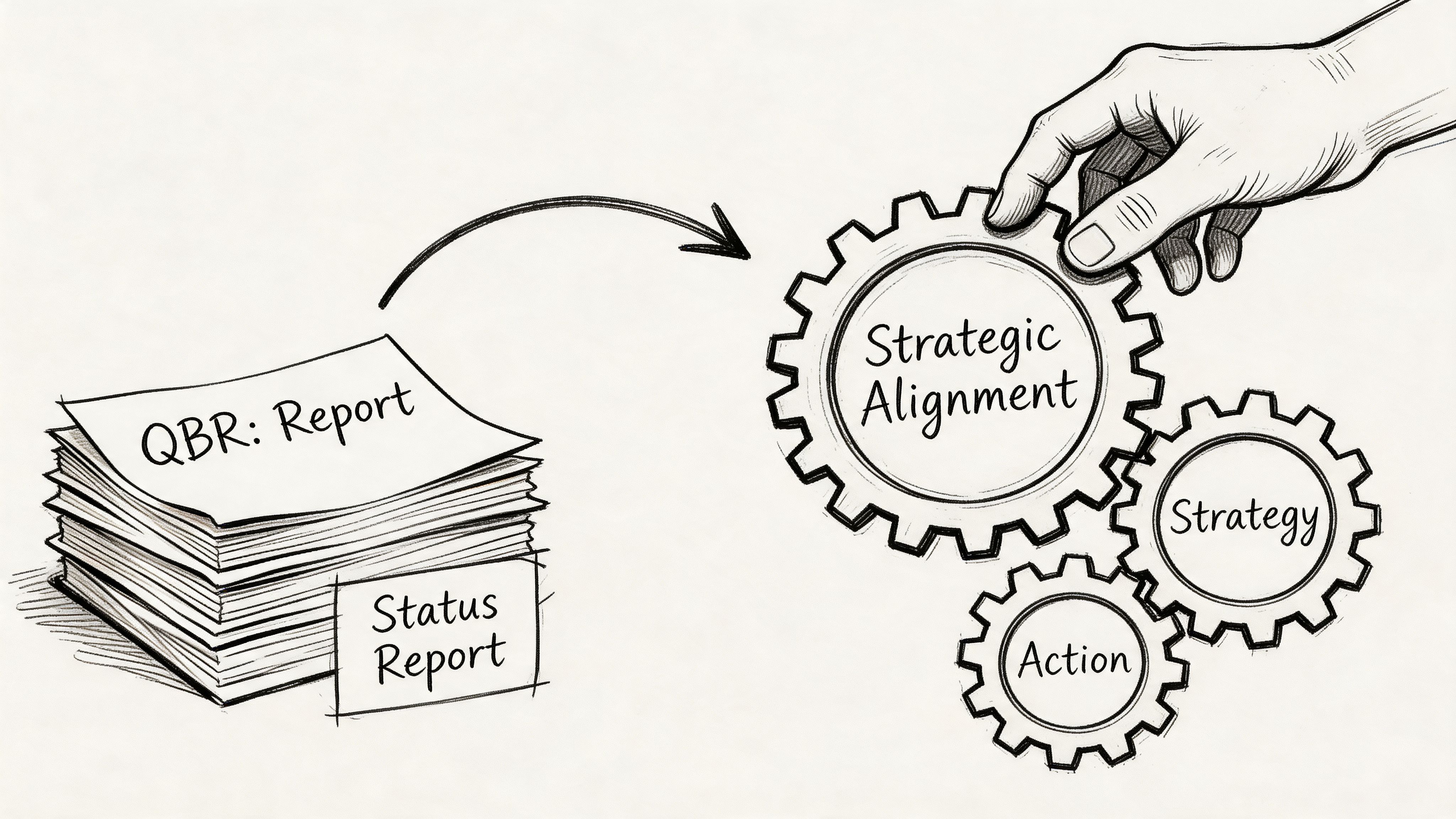
An action-oriented QBR does something else. It turns the quarter into a decision window.
Reporting QBR versus context-rich QBR
I think about QBRs in two modes.
The first is the Reporting QBR. It’s slide-heavy, retrospective, and usually defensive. Teams show what shipped, what moved, and what slipped. Everyone nods. Then the actual discussion starts after the meeting in side chats.
The second is the Context-Rich QBR. It’s selective, decision-shaped, and built around live business tension. It doesn’t ask, “What happened?” alone. It asks, “What happened, why did it happen, and what do we change now?”
Here’s the difference in practice:
| QBR mode | What it sounds like | What it produces |
|---|---|---|
| Reporting QBR | “Here are the numbers from the quarter” | Awareness, sometimes |
| Context-Rich QBR | “Here’s the pattern, the cause, and the decision we need” | Alignment and action |
This is what I mean: the same data can either close a conversation or open the right one.
A generic deck won’t get you there. Gainsight’s QBR guide notes that customer-centric QBRs in SaaS yield 25-35% renewal uplift and 15% expansion revenue growth, but fail 60% of the time due to generic templates. That tension should feel familiar. Teams know the meeting matters. They keep using a format that drains the value from it.
Why smart teams still run bad QBRs
This isn’t usually a competence problem. It’s an incentives problem.
People build QBRs to avoid risk. Product wants to show momentum. Leadership wants clean summaries. Cross-functional partners want their work represented. So the deck expands. More charts. More screenshots. More status. Less judgment.
Then the meeting becomes performance theater.
Most weak QBRs don’t fail because the team lacks data. They fail because nobody shaped the data into a decision.
There’s a management pattern behind this. In Harvard Business Review’s guidance on designing effective meeting agendas, the core point is simple: agenda design determines whether a meeting produces discussion or drifts into passive updates. That applies directly here. If your QBR agenda rewards presentation, you’ll get presentation. If it rewards choice, escalation, and ownership, you’ll get strategy.
That’s also why a strong quarterly business review template should feel closer to a product brief than a status report. The best PMs already work this way in roadmap reviews. They establish context, frame options, and make trade-offs visible. The same habits belong in the QBR. If you want a broader operating model for that kind of thinking, this product management guide is a useful companion.
What a useful QBR must do
A QBR is worth the calendar time only if it does three things:
- Create shared reality: Everyone leaves with the same understanding of what changed in the business and product.
- Expose trade-offs: You can’t have an open discussion about priorities without naming what won’t get attention.
- Convert discussion into commitments: If nobody owns the next move, the review was just expensive storytelling.
The basic gist is this: a quarterly business review template should help you tell a coherent data story, not dump dashboards into slides.
A quick diagnostic
If your current QBR has these symptoms, it’s still in reporting mode:
- Too much chronology: The deck walks slide by slide through the quarter, but never isolates the decisions that matter now.
- Too many vanity metrics: Numbers appear because they’re available, not because they change action.
- No explicit asks: Leadership hears context, but no one is asked to choose, fund, approve, or unblock anything.
- Action items live outside the deck: Which means the deck wasn’t designed to drive follow-through.
A strong QBR feels lighter in presentation and heavier in consequence.
That’s the shift.
The Product Manager's QBR Template A Slide-by-Slide Guide
When the philosophy is right, the deck gets smaller and sharper. I prefer a compact narrative over a giant review pack. The PM’s job is not to prove the team worked hard. The PM’s job is to make the next decision easier.
Start with a spine, not a pile.
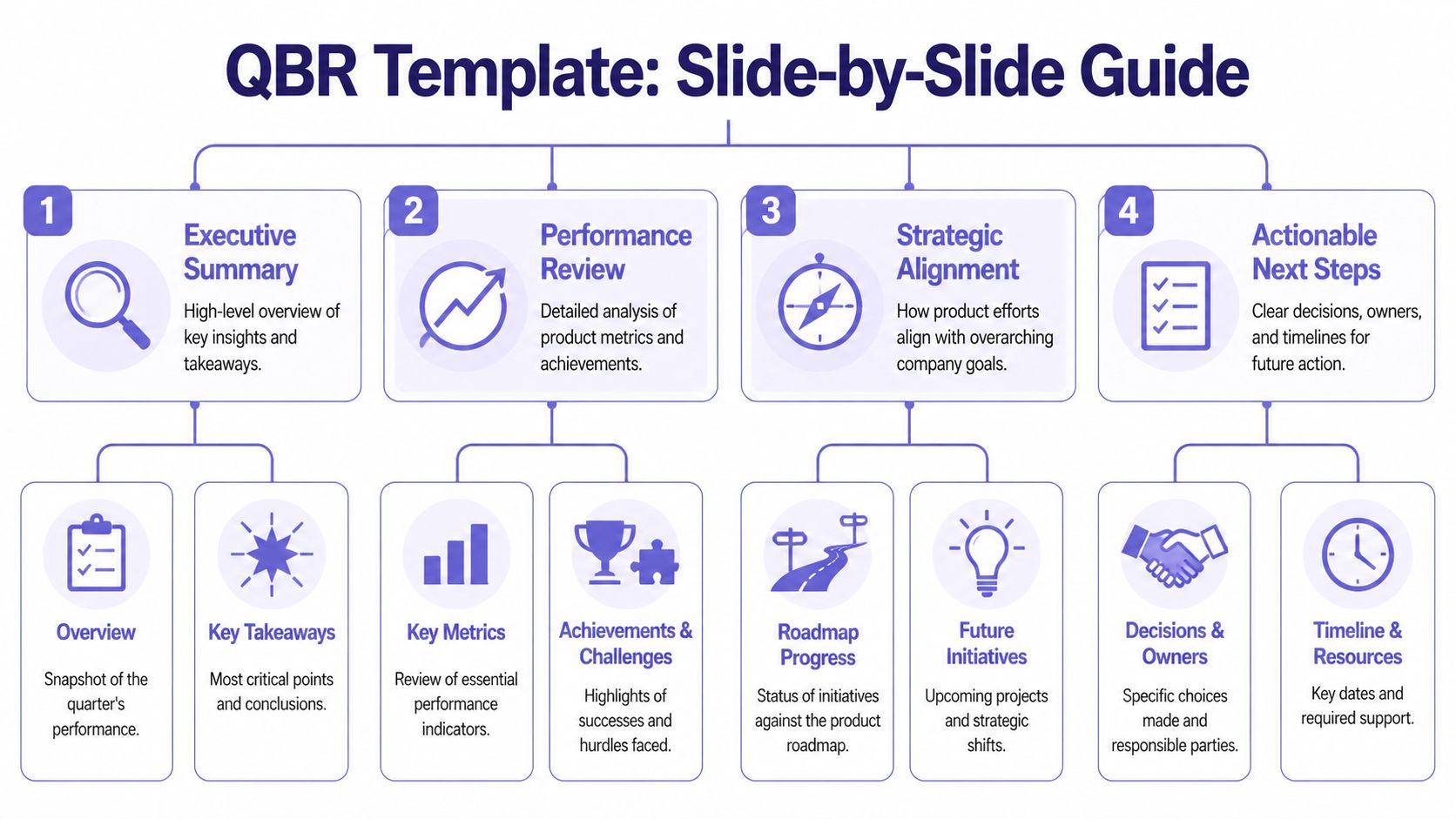
Slide 1, the executive narrative
This is the two-minute version of the quarter. Not every detail. Just the story a busy executive should remember.
Good executive narrative:
- What changed: Name the most important movement in customer behavior, product performance, or delivery.
- Why it matters: Tie it to business impact or strategic direction.
- What needs a decision: End with a clear tension or choice.
Bad executive narrative:
- Project inventory: “We completed X, Y, and Z.”
- Metric wallpaper: “Here are twelve KPIs from the quarter.”
- No point of view: “Overall, progress was mixed.”
A good opening line might sound like this: adoption rose in one part of the product while activation stalled in another, which tells us onboarding friction is now a bigger growth constraint than feature breadth.
That sentence has a pulse. It points somewhere.
Slide 2, the product health dashboard
Most dashboards are too broad. A QBR dashboard should only include metrics that support a strategic conversation.
Use three buckets:
| Metric bucket | What belongs here | What leadership should infer |
|---|---|---|
| Customer value | Adoption, feature usage, time-to-value | Are users getting meaningful outcomes |
| Commercial impact | Signals connected to retention or expansion | Is product work supporting the business |
| Product quality | Reliability, defects, friction themes | Are we scaling trust or debt |
If you need a separate artifact for people management or review language, keep it separate from the QBR deck. For that, a focused resource like this download performance review template can help teams avoid mixing employee evaluation with product strategy.
Practical rule: If a chart doesn’t support a decision, move it to the appendix.
Slide 3, review of past bets
This is the most underused slide in a quarterly business review template.
Every quarter, product teams make bets. Some are roadmap bets. Some are process bets. Some are onboarding bets, pricing bets, or experimentation bets. This slide should evaluate those choices candidly.
I usually structure it around three columns:
- Bet we made
- What happened
- What we learned
Notice what’s missing. There’s no column called “success.” That’s deliberate. Teams get smarter when they evaluate bets based on learning quality, not vanity narratives.
A weak version says, “Launched self-serve onboarding.”
A strong version says, “We expected self-serve onboarding to reduce setup friction. New users reached early value faster in simple workflows, but complex configurations still stalled. The next move is guided setup for high-complexity accounts.”
That tells leadership the team is learning, not hiding.
Here’s a helpful walkthrough before you build the rest of the deck:
Slide 4, the roadmap through a strategic lens
Roadmap slides often fail because they read like release calendars. A QBR roadmap should explain how upcoming work addresses the patterns from the review.
Try a before-and-after framing.
| Weak roadmap slide | Better roadmap slide |
|---|---|
| Feature list by month | Initiative list by strategic goal |
| Delivery status only | Delivery status plus expected impact |
| No dependency visibility | Dependencies and risks called out |
If your team is still refining solution direction, it helps to pressure-test upcoming initiatives before they harden into commitments. This is where rapid prototyping for product teams becomes useful. It gives you a way to bring evidence into the roadmap conversation, instead of presenting speculative delivery plans as settled fact.
Slide 5, key risks and dependencies
This slide earns trust fast.
Leadership already assumes you have risks. What they want is evidence that you know which ones matter and what support is needed. The strongest PMs don’t bury risk. They curate it.
Use short, explicit statements:
- Dependency on platform work: core initiative timing depends on shared engineering bandwidth.
- Onboarding complexity: adoption gains may stall without changes to setup flow.
- Measurement gap: current instrumentation limits confidence in one segment of the funnel.
The mistake here is abstraction. “Execution risk” means nothing. “Activation metrics are noisy because a critical step isn’t instrumented consistently” means something.
Slide 6, the ask
At this stage, many QBRs lose their backbone.
Every review should end with a small number of asks. Not vague hopes. Real asks. Approval, staffing, sequencing, trade-off, escalation, or alignment.
A useful ask has three parts:
- Decision needed
- Why now
- Consequence of delay
For example:
We need agreement on whether to prioritize activation improvements over an adjacent feature area, because the evidence from this quarter suggests onboarding friction is constraining value realization more than lack of breadth.
That’s a product conversation. It’s not decorative.
What good content feels like
Here’s a quick calibration pass for filling the template:
- Good content is comparative: show movement, not isolated numbers.
- Good content is causal: explain likely drivers, not just outcomes.
- Good content is selective: leave out metrics that don’t sharpen the story.
- Good content is uncomfortable in the right way: it makes trade-offs visible.
What doesn’t work?
- Screenshot museums
- Roadmap recitations
- Twelve “key takeaways”
- Action items with no owner in the room
The best quarterly business review template is the one that helps leadership say, “I understand the quarter, I understand the product risk, and I know what decision you need from me.”
That’s enough.
Product Metrics That Drive Strategic Conversations
Once the template is set, the hard part begins. Which numbers belong in the room?
Too many product QBRs confuse data volume with rigor. They aren’t weak because they lack charts. They’re weak because the charts don’t relate to one another. One metric says the product is healthy. Another says users are struggling. A third shows team throughput. Nobody has built a hierarchy.
A good QBR uses a metric tree.
Start with the top of the tree
At the top sits the business question. Are we improving customer value, protecting commercial outcomes, or reducing quality risk?
Below that, product metrics should connect visibly to the business question. Runway’s guide to actionable QBRs notes that high-performing SaaS teams use Budget vs. Actual analysis and metric hierarchy alignment, achieving up to 30% higher goal attainment rates compared to ad-hoc reviews. That’s the important lesson for PMs. The win isn’t “more metrics.” It’s aligned metrics.
Here’s a simple way to structure the tree:
| Business lens | Product evidence | QBR question |
|---|---|---|
| Customer value | Adoption, engagement patterns, time-to-value | Are users getting to meaningful outcomes |
| Commercial impact | Retention-linked usage signals, expansion-linked behavior | Is product usage supporting revenue durability |
| Product quality | Performance friction, support pain, reliability themes | Is the experience trustworthy enough to scale |
Use fewer metrics, with more intent
I’d rather see six well-connected metrics than twenty disconnected ones.
The strongest QBR metric sets usually do four things:
- Tie each metric to a decision: If activation dropped, what choice are we considering because of that?
- Show target context: Not in isolation, but in relation to expected performance.
- Show trend context: Quarter-over-quarter and year-over-year comparisons matter because movement is the story.
- Separate signal from noise: Don’t let one weird spike hijack the conversation unless it reflects a real product pattern.
If your team struggles to connect planning assumptions to product performance, it’s worth reviewing practical top forecast and budgeting resources. Not because budgeting belongs inside the product narrative, but because many QBR debates are really hidden planning debates.
A chart becomes strategic only when someone can answer, “What would we do differently if this moved again next quarter?”
Benchmark carefully, interpret aggressively
Benchmarks help, but they’re easy to misuse.
A benchmark should create perspective, not false certainty. If you compare your activation or feature usage against a market norm, use it to ask better questions. Don’t use it to pretend your product context is identical to everyone else’s. Product maturity, segment mix, implementation complexity, and pricing model all distort simple comparisons.
That’s why behavioral depth matters. Aggregate adoption can look healthy while important workflows still break down underneath. Teams that understand pathing and friction points tell better QBR stories. For PMs working on that layer, this piece on driving product growth with behavioral analytics is especially relevant.
The metric tree in practice
A strong narrative often looks like this:
- Business concern: retention risk in a key segment
- Product signal: lower repeat usage after onboarding
- Behavioral clue: users reach setup but don’t complete a critical workflow
- Product implication: the issue is not discovery, it’s early value realization
- Decision: prioritize activation improvements over adjacent feature expansion
That’s a metric tree doing its job. It moves the room from observation to action.
What doesn’t work is the opposite pattern, a slide full of charts that forces executives to reverse-engineer the story themselves. They won’t. They’ll default to the loudest concern in the room.
Your job is to curate the signal before the meeting starts.
How to Run the QBR Meeting Like a Facilitator
A friend at a Series C company told me about a QBR that went sideways in the first ten minutes. The PM had a thoughtful deck. The data was clean. Then one stakeholder latched onto a single delivery slip, treated it as proof the roadmap was flawed, and dragged the room into a tactical argument about sprint planning. By the end, nobody had discussed the actual product risk the PM came to escalate.
That’s not a deck problem. That’s a facilitation problem.
A PM in a QBR can’t just present. The PM has to manage attention.
Set the room before the room
The best QBRs are partially decided before anyone joins the call. Not the outcomes, but the shape of the discussion.
This matters even more when executives attend. Tendril’s QBR guidance notes that B2B customers with strong executive participation in QBRs are 2.5 times more likely to renew their contracts. The implication for internal product reviews is straightforward: senior participation is valuable, but only if the meeting is designed to use that attention well.
I pre-brief aggressively. Not with a giant pre-read tour, but with targeted context.
Here’s the prep I’d insist on:
- Decision-makers know the asks: No executive should encounter a critical trade-off for the first time on slide nine.
- Potential derailers get context early: If one stakeholder is likely to challenge methodology or scope, talk before the meeting.
- Roles are explicit: Who is there to decide, who is there to provide context, and who is there to leave with ownership?
Use facilitation moves, not just good intentions
In the meeting, your job is to keep the conversation strategic without sounding rigid.
A few moves work consistently:
| Situation | Facilitator move | Why it works |
|---|---|---|
| Discussion drifts into tactics | Park it visibly for follow-up | People feel heard without hijacking the meeting |
| Stakeholder challenges a metric | Clarify the implication, not just the math | Keeps focus on decision impact |
| Quiet executive in the room | Invite a direct reaction | Prevents late surprises |
| Team starts defending past work | Reframe toward the next choice | Stops blame loops |
“Let’s separate diagnosis from solution. We’ve named the issue. The question now is what we want to change before next quarter.”
That line has saved more QBRs than any dashboard improvement I’ve ever seen.
For remote or hybrid teams, visible collaboration helps. A lightweight shared workspace can act as a live parking lot, decision log, and follow-up board. If your team runs distributed sessions often, this guide to transforming remote workshops effectively is a practical reference.
Capture actions in the moment
Most QBR follow-through fails because teams record conclusions loosely. “We’ll revisit.” “Let’s sync offline.” “Someone should look into that.” Those phrases sound responsible. They are not.
Capture action items live, with names.
I use a simple structure:
- Decision or action
- Owner
- What done looks like
- When it will be revisited
If a room won’t tolerate that level of specificity, it’s not really doing a QBR. It’s doing commentary.
Handle hard questions without getting defensive
You will get challenged. Good. A serious QBR should surface disagreement.
The trick is to answer at the right altitude. If someone says, “How do we know this isn’t just seasonality?” don’t rush into a defensive data monologue. Start with what the question changes. Does it invalidate the conclusion, weaken confidence, or call for more segmentation before a final decision?
That response keeps your authority intact.
A facilitator’s tone is calm, concrete, and slightly unsentimental. You’re not there to win every point. You’re there to keep the room working on the right problem.
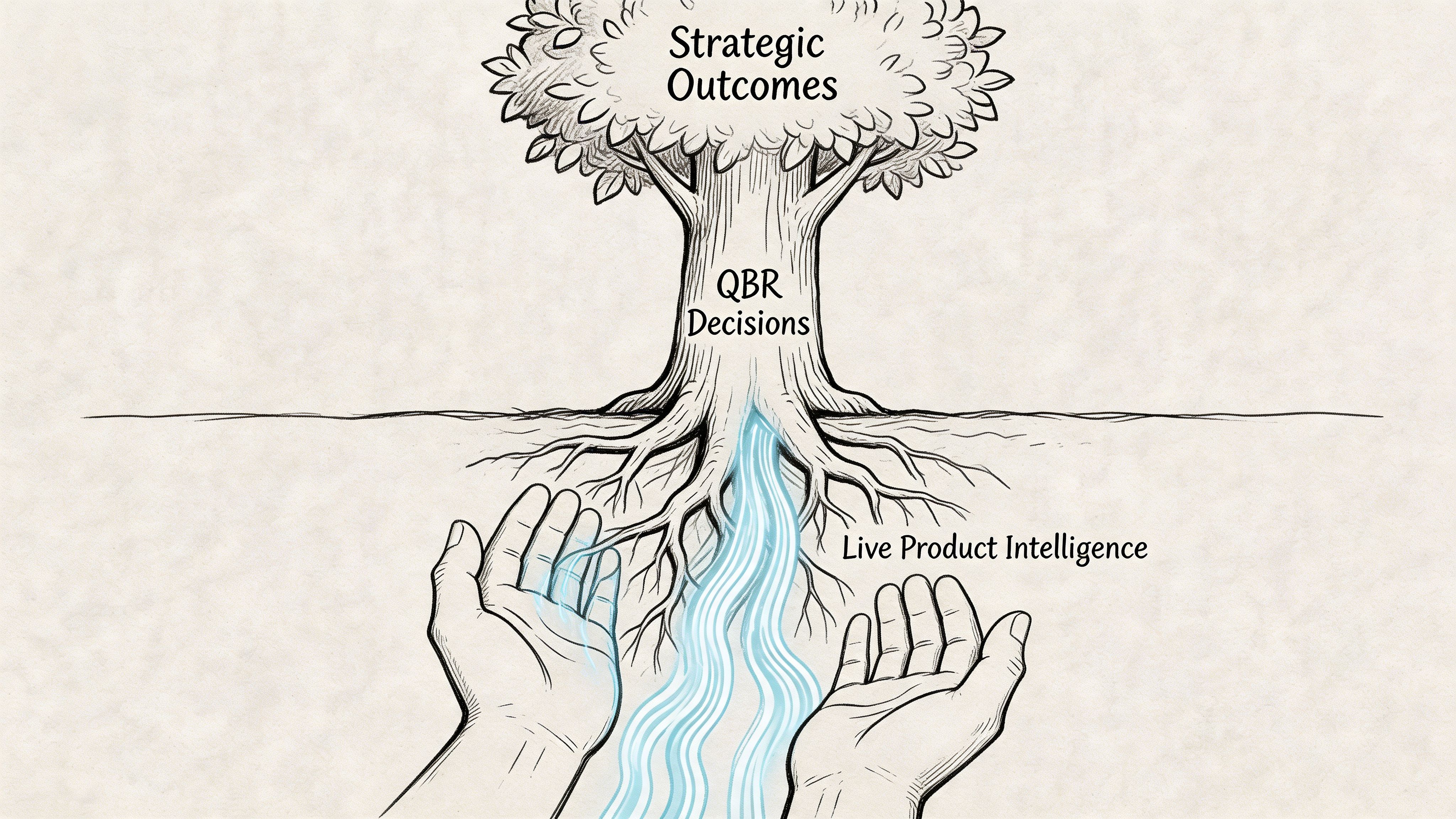
Grounding Your QBR with Live Product Intelligence
The hidden tax in every quarterly business review template is prep. Not the writing. The gathering.
Someone exports analytics. Someone screenshots funnels. Someone chases support themes. Someone asks design for current flows. Someone updates roadmap status. Someone checks whether the metrics still align with last quarter’s definitions. By the time the deck is ready, half the team is tired of the review already.
That’s why static QBRs age so badly.
The real bottleneck isn’t slides
A lot of teams think their QBR problem is storytelling. Usually, their real problem is synthesis. Gong’s QBR examples article points to the core issue: 68% of SaaS product teams report manual data synthesis as a top QBR bottleneck, while existing templates stay heavily backward-looking.
That rings true in practice. The pain isn’t just making slides. It’s stitching together product truth from too many disconnected systems.
The result is predictable:
- Data arrives late
- Context gets flattened
- UX issues get discussed qualitatively
- Product nuance disappears behind summary charts
And then teams wonder why the conversation feels stale.
What live product context changes
A modern QBR should be able to answer questions that static decks struggle with.
Not just:
- What moved?
- Did we hit the target?
But also:
- Where in the flow are users getting stuck?
- What changed in the actual experience?
- Which product decisions likely drove the movement?
- Where are the hidden edge cases that explain the metric behavior?
Live product intelligence matters. If your team can bring current product flows, behavior patterns, UX friction, and updated funnel context into the QBR, the review stops being an archaeological exercise. It becomes operationally useful.
The strongest product QBRs don’t just report outcomes. They reconnect outcomes to the product experience that produced them.
That changes the level of discussion immediately. A leadership team can reason more clearly about an activation dip when they can see the workflow that users encounter, not just the chart that reflects its consequences.
Move from stale snapshots to decision-grade context
What works here is a shift in source material.
Instead of assembling the review from exported fragments, bring in current product evidence:
- Recent product flow captures
- Behavioral funnel movement
- Observed friction points
- Design and UX context tied to the affected journey
- Benchmark framing where it is useful for interpretation
That’s a better operating model because it shortens the distance between signal and decision. It also makes root-cause conversations less political. When teams can inspect the product context directly, arguments get less abstract.
If you want to deepen that post-release perspective between QBR cycles, this article on how AI tracks feature performance post-launch is worth reading.
A practical shift for the next cycle
You don’t need to rebuild your process overnight. But you should stop accepting stale review inputs as normal.
For your next quarter, try this sequence:
| Old prep pattern | Better prep pattern |
|---|---|
| Export dashboards into slides | Pull current product context first |
| Add screenshots late | Start with the user flow under review |
| Summarize friction vaguely | Tie friction to a specific journey and metric |
| Debate causes in the meeting | Bring likely causes into the deck before the meeting |
That single change improves the quality of the room. People stop arguing over what happened and spend more time deciding what to do.
A quarterly business review template is only as good as the evidence you feed it. If the source is stale, the meeting will be too.
From Review to Rhythm Your Next Step
A strong quarterly business review template does more than tidy your slides. It gives the product organization a rhythm for looking at reality without flinching, choosing what matters next, and assigning ownership while the conversation is still warm.
The pattern is straightforward. Start with a QBR philosophy that rewards decisions, not theater. Build a deck that tells one sharp narrative. Choose metrics that connect product behavior to business outcomes. Run the meeting like a facilitator, not a narrator. Ground the whole thing in live product context so you’re not defending stale screenshots and disconnected exports.
In short, don’t redesign your entire review culture at once.
Take one product line, one feature area, or one customer segment. Use this structure in the next cycle. Cut half the slides. Add a real ask. Replace broad recaps with a metric tree and one forward-looking decision. Then see what changes in the room. Better QBRs rarely start with a grand transformation. They start with one meeting that finally feels worth having.
If your team wants a faster way to build QBR-ready product context from the live app instead of stitching together screenshots, dashboards, and scattered notes, take a look at Figr. It helps product teams ground decisions in real UX flows, analytics signals, and production-like prototypes so reviews lead to clearer decisions and less rework.
