
A product review goes quiet in a very specific way when someone asks, “Is this conversion rate good?”
The PM knows the redesign is cleaner. The designer knows the flow feels better. Engineering knows the form is faster than the old one. But nobody can answer the market question, or even the internal trend question, with confidence. Compared to last quarter? Compared to similar segments? Compared to peers with the same motion and price point?
That silence is usually the actual start of performance benchmarking.
Benchmarking is often perceived as a scorecard. It isn't. Used well, it's a navigation system. It tells you where you are, where the frontier is, and which gap is worth closing first. Used badly, it becomes theater, a deck full of charts that flatter the team and change nothing.
The difference comes down to discipline. You need the right KPI, a stable baseline, a fair comparison set, and a serious root-cause process once a gap appears. If any of those pieces are weak, the benchmark turns into a vanity metric in a suit.
Beyond Guesswork The Case for Performance Benchmarking
Monday morning. The growth PM walks into review with a slide that says the new lead form is winning. Completion moved from 2.1% to 2.5% after the redesign. The team is ready to call it progress until someone asks two questions: compared to what, and normalized for which traffic mix?
That is where performance benchmarking starts to matter in real product work. Raw improvement is easy to celebrate. Decision-grade improvement is harder. It requires a fair reference point, consistent definitions, and enough context to separate a design win from a channel shift, seasonality, pricing changes, or a sales push that sent better-intent traffic into the funnel.
Benchmarking earns its keep because product teams rarely suffer from too little data. They suffer from numbers that sound precise but cannot support a decision. A dashboard can show upward movement and still hide a worsening business problem if the underlying cohort changed or the comparison period was distorted.
A benchmark has to survive normalization
A useful benchmark answers three practical questions:
- Where are we now, for a clearly defined segment
- What does strong performance look like in a comparable context
- How much of the gap remains after normalizing for factors that skew the comparison
That last part is where many guides stop too early. Comparing numbers is the easy step. The hard part is making the comparison fair enough to trust.
If signup conversion rose, break out branded and non-branded traffic. If onboarding completion fell, check whether enterprise admins replaced SMB self-serve users in the mix. If support contacts increased, separate user growth from contact rate per active account. Without that normalization work, a benchmark becomes a story generator. With it, the benchmark becomes a tool for diagnosis.
Practical rule: If a metric cannot trigger a clear decision after you control for obvious context shifts, it is not ready for benchmarking.
The strongest product teams benchmark a small set of outcomes inside high-value journeys. Activation, task completion, cycle time, defect rate, and customer-reported friction are common starting points. They also connect those gaps to operating cost. That is why these insights for product teams about rework matter. If a benchmark exposes friction but nobody can tie it to rework, support volume, or delayed delivery, the issue stays interesting instead of urgent.
Primary risk: false confidence
What looks like certainty is often just inconsistent definition.
A Statistics Canada paper on benchmarking across statistical agencies makes a useful point for product leaders. Shared comparison only works when the parties involved define and measure performance in a consistent way. Product teams run into the same problem constantly. One team defines activation as account creation plus email verification. Another defines it as first project setup. Both teams report an "activation rate," and the comparison is already broken.
I have seen the same mistake in funnel reviews. A PM defended the 2.5% lead-form result because the redesign removed two fields and improved page speed. Both changes probably helped. But paid traffic had shifted toward high-intent branded campaigns during the same period, and returning visitors made up a larger share of sessions. Once the team normalized for source and visitor type, the redesign effect was smaller than the topline number suggested.
That does not make benchmarking less useful. It makes disciplined benchmarking more useful. The point is not to find a number that flatters the team. The point is to isolate the size of the underlying gap, then trace it back to the few causes a team can effectively fix.
Laying the Foundation with the Right KPIs
| Baseline field | What to lock down before you benchmark |
|---|---|
| KPI definition | Exact event logic, numerator, denominator, and exclusion rules |
| User scope | Segment, plan, geography, acquisition source, lifecycle stage |
| Time window | Fixed period with known traffic mix and no instrumentation break |
| Product condition | Release version, experiment variant, or pricing model in effect |
| Metric owner | One team responsible for definition changes and anomaly review |
A benchmark falls apart fast when any cell in that table is fuzzy.
I have seen teams spend a full review meeting arguing about a conversion gap that came down to one basic mistake. Product counted workspace invites accepted. Growth counted accounts created. Finance cared about paid activation. All three called it onboarding. Nobody was wrong in isolation. The benchmark was still useless because the metric did not describe one consistent behavior.

Start with the user moment you need to improve
Good benchmark KPIs sit close to a user action, a business outcome, and a decision the team can make.
That is why time-to-first-value is usually stronger than daily active users. DAU can rise because traffic rose, curiosity spiked, or low-intent users bounced through the product once. Time-to-first-value points to a tighter question. How long does it take a new user to reach the moment that proves the product is useful? If that time drops, new users usually reach value faster, support burden often falls, and early churn risk becomes easier to reduce because the product delivered on its promise sooner.
The same rule applies across the journey. In onboarding, measure setup completion for a defined persona or abandonment at a specific step. In a core workflow, track task success rate, retry behavior, or completion time for one job users hire the product to do. In the revenue path, failed payment attempts often beat a broad revenue conversion metric because the fix is more obvious. In delivery, defect escape rate says more than output volume if the actual cost shows up in rework and support.
A practical test helps here. If the metric moves, can the team name the screen, segment, or workflow that likely caused it? If not, it is a dashboard number, not a benchmark KPI.
Baselines earn trust before comparisons do
Many teams rush to external comparison and skip the boring setup work that makes any later analysis believable. Baselines are where that credibility starts.
A useful reference here is the Balanced Scorecard Institute's guidance on KPI development. The point is not to collect more metrics. The point is to define measures tightly enough that teams can use them consistently over time. For benchmarking, that means the denominator cannot drift every sprint, event names cannot change without documentation, and a release that alters behavior cannot be mixed into the same baseline window without being called out.
The practical work is simple, but it takes discipline:
- Write the KPI definition in plain language and event logic
- Freeze the user segment before anyone pulls the report
- Mark instrumentation changes in the same place the team reviews performance
- Separate baseline periods from test periods if a release changed the journey
- Assign one owner who approves metric definition changes
This is also where normalized baselines start to matter. A sign-up completion rate for enterprise admins should not share a baseline with self-serve trial users. Their intent, path length, and required setup differ too much. The KPI name can stay the same. The baseline should not.
Choose KPIs that support root cause work later
The next sections cover fair comparison and root cause analysis. Those steps get easier or harder based on what you choose here.
Broad metrics hide cause. Diagnostic metrics expose it.
If paid conversion drops, "conversion rate" tells you there is a problem. "Checkout completion by payment method and device type" gives the team a place to look first. If activation lags, "new user activation rate" is only a starting point. "Median time-to-first-value for invited workspace admins from mid-market accounts" is far more useful because it narrows the investigation to one cohort, one moment, and a smaller set of possible blockers.
That is the standard I use. Pick KPIs that can survive normalization and still point toward action.
Teams that need a cleaner behavior-to-outcome framework often map their benchmark set against key UX metrics for product teams. Marketing teams running acquisition benchmarks can use the same discipline. A topline CPM or CTR view is rarely enough without segmented definitions and baseline rules, which is why examples like AdStellar's performance benchmarks are more useful when treated as context, not as a KPI list to copy blind.
Five well-defined KPIs beat a busy dashboard every time.
Finding Your Benchmark The Art of Fair Comparison
The first benchmark question always arrives fast: compared to what?
At this point, teams drift into nonsense.
I once watched a PM at a B2B SaaS company compare their onboarding completion rate to a consumer app with radically different user intent, product complexity, and session pattern. The comparison made everyone feel behind, but it taught the team nothing. The benchmark was technically external and strategically useless.
Context decides whether a benchmark is valid
Research on healthcare benchmarking makes a point that product leaders should borrow immediately: reliable benchmarking requires a clearly defined context and a balanced metric set, because shared objectives and comparable measurement conventions are prerequisites for meaningful comparison, as discussed in this review of benchmarking requirements.
That principle is bigger than healthcare. It applies to every product dashboard you own.
If you compare unlike contexts, you don't get insight. You get distortion.
Fair comparison usually requires normalization across variables such as:
- Segment: self-serve users and enterprise admins rarely behave the same way
- Geography: traffic source, payment norms, language, and device mix shift outcomes
- Plan level: free users and premium buyers carry different intent
- Product maturity: a new product line shouldn't be judged like a mature core product
- Timeframe: launch week and a stable quarter are not equivalent periods
This is what I mean when I say most benchmarking guides stop too early. They explain comparison, but not comparability.
Build a benchmark definition before you discuss the result
A useful way to force rigor is to document the benchmark before presenting the gap. That prevents hand-wavy comparisons from slipping into planning.
| KPI | Data Source | Internal Benchmark (Value) | External Benchmark (Value & Source) | Normalization Notes (e.g., Segment, Timeframe) |
|---|---|---|---|---|
| Onboarding completion | Product analytics | |||
| Checkout completion | Funnel dashboard | |||
| Trial-to-paid conversion | Billing analytics | |||
| Defect escape rate | QA and support logs |
Notice what this table does. It forces a team to say where the number came from, which version of the number they trust, and how they adjusted the comparison. That alone removes a lot of benchmarking theater.
For channel-specific work, outside benchmarks can still be useful if the source explains context clearly. For example, teams running paid acquisition may use AdStellar's performance benchmarks as one input when pressure-testing ad efficiency assumptions, but only after filtering for campaign type, audience intent, and conversion event definition.
Internal benchmarks are often more honest than external ones
External benchmarks attract attention, but internal comparisons often produce better decisions. Compare product lines. Compare cohorts before and after a major release. Compare the same funnel across regions with matched traffic quality. Compare enterprise setup time across implementation models.
That's real benchmarking too.
If your team needs a shared mental model for this discipline, what is comparative analysis is a helpful framing device because it pushes people to ask whether the comparison itself is structurally sound.
A benchmark isn't fair because it's published. It's fair because the context matches.
The teams that get this right are rarely the loudest. They're the ones who refuse seductive comparisons and insist on apples-to-apples even when that makes the story less exciting.
Analyzing Gaps and Uncovering Root Causes
A benchmark gap is not a conclusion. It's an alert.
Once a team discovers that a flow underperforms a relevant benchmark, the temptation is to present the delta as the finding. That's where a lot of product reviews go stale. Everybody sees the number, nobody explains the mechanism, and the action item becomes “optimize funnel” or some other vague promise that will age badly.
The gap is the question
Industry guidance is clear on this point. Meaningful performance benchmarking is not just comparison, it is gap analysis plus root-cause analysis, using methods such as percentile rankings, correlation analysis, fishbone diagrams, and process mapping to explain why the gap exists, as outlined in this performance benchmarking guide.
That “why” matters because very different problems can produce the same benchmark gap.
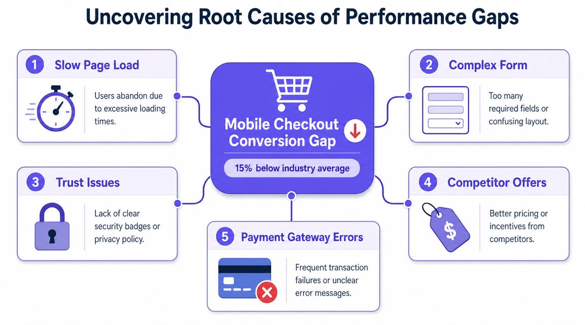
A checkout conversion issue, for instance, might come from page speed, trust friction, confusing form design, poor payment coverage, or traffic mismatch. If you jump to solutions too early, you'll end up polishing the wrong part of the flow.
A practical diagnostic stack
Most product teams don't need exotic analytics. They need a disciplined sequence.
Start with a few simple moves:
Break the KPI into stages
If the benchmarked metric is checkout completion, inspect view-to-start, start-to-submit, submit-to-success. A single top-line gap often hides multiple local failures.Look for segment concentration
Is the gap strongest on mobile web, a specific region, a plan tier, or a traffic source? Broad averages often blur the true failure zone.Pair numeric evidence with behavioral evidence
Funnel data tells you where. Session recordings, support tickets, and user interviews help explain why.Run a root-cause method
Fishbone diagrams work well when multiple functions are involved. The 5 Whys works well when the team already has a narrow problem statement.
Here's a useful way to phrase the output:
We are underperforming on mobile checkout completion for first-time buyers in a specific region, and the current hypothesis is that payment failures plus unclear trust cues create abandonment after form submission.
That is actionable. “Checkout is below benchmark” is not.
Root cause work needs narrative discipline
A friend at a Series C company told me their team spent weeks debating a weak activation benchmark. Design thought the onboarding copy was the issue. Engineering blamed latency. Support blamed account provisioning. When they finally mapped the journey and reviewed failed sessions, the actual culprit was simpler: users hit a permissions step they didn't understand, then left without inviting the admin who had the authority to proceed.
Different theories. One mechanism.
If your reporting still reads like a list of observations, tighten it. A benchmark review should show the evidence chain from gap to hypothesis. That's why a documented framework for actionable data reports is useful. The issue isn't just having data. It's presenting it in a way that turns diagnosis into a decision.
For teams that need a repeatable method, Figr's solution for diagnosing product issues is one practical template for moving from symptom to cause without getting lost in opinion.
The best benchmark analysis usually ends with fewer explanations, not more.
That sounds backward, but it's true. Weak analysis generates a pile of possibilities. Strong analysis eliminates most of them.
Prioritizing Actions and Measuring Impact
A benchmark review often ends the same way. The team leaves the meeting with ten gaps, three opinions about what matters, and no agreement on what gets built first.
That failure usually comes from weak prioritization, not weak analysis. Once the root cause is clear, the next job is deciding which fix is worth real team capacity.
Prioritize by decision value
A benchmark gap has to earn its place on the roadmap. Size alone is a poor filter. A large gap in a low-traffic flow may matter less than a smaller gap in a core journey that affects revenue, retention, or support cost every day.
The practical question is simple: if this gap closes, what changes for the business and for users?
I use a lightweight triage model to force that discussion:
| Question | What to ask |
|---|---|
| Impact | If this gap closes, which KPI moves and by how much would that matter |
| Frequency | How often does the issue appear in a meaningful user path |
| Confidence | How strong is the evidence behind the root-cause hypothesis |
| Effort | Can the team test a fix in a controlled way without tying up a full quarter |
| Strategic fit | Does the work support this quarter's product and company goals |
This works best when teams score each item together. Product, design, engineering, and operations usually see different costs. That tension is useful. A PM may push for conversion lift, while support points out that one fix would also cut ticket volume and refund handling. Those are not competing views. They are part of the same decision.
For backlog decisions, this work pairs well with effective product backlog prioritization, especially when multiple teams are competing for the same engineering time.
Measure impact against a normalized baseline
Teams lose the plot when they ship a fix and compare raw before-and-after numbers without adjusting for context. If traffic mix changed, pricing changed, acquisition quality dropped, or seasonality moved demand, the comparison is noisy.
Use the same normalization logic that made the benchmark fair in the first place. Compare like-for-like segments. Hold the baseline window and post-change window to similar conditions when possible. If that is not possible, annotate the confounders and narrow the claim.
A few operating rules help:
- Define success before launch so the team agrees on the win condition in advance
- Keep one primary KPI tied to the original gap, then monitor guardrails such as latency, error rate, support contacts, or downstream conversion
- Track impact by segment because an apparent average lift can hide failure in a high-value cohort
- Record assumptions and exclusions so the next team can see what was tested, what changed in the environment, and what remains uncertain
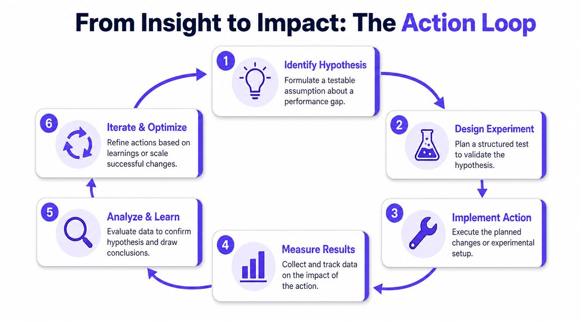
Close the loop with disciplined tests
A root-cause hypothesis should lead to a test, not a release celebration. Sometimes that test is an A/B experiment. Sometimes it is a phased rollout to one market, plan tier, or device class. In lower-volume products, a structured pre/post analysis may be the only practical option.
The method matters less than the quality of the readout.
If checkout completion improved after a payment fix, check whether the lift held across processors, geographies, and device types. If activation improved after onboarding changes, check whether retained users improved too, or whether the team just increased low-intent signups. That is how benchmarking turns into learning instead of a slide with a better number.
Here's a practical walkthrough that helps explain the habit of turning insight into experiment:
Improvement needs proof
The easiest way to overstate impact is to change several things at once. Funnel copy changes, targeting shifts, pricing edits, and lifecycle messages all land in the same two-week window. The KPI moves, but nobody can say why.
A useful benchmark program protects against that. It ties each action to a stated hypothesis, compares results to the pre-change baseline, and keeps a record of what else changed during the test period.
Working rule: If the post-change result cannot be compared to a normalized pre-change baseline, the team does not have an improvement claim. It has a correlation.
Benchmarking earns trust when it changes roadmap decisions and raises the quality of what the team can prove.
Building a System for Continuous Benchmarking
One-off benchmarking projects create moments of clarity. Systems create behavior.
That distinction matters because product performance doesn't stand still. Competitors change flows, markets shift, traffic quality moves, and internal product complexity accumulates faster than most dashboards reveal. A benchmark that was useful last year can become noise if the operating context changed underneath it.
Static benchmarks decay faster than teams expect
Recent research on performance progression shows that the closer an organization gets to the benchmark, the harder further gains become, which is a warning against treating benchmarks as fixed targets and a strong case for dynamic re-baselining in fast-moving environments, as discussed in this research on movement toward performance frontiers.
That matters for product leaders because benchmark management is really a resource allocation problem. Early gaps are often obvious and broad. Later gaps are smaller, more contextual, and harder to close. The economics change. A team may need to work much harder for narrower gains once it approaches the frontier.
That's why annual benchmarking rituals often feel stale. They assume a slow world. Most software teams don't operate in one.
Build a repeatable review cadence
A continuous benchmarking system doesn't need heavy governance. It needs a shared cadence and a few essential requirements.
A simple benchmark review can live inside monthly product reviews or quarterly planning if it includes:
- One benchmarked KPI per critical journey, not a crowded dashboard
- Current internal baseline with a clean definition
- Relevant comparison set with normalization notes
- Observed gap and current hypothesis
- Action status, owner, and next review date
You don't need every metric in the same room. You need the right ones reviewed consistently enough that drift becomes visible before it becomes expensive.
Culture follows the review mechanism
This is the zoom-out moment organizations often overlook. Culture doesn't become data-driven because leadership says it should. It becomes data-driven when recurring decisions require shared definitions, clear owners, and comparable evidence.
That changes incentives.
PMs stop defending pet features with anecdotes. Designers start asking sharper segmentation questions before redesigns begin. Engineering leaders see where performance debt affects commercial outcomes. QA can connect defect patterns to benchmarked user journeys instead of reporting bugs in isolation.
And yes, tools matter here. Some teams assemble this from analytics, spreadsheets, and review docs. Others use platforms that connect product context, design artifacts, and funnel performance in one workflow. Figr is one example, especially for teams that want to compare funnels against benchmarks, surface drop-offs, and generate design work grounded in the existing product rather than a blank canvas.
Re-baseline before the story gets stale
When should you re-baseline?
Usually after a meaningful product change, a channel mix shift, a major segment expansion, or a cadence change that makes old comparisons misleading. If your team ships fast, waiting for an annual planning cycle is often too slow.
The most mature product teams I know treat performance benchmarking less like an audit and more like calibration. They don't ask, “Did we benchmark this already?” They ask, “Is our current benchmark still a fair map of reality?”
That question keeps the system honest.
If you want to make performance benchmarking part of how your team works, not just something that appears in review decks, take a look at Figr. It helps product teams ground UX and funnel decisions in live product context, compare flows against benchmarks, surface drop-offs, and turn findings into production-ready artifacts without starting from scratch.