
You have a feature spec. Your designer has four PMs ahead of you in their queue. The roadmap deadline does not move. You need a wireframe by Thursday.
That's the moment when PMs stop asking whether wireframing is “their job” and start asking how to create wireframes without a designer fast enough to keep engineering unblocked.
I've watched this happen over and over. The team isn't waiting for polished UX. They're waiting for a shared picture of what should exist, what users can do on each screen, and where the ugly edge cases probably hide. A wireframe is often the cheapest way to get there.
This is not about becoming a designer. It's about learning a PM wireframing workflow that clarifies thinking before ambiguity gets expensive.
If you want the short version, good PM wireframes do one thing well: they make the next conversation easier.
Meta description: How to create wireframes without a designer, a pragmatic PM field guide to sketching flows, choosing tools, staying low-fi, and handing work to design without redo.
The Deadline Is Thursday and Your Designer Is Booked
A PM at a SaaS company pings design on Monday. The answer comes back fast and unhelpful: “Can look next week.” Engineering refinement is on Thursday. Leadership wants proof the feature is moving. Nobody cares that the design queue is full.
This isn't a personal failure. It's a workflow bottleneck.
A lot of wireframing advice still treats the work like an isolated design exercise, disconnected from live product context, user behavior, or existing design systems, which is exactly why teams end up reworking screens later, as noted in current guidance on wireframing gaps. PMs feel that gap first because they sit between urgency and uncertainty.
Last week I watched a PM solve this in the least glamorous way possible. She opened a notebook, drew three screens, marked the main action on each, and took photos for the team thread. It wasn't pretty. It was enough to expose one broken assumption before engineers built around it.
A PM-built wireframe doesn't need to impress anyone. It needs to remove one layer of confusion.
That's why this skill matters now. You need a way to show intent before design bandwidth appears. You also need a way to avoid producing a random artifact that dies in Slack two hours later.
If you've seen teams stall between spec and execution, it helps to study how Figr accelerates UX design cycles. The useful idea isn't speed for its own sake. It's reducing the time between “we think this is the flow” and “we can react to something concrete.”
Why Wireframing Became a Core PM Competency
Specialists got more specialized. That's good. Designers spend their best time on systems, research, interaction quality, and hard product problems. Engineers spend theirs building. The space in the middle didn't disappear.
It landed on PMs.
The economics are simple
A vague ticket is cheap only on paper. In practice, somebody pays for ambiguity. Usually engineering pays first, then design pays during cleanup, then PM pays in roadmap credibility.
PM-led wireframing is a response to that reality. You're not trying to replace design. You're trying to reduce uncertainty early, while the cost of being wrong is still low.
That shift explains why visual communication has become part of the modern PM job. It sits right next to writing requirements, running discovery, and forcing decisions when a team keeps circling the same unresolved question.
Why teams need a shared picture
A lot of product work breaks because words hide disagreement. “Simple onboarding improvement” sounds aligned until one person imagines a modal, another imagines a multi-step flow, and a third imagines changing account permissions in the same sprint.
A rough wireframe exposes that mismatch fast.
This is what I mean: the wireframe is not a design deliverable first. It's a compression format for product intent.
If your team already uses notes, transcripts, or meeting summaries heavily, there's a related lesson in integrating SpeakNotes with collaborative AI tools. Teams move faster when raw discussion turns into artifacts other people can act on. A wireframe does that visually.
What this looks like in practice
The PM who can sketch a viable flow gains an advantage in three places:
Before planning: They surface assumptions while the feature is still cheap to reshape.
During alignment: They give engineering and design something concrete to react to.
During handoff: They prevent a long written spec from becoming six different mental models.
That's why this now belongs in the same bucket as best practices for product managers. It's not decorative work. It's risk management.
How to Create Wireframes Without a Designer Three Viable Paths
You don't need a design degree. You need a method that fits the moment.
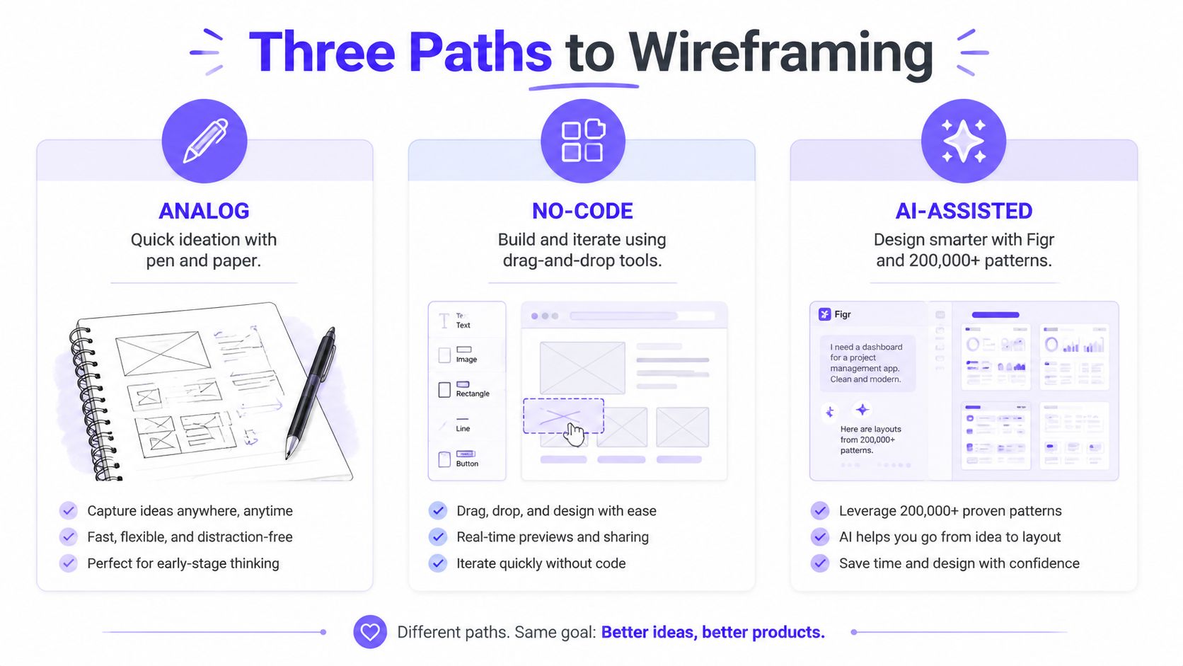
Path one, pen and paper
Don't roll your eyes at paper. It's still the fastest way to think.
A Nielsen Norman Group study found that 78% of UX professionals use pen-and-paper for initial wireframes, which helped non-designers prototype 40% faster, and in usability tests non-designers matched designer output in 88% of layout accuracy metrics using simple shapes, according to NN/g's wireframing research.
That should free a lot of PMs from the weird guilt of not opening Figma first.
The practical pattern is brutally simple:
Start with the frame: Draw the screen boundary and label the device or view.
Place the decision points: Navigation, search, filters, primary action.
Block the hierarchy: Big rectangle for the main content, smaller boxes for secondary content, lines for text.
Mark the flow: Arrows between screens, notes on what changes after each action.
This is the fastest option when you're exploring a new user flow, trying to prep for a designer conversation, or making sense of a messy requirement. It's also the right move when the team still disagrees on basics.
Practical rule: If you're debating structure, use paper. If you're debating styling, you're already too far ahead.
Path two, no-code wireframing tools
Sometimes a napkin sketch isn't enough. You need something readable in a stakeholder review or something an engineer can scan without interpretation gymnastics.
That's where drag-and-drop tools help. They're useful when you need a wireframe without Figma skills and don't want to spend your afternoon nudging pixels. Pick a few standard components, keep everything grayscale, and focus on layout and interaction order.
No-code tools are strong for dashboards, CRUD screens, settings pages, and admin flows because those patterns are familiar and modular. They're weaker when the product concept itself is still fuzzy. Templates can make a vague idea look prematurely settled.
If you're comparing options for mobile-oriented workflows, RapidNative's mobile mockup tool comparison is a practical place to see how different tools fit different build contexts. For broader options, this roundup of best free wireframing tools is useful.
A decent no-code setup is often the sweet spot for DIY wireframing PM work because it's clean enough to share but still rough enough to challenge.
A quick walkthrough helps here:
Path three, AI-assisted wireframing
AI helps when the issue isn't drawing skill. It's blank-canvas paralysis, system complexity, or the need to stay grounded in the actual product.
The gap in most wireframing advice is context. Teams create layouts in isolation, detached from real product patterns, analytics, and design systems. AI-assisted workflows are useful when they can reference those inputs rather than spit out generic screens.
One option in that category is Figr, an AI product agent for UX design and product thinking that ingests your live webapp, Figma files, screen recordings, and docs to learn your actual product before designing, then references 200,000+ real-world UX patterns to design from your product rather than from a blank prompt. If you want concrete examples, see what teams have built with Figr, including the Cal.com vs Calendly setup speed showdown.
This path is best for extending an existing flow, comparing variants, or producing a first pass that already respects the product's shape. It's a form of fast wireframing, but only when the system has context. Generic prompts usually produce generic thinking.
The Fidelity Spectrum Knowing When to Stop
A friend at a Series C company showed me a wireframe he'd spent two days polishing. Nice spacing. Soft shadows. Realistic copy. Tiny icons. The designer stared at it for a second and asked the obvious question: “Is this already decided?”
That's the trap.
Low fidelity creates room for disagreement
A good low fidelity wireframe for PMs feels unfinished on purpose. It invites correction. It tells the room, “react to the flow, not the cosmetics.”
That matters because polish changes behavior. People hesitate to criticize something that looks final. They comment on button color instead of the broken logic in step three.
Use grayscale. Use simple labels. Use placeholder text. Keep annotations short and blunt.
The stop signs are obvious if you know them
You should stop adding detail when:
People understand the user flow without you narrating every click
The primary action is clear on each screen
Open questions are visible in notes or callouts
The artifact still looks editable, not approved
The basic gist is this: once you start tuning aesthetics, you've crossed from alignment into pseudo-design.
If you need a sharper lens on where that line sits, read understand low-fidelity wireframes and keep the purpose straight. You're trying to create enough clarity for decisions, not enough polish for implementation.
The best PM wireframes are strong on sequence, weak on style, and explicit about what's still unresolved.
That's how you get to low fidelity wireframes for faster decisions.
The Handoff How to Avoid the Designer Redo Trap
Most PM wireframes fail at the exact moment they leave PM hands.
Not because they're ugly. Because they're framed badly.
Present it as a question, not a solution
Don't send a file named “final-wireframe-v3.” Don't present the screens like a junior designer seeking approval. Bring the work into a live conversation and frame it around uncertainty.
Say something like this:
I mapped one possible flow. I want your help stress-testing it. Where does this break, and what did I miss?
That one shift changes the politics of the handoff. You stop acting like design support and start acting like a product partner who did the pre-work.
What the designer actually needs from you
Designers can work with roughness. They struggle with missing logic.
Bring these things into the review:
The user goal: what the user is trying to complete
The constraint: what engineering, policy, or data reality limits the flow
The open questions: edge cases, states, missing data, permissions, empty screens
The reason this variant exists: what problem this screen sequence is solving
That's the stuff that prevents a full reset.
For teams exploring context-aware workflows, it also helps when the wireframe references the actual product rather than generic components. AI-augmented tools like Figr can cut wireframe creation time from 4 to 6 hours to 10 minutes by analyzing over 200,000 screens to generate context-grounded wireframes with 92% adherence to existing design systems, reducing rework by 40% for SaaS teams, according to Figma's resource library reference to this workflow.
If the next step after design is engineering alignment, keep the transition clean with these developer handoff best practices.
And if you're exploring broader generation workflows beyond PM sketches, this is also where a practical guide to website wireframe AI becomes useful.
Your Next Step From Drawing to Alignment
The wireframe isn't the asset. The conversation after it is.
Once you have even a rough sketch, ask who should react next. Maybe it's your engineering lead for a feasibility gut check. Maybe it's a designer for flow critique. Maybe it's one customer success teammate who knows where users usually get stuck. If your team also records product demos or workflow walkthroughs, a process like the Smooth Capture workflow for marketing teams is a good reminder that clear visual artifacts travel farther than long explanations.
In short, learning how to create wireframes without a designer is mostly about speed, communication, and reducing expensive misunderstanding before it hardens into backlog debt.
Your next move is simple. Take the feature currently bouncing around your head. Draw the three most important screens on paper in ten minutes. Mark the main action on each. Add one note for the biggest open question. Then put it in front of one designer or one engineer and ask what breaks.
For the complete framework on this topic, see our guide to what is a wireframe.
If your team is tired of starting from a blank canvas, Figr helps turn product context into wireframes, flows, and handoff-ready artifacts grounded in the product you already have, not a generic prompt.