It’s 4:47 PM on Thursday. Your VP just asked for something visual to anchor tomorrow's board discussion. You have a product requirements doc, a pile of bullet points, and sixteen hours. You do not have a designer.
This is the moment a wireframe stops being a design-team checkbox and becomes your most valuable strategic tool.
A wireframe isn’t a picture of a website. It’s a blueprint for behavior. It's the architectural drawing for your user's experience, a tangible hypothesis about how people will navigate, decide, and act. A good wireframe is a conversation starter that forces clarity long before a single line of expensive code gets written.
The Blueprint Before the Build
We think of building software as a linear process: plan, design, code, ship. But it’s not a conveyor belt; it’s a switchboard. Every decision early on reroutes the entire project, connecting it to either a smooth launch or a tangle of delays. The wireframe is your hand on that switchboard.
A wireframe is arguably the most important step in building a professional website, and it should happen long before you start picking colors or fonts.
The True Cost of Skipping the Blueprint
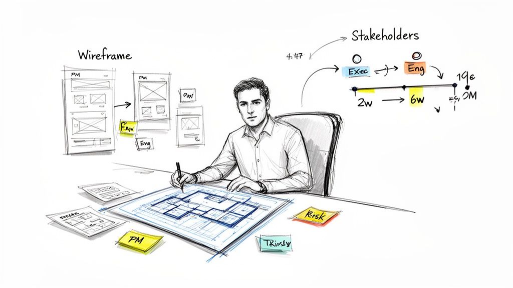
Last quarter, a PM I know at a fintech company shipped a file upload feature. Engineering estimated two weeks. It took six. Why the blowout? The PM specified a single screen.
Once development started, the engineers discovered eleven additional states they had to account for. Each one required a design decision, and each decision required another “quick sync” with the product manager. The two-week estimate assumed one perfect scenario. The six-week reality was twelve screens plus four rounds of “what should happen when…” conversations.
A simple set of wireframes could have surfaced those hidden complexities in a few hours. It would have forced the team to consider the entire user journey, including all the ways it could go wrong. You can see just how deep this rabbit hole goes by exploring a map of Dropbox's upload failure states.
This isn't just about saving time. It's about building institutional confidence. When you present a thoughtful wireframe, you aren't just showing a layout, you're demonstrating that you've anticipated the user's needs.
This shift from a design artifact to a critical business function is playing out in the market. The online wireframe tool market is projected to hit a $2.5 billion valuation by 2025, a significant jump from its $1.6 billion value in 2021. You can find more data on this growth over at Archive Market Research.
From Static Image to Dynamic Conversation
So, how do we create a wireframe for a website that actually works? How do we avoid making pretty but useless pictures?
We have to reframe our thinking.
A wireframe isn't a static image. It's the physical manifestation of a conversation between the product, the user, and the business. It’s a tool for asking better questions. It makes abstract goals concrete and forces everyone to confront ambiguity. Is this the right information? Is this the most important action?
These are strategic questions, and the wireframe is your most effective tool for answering them.
Grounding Your Vision in Goals and User Flow
Before you draw a single box, stop. What is the one job this page must do? A wireframe without a clear objective is just a collection of empty shapes.
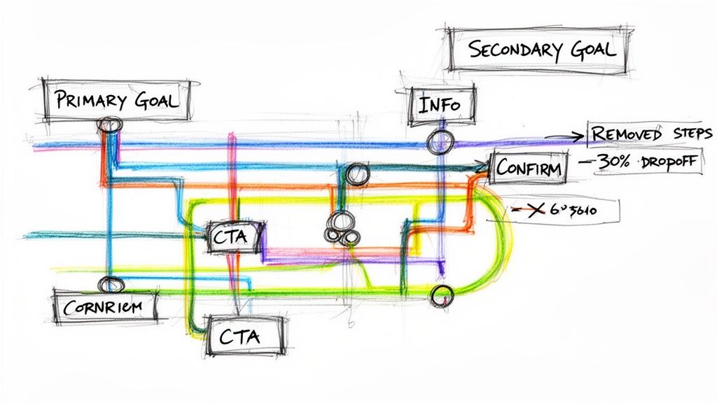
Think of it like a subway map. Each colored line is a primary user goal, and every station is a critical decision point. Your job isn’t to design one station in isolation: it’s to map the entire line from start to finish. This is the moment you translate an abstract business goal into a concrete user path. A friend at a Series C company told me they slashed their new user onboarding drop-off by 30% just by mapping the user flow before wireframing.
This simple exercise revealed three unnecessary steps creating friction.
The Art of Externalizing Your Thinking
You have to get your assumptions about how a user will navigate the system out of your head and onto a canvas. The most effective way to learn how to create a wireframe for a website is to first learn how to map the journey.
What's the primary call to action? Is it ‘Learn More’ or ‘Start a Trial’? The answer fundamentally changes the entire layout. What information does the user absolutely need at this exact moment to make a confident decision? Everything else is noise.
A beautiful wireframe supporting a broken user flow is lipstick on a pig. It will fall apart the second it meets a real user. This is a core principle of creating effective user experience flows that genuinely guide people.
From Chaos to Clarity
Let's make this tangible. A product team wants to improve the Shopify checkout setup for merchants, a notoriously complex process. They have analytics showing high drop-off rates and a folder of competitor screenshots. This is a mess of inputs, not a plan.
The first step is to translate that chaos into a clear user flow diagram, like the one built for this Shopify Checkout Setup Redesign.
A user flow diagram is the most honest document a product team can create. It has no opinion. It just shows the path, revealing every awkward turn your users are forced to take.
This "as-is" map becomes your foundation. It provides the shared context needed to ask intelligent questions. Where can we combine steps? Which fields can we get rid of? According to a study cited by the Interaction Design Foundation, a key aspect of usability as defined by ISO 9241 is efficiency: does the user achieve their goal with minimum effort? A flow map is the only real way to measure this.
In short, your wireframe is the answer. The user flow is the question.
Start with the question. It forces you to think through the entire journey, not just one screen. Your next step isn’t to open a design tool. It’s to grab a whiteboard and start mapping the user’s journey, one decision at a time.
From Sketch to Structure: Building Your First Wireframe
With your goals locked and user flow mapped, the abstract journey is over. Now you give that journey a physical form. This is where you shift from paths to placement. Building your first wireframe isn't about being an artist: it’s about being an architect.
Think of it like sculpting. You don't start with the eyelashes. You start with a big, rough block of stone and focus on getting the basic human form right. Your lo-fi sketch is that block of stone.
From Low-Fidelity Sketch to Digital Blueprint
Always start with low fidelity. Grab a pen and paper, a whiteboard, or one of the many best free wireframing tools out there. The point is speed, not precision. Draw boxes for images and squiggly lines for text. Your only goal is to translate the steps from your user flow into a spatial arrangement on a page.
Here’s what I mean. For a user profile page, your flow might point to two goals: editing details and viewing activity. Which is more important? The answer dictates your layout.
- If editing is primary: The "Edit Profile" button needs to be prominent, with details presented in editable fields.
- If viewing activity is primary: The activity feed should take up the most screen real estate, pushing the edit function to a smaller link.
These aren't aesthetic choices. They are structural decisions rooted in user goals. Your lo-fi sketch is where you test these foundational ideas quickly and cheaply.
The Premature Optimization Trap
I see it all the time. Teams have a powerful urge to rush past this stage. A high-fidelity design, shimmering with colors and real copy, feels like progress. But this is a trap of premature optimization. It locks you into decisions before the core structure is validated.
A wireframe’s job is to force hard conversations about what truly matters on a screen. High fidelity often distracts, inviting feedback on color palettes when the fundamental structure might be broken.
Once your initial sketches feel solid, a great next step is turning them into interactive models. A practical guide on prototyping a website can help you evolve your static wireframes. This lets stakeholders feel the flow, not just see the layout.
The AI-Powered Shift
This is where the process is changing. Instead of starting from a blank page, AI agents can now generate initial layouts based on proven design patterns. You can feed it your user flow and get back a structured, low-fidelity wireframe that follows established usability principles. For example, generating a layout for a scheduling page can be based on an analysis of thousands of successful booking flows, like the one in this AI-generated redesigned scheduling page.
This isn't about replacing the designer. It's about giving the entire product team a superpower: the ability to explore structural possibilities much faster. It's projected that over 70% of designers in 2026 will report that AI significantly speeds up their prototyping and wireframing process. You can find more on these emerging web design trends and what they mean for the industry.
Your first wireframe is a tool for thinking. Start rough, focus on hierarchy, and make sure the structure is solid before you think about making it pretty. This disciplined approach is how you create a wireframe for a website that actually works.
Infusing Reality with Data and Edge Cases
A wireframe built only for the "happy path" is a work of fiction. It assumes every user is patient, every network connection is flawless, and every click is perfect. Reality is a far messier business.
To create a wireframe that can survive contact with actual users, you have to move beyond screens and start thinking in states.
Thinking in States, Not Screens
A single component, like a file uploader, is a perfect example. It isn't one screen. It’s a tiny system with a dozen potential outcomes: uploading, processing, success, network error, file too large, wrong file type, permissions denied. Each of these is a state that requires a specific design decision.
I once watched a team spend a month in QA hell over a simple form. The wireframe looked fine, but it only showed the filled-out state. It never asked: what happens when the form is empty? What does a validation error look like? What is the loading state after the user hits "submit"?
The great design thinker Don Norman, in his book The Design of Everyday Things, stressed the importance of feedback and error handling. A user should always know what is happening. A state-aware wireframe is the purest expression of this principle, ensuring the user is never left confused. Exploring these unhappy paths is essential, as we've discussed in our article about 10 edge cases every PM misses.
A wireframe that only shows the happy path isn't a blueprint. It's a prayer. A robust wireframe anticipates chaos and provides a clear plan for managing it.
This process involves sketching the initial layout, defining its structure, and then using intelligent tools to refine it with real-world complexities.
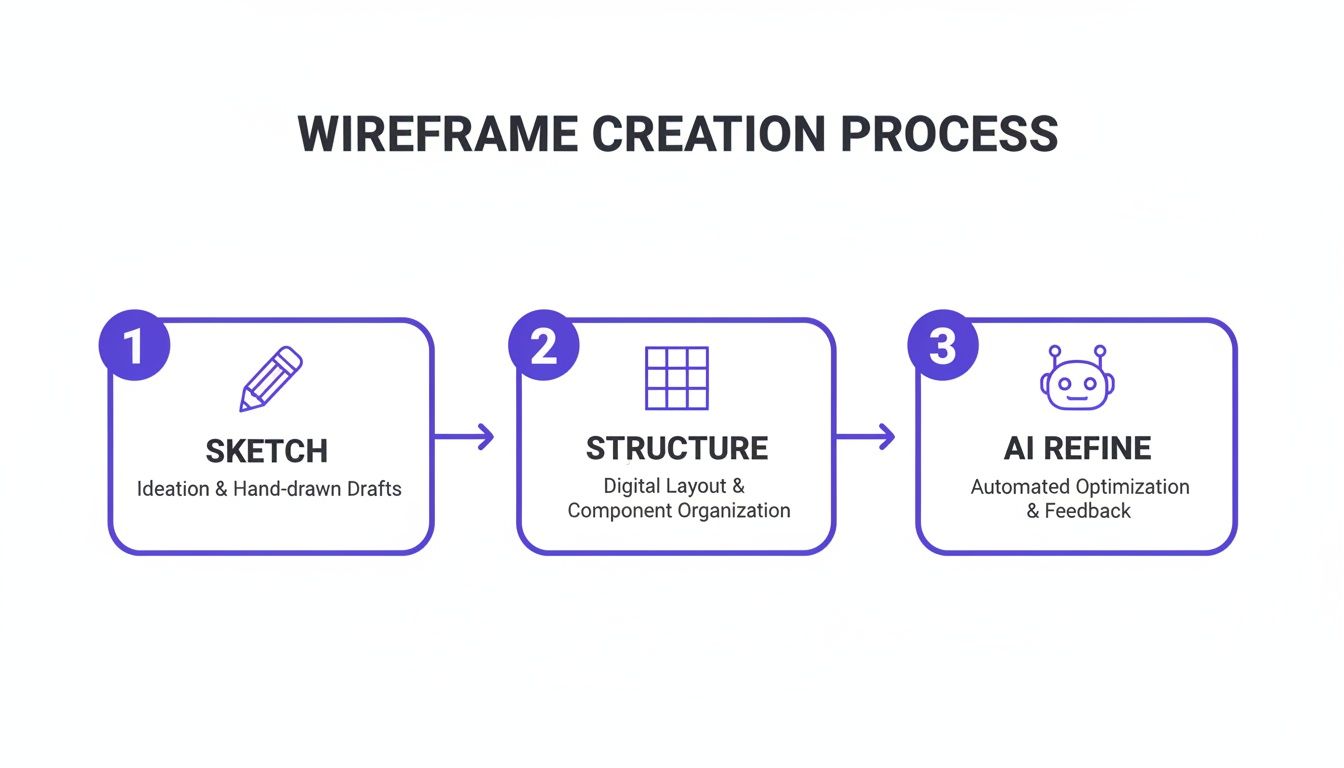
This workflow shows how a simple sketch evolves into a structured layout that is then stress-tested and refined against real-world scenarios.
Arming Your Wireframe with Data
Thinking in states prepares your wireframe for what could happen. Infusing it with data prepares it for what is happening.
Integrating analytics early is a powerful shift from designing based on assumptions to designing based on observed behavior. Does data show that users consistently stumble on the second step of your sign-up flow? That insight should directly inform your wireframe's hierarchy.
The basic gist is this: data tells you where the friction is. Your wireframe is your first and best chance to design that friction away. Seeing the messy reality laid out visually, as in this map of Zoom's network degradation states, transforms how you approach the design. It moves you from being an artist to a systems thinker.
The next step is to take this robust, reality-tested wireframe and make it interactive, bridging the gap between a static document and a living product.
Bridging the Gap from Wireframe to Handoff
The most thoughtful wireframe is useless if it dies in a forgotten folder. To see your vision through, you have to cover that final, critical mile: turning your structural plan into an interactive experience and a clear handoff package for your engineering team.
Your wireframe isn't a baton to be passed in a relay.
Think of it as the first leg of a continuous race where the whole team runs together. The transition to development should be a seamless continuation of that race.
Making the Blueprint Breathe
The first thing to do is add interactivity. This is where you bring the user flow to life. Static images are notorious for hiding awkward transitions and missed steps that only appear once you can click around.
How does the screen react when a user clicks this button? What's the feedback when an action is completed?
A clickable prototype is the single most effective way to answer these questions. Just last month, I watched a team debate the logic of a task approval flow for an hour. They resolved it in five minutes once I showed them a clickable prototype that simulated the different task component states. The interaction made the logic tangible in a way no static box ever could.
This phase isn't about making it pretty. It’s about making it work. A simple click-through model built from your wireframes is often all you need.
The Handoff as a Source of Truth
The final act is preparing your wireframe for its new life as a development guide. This is the handoff, a process that’s less about sending a file and more about establishing a shared source of truth. The incentives here are huge. A clear handoff minimizes ambiguity, which in turn slashes the number of clarification meetings that derail sprint velocity. A great handoff saves engineering time.
To get there, your handoff package must align with your engineering team's workflow. The goal is to provide assets, not just pictures. This includes:
- Exported Components: Instead of flat images, provide components with defined states (hover, disabled, active).
- Design Tokens: Include specifications for spacing, color, and typography that map directly to code.
- Clear Annotations: Document any complex logic or edge cases right on the wireframe.
Modern tools like Figma let you export wireframes with design tokens and states already defined. It transforms the wireframe from a reference image into an actionable, production-aware artifact. For teams looking to master this phase, exploring a complete developer handoff playbook is a worthwhile investment.
The takeaway is this: Your job isn't done when the wireframe looks right. It’s done when a developer can look at your handoff package and build the right thing without asking you a single question.
Frequently Asked Questions About Website Wireframing
You have the theory and the process. But the moment you sit down to sketch, practical questions always hit. Let's tackle the ones that come up most often.
What Is the Difference Between a Wireframe, a Mockup, and a Prototype?
Think of it as a progression: from an architect's blueprint, to a builder's rendering, to a staged model home you can walk through.
A wireframe is that raw blueprint. It’s all about structure and flow. Using simple boxes and lines, it defines the layout and information hierarchy. It answers the question: what does this do and where does everything go?
A mockup is the visual rendering. It takes the wireframe’s structure and layers on the visual identity: color, typography, and actual imagery. It’s a static picture. It answers: what will this look like?
A prototype is the interactive simulation. It stitches mockups together to create a clickable experience that demonstrates how a user will move through the product. It answers: how will this work and feel?
You always start with the blueprint before picking out paint colors.
How Can I Get Stakeholder Buy-In with a Simple Wireframe?
The trick is to frame the conversation before you show the wireframe. You aren't presenting a final design; you’re presenting a strategic tool for discussion.
State the goal clearly: "Today, we're here to validate the user flow and information hierarchy, not the visual design." This sets expectations and channels feedback where you need it most.
Then, use annotations directly on your wireframe. Explain the "why" behind your choices. Connect each element back to a specific user story or business goal you've already agreed on. This shows you're solving a problem, not just drawing boxes. An interactive low-fidelity prototype can be a secret weapon here, making the structure feel real and keeping feedback focused on function.
What Are the Most Common Mistakes to Avoid?
I see teams fall into the same three traps over and over. Sidestepping them is the fastest way to get better at creating website wireframes.
- Jumping to high-fidelity too soon. This is the number one mistake. It locks you into visual decisions before the core structure is sound and invites feedback on the wrong things (like colors and fonts).
- Designing only the "happy path." Ignoring what happens when things go wrong—error states, empty states, loading states—is a recipe for scope creep and last-minute panic. Reality is messy; your wireframe needs to account for that mess.
- Designing in a vacuum. If you start drawing screens without a clear user flow map or defined goals, you’ll end up with a collection of disconnected layouts that don't solve a real problem.
Always start with the user's journey, not the interface.
Can AI Truly Create a Useful Wireframe for a Complex Website?
Yes, but its real power isn’t in spitting out a generic layout. An advanced AI agent creates a useful wireframe because it starts with your product's specific context.
It doesn’t begin with a blank slate. By learning from your live application, importing your design system from Figma, and remembering your product docs, the AI generates layouts and flows that are already consistent with your existing UX.
For instance, it can map a complex user journey, like the one needed for an AI-powered playlist curation feature for Spotify, and spot potential edge cases by analyzing patterns from thousands of proven screens.
The result is a production-aware artifact that dramatically speeds up the entire process. It’s not about replacing product thinkers; it's about giving them a more powerful tool to build better blueprints, faster.
