

Monday morning, the team had seven dashboards open and no real answer.
Acquisition looked healthy. Session replays showed friction. Support tickets said one thing, sales calls said another, and a senior stakeholder kept pointing at a KPI that had moved for reasons nobody could explain. By noon, the meeting had turned into a ritual of screenshots, opinions, and delayed decisions. The product wasn't suffering from a lack of data. It was suffering from decision paralysis.
I've seen this pattern more than once. A PM walks into sprint planning armed with analytics, survey snippets, and a slide full of trends, yet still can't say what should ship next. Why? Because raw evidence is not the same thing as a decision. The problem isn't a lack of data; it's a decision synthesis problem.
That distinction matters.
Data driven product development is often described as a discipline of measurement, instrumentation, and experimentation. All true. But on real teams, the harder part is choosing which signals deserve action and which ones are just noise dressed up as rigor. Atlassian's 2024 System of Work research found that knowledge-heavy teams lose too much time to meetings and context-switching instead of execution, and that teams often have analytics, surveys, and support tickets yet still struggle to turn them into coherent decisions, as summarized in this discussion of data-driven product strategy.
If that feels familiar, you're not behind. You're operating in the default condition of modern product work.
The teams that get unstuck aren't necessarily the ones with more dashboards. They're the ones with a tighter method for measuring UX effectively and translating mixed signals into one clear next move, which is why a practical framework for measuring UX effectively matters more than another reporting layer.
Introduction Beyond the Dashboard
The real bottleneck is synthesis
A lot of product advice still assumes the main challenge is collecting enough evidence. That's yesterday's problem. Today, most SaaS teams already have event data, funnel reports, NPS responses, app reviews, CRM notes, support logs, and session recordings. They're not blind. They're overexposed.
The failure mode is subtle. Teams confuse coverage with clarity. They assume that if every surface is instrumented, the right answer will reveal itself. It usually doesn't. More often, the team ends up in a debate over which metric matters most, or whether a qualitative pattern is representative enough to justify a build.
Practical rule: If a team can describe ten signals but can't name the next product decision in one sentence, it has an interpretation problem, not an instrumentation problem.
Last week, a friend at a Series C company told me about a release review that stalled on exactly this issue. Growth wanted to optimize activation. Design wanted to fix a confusing onboarding step. Support wanted to prioritize account recovery because it generated the loudest complaints. Everyone had evidence. Nobody had synthesis.
That's what this article is really about.
Why this keeps happening
Knowledge work rewards visibility. Dashboards, reports, and research decks are visible. Decision quality is harder to see, so teams overproduce the first and underinvest in the second. Add context switching, recurring meetings, and too many stakeholders pulling from different datasets, and the product loop slows down.
The basic gist is this: data driven product development only works when evidence is compressed into a usable decision model. That means one target outcome, a small set of supporting signals, an explicit hypothesis, and a testable next step.
Without that, even smart teams drown in their own instrumentation.
The Signal-Over-Noise Product Model
The shift that changed product management wasn't the arrival of better charts. It was the move from intuition-led decisions to measurable experimentation. Modern guidance now treats product work as a loop: define goals and metrics first, collect and analyze data, formulate hypotheses, run A/B tests, and iterate, as outlined in LogRocket's data-driven product management guide.
That history matters because it changed the job. Product teams stopped asking, “What do we think users want?” and started asking, “What can we verify?”
Three pillars that keep the model honest
I call this the Signal-Over-Noise Product Model. It's not a new analytics stack. It's a way to run product development so the team can separate useful evidence from distracting evidence.

The model rests on three pillars:
- Measurable goals first: Before anyone opens Mixpanel, Amplitude, GA4, Hotjar, or a spreadsheet, define what success means. Not “improve onboarding.” Say what outcome should move and for whom.
- Integrated evidence: Don't let one dashboard dominate the room. Behavior data, support conversations, usability sessions, and sales friction each describe a different part of the same system.
- Iterative validation: Teams need a rhythm of hypothesis, experiment, and review. Shipping isn't proof. Measured impact is proof.
These sound basic. They're not. Most product confusion starts when one of the three is weak.
Why goals matter more than tooling
If I had to choose one discipline that separates high-functioning teams from chaotic ones, it would be this: they define the target before they collect the evidence. Everything downstream improves when that happens. Metric selection gets sharper. Analysis gets faster. Disagreements become easier to resolve because the team can ask a simple question: does this signal help us move the defined outcome?
A lot of PMs skip this and jump straight to instrumentation. That creates what I think of as metric exhaust, a trail of numbers with no operating logic behind them.
A better pattern is to start with a decision statement:
| Product question | Weak framing | Strong framing |
|---|---|---|
| Onboarding issue | “Users seem confused” | “We need to determine whether the setup step is blocking activation” |
| Feature adoption | “Engagement is low” | “We need to learn whether discoverability or usefulness is limiting feature adoption” |
| Retention drop | “People aren't coming back” | “We need to identify which part of the recurring workflow breaks before repeat use” |
That's the mindset behind a disciplined guide to behavioral analytics. Behavioral data is powerful, but only if it's tied to a decision the team needs to make.
A dashboard should answer a product question. If it only displays motion, it's decoration.
Your Data Compass Navigating Sources and Metrics
A product team's evidence usually comes from four places. If you don't name them clearly, they get mashed together and the conversation goes soft.
Four evidence types worth separating
Behavioral data tells you what users do. Think event streams, feature usage, pathing, drop-offs, session replays, and funnel movement.
Attitudinal data tells you what users say. Surveys, interviews, customer calls, in-app prompts, and usability sessions live here.
Operational data tells you whether the product can reliably deliver the experience you designed. Error logs, performance traces, release issues, QA failures, and support escalation patterns matter more than many teams admit.
Market data gives context. Competitive positioning, category expectations, pricing friction, and demand signals help you avoid solving the wrong problem beautifully.
The most important distinction is this one: quantitative data explains what users do, while qualitative data explains why they do it. Uxia makes that point clearly in its practical guide to data-driven design. If you only look at one side, you'll either get clean numbers with weak interpretation or rich anecdotes with no sense of scale.
Don't build a metric salad
Tracking too many metrics per initiative is a common pitfall. This is one of the fastest ways to lose the thread.
Use a simple hierarchy instead:
- North Star for the workflow: Pick the one outcome that defines success for this initiative.
- Diagnostic metrics: Add a few supporting signals that explain movement in the North Star.
- Guardrails: Watch for unintended damage elsewhere, such as quality, support load, or downstream task failure.
If you work in ecommerce or subscription flows, category context can help pressure-test your assumptions. This guide to ecommerce conversion rates is useful not because benchmarks solve your strategy, but because they force better questions about funnel friction and realistic expectations.
Here's a simple way to choose metrics:
| Initiative type | North Star example | Diagnostic examples | Guardrail examples |
|---|---|---|---|
| Onboarding | Activation | Step completion, time to first value, error points | Support contacts, drop-off at verification |
| Checkout | Conversion | Cart abandonment step, field errors, payment retries | Refund requests, failed transactions |
| Core feature usage | Repeat use | Feature discovery, first successful task, return path | Session frustration, negative feedback |
A lot of teams now use AI-assisted tooling to connect these sources faster. A good guide to AI in product analytics can help you think through where automation is useful and where human judgment still needs to lead.
The video below is a good prompt if your team is trying to turn all this into a repeatable habit rather than a one-off exercise.
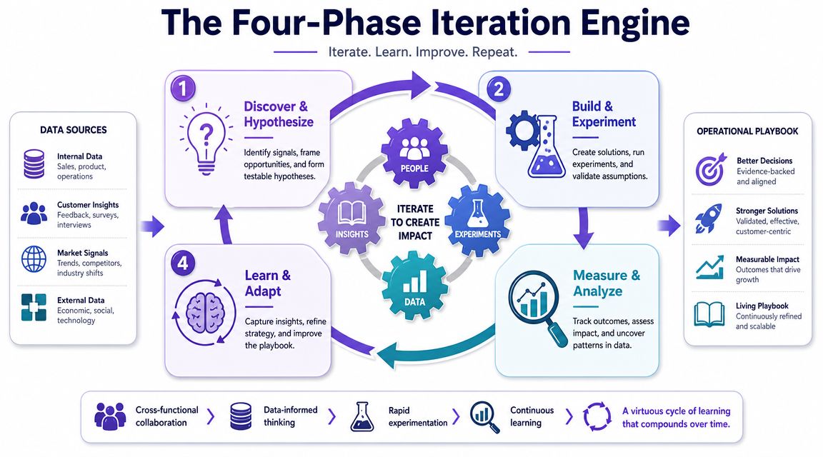
The Four-Phase Iteration Engine
A team ships a checkout redesign after weeks of analysis. Clicks go up. Celebration starts. Two days later, support volume spikes, payment failures rise, and revenue slips. The problem was never a lack of data. The team had plenty of it. They failed at decision synthesis. They collected signals, but they did not turn them into one clear decision about what needed to change and how they would judge success.
Strong product teams run a repeatable loop that converts noise into action. The point is not to measure more. The point is to make better calls, faster, with less debate driven by anecdotes. I use four phases.
Discover and frame the problem
Start with a user struggle you can describe in plain language.
Pull from funnel analysis, support themes, session recordings, review text, and sales objections. Then force those inputs into a single problem statement with evidence behind it. A drop-off chart shows where behavior changes. Support tickets explain what users found confusing. Neither source is enough on its own.
A useful framing statement sounds like this: “Users reach plan selection, hesitate, and abandon because the pricing rules are unclear at the moment of choice.” That gives design, engineering, and analytics something concrete to test. “Conversion is down” does not.
The output of discovery should fit in one sentence and survive scrutiny from the whole team.
Prioritize with a decision lens
Teams usually have more problems than capacity. Priority gets clearer when each candidate issue is judged on the same three filters:
- Impact on a core workflow
- Strength of evidence
- Ease or speed of change
This is the practical side of decision synthesis. Priority should go to the problem where user pain, business impact, and delivery reality overlap. Loud feedback alone is a weak reason to commit a sprint. So is a large drop in a metric if nobody can explain what behavior caused it.
I like lightweight scoring here, but the score is not the decision. It is a forcing function. Every proposed initiative should name the target metric, the expected behavior change, and the reason the team believes that change will happen.
Build and experiment
Now the team moves from diagnosis to intervention.
Sometimes the right move is a prototype or copy change. Sometimes it is a flow change, pricing explanation, or controlled feature test. The common requirement is a written hypothesis. “Redesign onboarding” is vague and hard to evaluate. “Reducing choices on the setup screen will increase completion because users will reach first value with less hesitation” is specific enough to build and review.
Teams that run experiments often need process discipline more than more tooling. Strong A/B testing best practices reduce false confidence, especially when sample sizes are small or multiple teams are changing the product at once.
Tools can shorten this phase if they help the team produce testable artifacts faster. Figr is one example. It can use product context such as screens, analytics, and design systems to generate flows, PRDs, test cases, and proposed UX changes based on the existing product.
Measure, learn, and adapt

This phase is where weak teams declare victory too early.
A launch review should answer three questions. Did the target metric move? What did the result reveal about user behavior? What should the team do next? Scale it, revise it, or stop it.
Good review habits also look for side effects. An onboarding change might improve activation while increasing support contacts. A pricing test might raise conversion while lowering average order value. Those trade-offs matter because product decisions rarely improve one thing in isolation.
The loop only works when learning changes the next decision. Teams improve when each cycle leaves behind a sharper hypothesis, a cleaner metric set, and better judgment about which signals deserve attention.
Pitfalls and Governance How to Keep Data Honest
A team ships a feature, sees engagement rise, and calls it a win. Two weeks later, support volume climbs, task completion drops, and customer calls reveal what the chart missed. People were not getting more value. They were getting stuck for longer.
I have seen that failure more than once. The pattern is consistent. Teams collect plenty of data, but they stop at observation instead of decision synthesis. A metric moves, someone grabs the most convenient explanation, and the organization mistakes motion for progress.
The usual ways teams fool themselves
The common failure modes are familiar, but they matter because each one distorts a decision in a different way.
- Confirmation bias: A team favors the chart that supports the feature it already wanted to ship.
- Vanity metrics: Clicks, views, or session length stand in for user value or business impact.
- Correlation confusion: Two variables move together, and the team treats that as proof of cause.
- Metric monoculture: One KPI dominates every review and hides damage to retention, margin, trust, or support load.
- Overreliance on models: Forecasts and scoring systems can help prioritize, but weak inputs produce polished nonsense.
The last problem gets worse when AI enters the workflow. Prediction can help teams spot likely churn, prioritize accounts, or estimate adoption risk. It can also scale bad assumptions fast. If churn is defined poorly, if event tracking is messy, or if the model ignores context from sales calls and support tickets, the output looks precise while pushing the team toward the wrong choice.
That is the core governance problem. Data collection is not the hard part anymore. Deciding which signals deserve trust is harder.
Governance is how teams protect decision quality
Good governance starts before launch. The team writes down the decision it is trying to make, the metric that matters most, the guardrails that prevent local wins from hurting the product, and the person who owns the call when evidence conflicts.
One habit matters more than people expect.
Countermeasure: Define success and guardrail metrics before work starts.
That forces clarity early. It also makes post-launch reviews harder to manipulate.
A practical governance layer usually includes:
| Risk area | Lightweight governance habit |
|---|---|
| Goal drift | Write the target outcome and decision owner before work begins |
| Metric misuse | Define primary, diagnostic, and guardrail metrics together |
| Interpretive bias | Review results with product, design, engineering, and support in the room |
| False confidence | Record what the team expected to happen before the test runs |
| AI misuse | Validate model outputs against user feedback and product context |
These habits are simple. They are not free.
Cross-functional reviews take time. Guardrail metrics slow down teams that want one clean success story. Writing down predictions before a launch can expose weak thinking. That discomfort is useful. It keeps teams from retrofitting a narrative after the fact.
Culture matters here, but culture shows up in operating choices. If leaders praise shipment volume and ignore whether the team made a better decision, people will optimize for activity. If reviews ask, "What did we learn, what trade-off did we accept, and what evidence changed the call?" teams get more honest fast.
Teams bringing AI into PM workflows should apply the same standard. These insights on AI in product development are a useful reminder that automation can speed analysis, but judgment still sits with the product team.
The point of governance is not control for its own sake. It is to make evidence usable. Strong product teams do not collect more dashboards than everyone else. They make fewer, clearer decisions from the evidence they already have.
Conclusion Your First Data-Driven Sprint
I've seen teams spend a full quarter instrumenting events, building dashboards, and debating definitions, then miss the obvious call on a broken signup flow. I've also seen a small team pick one user path, review three pieces of evidence, and ship a change that improved activation within a sprint. The difference was not data volume. It was decision synthesis.
Start with one workflow that matters to the business this sprint. Choose a path with a clear outcome and visible friction: activation, checkout, invite flow, document creation, or first report setup. Keep the scope tight so the team can inspect the evidence, make a call, and learn from the result without getting buried in reporting work.
A practical first sprint looks like this:
- Choose one success metric for that workflow.
- Pull three inputs around it: one quantitative signal, one qualitative signal, and one operational signal.
- Write a single sentence naming the likeliest point of friction.
- Ship one small change and define the review criteria before release.
That sequence sounds simple because it is. The hard part is discipline.
Teams usually fail here in one of two ways. They either collect too much evidence and delay the decision, or they pick one chart, call it truth, and ignore context from support tickets, session replays, or delivery constraints. Good data-driven product development sits in the middle. Use enough evidence to reduce avoidable mistakes, then make the call.
Do this once and the team starts building the right habit. Evidence stops being a reporting artifact and becomes an input to judgment. Over time, that habit shapes culture through operating behavior, review quality, and the questions leaders ask, as noted earlier.
Start smaller than feels comfortable.
One clear metric on one important workflow will teach your team more than another month of dashboard sprawl. If you want help turning scattered product evidence into usable artifacts, Figr is built for that workflow. It captures product context, connects analytics and design inputs, and helps teams generate flows, PRDs, test cases, and UX changes grounded in the product they already have.