Friday afternoon, thirty minutes before a launch window, someone drops a screenshot in Slack. The new checkout flow is live in staging. The button is blue, but not your blue. The radius is tighter. The hover state feels like it came from another company entirely.
Nobody planned that.
A PM approved the flow because the logic looked right. Engineering reused a component from an older surface. Design assumed the token mapping had already been handled. QA checked for bugs, not subtle drift. By the time users touch it, the product still works, but it no longer feels fully trustworthy.
That's usually when teams start asking what is brand consistency, as if it's a marketing question.
It isn't. For SaaS teams, brand consistency is an operating discipline. It shapes how fast you ship, how much rework you absorb, and whether customers feel like each new feature belongs to the same product they already chose.
Last week I watched a PM at a growth-stage company walk through three nearly identical onboarding screens built by three squads. Same goal. Same product. Three different tones of voice, two different date formats, and conflicting confirmation patterns. Nobody had broken the product. But everyone had taxed the user.
That tax adds up.
The Cost of a Single "Slightly Different" Button
A single inconsistent button rarely stays single for long. It spreads through templates, clones, hurried experiments, and copied code. Then it shows up in the places where users are already making decisions with low patience and high intent.

Where the damage actually happens
The obvious problem is visual mismatch. The more expensive problem is what follows.
Support gets tickets that sound vague. Users say the flow felt odd, or they weren't sure they clicked the right thing, or they hesitated before submitting payment. Design gets pulled into an emergency review. Engineering burns a sprint fixing UI debt that should never have reached production. Product has to explain why a “small” polish issue became roadmap work.
That is not a design miss. It's a coordination miss.
A lot of teams still treat these incidents as isolated defects. They're not. They are evidence that the system for shipping product has gaps between brand, design, code, and QA. If you want a clean way to frame that internally, start by calculating the true cost of rework.
Why leadership should care
The business case is stronger than commonly assumed. Companies with highly consistent branding achieve 2.4 times the average growth rate compared to inconsistent peers. Consistent presentation across all platforms can boost revenue by up to 33%, while repeated poor or inconsistent experiences are cited by 59% of customers as a reason for churn, according to Envive's summary of brand consistency research.
Those numbers matter, but the day-to-day signal is simpler. Teams that let “close enough” into the product pay for it twice. Once in user confusion, and again in internal cleanup.
Practical rule: If a UI decision is small enough to skip system enforcement, it's small enough to multiply unnoticed.
Here's what usually works versus what doesn't:
- What works: Shared tokens, governed components, copy patterns, and QA that checks for consistency before release.
- What doesn't: A PDF style guide, a heroic designer doing manual reviews, and a hope that squads will remember the rules under deadline pressure.
The first version of inconsistency looks cosmetic.
The second version becomes operational drag.
Defining Consistency as a System of Trust
The cleanest definition of brand consistency is this: the uniform application of visual identity, messaging, tone, values, and customer experience standards across touchpoints. In practice, that means logos, color, type, interface behavior, voice, and experience rules all point in the same direction.
For product teams, I use a more operational term for the failure mode: experiential debt.
The hidden debt most teams keep shipping
Experiential debt builds when each local decision looks reasonable on its own, but the product stops feeling coherent over time. One team introduces a new button treatment. Another rewrites error messages in a different voice. A third changes a destructive action pattern because it was faster in the sprint.
None of those choices looks catastrophic in isolation. Together, they make the product harder to learn and less trustworthy to use.
This is what I mean when I say consistency isn't sameness. It's reliability. Users are constantly learning the rules of your product. When those rules stay stable, the product feels easier. When they drift, users have to keep re-interpreting basic signals.
Why trust starts with pattern recognition
There's a cognitive reason this matters. Repeated, aligned signals reduce the mental effort required to recognize and act. That's part of why consistency supports trust, recall, and easier decision-making. If you want a broader brand framing on this, Secta Labs has a useful piece on establishing brand trust and loyalty.
A practical definition also needs governance. Brand consistency is not just a set of rules. It's a workflow with version control, permissions, and visibility into whether teams are using the current system. That's where many organizations break down. They have guidelines, but no enforcement layer.
A product feels trustworthy when users can predict what will happen next, and they're right.
That predictability is commercial, not cosmetic. Buyers don't separate “brand” from “product” once they're inside your app. They experience one company, one set of promises, one standard of care.
Consistency is enforced, not wished into existence
The basic gist is this: if your product team can't turn brand standards into daily defaults, then your standards are just documentation.
That's why teams need a single source of truth for how visual and verbal decisions get made, updated, and shipped. If you're mapping that foundation, this guide on how Figr helps define brand style is useful for translating brand rules into design-system inputs instead of static guidance.
The moment consistency becomes operational, velocity improves. Fewer debates. Fewer exceptions. Fewer fixes after handoff.
That's the opposite of rigidity.
It's how teams move faster without creating doubt.
The Five Dimensions of Product Brand Consistency
Product teams often define what is brand consistency through visual examples like logo usage, colors, and typography. While those elements are important, a broader model is necessary. Users do not experience a brand as a mood board. Instead, they experience it as a sequence of screens, words, actions, and outcomes.

Visual identity
This is the layer everyone sees first. Color, typography, iconography, spacing, illustration style, and component styling all live here. It matters because visual repetition shortens recognition time and lowers uncertainty.
Forbes-cited data shows that consistent color palette usage can boost brand recognition by up to 80%, a useful reminder that visual alignment does real cognitive work, not just aesthetic work, as described in Marq's brand consistency analysis.
If your colors and spacing only exist in design files, drift is inevitable. Teams need tokens and component constraints, not just visual examples. That's where an automated design token integration guide becomes more useful than another slide deck.
Voice and tone
The product speaks constantly. Empty states, onboarding copy, warnings, confirmations, billing notices, and support messages all signal who you are.
A strong brand voice can flex by context without becoming unrecognizable. A billing error can be direct. An onboarding nudge can be encouraging. But both should still sound like the same company. When they don't, users feel the seams between teams.
A practical test helps here:
| Surface | Bad sign | Good sign |
|---|---|---|
| Error states | Different teams use different vocabulary for the same issue | Shared language for action, cause, and next step |
| Onboarding | Tone swings between playful and legalistic | Voice adapts, but personality remains recognizable |
| Help content | UI says one thing, docs say another | Terms and actions match across product and support |
Interaction patterns
Users learn behavior faster than they read guidelines. Do primary actions always look and behave the same way? Do modals close predictably? Does a destructive action use the same pattern across modules?
This dimension often reveals the split between design intent and shipped reality. A team may use the right component visually, but add a different hover state, confirmation pattern, or keyboard behavior in code. That inconsistency hurts confidence because users stop trusting muscle memory.
Working heuristic: If two components look similar but behave differently, users will assume one of them is broken.
Content strategy and data presentation
Terminology and information architecture are part of consistency, too. If one area says “workspace,” another says “project,” and a third says “account” for the same object, users have to keep translating your product in their heads.
The same goes for data. Dates, currencies, labels, table structures, and status language should feel orderly. This is quiet work, but it signals competence.
Product values
This is the deepest layer, and the one teams skip most often. Brand consistency also means your features reflect the same principles your company claims to value. If your brand says clarity matters, your settings shouldn't feel cryptic. If your brand says control matters, users shouldn't get surprised by irreversible actions.
When these five dimensions line up, the product starts to feel authored, not assembled.
That feeling is hard to fake.
How to Measure and Audit Experiential Debt
Teams usually notice inconsistency emotionally before they measure it. Someone says the app feels fragmented. A customer says one workflow felt polished and another felt improvised. Those observations matter, but they're not enough to prioritize work.
You need an audit.

Start with a simple audit frame
A consistency audit should review the product across the five dimensions above, but the most useful audits start narrow. Pick one key journey. Onboarding. Checkout. Team invite flow. Billing change. Then inspect what the user experiences in practice, not what your design file says should exist.
A friend at a Series C company once showed me their “primary button” inventory across product surfaces. It turned into a mildly painful laugh. They hadn't created one broken system. They had created many local versions of “basically the same” system, each rationalized by speed.
That's the pattern to catch.
A good audit usually includes:
- Component review: Compare live product components against approved system components.
- Copy review: Check terminology, error language, and action labels across the journey.
- Behavior review: Verify that similar actions trigger similar feedback and safeguards.
- Data review: Look for shifts in formatting, status labels, or hierarchy.
If you need a starting template, this comprehensive UX audit checklist for SaaS is a practical base.
Use at least one score
Not every part of consistency should become a metric, but some should. One of the most useful is Message Consistency Score, calculated as (Consistent messages / Total content pieces audited) x 100. That gives teams a clear way to audit UI copy, support touchpoints, or lifecycle messaging.
Siteimprove's data suggests that even a 10-15% inconsistency in messaging can lead to a 25% erosion in user trust, which makes copy drift far more expensive than many product teams assume, as noted in Siteimprove's explanation of brand consistency measurement.
Here's a lean scoring model teams can maintain:
| Audit area | What to check | Output |
|---|---|---|
| Messaging | Terms, tone, repeated actions, status labels | Message Consistency Score |
| Components | Off-system variants in live product | Count of non-compliant components |
| Interaction | Mismatched behavior across similar patterns | List of behavior conflicts |
| Data display | Inconsistent formatting and hierarchy | Prioritized cleanup log |
If your audit ends as a slide deck, it won't change behavior. If it ends as a backlog with owners, it will.
Tie drift to product performance
The strongest audits connect consistency issues to product outcomes. Compare drop-off in a clean flow versus a fragmented one. Look at time-on-task where labels change unexpectedly. Review support tags tied to user confusion. You don't need a perfect attribution model to see the pattern.
What matters is this: experiential debt becomes visible once teams stop treating consistency as subjective. When you can point to repeated deviations in the same journey, the cleanup work stops sounding cosmetic.
It starts sounding overdue.
A Modern Workflow for Enforcing Consistency
Most consistency problems don't start with bad intent. They start with disconnected tools. Design lives in Figma. Copy rules live in a doc. Product requirements live in tickets. Code lives in a component library that may or may not match what design approved last quarter.
That setup invites drift.
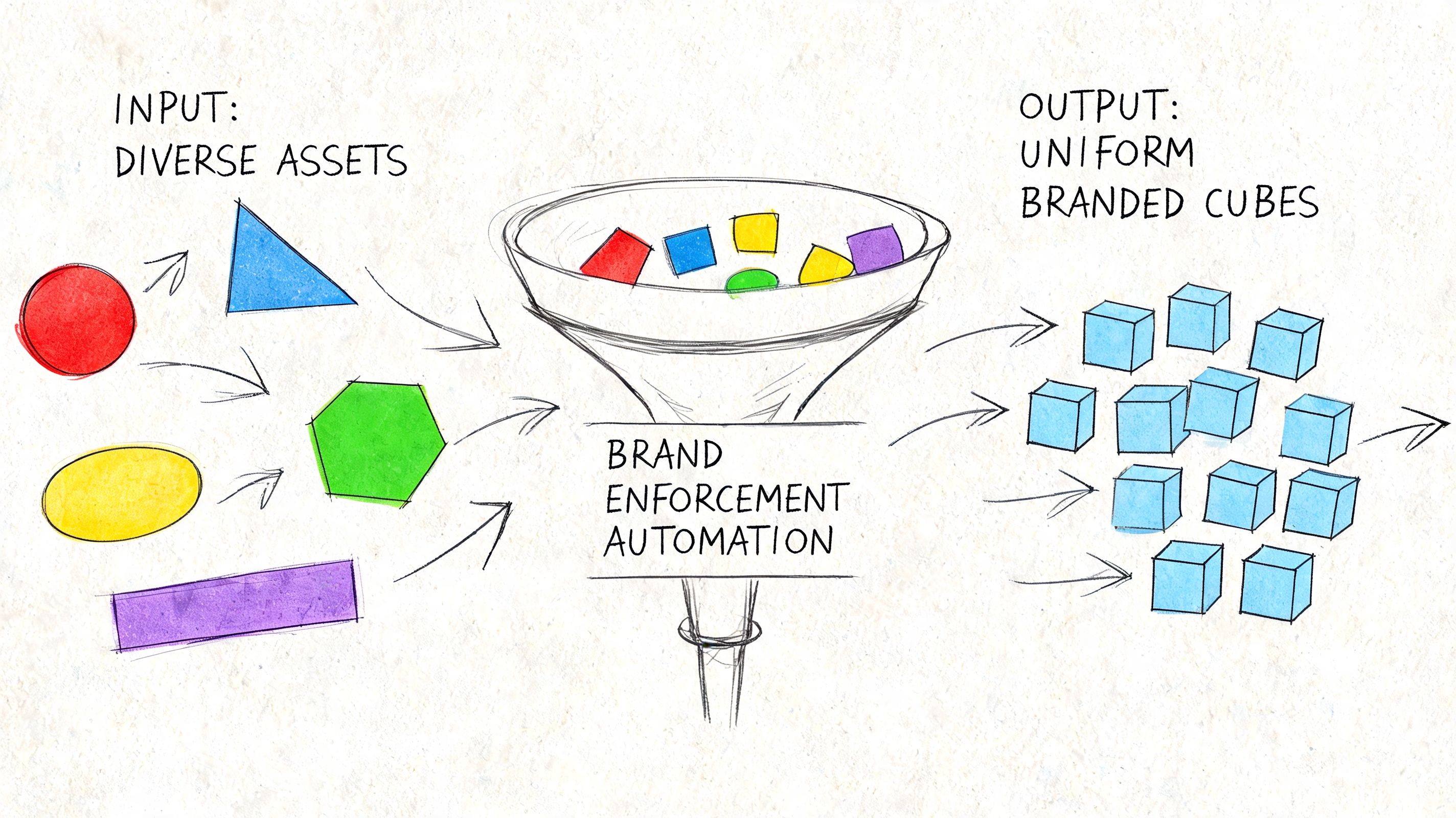
Build one source of truth that reaches code
The fix is not more review meetings. It's a workflow where the source of truth can govern daily work.
That starts with a design system connected to development through tokens, component standards, and clear ownership. This is already a common understanding. The harder part is adoption across distributed squads. Someone always has a valid exception. Someone always ships from an old branch. Someone always says they'll align it later.
That's why enforcement has to happen in the tools people already use.
A solid stack usually includes:
- Design system governance: one maintained source for approved components and interaction rules
- Token-based implementation: colors, typography, spacing, and motion mapped into reusable code-friendly values
- Automated checks: flags in design or code review when teams drift from approved patterns
- Analytics feedback: visibility into whether new variations help or just introduce inconsistency
For teams working across multiple channels, the same principle applies outside product. Even a practical operational guide like Mallary's developer's guide to social posting points to the same truth: consistency gets easier when distribution workflows are centralized instead of manually recreated channel by channel.
Add automation where humans reliably fail
Manual enforcement breaks under speed. Reviewers get tired. Context gets lost between time zones. Documentation falls behind shipping reality.
AI-assisted tooling becomes useful when it is grounded in the actual product system rather than generic outputs. Figr, for example, can import Figma design systems and tokens, generate product artifacts based on live app context, and keep outputs aligned with established patterns. That makes it one practical option inside broader SaaS design system adoption strategies, especially for teams trying to reduce drift between product thinking and shipped UI.
The right automation doesn't replace judgment. It removes the repetitive opportunities to make the same mistake again.
A short walkthrough helps make the workflow concrete:
- Capture current reality: Start from the live product, not a blank canvas.
- Generate inside constraints: New screens, flows, or prototypes should inherit approved tokens and components automatically.
- Review exceptions, not everything: Humans should inspect the edge cases, not re-check every hex code and radius value.
- Validate after release: Watch whether consistent patterns improve completion, reduce hesitation, or cut support confusion.
Here's the workflow in motion:
What works in distributed teams
The teams that hold consistency well across locations usually do three things differently. They assign ownership clearly. They treat tokens and components as production infrastructure, not design preference. And they make non-compliance visible early, before users become the audit layer.
What doesn't work is equally clear. Static guidelines. Optional adoption. Last-minute QA as the only guardrail. Those approaches depend on memory and goodwill, which is not enough when multiple squads ship every week.
Consistency at scale is less about discipline than system design.
Once that clicks, the chaos gets quieter.
From Consistent Rules to Coherent Experiences
A product can be perfectly consistent and still feel wrong.
That's the next level many teams miss. Consistency means the rules are followed. Coherence means the rules work together in service of the user's goal. You can have aligned buttons, approved copy, and token-perfect spacing, then still create a journey that feels fragmented because the flow itself makes no sense.
The standard worth aiming for
Coherence is what users remember. Not whether your border radius was correct, but whether the whole experience felt like one thoughtful system. That requires consistency, but it also requires judgment. Where should the product be familiar? Where should it flex? Where does a local variation help clarity, and where does it add noise?
Good product leaders make that distinction constantly.
Here's the practical test I use:
- If a change improves clarity without breaking learned patterns, keep it.
- If a change creates novelty but weakens recognition, challenge it.
- If a team can't explain how the new behavior fits the existing system, it probably doesn't.
Consistency earns trust. Coherence earns ease.
There's also an economic angle here. As teams grow, incentives split. PMs want speed. Designers want quality. Engineers want maintainability. Marketing wants recognizable brand expression. Coherence is the discipline that keeps those incentives from pulling the product apart.
That's why the most useful next step is small enough to survive a busy week.
Add one line to your next PRD or user story: How does this feature honor our existing visual, verbal, and interactive patterns?
If your team starts asking that question early, consistency stops being a cleanup exercise. It becomes part of how product decisions get made.
If your team wants a more operational way to turn consistency into shipped product behavior, Figr is built for that workflow. It helps product teams work from live app context, import Figma systems and tokens, generate product artifacts, and keep new UX aligned with the patterns already in use.
