
It's 4:47 PM on Thursday. A user just clicked ‘Import from Figma,’ and a small loading spinner appears. Below it, the text says, ‘Processing...’ For the next thirty seconds, they wait. Is it working? Did it break? Should they refresh? Now, imagine the text said, ‘Connecting to Figma... analyzing your 147 components. This usually takes about 30 seconds.’ The difference isn’t just words, it’s confidence.
The second version builds a bridge of understanding. The first builds a wall of uncertainty.
Good UX writing isn’t about filling empty space on a screen. It’s the silent conversation your product has with its users, and these seemingly small moments are where great products are made or broken. We often think of this as an art, but it's a system. The best UX writing best practices aren’t just tips, they are principles for engineering clarity at scale. They transform confusing interfaces into self-guiding workflows that feel intuitive and human.
This guide provides a roundup of actionable principles to achieve just that. We will cover everything from writing scannable microcopy and maintaining a consistent voice to handling error states gracefully. You will learn not just what to do, but how to apply these practices within your workflow, ensuring your product speaks a language your users understand.
1. Write for Scannability and Clarity
People don't read interfaces, they scan them for anchors. Your job is to accept this reality and design words that transmit meaning almost instantly. This practice isn’t about dumbing down content, it’s about respecting the user’s cognitive load. An interface is a tool, not a novel. It’s an electrical switchboard, designed for quick connections, not a conveyor belt you ride from start to finish.
This principle, heavily researched by the Nielsen Norman Group, is critical because it directly impacts task completion. A button labeled ‘Capture screen for analysis’ is instantly understood. ‘Initiate Browser Extension Data Collection Protocol’ forces the user to stop and translate. Which one do you think gets clicked?
How to Implement This Practice
- Front-load keywords: Put the most important words at the beginning. Instead of "You can manage your team by clicking here," write "Manage your team."
- Use active voice: Active voice is direct. Write ‘Generate PRD’ not ‘The PRD can be generated.’ This clarifies who is doing what.
- Implement progressive disclosure: Don't show everything at once. Hide advanced options behind a link. This keeps the primary interface clean.
- Replace jargon: Translate technical terms into your user's language. ‘Design tokens’ makes sense for designers, but ‘Color and font styles’ might be clearer for marketers.
2. Use Consistent Terminology and Voice
Inconsistency is a tax on your user's attention. When a button is labeled ‘Configure’ on one screen and ‘Settings’ on another, the user has to pause and ask, "Are these the same thing?" These micro-hesitations, multiplied across a product, erode trust. The antidote is a consistent vocabulary and tone. Your product becomes a predictable, reliable world for the user, reducing cognitive load and making navigation intuitive.
The basic gist is this: a unified voice isn’t just branding, it’s a core usability principle. A friend at a Series C company told me they spent an entire sprint debating whether to call a feature ‘Workspaces’ or ‘Projects’. It sounds trivial, but for a tool where different teams collaborate, that shared language is non-negotiable. Miscommunication can derail an entire release. A well-defined voice and terminology act as a lighthouse, guiding both the user and the internal team.
How to Implement This Practice
- Create a UX writing dictionary: Start a shared document that defines key terms. This becomes the single source of truth. For example: "We use 'Project,' not 'Workspace'." Include this in your design system documentation.
- Audit your existing copy: Before setting new standards, find where you are currently inconsistent. This audit provides a clear roadmap for what to fix.
- Define your brand voice dimensions: Go beyond "friendly." Is it "friendly but professional" or "friendly and witty"? Documenting these dimensions provides clear guardrails. For a deeper dive, check out this guide to Mastering Different Tones of Voice for Your Brand.
- Standardize AI-driven language: If your tool uses AI, establish consistent phrasing. Decide if the AI generates ‘recommended patterns,’ ‘proven patterns,’ or ‘suggested flows’ and stick to it. This is crucial for teams using AI tools for design system management.
3. Prioritize User Intent Over Feature Description
Product teams often describe what their software is. They write about the code, the algorithms, the architecture. But users don’t care about the machinery, they care about the job the machine does for them. Does a driver care about the engine's compression ratio, or do they care about acceleration? This practice flips the script from explaining functionality to communicating outcomes. It frames your product not as a collection of features, but as a lever for success.
This user-centric framing, championed by the Jobs to Be Done framework, is a core tenet of product-led growth. Instead of describing an AI feature as 'utilizing machine learning for design system analysis,' the user-intent approach frames it as 'uncover edge cases before handoff.' One describes a process, the other promises a result. For a PM on a tight deadline, the promise of less rework is infinitely more compelling.
How to Implement This Practice
- Map user intent: For an analytics feature, is the user trying to ‘connect data’ or ‘compare funnels against industry benchmarks’? Write for the latter.
- Use outcome-oriented language: Quantify the benefit whenever possible. 'Ship 40% faster' is more powerful than 'Generates production-ready artifacts.' Connect your feature to a metric the user cares about.
- Lead with the 'why' in onboarding: Start with the benefit. Instead of "Connect your analytics to begin," try "See how your product compares to industry leaders." This creates motivation before asking for action.
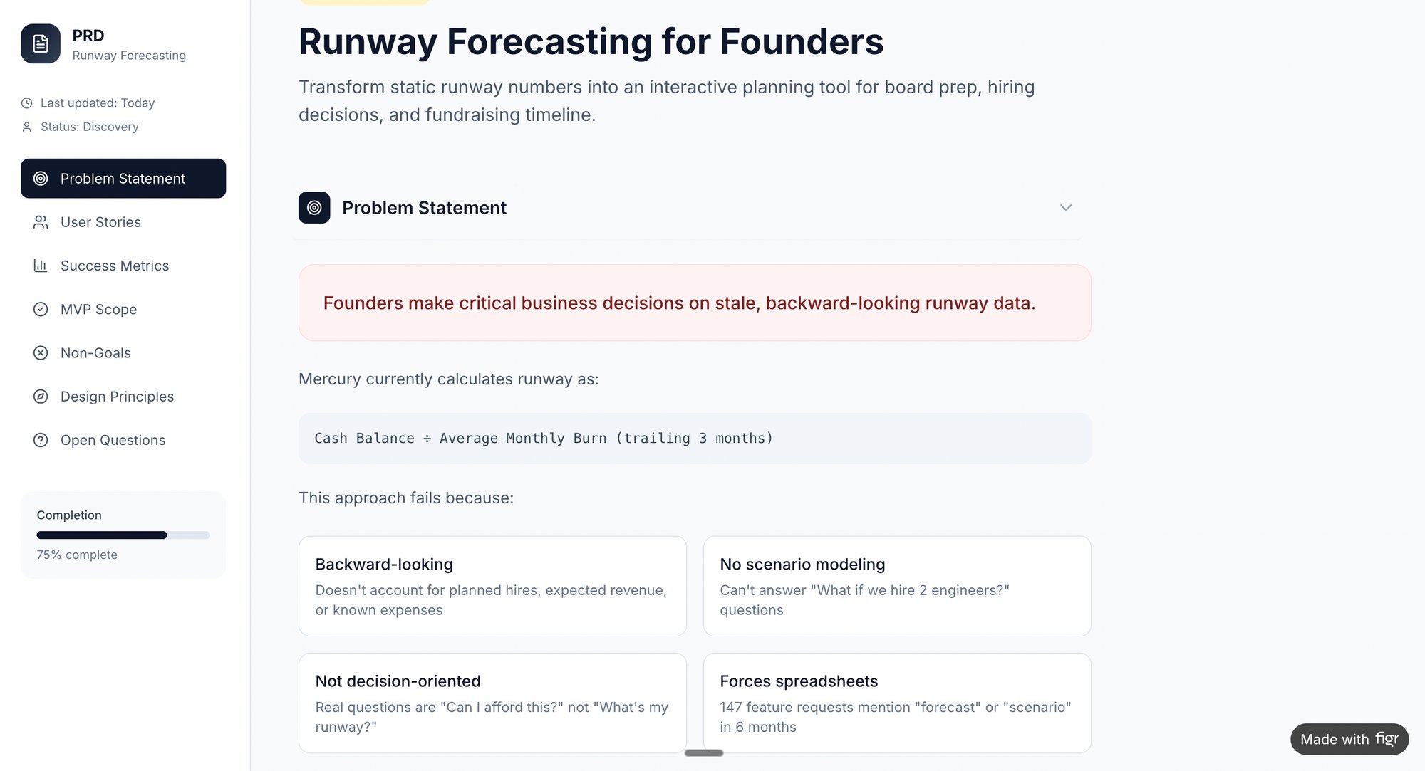
- Focus on user metrics: Frame features around reducing timelines, eliminating rework, and increasing team velocity. For example, a PRD for a new runway forecasting tool should focus on helping founders make better financial decisions, not just on the calculations themselves.
4. Use Microcopy Strategically for Guidance and Delight
If the interface is a conversation, microcopy is the thoughtful nod, the quick clarification, the reassuring word. These tiny bits of text on buttons, tooltips, and placeholders are the connective tissue of the user experience. Done well, they prevent errors, build trust, and can even inject personality that makes a digital tool feel more human. Strategic microcopy is one of the most impactful UX writing best practices for reducing friction.
This isn't just about being clever, it's about being clear at the point of action. The copy is not decoration, it’s a functional part of the design. A button might say 'Generate Flow,' but a small tooltip that reads, 'Analyzes your screen recording to map the user journey,' explains the magic without cluttering the UI. Good microcopy anticipates the user's question and answers it before it's even asked.
How to Implement This Practice
- Explain the 'why,' not just the 'what': Instead of a generic 'Enable accessibility checks,' use a tooltip: 'Checks your design against WCAG 2.1 standards for contrast.' This educates the user on the value.
- Make error messages constructive: Don't just state the problem, offer a clear path to the solution. Instead of 'Error: Missing tokens,' write 'Design system tokens required. Add tokens in settings.' One is a dead end, the other is a detour.
- Use positive language for confirmations: Celebrate success. ‘PRD generated!’ feels more rewarding than ‘PRD generation process has been completed.’ The goal is to build momentum.
- Keep it concise: Microcopy should be just that: micro. If a tooltip needs more than a sentence, the information likely belongs in dedicated help documentation.
5. Avoid Jargon and Explain Technical Concepts Simply
Your product speaks a native language, full of internal acronyms and technical shorthand. Your user does not. The distance between your team’s language and the customer’s understanding is a chasm where confusion and churn live. This practice is about building a bridge. It means translating complex concepts into plain language that respects the user's context, not their technical expertise.
This principle is a cornerstone of inclusive design. It acknowledges that even a technical user appreciates clarity. Think about it: a code repository is a complex system of distributed version control, but GitHub explains a 'Fork' as 'your own copy of this project.' The focus shifts from the mechanism to the user’s goal. When language is clear, the product feels less like a machine to be operated and more like a partner.
How to Implement This Practice
- Define on first use: When a technical term is unavoidable, provide a brief explanation the first time it appears. For example, "Enable SOC 2 compliance (a security standard many enterprises require)."
- Focus on the benefit: Explain what a feature does for the user before explaining how it works. Instead of leading with the technical details, say "Identifies hidden edge cases by analyzing your product's flows."
- Use analogies and comparisons: Connect unfamiliar concepts to familiar ones. "Design tokens are like variables for your brand: change the color once, and it updates everywhere."
- Create a translation guide: Maintain an internal document that maps your team's jargon to user-friendly alternatives. This ensures consistency across all user-facing copy, from tooltips to AI-powered support solutions.
6. Create Clear and Actionable Error and Success Messages
Error and success messages are high-stakes conversations. They occur at moments of friction or triumph, and trust hinges on their clarity. Bad error messages strand users in a maze of technical codes. Good ones act as a helpful guide, explaining what happened, why, and exactly what to do next. This isn't just about politeness, it's about maintaining momentum.
A vague 'Error 403' leaves a user feeling powerless. In contrast, Slack's simple 'Couldn't send message. Check your connection' provides a specific problem and a direct solution. For a tool trying to import designs, a message saying 'Token import failed' is a dead end. But what about this: 'Design system tokens couldn't be imported. Make sure tokens are exported from Figma in the correct format. Download the format guide.'
That is a complete, actionable resolution path.
How to Implement This Practice
- Always provide a next step: Never present an error without a solution. Instead of 'Permission denied,' write 'Can't access your Figma file. Check that you've granted Figr permission to view this project.'
- Avoid technical jargon: Translate system-speak into human language. 'This Figma file is missing 3 required design tokens' is far more useful than an abstract import error.
- Use success messages to guide users: A good success message confirms an action and suggests the next logical step. Think 'PRD generated! Review recommendations, then export to Figma.'
- Log common errors for product improvement: Tracking recurring errors reveals friction points in your product. This data can inform your next sprint. You can also leverage AI tools for better contextual messages.
7. Tailor Copy to Specific User Journeys and Roles
A single interface is often a multi-tool used by different people for wildly different reasons. Treating all users the same is a missed opportunity. This means the language a product manager sees during onboarding should be different from the language a QA tester sees when generating test cases. It’s the difference between a generic tool and a personal assistant that understands your job.
This is what I mean: for a product manager, the goal is strategic insight, while a QA tester's goal is comprehensive coverage. Onboarding copy for a PM might be, ‘Explore A/B variations with AI-generated rationale side-by-side.’ For a QA tester, it becomes, ‘Create comprehensive test cases automatically from designs.’ The product's value proposition is like a prism, you have to turn it to show the right spectrum of light to the right person. Each user should feel the product was built specifically for them.
How to Implement This Practice
- Segment at onboarding: Ask users for their role or primary goal when they sign up. Use this to customize the subsequent experience and copy.
- Create persona-based messaging: Develop messaging templates for each key user role. A PM’s template might focus on speed and outcomes, while a QA tester’s template emphasizes accuracy and coverage. You can even simulate this with artifacts like this UX persona simulation for AI assistants.
- Use role-based contextual help: When a user is performing a role-specific task, the help text, tooltips, and empty states should reflect their context and goals.
- Map your content to the journey: A user’s needs change from awareness to adoption to troubleshooting. Ensure your copy evolves with them. Learn more about how to map the user journey.
8. Test Copy with Real Users and Iterate Based on Feedback
Words written in a vacuum are just guesses. Great UX writing isn't about being clever in a document, it's about being clear in a context. The only way to confirm clarity is to watch people interact with your words. Testing copy moves it from a subjective art to an evidence-based discipline. It’s the bridge between your team's intent and the user's actual interpretation.
Is this really necessary? Last quarter, a PM at a fintech company shipped a file upload feature. Engineering estimated 2 weeks. It took 6. Why? The copy on the upload button was ambiguous, leading users to upload the wrong file type, which triggered a cascade of unhandled error states. A five-minute copy test could have saved them a month of rework. A/B testing two variants isn’t just a stylistic choice; it's a direct inquiry into what motivates your user.
How to Implement This Practice
- Run qualitative copy tests: Recruit 5-8 users. Use the think-aloud protocol where they verbalize thoughts while interacting with a prototype. Ask: "What do you expect to happen when you click this?"
- Analyze support tickets for confusion: Your support desk is a goldmine for copy failures. If users constantly ask what ‘edge cases’ means, that’s your signal to refine the explanation in the UI.
- A/B test high-impact copy: Use quantitative testing for critical microcopy like CTAs, value propositions, and feature descriptions. Set clear success metrics and test variants until you reach statistical significance.
- Test technical concepts with non-technical users: A platform should test copy around concepts like 'design system tokens' with marketers or project managers, not just engineers, to ensure broader team alignment.
9. Use Progressive Disclosure to Manage Complexity
An interface isn't a textbook, it's a cockpit. Showing every possible control at once is a surefire way to overwhelm the pilot. Progressive disclosure is the art of showing users only what they need, revealing complexity gradually and on demand. This UX writing best practice is critical for dense, powerful tools where a user's goal might be to generate a PRD, not to immediately learn about advanced design system token mapping. It respects their focus.
This approach, championed by the Nielsen Norman Group, treats user attention as a finite resource. It prevents cognitive overload by sequencing information. A GitHub pull request shows the essential fields first: title and description. All the extra controls like reviewers and labels are available but don't compete for initial attention. This creates a clear path for the primary action while providing depth for power users.
How to Implement This Practice
- Prioritize the primary action: Identify the single most common goal on a screen. The copy for that action, like ‘Generate PRD,’ should be prominent and uncluttered.
- Use clear disclosure language: Employ conventional, action-oriented text for expandable sections. ‘Show advanced settings’ or ‘View details’ are predictable and effective.
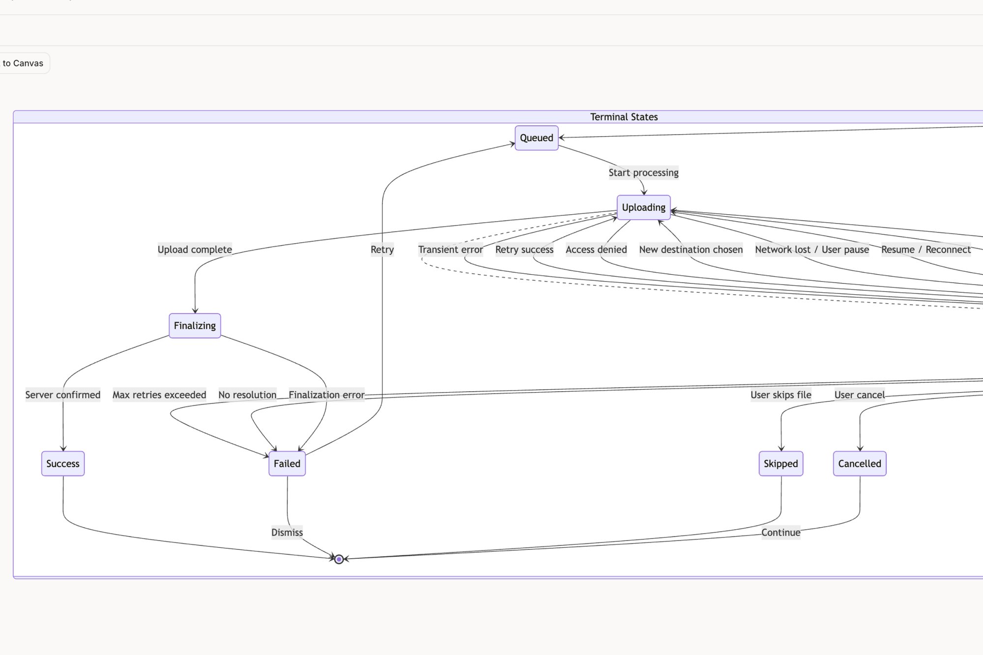
- Sequence onboarding carefully: Introduce one core concept at a time. Only after a user understands how to create a task should you reveal how to manage its various states, as seen in this Figr component flow for a task assignment card.
- Leverage tooltips for context: Use tooltips for small, non-critical explanations. This avoids cluttering the interface with text that only a fraction of users will need.
From Principles to Practice
We've walked through the core mechanics of effective UX writing. Clarity, consistency, user intent, and strategic microcopy. But knowing these principles is like knowing the notes on a piano. It doesn’t automatically make you a musician. The artistry lies in translating those principles into a seamless conversation.
Think of your product's interface as a physical space. Is it a cluttered warehouse where every sign uses different vocabulary? Or is it a well-lit gallery where each label guides you effortlessly? Good UX writing is the signage that makes navigation feel intuitive.
In short, the goal is for the words to disappear, leaving the user with a feeling of effortless competence.
This has real economic consequences. When words work, developers spend less time on rework, support teams spend less time answering tickets, and users spend less time frustrated. This isn't just about crafting elegant prose, it’s about engineering efficient, human-centric systems. As stated in Microcopy: The Complete Guide by Kinneret Yifrah, "Good microcopy is one of the fastest ways to improve the user experience." The practices we've discussed are not a checklist, but a mindset. A commitment to seeing the product through your user’s eyes.
Your next step doesn’t require a complete overhaul. Pick one critical user flow in your product this week, perhaps the onboarding sequence or a core action like the one we mapped for Dropbox's file upload states. Read every word out loud. Does it sound like a human conversation? Is every instruction clear? Start there. Begin by listening to the words your product already uses, and you'll immediately see where to build a better dialogue.
Mapping out user flows, identifying edge cases, and generating context-aware copy is where theory meets reality. If you're ready to move faster from messy screenshots to clear, testable user experiences, check out Figr. It's the tool we use to turn UX writing principles into product reality, helping you generate and refine copy directly within your flows.