It’s 3:00 PM on a Tuesday. You’re staring at a dashboard. User engagement is flat, churn is ticking up, and the last feature you shipped landed with a thud. The data shows what is happening, but it whispers nothing about why.
This is the moment where most teams start guessing.
Great teams analyze.
UX design analysis is the disciplined process of figuring out why users do what they do, so you can fix the parts of your product that cause friction and find the hidden opportunities for improvement. It goes way beyond just looking at dashboards. It's about blending hard data with a real understanding of human behavior to build a better customer experience design. This isn't about making things look pretty; it's a diagnostic tool that’s absolutely critical for product growth.
The Hidden Engine of Product Success
UX design analysis isn't a debate over opinions or a reaction to the latest design trend. It's the methodical act of deconstructing a user's journey to find the precise points of friction and opportunity.
From Noise to Signal
Think of product data like an engine’s hum. Most people just hear noise. A seasoned mechanic hears the specific rhythm that points to a misfiring cylinder. A UX design analysis is that mechanic’s ear. It doesn't just see a high bounce rate on a screen, it identifies the confusing button label or the broken form field causing thousands of users to abandon their carts. It learns to separate correlation from causation.
This is what I mean: it turns a vague problem into a specific, solvable task.
Instead of a generic complaint like "users are confused," you get a concrete finding: "Users drop off when asked for their phone number because we never explain why we need it."
That clarity is the difference between building another feature and fixing the one that's bleeding customers.
Last week, I watched a PM at a Series C company describe how his team spent an entire quarter building a new reporting feature based on a single VP’s request. It launched to crickets. A post-launch analysis revealed their users weren’t struggling to create reports; they were struggling to share them. The team had solved a problem nobody had, all while ignoring the one everyone did.
Why This Analysis Matters Now
In a market where users can switch to a competitor with a single click, a frustrating experience is a direct threat to your revenue. As Jakob Nielsen of the Nielsen Norman Group has hammered home for decades, focusing on usability isn't optional. It’s the bridge between raw data and real human experience.
Analytics can tell you the engine stalled, but a proper UX design analysis tells you which part to fix. It transforms user behavior from a mystery into a playbook for real, measurable improvement. For instance, a detailed review of an existing product, like this UX review of Skyscanner, shows how to pinpoint specific failures that harm the user journey. The goal is simple: move from guessing to knowing.
Framing Your Analysis: What to Look For and Where
A great UX analysis isn't a random walk through your product. It’s a structured investigation. A detective arriving at a crime scene doesn't just wander around hoping to spot something. They follow a methodical process, dusting for prints, following a trail of evidence.
Your analysis is a switchboard, not a conveyor belt.
You plug in different methods to illuminate different parts of the user journey. Without a framework, you’re just clicking around. With one, you're on a systematic search for the truth hiding in your user data. This structure helps you move past personal opinions and ground your findings in real principles of human-computer interaction. The goal is to build a complete picture, combining hard numbers with the human story.
Choosing Your Investigative Method
Two of the most foundational methods for this work are heuristic evaluations and cognitive walkthroughs. They serve different purposes, much like forensic principles differ from a crime scene reenactment.
- Heuristic Evaluation: This is your set of forensic principles. You run your interface against a checklist of well-known usability rules (like Jakob Nielsen's famous 10 usability heuristics). It’s a fast, efficient way to catch common usability problems without having to recruit a single user. Does the system give clear feedback? Is the language simple and direct? It’s perfect for a broad, expert-led review.
- Cognitive Walkthrough: This is the reenactment. You step directly into the user's shoes and try to complete a specific task, one step at a time. For each step, you ask: Will the user know what to do here? Will they see how to do it? Will they understand if it worked? You can learn more by understanding what is task analysis and how it dissects user goals into tiny, observable actions. This approach is ideal for pressure-testing a critical user flow, like a checkout process or that all-important onboarding sequence.
Often, the most powerful analysis combines both. You might start with a heuristic evaluation to find the obvious flaws, then use a cognitive walkthrough to dive deep into a specific, high-stakes user journey.
This decision tree helps visualize when to shift from just monitoring metrics to actively analyzing user behavior.
The key insight here? Analysis isn't a constant activity. It's a targeted response to specific signals, like flat engagement or a drop in conversions.
Grounding Analysis in Economic Reality
Why go through all this trouble? Because every unexamined friction point in your product is a leak in your revenue bucket. Research from Forrester has shown that, on average, every dollar invested in UX can yield a return of $100. That’s a 9,900% ROI. This isn't a cost center, it's a direct investment in profitability.
A friend at a fintech company told me her team spent six months building a new loan application feature. After launch, conversion rates were abysmal. A quick cognitive walkthrough revealed a critical flaw: the "Submit" button was below the fold on most mobile screens, and its color contrast was terrible.
Users literally thought the form was broken.
A five-minute design fix, informed by a 30-minute analysis, boosted their conversion rate by 12%. That’s the power of a structured investigation over just building and hoping for the best.
Your first step is to define your scope. Are you investigating a single feature or an entire journey? Set a clear goal, choose your method, and start looking for clues.
From Abstract Goals to Concrete Artifacts
Good analysis is about seeing what users actually do, not what we hope they do. It’s the bridge between abstract goals and concrete observations. Saying “users are dropping off” is one thing. Watching a screen recording and seeing the exact, confusing label that made someone give up? That's everything.
This whole process is about making the invisible, visible.
Mapping the Messy Reality
The first deliverable of a real UX design analysis is often the user flow diagram. It’s not the ideal path you wish users would follow. It’s a map of the terrain they actually navigate, warts and all. A great flow map feels like an exposé, revealing the hidden complexity your team has gone blind to over time. It shows every click, every fork in the road, every dead end.
When you visualize the full journey, you stop talking in generalities and start pointing at specific, broken steps. You can see how a small action here creates a huge headache three screens later. To get this right, nothing beats direct observation, and valuable insights from analyzing live chat interactions offer a raw, unfiltered view into these user journeys. An excellent example is this new setup flow for Shopify Checkout, which visualizes a simpler path for merchants.
A user flow diagram is the ultimate tool for building shared understanding. When an engineer, a designer, and a product manager can all point to the same box on a chart and say "this is where it breaks," you’ve turned a complex problem into a shared target.
Uncovering the Ghosts in the Machine
The second key deliverable is the edge case analysis. These are the scenarios that haunt the margins of your product requirements doc. What happens if the network drops mid-upload? What does a user see if their trial expires while they’re using a feature?
These aren't small details. They are the moments that define a user’s trust in your product. Engineers usually find these mid-sprint, which leads to frantic DMs, design debt, and delayed releases. A proactive UX analysis treats these states as first-class citizens, not afterthoughts. You move from assuming a "happy path" to mapping the fragile reality of how software actually works.
A file upload seems simple, right? A deep analysis uncovers a universe of ways it can fail:
- Network dies during the upload.
- File size is bigger than the account limit.
- The user tries to upload a duplicate file.
- The user doesn't have permission to upload to that folder.
- The storage destination is full.
Each of these needs a deliberate design decision. Do you show an error? Offer a fix? Retry automatically? Without a plan, developers make these calls on the fly. For a powerful example, explore a detailed map of Dropbox's file upload failure states to see just how many states a "simple" feature really has. You can also learn more about how to conduct usability testing to see how these edge cases are validated with real users.
Thinking through these scenarios isn't just about bug prevention. It's about designing a resilient, trustworthy experience. When something inevitably goes wrong, the user feels guided and supported, not abandoned. That feeling is the hallmark of a product built on a deep, empathetic analysis of what users actually do.
Leveraging AI for Deeper and Faster Insights
Imagine mapping a coastline by walking its entire length, foot by foot. You’d get an accurate picture, eventually. Now imagine seeing it from a satellite, where every cove, cliff, and sandbar is visible at once.
Patterns jump out from the noise.
That’s the difference between purely manual UX design analysis and one augmented by AI. Manual analysis is powerful, but it’s meticulous and slow. AI acts as a force multiplier. It automates the exhausting work of sifting through data so you can focus on the strategic thinking. It’s not about replacing the analyst; it’s about giving them a super-powered assistant.
From Manual Clicks to Automated Insights
The basic gist is this: AI can compress days of discovery into minutes. Instead of manually clicking through a competitor’s app for hours to map their onboarding flow, an AI agent can trace the entire journey, pull out the key screens, and even draft a competitive analysis for you.
I watched a product manager do this last week. He wanted to understand how Cal.com's setup flow compared to Calendly's. The old way meant taking dozens of screenshots and pasting them into a deck. Instead, he used an AI agent to produce a full comparison doc and a list of test cases for the scheduling flow while he went to get coffee.
This isn't just about convenience. It fundamentally changes the economics of product improvement. Teams that weave AI into their workflow can run more improvement cycles, test more hypotheses, and ship better user experiences faster and at a lower cost. That’s a massive competitive advantage.
Surfacing Patterns the Human Eye Might Miss
The real power of AI in UX design analysis isn't just speed, it's scale. A human analyst might review a dozen user session recordings. An AI can parse ten thousand. It finds subtle behavioral patterns across vast datasets that would be invisible to any single person.
It helps you see the forest, not just the trees. AI can highlight where 80% of users from a specific region drop off. It can spot that users who interact with a certain filter are 3x more likely to convert. These are the kinds of insights that lead to breakthroughs, not just minor tweaks. You can learn more about how to automate product feedback analysis with AI tools and turn raw feedback into actionable signals.
This shift is already happening. According to Figma's research on web design statistics, 34% of designers and developers reported shipping an AI product in 2025, a huge jump from 22% the previous year.
But designers are still rightly cautious. Only 69% are satisfied with the current AI tools, often pointing to a lack of precision. This is where the human analyst remains irreplaceable. AI can surface the what, but a skilled analyst is still needed to interpret the why and guide the AI toward meaningful answers.
The goal isn't to outsource your thinking. It's to offload the repetitive tasks so you have more time to think. For example, instead of manually writing out every test case for a user flow, an AI can generate a comprehensive list covering happy paths and edge cases, like these test cases for a Waymo mid-trip change. This frees up the team to focus on the truly hard strategic questions.
Your next step? Identify one repetitive, time-sucking task in your current analysis workflow. Find a tool that can automate it. Start there.
Translating Analysis Into Actionable Recommendations
An analysis that gathers dust on a virtual shelf is a failure. All the diagrams, data points, and observations are worthless if they don’t ignite change. The final, most crucial step is turning your complex findings into a clear, compelling story that forces action.
Think of yourself as a film editor. You have hours of raw footage, but your job is to assemble a tight, 90-second trailer that grabs the audience. You have to cut the noise, amplify the most critical scenes, and build a narrative that makes the conclusion feel inevitable.
From Findings to Narrative
A common mistake is presenting findings as a chronological log of your work. Nobody cares about your process, they care about the results. In short, lead with your most shocking, high-impact discoveries. Support them with undeniable visual evidence. End with a prioritized list of what to do next.
Your report isn't an academic paper. It's a persuasive argument for resource allocation.
Last week, I watched a PM present an analysis of their checkout flow. He didn’t start with methodology. He opened with a screen recording of a user trying to buy a product, failing six times, and then sighing in defeat. The room was silent. He had their complete attention before he even showed a single chart.
He followed that human moment with the data: a 42% drop-off rate at that exact step, costing the company an estimated $1.2 million a year. The problem wasn't just a "bad user experience." It was a massive, quantifiable business liability.
Speaking the Language of Outcomes
The most effective recommendations are framed in the language of business outcomes, not design jargon. Your stakeholders, especially outside the product team, don't operate in a world of heuristics and cognitive load. They live in a world of customer acquisition costs, retention rates, and support tickets.
You have to translate your UX findings into their language.
- Instead of: "This button has poor color contrast and is confusing."
- Try: "Fixing the contrast on this button could reduce support tickets related to checkout failure by an estimated 15%."
This reframing turns a design critique into a business case. It connects your work directly to the metrics the rest of the company is measured by. A strong analysis report makes the path forward so obvious that stakeholders feel compelled to act. It's not just a suggestion, it's a clear map from a costly problem to a profitable solution.
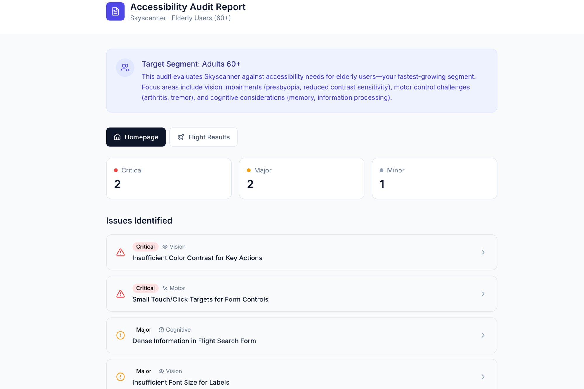
An effective report often visualizes the problem in a way that’s impossible to ignore. For example, a thorough UX audit can present a clear, visual report of accessibility issues that highlights exactly where a design fails users with disabilities.
Structuring Your Action Plan
Your recommendations must be concrete and prioritized. A long, unorganized list of "things to fix" is overwhelming and just invites inaction. Use a simple framework to give your stakeholders a clear path forward.
A powerful way to structure this is the Insight, Evidence, Recommendation model:
- Insight: A concise statement of the problem and its impact. (e.g., "Users are abandoning the cart because they can't find the guest checkout option.")
- Evidence: The proof. This could be a quote from a user interview, a clip from a usability test, or a chart showing a conversion funnel drop-off.
- Recommendation: A specific, actionable next step. (e.g., "Elevate the 'Continue as Guest' button to be visually equal to the 'Sign In' button.")
This structure builds a logical case for each proposed change. It shows you’ve done the work, you understand the business impact, and you have a clear plan to fix it. This is how a UX design analysis moves from a diagnostic report into a strategic roadmap for growth.
Your First UX Design Analysis Playbook
Knowing isn't doing. All the frameworks and theories in the world are just noise until you point them at a real product, a real screen, and a real user problem. This is where we get practical.
Think of this as a checklist for action, not theory.
The next time you're asked to improve a feature, resist the urge to jump straight into Figma. Start here instead.
The Five-Step Playbook
This process is built to be lean and fast. It doesn't need a huge budget or weeks of formal research. All it really needs is a screen recorder and a critical eye.
- Select One Critical Flow: Don't try to boil the ocean. Pick a single, high-value user journey. Maybe it's user onboarding, creating a first project, or the checkout process.
- Record the Journey: Fire up a screen recorder and open your product. Go through the task from start to finish as if you're a brand new user. Talk out loud. What do you expect to happen? Where does it feel clunky?
- Map the Actual Steps: Now, watch that recording. Document every single screen and every single click. Sketch out a simple user flow diagram. Be brutally honest about how many steps it really takes to get the job done.
- Identify One Point of Friction: Find the single most confusing or frustrating moment in that flow. Is it a vague button label? An unexpected pop-up? A form field with unclear rules? Just find one thing.
- Propose One Improvement: Based on that single point of friction, write down a specific, testable hypothesis. Not "make it better," but something like, "Changing the button text from 'Submit' to 'Create My Account' will increase sign-ups."
From Small Acts to Deep Muscle
This playbook might seem almost too simple, but its power comes from repetition. That small act of analysis, done consistently, is how you build a deep, analytical muscle across your entire team. It starts to change the conversation from "What should we build next?" to "What problem should we solve next?"
So, your first action is simple. Pick one critical user flow in your product. Document one point of friction and one potential improvement.
That's where it begins.
Questions We Hear All the Time
We get it. The lines between different design activities can get blurry. Here are a few common questions that come up, with some straightforward answers.
What’s the Difference Between a UX Audit and a Full-Blown UX Analysis?
Think of it like this: a UX audit is one specific tool in your belt, while UX analysis is the entire toolkit.
An audit is usually a quick, targeted evaluation. You’re typically checking an existing product against a set of established rules, like Jakob Nielsen’s famous 10 usability heuristics. It’s great for spotting low-hanging fruit and obvious usability problems.
UX design analysis, on the other hand, is the whole process of understanding the user experience. It’s a much broader investigation that pulls in all sorts of methods—user testing, journey mapping, analytics reviews, competitive deep-dives—to build a complete picture of what’s really going on. An audit might tell you what's broken, but a full analysis tells you why it’s broken and what your users actually need instead.
How Often Should We Be Doing This?
Should you only analyze your product before a big redesign? That’s like only going to the doctor when you're already in the emergency room.
UX analysis isn't a "one and done" project. The best teams weave it into their regular product cycle.
So, when should you kick off a focused analysis?
- When your analytics show a sudden drop in conversions or engagement.
- Before you start designing a major new feature (and right after you launch it).
- When you keep hearing the same complaint over and over in user feedback.
Treating analysis as a continuous activity is how you stay ahead of problems before they quietly sink your product.
Can I Do a UX Analysis if I Can’t Talk to Users?
Yes, absolutely. While nothing beats observing real users, there are several powerful methods—often called 'expert reviews'—that don't require direct user interviews or testing.
Things like heuristic evaluations, competitive analysis, and cognitive walkthroughs are perfect for this. In these, you or your team act as the expert, walking through the interface and evaluating it against established design principles. It's a fast way to uncover a surprising number of significant usability issues.
Just remember, these methods are at their best when you eventually pair them with real user data. An expert review can tell you where the smoke is, but usability testing is what confirms there’s a fire.
Moving your team from guessing to knowing is the whole point of a deep, analytical approach. Figr is the AI design agent built to make that happen faster. It learns your live product, analyzes what your competitors are doing, and generates the user flows, edge cases, and high-fidelity prototypes you need—all grounded in your actual UX. You ship better products, without the endless guesswork. See how it works at figr.design.