
It’s 4:47 PM on Thursday. Your analytics show a 30% drop-off at checkout, and the VP just asked for a visual to anchor tomorrow's board discussion. Engineering says the code is fine. Marketing blames the copy. You have a hunch the problem isn't on that screen at all. It started three steps back, with a confusing button that planted a seed of doubt.
This is the central truth of customer experience design. It's about orchestrating every interaction a customer has with your brand to shape their perception and build loyalty. Time isn't a conveyor belt of isolated events: it's a switchboard of interconnected moments. A single misstep can reroute a customer’s entire journey, often leading them straight to a competitor.
Your Customer Experience Is a Chain Reaction
Customer experience design, or CX design, is a holistic view. It looks past a single app and sees the entire journey, from the first ad a customer sees to the support ticket they file six months later. Good CX makes every touchpoint feel consistent, valuable, and intentionally connected.
Beyond the Screen
User Experience (UX) design is laser-focused on the usability of a single product. It answers questions like: Is this app easy to navigate? Can users get things done without frustration? This is critical work, but it’s only one piece of a much larger puzzle.
Customer experience design zooms way out.
It asks bigger questions. What happens before someone even opens your app? And what about after they log off? The experience includes the clever ad that brought them in, the clarity of the welcome email, and the tone of the support agent they chatted with last week.
I recently watched a product team obsess over optimizing their sign-up flow, a classic UX problem. They managed to shave a few seconds off the process, a minor victory they celebrated loudly. Meanwhile, their support team was taking 48 hours to answer simple questions, a catastrophic CX failure that was quietly bleeding users. They were polishing one link while the chain was rusting through somewhere else entirely.
The Holistic Viewpoint
This is what I mean: CX design sees the customer’s journey as one continuous story, not a collection of unrelated scenes. Every touchpoint, from a social media post to a billing statement, moves the plot forward. Research from Harvard Business School backs this up, showing that since customers don’t follow a neat script, a comprehensive view is the only one that works.
This perspective reveals a hard truth: your product isn't just the software. It’s the sum of all promises, interactions, and resolutions. You can have a perfectly designed feature, but if the onboarding is a mess or support is slow, the experience is broken. You can see this holistic thinking in action by looking at how a company like Shopify completely rethought its entire merchant checkout setup, focusing on the end-to-end flow, not just individual screens.
In short, customer experience design isn't a department; it's a company-wide philosophy. It’s the deliberate act of making sure every interaction, no matter how small, reinforces the value you promise to deliver. It’s about building a strong, resilient chain, not just a few shiny, isolated links.
Mapping the Entire Customer Journey
Most teams have a user flow for a single feature. Great teams have a map of the entire customer battlefield.
This is the core of practical customer experience design, moving from isolated product interactions to a fully orchestrated journey. It's the difference between defending a single trench and planning a full campaign. The central tool for this is the customer journey map, a visual artifact of the end-to-end experience. A good map forces you to see your product not as a collection of screens, but as a series of moments that either build trust or erode it.
A friend at a Series C company told me they spent a whole quarter mapping one journey: a customer dispute process. They discovered the friction wasn't in the form itself. The problem was an automated email sent two days later with confusing legal language. Customers felt accused, not supported.
Without the map, they would have kept redesigning the form.
Charting the Emotional Landscape
Building an effective journey map involves more than just listing steps. It requires a deep dive into the human side of the experience, identifying key touchpoints and the emotions they provoke. The journey map is less a flowchart and more an emotional seismograph.
This process involves:
Identifying all touchpoints: Document every interaction, from the first ad a user sees to the billing reminder they receive months later. Think website, mobile app, support chat, and even social media mentions.
Pinpointing customer emotions: At each stage, what is the customer feeling? Are they confident, confused, frustrated, or delighted? This emotional layer is where loyalty is won or lost.
Highlighting 'moments of truth': These are the critical make-or-break interactions where a customer’s perception of your brand is solidified. A smooth checkout is expected, but how you handle a failed payment is a moment of truth.
The following graphic shows how customer experience encompasses UX, service, and brand touchpoints into one cohesive whole.
This visualization makes it clear that customer experience design isn't just one discipline. It’s the orchestration of several to create a single, unified journey for the user. For instance, mapping the full flow for a recruiter posting on LinkedIn requires seeing beyond just the form fields and considering the entire arc from job creation to applicant screening.
From Static Map to Dynamic Guide
A journey map is only as valuable as the data that feeds it. It cannot be an exercise in imagination alone.
The basic gist is this: you combine what customers say with what they actually do.
To do this, you must gather inputs from:
Customer Interviews: Direct conversations are invaluable for understanding motivations, frustrations, and the "why" behind user actions.
Analytics Data: Tools like Google Analytics or Mixpanel show you where users drop off, which paths they take, and how they interact with key features. This provides the quantitative "what."
Support Logs: Your customer support team is on the front lines. Their chat logs, ticket data, and call notes are a goldmine of information about real-world friction points.
A study from Gartner highlights that CX drives over two-thirds of customer loyalty, which is more than brand and price combined. This underscores the economic imperative of getting the journey right. A well-researched map isn't just a design artifact; it's a strategic document that aligns the entire company around the customer's reality.
Exploring a detailed guide on what a user journey map is can provide a foundational understanding for your team. This moves your customer experience design from a theoretical exercise to a data-informed strategy that directly impacts the bottom line.
How to Connect Customer Experience to Profit
A beautiful design that doesn't improve the bottom line is an expensive hobby. It sits in a presentation deck, admired but ultimately inert. But real customer experience design isn't just about making things look good; it's the engine, not the paint job. It must be directly and quantifiably tied to the health of the business.
Too many product teams operate like orchestra conductors who can only hear one instrument. They tune the strings of user engagement but fail to hear the complete symphony. The music that truly matters is rising profitability, and that requires listening to a different set of instruments: Customer Lifetime Value (CLV), Net Promoter Score (NPS), and Customer Satisfaction (CSAT).
The Metric That Measures Friction
While all those metrics are useful signals, one stands out for its raw, actionable power: the Customer Effort Score (CES).
CES asks a devastatingly simple question: “How easy was it to get your issue resolved?” or “How easy was it to use our product?” It measures friction. And in the world of digital products, friction is the silent killer of loyalty. Making things easier for customers is one of the most direct paths to retention you can build.
This isn’t just a comforting theory. A mere 5% boost in customer retention can skyrocket profits by anywhere from 25% to 95%. In the churn-heavy world of SaaS, that single statistic should reframe every design decision you make. And don't forget that loyal customers become your best advocates, generating 65% of a typical company’s sales.
From Pixels to Profitability
This is where a systems-thinking approach becomes non-negotiable. It’s about drawing a straight line from the pixels on a screen to the profit on a balance sheet. I once watched a PM try to justify a six-week project to redesign their settings page because the old one "felt cluttered."
That justification is weak.
A systems-thinking PM would frame it completely differently. They'd start by analyzing support tickets and discover that 20% of all inbound requests are from users who can't find the billing history setting. They would then calculate the cost of those tickets and the associated churn risk.
The redesigned settings page isn’t about aesthetics. It’s a project to reduce support costs by an estimated $15,000 per quarter and cut churn in that user segment by 2%.
See the difference? One is a subjective opinion; the other is a rock-solid business case. This is what it means to connect customer experience design to profit. You have to learn the language of the CFO and translate user friction into financial impact. You can even explore AI tools for forecasting the MRR impact of your proposed changes.
Your next step is to stop talking about "good design" in isolation. Instead, frame your work in the context of a key business metric. Pick one friction point from your journey map, measure its current impact on CES or churn, and build a clear, data-backed case for why fixing it isn't just a good idea, it's a profitable one.
The Playbook for Product Teams
Theory is great, but execution is what ships. The distance between a beautiful customer journey map and a feature your users can actually touch can feel impossibly wide. So, how do you translate high-level customer experience principles into the daily grind of sprints, stand-ups, and PRDs?
The product playbook is not a static document; it’s a living system for translating strategy into action.
A Head of Product I know at a fintech company told me their biggest win last year came from one simple shift. Instead of just mapping the “happy path” for a new feature, they started obsessing over every single failure state. What happens when a file upload fails? The answer wasn't one screen. It was eleven different states, each triggered by a different error: network drop, file too large, unsupported format, duplicate filename, permission error. Great customer experience isn't about the ideal journey; it's about gracefully managing the inevitable detours.
Conduct a Touchpoint Audit
Your customer's experience is a series of distinct moments. A touchpoint audit is simply the process of identifying and evaluating every single one of them. You have to look way beyond just the app and website.
Start by listing every possible interaction:
Acquisition: Social media ads, content marketing, search results.
Onboarding: Welcome emails, setup wizards, initial login.
Core Product Use: Key features, notifications, integrations.
Support: Help docs, chat support, error messages.
Billing & Retention: Invoices, upgrade prompts, cancellation flows.
For each one, ask a simple question: does this interaction build trust or erode it? Is it clear and helpful, or confusing and frustrating? The goal here is to find the weak links in the chain before they snap.
Build a Voice of the Customer Dashboard
Intuition is a starting point, not a strategy. To embed customer experience into your workflow, you need a single source of truth that pipes real customer feedback directly into your decision-making. A "Voice of the Customer" (VoC) dashboard isn't about vanity metrics; it's about creating an early warning system for friction.
This dashboard should pull together both quantitative and qualitative data:
Quantitative: Track metrics like Customer Effort Score (CES) for key workflows, Net Promoter Score (NPS), and feature adoption rates.
Qualitative: Pull in themes from support tickets, user interview transcripts, and app store reviews. Tag and categorize this feedback so patterns can emerge.
This creates a constant, low-level hum of customer reality in the background of every product meeting. It moves conversations from "I think users want..." to "Here's what users are telling us..."
Integrate CX Metrics into Sprint Goals
What gets measured gets managed. It’s a cliché because it’s true. If your sprint goals are only about shipping velocity and bug counts, you'll get a fast, stable product that your customers might hate using. To prioritize the customer experience, you have to make it part of your team's definition of "done."
This means setting goals that sound like this:
Reduce the Customer Effort Score for the checkout flow from 4.1 to 3.5.
Decrease support tickets related to password resets by 30%.
Improve the CSAT score for the new reporting feature by 15 points post-launch.
Suddenly, the team isn't just shipping code. They're shipping outcomes. To dig deeper into structuring these kinds of initiatives, you can explore the human-centered design process in more detail.
Systematically Deconstruct Edge Cases
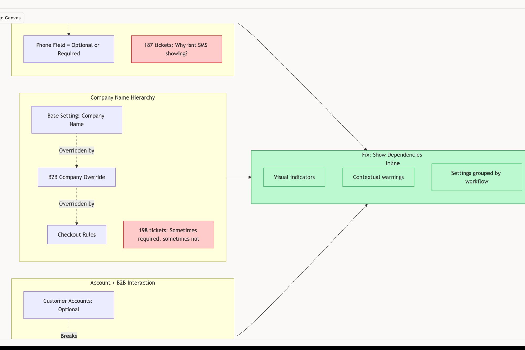
The best teams don’t just build for success; they design for resilience. A huge part of this is deconstructing what happens when things go wrong. Instead of reinventing the wheel every time, you can learn from how best-in-class products handle these tricky situations. For product teams aiming to deliver consistent experiences, leveraging resources like a company styleguide API can be invaluable in maintaining brand and design cohesion across all customer touchpoints.
Studying how a product like Dropbox handles its various upload failure states or how Zoom manages network degradation during a call provides grounded inspiration. These analyses turn abstract problems into a library of solved patterns. By studying these edge cases, your team can proactively design solutions instead of reactively fixing problems after they’ve already frustrated a user.
Moving From Reactive Fixes to Proactive Design
It’s Friday at 4:47 PM. One support ticket blows up a critical flaw in your onboarding, and suddenly, everyone is scrambling. This is reactive work. It's a firefighting culture where the product roadmap is dictated by the latest emergency.
Proactive customer experience design operates on a completely different timeline.
It anticipates failures before they ever become support tickets. The shift is fundamental: you move from fixing problems after they happen to designing systems that prevent them in the first place. It’s the difference between patching a leaky roof during a rainstorm and building it correctly from the start. This takes an obsessive focus on the unglamorous parts of a product, the edge cases and failure states.
Uncovering Hidden Complexities
Great teams don’t just build for the “happy path.” They know a product’s real measure is how it behaves under stress. But how can you possibly anticipate every potential point of failure?
You don’t have to start from scratch. You can systematically uncover these hidden complexities by deconstructing how premier products handle them. For example, a friend working on a delivery app was struggling to map out all the potential issues with a simple "add a stop" feature. The scope felt infinite. What if the new stop adds too much time? What if it conflicts with another delivery?
Instead of guessing, they started exploring how best-in-class services manage similar high-stakes scenarios. This kind of competitive analysis isn't about copying features; it's about borrowing solved problems and adapting proven patterns.
From Blueprint to Actionable Insight
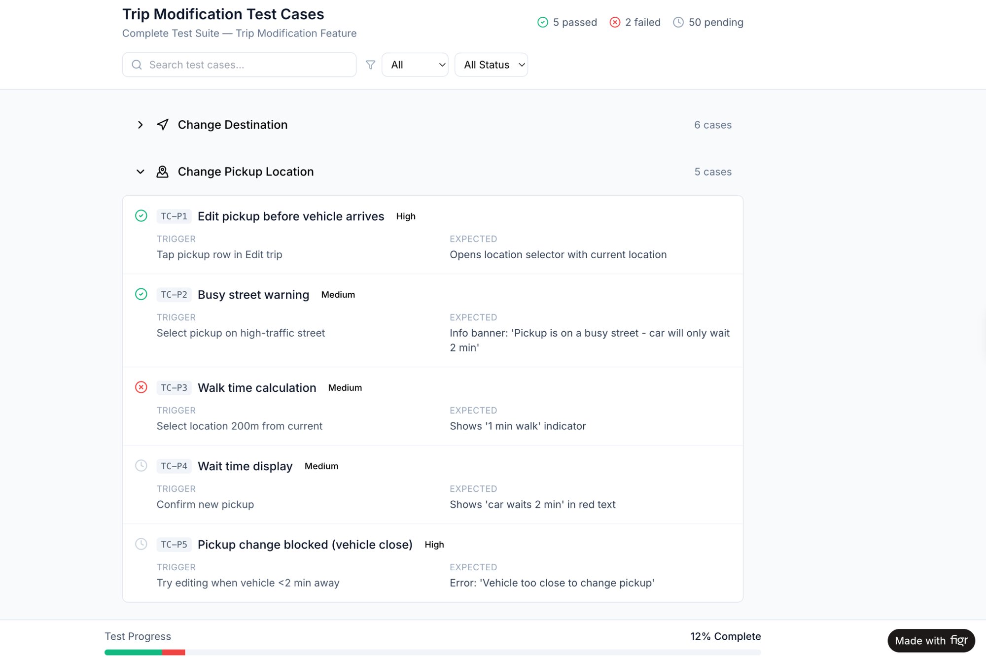
You can accelerate this entire process by studying detailed breakdowns of existing products. For instance, exploring a deep analysis of the Waymo mid-trip change flow can reveal a battery of test cases your team might never consider on its own. It’s like having an opponent’s playbook. This provides a robust blueprint for handling complex, in-progress user actions.
This proactive approach has a profound economic impact. According to research from Harvard Business School, a poorly managed experience can trap a company in what Professor Ryan Buell calls a "death spiral" of declining morale and performance. Proactively designing for failure breaks this cycle.
It shifts your team’s energy from constant, expensive course correction to thoughtful, forward-looking creation. You spend less time apologizing to frustrated users and more time building value.
This proactive mindset is especially crucial as you begin to automate parts of your product development. Understanding the full spectrum of user interactions is foundational, a topic we dig into in our guide to AI tools that automate product feedback analysis.
Your next step is to pick one critical flow in your product. Before writing a single line of new code, dedicate time to mapping every possible failure state. This simple exercise is your first move from being a product firefighter to becoming a product architect.
Your Next Step for Improving CX
Alright, you now have a new lens for seeing your product, one that takes in the entire journey, not just the disconnected steps. But insight without action is just trivia.
Your next move isn't to redesign everything at once.
It's much simpler. Pick one critical customer journey and map it.
I'm talking about the core value loop of your product. Think the 'complete a purchase' sequence or the 'create a new project' flow. But don't start with a whiteboard sketch. Start with reality. Use a tool like Figr to capture the existing flow directly from your live application.
Start with What Is, Not What Should Be
This one action is the most powerful first step you can take in customer experience design. Why? Because it gives you a tangible map of your current reality, not some theoretical ideal.
This map will immediately expose friction points you just couldn't see before.
Just last week, I watched a PM do this for their checkout process. They were convinced the problem was a clunky payment form. But the real-time map showed the actual issue: three confusing, confidence-killing screens that appeared before the user ever got to the form. Looking at something like this new setup flow for Shopify Checkout can reveal just how many hidden steps exist in a seemingly simple process.
That’s the kind of grounded work that moves the needle. As you dig deeper, a comprehensive customer experience optimization guide can give you more strategies to deliver impactful results.
The basic gist is this: you cannot chart a course to a better experience until you have an honest map of where you are right now. Capture one flow. Find one point of friction.
Start there.
Frequently Asked Questions
People often treat customer experience like a weather system, something powerful and unpredictable you just have to react to. But it's not the weather. It’s architecture. You can design it, build it, and maintain it with intention.
Here are a few common questions product leaders ask when they finally pick up the blueprints.
What Is the Difference Between CX and UX Design?
Think of an airport.
User Experience (UX) is making sure the check-in kiosk is intuitive. It’s ensuring the security line flows smoothly and the gate information is easy to read. UX is all about the usability of a specific, contained interaction. It’s a moment.
Customer Experience (CX) is the entire trip. It starts with how easy it was to book the ticket online and continues with the clarity of your confirmation email, the attitude of the staff at the check-in desk, the cleanliness of the airplane, and even the process for retrieving lost luggage.
UX is a critical part of CX, but CX is the sum of all those moments over time. It’s the entire journey, not just one stop along the way.
How Can a Small Team Start with Customer Experience Design?
Don’t try to boil the ocean. Mapping every single journey at once is a surefire recipe for paralysis.
Instead, start with the single most critical flow that delivers your core value. For a scheduling tool, that’s the user setting up their first event, like in this side-by-side comparison of Cal.com and Calendly. Zero in on identifying and fixing the biggest point of friction in that one flow.
Use the data you already have. Talk to your support team about common complaints. Look at your analytics to find the biggest drop-off points. Run three to five quick customer interviews. Small, focused improvements in a key journey have a much bigger impact than broad, shallow changes everywhere.
What Are the Most Important CX Metrics to Track?
High-level metrics like Net Promoter Score (NPS) and Customer Satisfaction (CSAT) are great for gauging overall sentiment. But for product teams on the ground, the most actionable metric is often the Customer Effort Score (CES).
It asks a simple question: "How easy was it to [accomplish a task]?"
A lower effort score is highly correlated with loyalty and retention, a finding backed by research from Gartner. When you track CES for specific journeys, like the checkout process or filing a support ticket, you get direct, granular feedback on where your experience is causing unnecessary friction. This makes it an incredibly powerful diagnostic tool for prioritizing your work.
What Is the Biggest Mistake Companies Make?
The single biggest mistake is designing only for the "happy path." Most teams spend 90% of their time designing the ideal user journey, where everything works perfectly.
But the moments that truly define a customer’s experience are when things go wrong.
A lost password, a failed payment, a dropped network connection, these aren't edge cases. They are the experience for a significant slice of your users. Great customer experience design obsessively maps these failure states, like these test cases for a card freeze feature, and designs graceful, helpful ways out.
Ignoring them is like building a beautiful house with no fire escape.
Great customer experience design isn’t a mystery; it’s a discipline. With Figr, you can stop guessing and start building with confidence. Capture your live product, uncover hidden edge cases, and generate production-ready artifacts that ground your decisions in reality. Ship UX faster with Figr.