It’s 4:47 PM on Thursday. Your VP just asked for something visual to anchor tomorrow's board discussion. You have a PRD. You have bullet points. You have 16 hours and no designer availability.
This pressure cooker is where most great ideas are forged, or forgotten. It’s also where bad prototypes are born: the kind that look good on the surface but create weeks of engineering delays. We’ve been taught to see prototyping as a task on a checklist. This view is fundamentally broken.
The real problem is something I call Vision Drift.
This is the subtle, compounding gap between the static picture in a mockup and the fluid reality of an interactive product. It happens when simple sketches fail to capture interaction nuances, hidden states, and the edge cases engineers will inevitably find. A prototype isn’t a drawing; it’s a hypothesis.
A friend at a Series C company told me a two-week project spiraled into a six-week fire drill. Why? The initial prototype only showed the "happy path" for a file upload, completely ignoring the 11 other states engineering had to account for. Ouch. To explore how to prevent these issues, it is worth looking into these common website design mistakes.
This is what I mean. A prototype's job isn't to look pretty; its job is to reduce risk. It should be a model that doesn’t just show what a feature looks like, but proves how it behaves under pressure.
What is the economic reality of unclear prototypes? According to a landmark study by the Standish Group, project rework can consume a staggering 40-50% of total effort. This isn't just a process failure; it's a financial drain caused by a failure of imagination at the very first step.
The key is to ask a different question. Instead of "What should this look like?", we need to ask, "What could go wrong here?". For instance, an interactive prototype comparing scheduling tools, like this one for Cal.com vs Calendly, immediately surfaces questions about time zones and availability conflicts: things a static image would have missed.
The grounded takeaway is this: treat your next prototype not as a presentation deck, but as a flight simulator. Its purpose isn't to be admired, but to be tested. The sooner you make it fail, the less it will cost you.
Ground Your Prototype in Reality, Not a Blank Canvas
A prototype built from pure imagination is a work of fiction. A prototype built from your live product? That’s a strategic plan.
Too many teams start prototyping with a blank canvas. It feels creative, even liberating, but it sows the seeds of disconnection. The design process as an architectural blueprint is a useful analogy. Designing a new feature without grounding it in your existing product is like designing a new room for a house without looking at the original blueprints. You might design a beautiful room, but it won’t fit.
You must anchor your prototype in reality.
Create a Digital Twin of Your Product
This is more than taking screenshots. It’s capturing the interactive DNA of your current product. You are creating a digital twin of your live website, capturing not just the pixels, but the logic baked into them.
What does this mean in practice?
- Component Behavior: Instead of drawing a generic login button, you capture your actual login component with all its states: hover, pressed, disabled, and error.
- Design System Tokens: You import the real hex codes for your colors, the exact font weights for your typography, and the specific spacing values defining your layout.
- Live Data Structures: You understand how content actually flows into the UI, not just how lorem ipsum fills a box.
This process establishes a baseline of truth. This is how Vision Drift looks in the wild.
Starting with a disconnected sketch forces a painful rework cycle. Grounding your prototype in reality bypasses this trap entirely.
The Cartographer's Mindset
Think of yourself as a cartographer charting a new course. You can't start without an accurate map of where you are right now. Your live website is that location; capturing its context is the act of map-making.
Last week I watched a PM spend three days recreating screens from their own app in a design tool. They meticulously rebuilt components that already existed, introducing small, unintentional errors along the way. Their focus was on the new feature, but 80% of their time was spent on redundant, low-value work.
Building from a digital twin flips this equation. You spend energy on the future, not recreating the past.
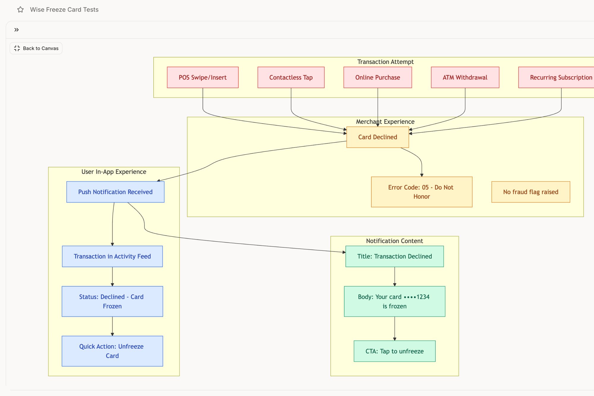
A grounded approach also uncovers complexities a blank canvas hides. For example, mapping a simple feature like a card freeze reveals dozens of potential edge cases and testable scenarios a designer might otherwise miss, a workflow you can explore here in this Wise Card Freeze feature. This proactive discovery is what effective prototyping is all about. To learn more about speeding up your work with modern tools, check out our piece on AI for UX design in our article.
Starting with reality isn't a shortcut: it's a smarter path. It forces discipline, ensures consistency, and makes your prototype a genuine extension of your product rather than a beautiful but irrelevant fiction.
Map the Invisible Architecture of Your Website
Every great website is built on an invisible skeleton: its user flows and information architecture. A beautiful screen a user can never find is a beautiful failure. So before you design a single pixel, you must map these critical pathways.
This isn’t about drawing boxes for the sake of process. It’s about making the implicit, explicit. It is turning a vague idea into a solid blueprint that accounts for both the happy path and the messy detours real users take. Think of your website’s flow not as a straight line, but as a river delta. There’s a main channel, but countless smaller streams branch off, rejoin, and sometimes lead to dead ends. Your job is to map all of them.
From Recording to Roadmap
The easiest way to start is by mapping what you already have. A screen recording of a core task captures real steps, hesitations, and friction. From that recording, you can build a user flow diagram. This visual map isn't just a sequence of screens; it's a decision tree forcing you to ask hard questions early. What happens if the network drops mid-upload? What if permissions are denied?
These aren't minor details. They're the iceberg under the surface.
The High Cost of Unmapped States
A PM I know watched a two-week estimate for a file upload feature bloat into six weeks. Why? The initial prototype showed one perfect flow. Then, engineering discovered 11 unmapped states that needed design decisions and new UI. You can explore a similar deep-dive into the complexities of Dropbox's upload failure states to see just how many things can go wrong.
This isn't an isolated story. It's the daily reality for teams who prioritize pixels over pathways. This process is also closely related to building a comprehensive system context diagram example.
Product leaders know the numbers. Enterprise platforms can be derailed by untested prototypes, causing 40% or more late-stage changes. As the voice UI market barrels toward $92.41 billion by 2030, these invisible architectures become even more critical. You can find more details on these software development statistics on Keyhole Software.
Uncovering the Edge Cases
The basic gist is this: your flow map is a tool for deliberate discovery. Your job isn't just to document what you know, but to actively hunt for the unknown.
Think like a QA engineer. What could break?
- Empty States: What does a screen look like before any data is there?
- Error States: How do you tell the user something failed, and what is their path to recovery?
- Loading States: What does the user see while they wait?
- Permission States: What can different user roles see and do in the same flow?
Mapping these states isn't pessimism; it's professional diligence. A prototype that only shows the happy path is a work of fiction. A prototype that accounts for errors, delays, and exceptions is a strategic plan. For example, mapping a Wise Card Freeze flow doesn't just show a confirmation. It maps the entire state machine.
Before you design the house, you have to be certain of the foundation. Mapping your website’s invisible architecture is how you pour that concrete.
Generate High-Fidelity Screens That Speak Your Language
Your user flows are mapped. You’ve made the invisible architecture visible. Now it's time to build the rooms, and this is where most teams mistake speed for progress. They rush to generate screens that look beautiful but are disconnected from their product’s DNA.
Your prototype isn't a separate artifact; it's an extension of your system. Think of your design system as a language. Generating a new screen isn't about inventing new words, but about forming a coherent sentence using the vocabulary and grammar you’ve already established.
With a solid foundation, generating high-fidelity screens should feel more like refinement, not raw invention. The goal is to move from a structural diagram to an interactive experience that speaks your product’s language fluently.
From Blueprint to a Breathing Prototype
The real challenge here is System Adherence. How do you ensure every new screen, button, and modal is a faithful extension of your existing design system? When you violate this, you accumulate design debt.
You enforce consistency by making it the path of least resistance.
Instead of a designer manually picking colors, the process should be guided by your system. This means using tools that understand your design tokens: the atomic units of your design language. An AI agent, for instance, can be fed your design system and then generate new screens that aren't just visually similar, but mathematically precise. For a detailed breakdown of this phase, you can learn more about crafting high-fidelity wireframes in our article.
The Economics of Consistency
This isn't just about aesthetics; it's about economics. The global web design market is forecasted to hit USD 100 billion by 2031. A mid-complexity web app can cost between $50,000 to $150,000, and poor prototypes frequently inflate those budgets by 20-30%. AI tools are a direct response to this financial drain.
This level of precision is powerful. When you can iterate quickly while knowing brand consistency is guaranteed, you free up mental energy for higher-level problem-solving. As you move into developing detailed visuals, learning how to create website mockups is crucial for visualizing the final product and minimizing rework later.
A high-fidelity screen isn't just a picture. It's a testable artifact, a contract between design and engineering.
Building Accessibility In, Not Bolting It On
A truly high-fidelity prototype also accounts for accessibility from the beginning. This is another area where automation provides a huge advantage. As you generate screens, you can run automated checks for critical compliance issues.
What should you be looking for?
- Color Contrast: Does your text have enough contrast against its background for users with low vision?
- Tap Target Size: Are buttons large enough for someone on a phone to tap accurately?
- Readable Fonts: Is your typography clear and legible at different sizes?
A friend at a travel tech company once launched a feature that flopped with older demographics. The culprit? Tiny tap targets and low-contrast text that passed a quick visual check but failed miserably on actual accessibility tests.
Generating high-fidelity screens is the final translation layer between strategy and reality. It’s where you convert flows and components into an experience. By enforcing system adherence and embedding accessibility checks, you create a prototype that isn’t just a pretty picture, but a reliable, production-ready specification.
From Prototype to Production: The Final Mile
A prototype’s final job is to make itself obsolete. It is not a permanent artifact; its purpose is to pave a clear, unambiguous path to production and then exit the stage. This final mile is where the abstract rigor of design meets the concrete reality of code, and it’s where many projects stumble.
The handoff isn't just sending a file. It’s a knowledge transfer. A truly effective prototype doesn't just show the destination; it provides the turn-by-turn directions. Your prototype is the Rosetta Stone, allowing designers, engineers, and QA to speak the same language.
Generating Your QA Blueprint
An interactive prototype is a machine for generating test cases. Every click, state change, and potential user error you mapped out is now a testable scenario. This flips QA from a reactive process into a proactive mission to validate intended behavior.
Think about a critical financial feature, like freezing a lost credit card. A simple prototype can expose dozens of permutations. You can see this in action by exploring the detailed states mapped for a Wise Card Freeze feature, where each step becomes a testable case.
What scenarios pop up?
- Happy Path: The user successfully freezes the card.
- Network Failure: The app loses connection after the user confirms. What message do they see?
- Authentication Error: The user fails to verify their identity.
- State Conflict: The user tries to make a purchase a millisecond after freezing the card.
A comprehensive prototype forces these conversations before code is written, turning QA into a collaborative partner from day one. To see how this tightens the loop, check out our guide on automating the designer-to-developer handoff.
Closing the Loop with Business Outcomes
How does a well-defined prototype connect to the metrics the business cares about? It creates a continuous feedback loop between your designs and your live product analytics.
In short, your prototype is a hypothesis. Your analytics are the test results.
If your data shows a 30% drop-off during checkout, you don’t guess at a solution. You build a prototype of a new flow, test it, and validate that it solves the specific friction point your data revealed. The prototype becomes the bridge between a business problem and a validated solution, like this redesigned Shopify checkout setup.
This cycle can dramatically slash time-to-market. By generating high-fidelity mocks in 48-72 hours, some teams enable live user testing that leads to a 60% savings in R&D costs. These results reflect a broader trend in a rapid prototyping market projected for significant growth, as detailed in this North America rapid prototyping market report.
Prototyping is the most efficient mechanism for converting user behavior data into product improvements.
The grounded takeaway is to export a complete handoff package before development kicks off. This isn't just a Figma link. It's a bundle containing user flows, high-fidelity interactive screens, detailed test cases for every edge case, and the strategic rationale linking it all back to the original problem. This is how you ensure nothing gets lost in translation.
You Probably Have Some Questions
It’s 10:17 PM. You just wrapped up a prototype walkthrough. The core concept landed, but then came the questions about fidelity, tools, and how to do this right.
This is the critical moment where a good prototype solidifies into a great plan or dissolves into ambiguity. Let's get to the most common questions.
How High-Fidelity Does My Website Prototype Need to Be?
Fidelity isn't a single setting; it's a dial you turn based on the decision you need someone to make. Match the level of detail to your audience and the answers you're after.
For early internal alignment on a user flow, a simple low-fi diagram is enough. It answers: "Does this path make logical sense?".
But for user testing, where you need genuine reactions, you need high fidelity. The prototype has to feel like the real product. If the user needs to click it, it should behave as if it were coded. And for an executive sign-off or investor pitch? A fully interactive, pixel-perfect prototype is non-negotiable.
What Is the Difference Between a Prototype and a Wireframe?
Think of it like this: a wireframe is the architecture, while a prototype is the interior design. One defines the structure, the other defines the experience within it.
A wireframe is the blueprint. It’s a low-fidelity, structural layout focused on information architecture and basic functionality. It’s placeholders and grayscale to answer one question: "What goes where?".
A prototype, especially a high-fidelity one, is an interactive model. It's the furnished show home. It brings in specific UI elements, brand colors, and clickable interactions to simulate the user experience. A prototype moves beyond structure to answer a more important question: "How does this feel and work?".
How Can I Prototype Faster Without a Dedicated Designer?
This is a classic bottleneck. The solution isn't to become a designer overnight. It's to use tools that automate the most repetitive parts of the design process.
The old way is starting from a blank canvas. The better way is to start from your existing product context. Use tools that can capture your live app’s design system, components, and styling. This creates a foundation that is 100% consistent with your brand from the start.
From there, AI-powered tools can generate new screens that follow your established rules. This approach lets product managers create high-fidelity, on-brand prototypes in a fraction of the time, even without deep design expertise.
How Do I Get Meaningful Feedback on My Prototype?
Getting good feedback is an art form. The quality of feedback you receive directly reflects the quality of your prompts.
Stop asking generic questions like "Do you like it?". These invite vague opinions, not actionable insights. Instead, frame the session around specific tasks.
- Give users a clear goal to accomplish. For example: "You've forgotten your password. Show me how you would reset it."
- Watch where they struggle. Don't interrupt. Let the silence hang; it's revealing.
- After the task is done, ask context-specific follow-ups like: "What did you expect to happen when you clicked that button?".
For stakeholders, tie the feedback directly to business goals. Frame the prototype as a solution to a specific problem they care about. Targeted, task-based feedback is infinitely more valuable than a simple thumbs-up. This website prototyping approach is one piece of a larger practice. For the complete framework, see our rapid prototyping guide. The same principles apply to mobile and cross-platform prototyping. See our broader guide on prototyping in UX design.
For sprint-aligned prototyping workflows, see prototyping best practices in agile environments.
Ready to build prototypes that are grounded in reality, not a blank canvas? Figr is an AI design agent that learns your live app, enforces your design system, and generates production-ready artifacts from user flows to test cases. Stop the rework cycle and start shipping faster. Design confidently with Figr.