
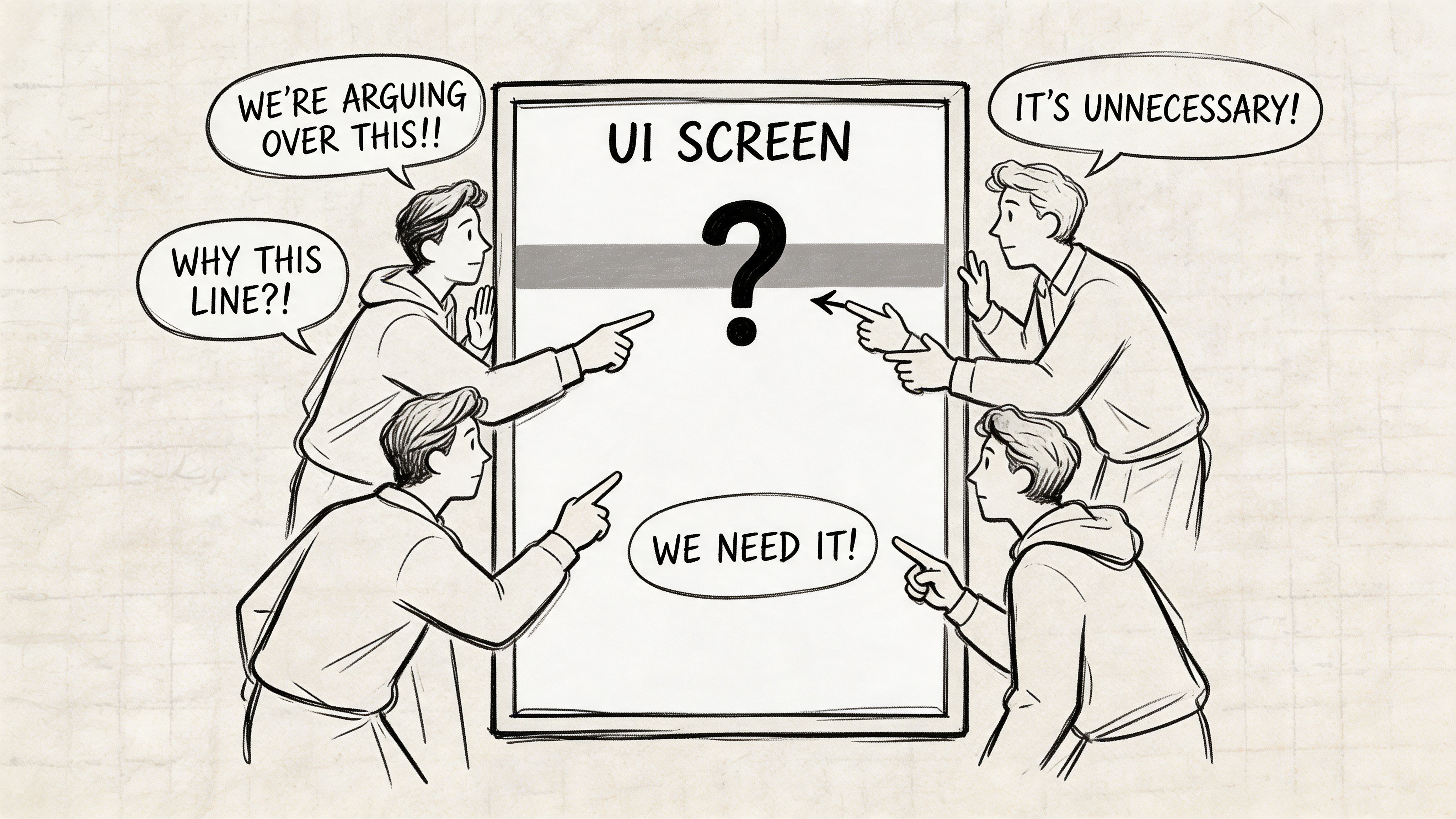
At 4:17 p.m., the meeting should've been over. The feature was approved, the prototype looked polished, and everyone was ready to move on. Then someone zoomed into a divider line and asked the question that turns calm teams feral: is that the right grey?
An engineer pulled the browser inspector. The designer opened Figma. The PM stared at both screens like they were written in different languages. Three values appeared for what everyone had been casually calling “light grey.” None matched cleanly. Nobody felt confident enough to ship.
That moment isn't about taste. It's about governance.
I've watched teams lose a day to this kind of argument, and the painful part is how avoidable it is. A hex light grey sounds trivial until it becomes the seam where design, code, QA, and product all expose their hidden assumptions.
The Unwinnable Argument Over Light Grey
The worst grey debates don't start with disagreement. They start with false agreement. Everyone says “just use a light grey,” as if that phrase contains a decision. It doesn't. It contains ambiguity with a nice tone of voice.
Last week I watched a PM at a growing SaaS company ask why the team was debating a border color during a release review. Fair question. The answer was uncomfortable. They didn't have a shared language for neutrals, only a pile of swatches and a lot of tribal memory.
That's why I don't treat hex light grey as a color topic anymore. I treat it as a coordination topic.
Light grey is a category of failure
When a team says “grey,” they often mean one of several jobs:
- Background support, something that lifts content without drawing attention
- Structural separation, like borders, dividers, and table lines
- State communication, especially disabled or read-only UI
- Depth cues, where shadows or subtle fills create hierarchy
Those jobs shouldn't share a casual name. They need explicit intent.
The design world has leaned on #d3d3d3, standardized as LightGray in CSS around 1996 with CSS1, for a reason. It became foundational in web design and appears in over 15% of neutral UI elements in analyzed design systems because it balances subtlety with accessible contrast potential against dark text, as summarized by ColorHexa’s LightGray reference.
A light grey choice looks small only until three functions get mapped to one swatch.
This is what I mean. The argument is unwinnable because the room is debating implementation while the underlying problem is missing policy. If your system can't answer who chose the grey, what it means, where it belongs, and how it gets enforced, the same debate will return in the next sprint wearing a slightly different hex code.
Why Your Team Needs a Grey Scale System Not Just Swatches
A folder full of neutrals is not a system. It's a museum of prior decisions.
Teams commonly accumulate greys the same way kitchens accumulate mystery containers. Someone needed one quickly, another person duplicated it and nudged it slightly, and six months later nobody knows what should be kept. The interface still looks mostly fine, which is why the problem survives. But “mostly fine” is expensive.
The case for Intentional Neutrals
I use the term Intentional Neutrals for a grey system organized by role, not by vibe. The name matters because it shifts the conversation away from “which one looks better?” and toward “what job is this token performing?”
A practical neutral system usually maps to functional buckets such as:
- Surface greys, for app backgrounds, cards, panels, and layered containers
- Boundary greys, for borders, dividers, table rules, and field outlines
- State greys, for disabled text, placeholders, and inactive controls
- Feedback-adjacent greys, for hover fills, selected rows, or temporary scaffolding around interaction states
That sounds obvious. Yet teams skip it all the time.
Why? Because swatches feel fast. Governance feels slow. But when product and engineering scale, every unnamed neutral becomes a small tax on judgment. Designers second-guess mockups. Engineers inspect old components. QA files bugs that are technically valid and strategically pointless.
Color governance is product governance
This is the zoom-out often overlooked. Neutral colors sit in the invisible layer of your product economics. They influence review time, implementation drift, accessibility consistency, and how quickly new people can work without asking permission.
A mature team doesn't just maintain a palette. It maintains Color Governance. That means deciding:
- which greys are allowed
- what each one means
- where exceptions can happen
- who resolves drift when design and code diverge
If your design system doesn't already encode those rules, this guide for product teams is a strong place to calibrate how design systems stay operational.
Practical rule: If a neutral token name describes appearance only, it's probably too weak to survive scale.
“Grey 200” can work inside a foundation layer. “border-subtle” works better in daily product work because it carries intent. Teams move faster when they don't have to reverse-engineer the designer's emotional relationship with a swatch.
What works, in practice, is boring on purpose. Small neutral set. Clear token semantics. Strict usage boundaries. Review rules that stop “close enough” from entering production. What doesn't work is the common compromise, a master palette in Figma, a different one in code, and a shared belief that people will remember which grey is for what.
They won't.
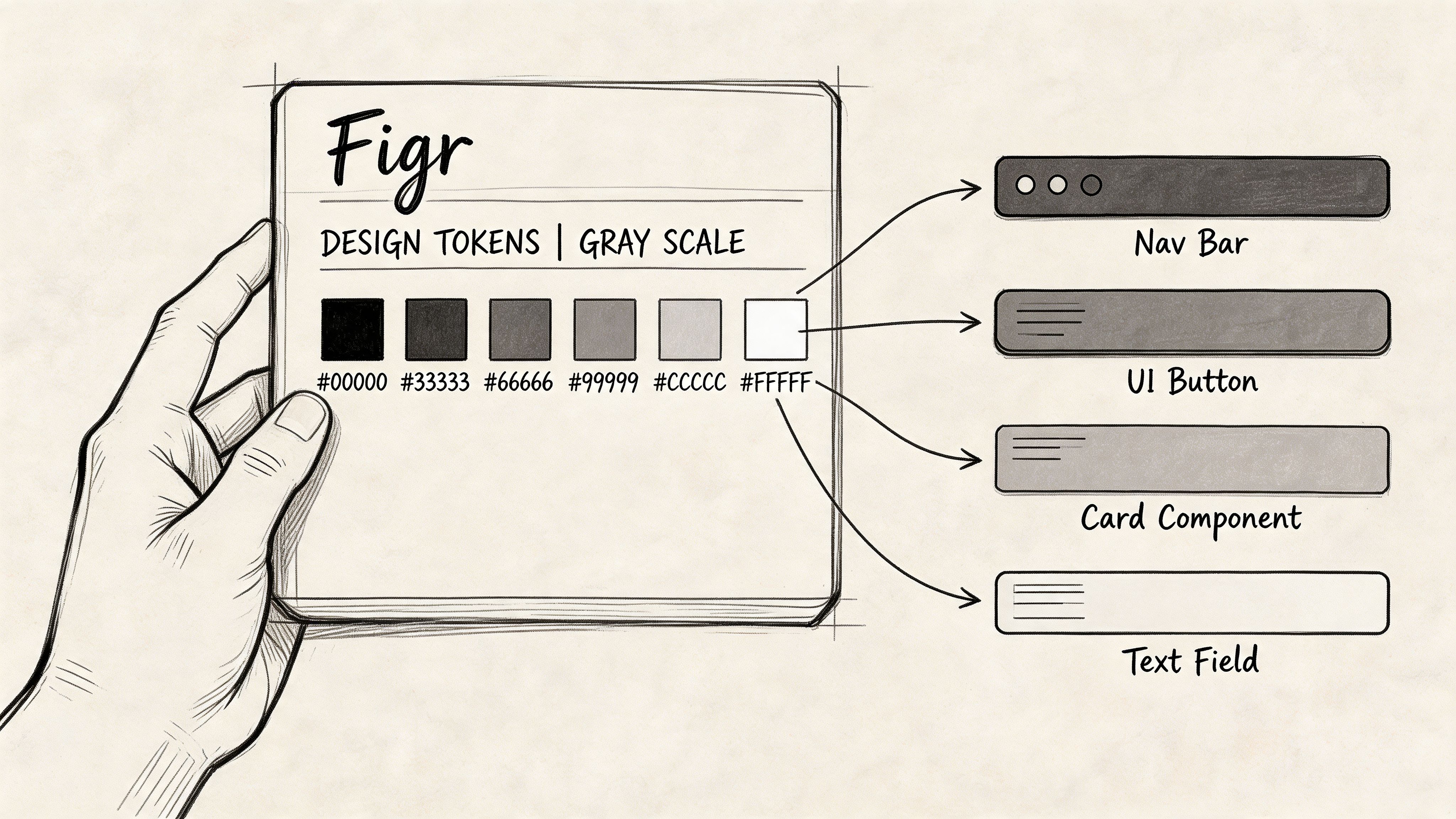
The Only Five Light Grey Hex Codes You Need
A product team ships a new settings page. Design uses one light grey for the page background, another for cards, a third for dividers, and two more that appeared somewhere between Figma edits and CSS cleanup. Three weeks later, nobody can explain which one is correct. That is how neutral palettes turn into maintenance work.
Five light greys are enough for most light-mode products. Fewer choices force clearer decisions, which is exactly what a design system is supposed to do.
A small grey set gives each value a job
These are not inspiration swatches. They are operating values. Each one should map to a token, a component rule, and a review standard. If a grey has no stable role, remove it before it spreads into mocks, code, and exceptions.
| Use Case | Token Name Suggestion | Hex Code | Contrast vs. Black |
|---|---|---|---|
| Main app canvas | surface-main | #FAFAFA | Validate in context |
| Raised surfaces and nested panels | surface-raised | #F5F5F5 | Validate in context |
| Subtle dividers and low-emphasis strokes | border-subtle | #EEEEEE | Validate in context |
| Stronger borders and input chrome | border-default | #E0E0E0 | Validate in context |
| Light neutral background with more presence | surface-neutral-strong | #D3D3D3 | Verify with a contrast checker for the exact text, size, and weight used |
That last row matters because teams often overestimate how interchangeable light greys are. A grey that works for a panel background can fail as a text surface, and a border grey that feels clean in Figma can disappear on a lower-quality display.
What each grey is for
#FAFAFA is the safest canvas for products that want a soft background without drifting into visible tint. It keeps white cards readable and avoids the sterile look of pure #FFFFFF across the entire app.
#F5F5F5 works for raised surfaces, secondary panels, and inset zones. The step from #FAFAFA is small on purpose. If users can spot the hierarchy in one second, you did enough.
#EEEEEE is for quiet separators. Use it for dividers and low-emphasis borders where spacing already does most of the structural work.
#E0E0E0 is the practical border color. Inputs, table outlines, and selected containers often need a line that survives real screens and real lighting conditions.
#D3D3D3 is the strongest light neutral in this set. Use it when the background itself needs to read as intentional, not incidental. It is also the first grey here that deserves explicit contrast verification before the team treats it as a reusable text surface. For system setup guidance beyond raw hex selection, these design system color palette practices are a useful reference.
Why this set holds up in production
The spacing between these values is doing the work. Teams get enough visual separation to define surfaces and borders, but not so much range that every designer invents a new semantic layer. That trade-off matters more than aesthetic purity.
I have seen teams carry ten or twelve near-white greys because they wanted flexibility. What they got was review churn, token sprawl, and coded interfaces that never quite matched the library. A five-step set is easier to name, easier to test, and much easier to enforce with tokens and automation.
If two greys serve the same role, one of them is system debt.
That is the standard. Pick the five that cover real UI jobs, assign intent-based tokens, and stop treating neutral drift like a harmless detail.
Validating Your Greys for Accessibility and Consistency
A grey token looks harmless until it reaches production. Then the arguments start. Design says the border is intentional. Engineering says it disappeared on a low-quality monitor. Support shares screenshots from a dim hospital workstation where placeholder text is unreadable. That is why grey validation needs a system, not taste.
A swatch library does not answer the core question. Can this grey survive the actual conditions your product lives in: long tables, mixed elevations, disabled states, bright offices, dark rooms, and inconsistent displays?
What to test beyond the hex value
I validate light greys in context, not in isolation. That means checking the coded component in the browser, comparing it to the design source, and viewing the same pattern on more than one screen. Greys fail through interaction with everything around them. White cards, shadows, nearby borders, font weight, and spacing all change how faint or strong a neutral feels.
Use a review loop that catches drift early:
- Inspect the live UI: compare computed values in developer tools against the token or Figma variable, not just the intended hex.
- Check text pairings: review dark text on grey surfaces, helper text, placeholders, disabled labels, and any secondary content that designers tend to excuse as “close enough.”
- Review state changes: hover, focus, selected, disabled, empty, and error-adjacent states often expose neutrals that looked fine in static mocks.
- Test the layout, not just the color: weak spacing often gets misdiagnosed as a grey problem, especially with borders and dividers.
- Compare across surfaces: a grey that works on a flat page background can collapse once shadows, cards, or tinted containers enter the composition.
The trade-off is simple. The more subtle the grey, the more disciplined the surrounding structure needs to be.
AA, AAA, and actual product decisions
WCAG is a floor for product teams, not a style preference. Passing contrast on one text sample does not make a light grey safe as a reusable surface token across the system. The typography, component size, state behavior, and surrounding colors still decide whether that choice holds up.
For example, if a team wants to use #d3d3d3 as a background behind dark text, validate that exact pairing with the text size and weight used in the component. A specific WebAIM contrast check for black text on #D3D3D3 gives you a concrete reference point. Use that result to confirm the pairing you ship, not to justify broader reuse without testing.
This is also where teams either preserve consistency or let neutral drift creep in. One squad approves a slightly darker disabled surface for readability. Another keeps the original token for visual polish. Six weeks later, both are “light grey,” neither matches, and nobody knows which exception became standard.
Teams that want fewer manual checks should evaluate product UI accessibility with AI during review, especially after handoff. Automation will not replace judgment, but it will catch mismatched tokens, weak states, and accessibility regressions before they spread through the library.
Good accessibility review asks whether users can read and parse the interface for an hour without strain.
That standard is harder than passing a checker, and more useful. It forces teams to test greys as part of an operating system for design quality, with tokens, validation rules, and enforcement that scale beyond a single file.
From Hex Code to Design Token in Figma and CSS
A team picks #D3D3D3 in a review, everyone nods, and significant problems start a week later. Design calls it Light Grey 2, engineering hardcodes #d3d3d3 in one component and #d9d9d9 in another, and QA approves both because they look close enough on a laptop.
Hex values do not survive scale on their own. Teams need a naming system, a token hierarchy, and a rule for how color choices move from Figma into production code without mutating along the way.
Name the job, not the shade
Semantic naming holds up better than visual naming in product work. color.border.subtle ages well. light-grey-2 does not.
The trade-off is real. Semantic tokens take longer to define upfront because the team has to agree on purpose, not just appearance. That extra work pays back the first time the UI theme changes, a component gets redesigned, or a neutral needs to shift slightly for contrast. Engineers still know what the token is for. Designers do not have to rename half the library.
A practical stack looks like this:
- Foundation token:
grey.300 = #d3d3d3 - Semantic token:
color.surface.neutral.strong = var(--grey-300) - Component token:
input.border.default = var(--color-border-default)
That structure separates value from intent and intent from implementation. It also gives teams a clean place to make changes. Adjust the foundation when the palette changes. Adjust the semantic layer when usage changes. Leave component code alone unless the component itself changes.
Figma first, CSS second
Set up Figma variables or color styles to match the same token model used in code. If design uses one naming scheme and CSS uses another, drift is already in the system.
Keep the raw hex at the foundation layer. Keep semantic meaning in aliases. Keep component usage specific. That discipline sounds strict because it is. Strict systems are easier to maintain than libraries full of polite exceptions.
Here is a clean implementation pattern:
:root {--grey-300: #d3d3d3;--color-surface-neutral-strong: var(--grey-300);--color-border-default: #E0E0E0;--color-border-subtle: #EEEEEE;--color-surface-raised: #F5F5F5;--color-surface-main: #FAFAFA;}And inside components:
.card {background: var(--color-surface-raised);border: 1px solid var(--color-border-subtle);}.input {border-color: var(--color-border-default);}The point is not to create more layers for the sake of process. The point is to make a future palette update boring. If a neutral changes, one token updates and the system absorbs it.
What usually breaks
Token systems fail less from tooling than from behavior. I see the same pattern repeatedly:
- Designers create local aliases to move faster in a file
- Engineers paste hex values directly to avoid looking up token names
- QA signs off on screenshots instead of checking token use in inspected builds
- Product teams approve one-off exceptions that gradually become standards
Stable systems solve this by removing the need to remember. The token carries the decision, and the tooling enforces it.
If your team needs a practical reference for setting up that structure across design and code, Figr's guide to design tokens is a useful starting point.
Automating Your Grey Scale with Figr
A sprint gets tight, a designer duplicates an old file, an engineer copies a hex from DevTools, and by the next release your "approved" light greys exist in six slightly different versions. I have seen this happen even on teams with a documented palette. The problem is rarely the palette itself. The problem is that documentation does not enforce behavior.
Automation matters once the team has already agreed on the grey scale and token structure. At that point, the job is operational: keep approved values attached to the right components, catch drift before review, and make handoff reliable enough that nobody needs to re-litigate border colors in Slack.
The failure points are predictable:
- Importing legacy work that contains hard-coded greys with no token mapping
- Exploring new variants that introduce near-match colors outside the system
- Reviewing prototypes where visual approval happens without checking token compliance
- Handing off to engineering with names, values, or usage rules that change between files
Teams do not need another style guide for this. They need workflow enforcement. A useful automation layer checks whether a surface, border, or divider is using the approved neutral token, flags mismatches early, and keeps generated deliverables tied to the same source of truth used by design and engineering.
That changes QA in a practical way. Testers can verify rules instead of judging screenshots by eye. Engineers spend less time asking whether #F4F4F4 was intentional or just close enough. Design reviews stay focused on hierarchy, states, and usability instead of microscopic color differences that should have been settled months ago.
For product teams comparing ways to reduce that coordination overhead, it helps to compare AI automation tools based on enforcement and handoff quality, not novelty.
An AI-powered design tool is useful here because it helps teams import existing systems, apply tokens consistently, generate artifacts from the same rules, and keep neutral decisions from decaying into file-by-file exceptions. That is the core value of automation for light greys. It turns a fragile convention into a repeatable operating system.
Stop Picking Colors and Start Shipping Faster
A hex light grey debate looks aesthetic from the outside. Inside the team, it's about trust. Can design and engineering rely on the same source of truth? Can QA test against rules instead of guesses? Can product keep reviews focused on decisions that matter?
That's the payoff of a disciplined neutral system. Less time spent reconciling tiny differences. More time spent improving the product.
If you're comparing ways to reduce that manual coordination tax, it also helps to compare AI automation tools through the lens of workflow enforcement, not novelty. The useful tools aren't the ones that generate the most options. They're the ones that reduce drift between decision and delivery.
Book a 30-minute meeting with your lead designer and lead engineer this week. Don't call it design system governance. Call it “let's kill the grey debate.” Start with five approved light greys, assign each a job, convert them into semantic tokens, and agree that anything outside the system needs explicit review.
That's how teams stop arguing about borders and start shipping with confidence.
If your team wants help turning those decisions into working artifacts, Figr is built for exactly that. It helps product teams import design systems, enforce tokens, generate UX deliverables, and move from scattered decisions to production-ready output without the usual grey-zone chaos.
