
It's 4:47 PM on a Thursday. Sprint planning is tomorrow. You have a PRD. You have bullet points. You have 16 hours, and that sinking feeling tells you a key user flow is based on a guess, not reality.
The connection between your product and what users actually do feels fragile. It’s a bridge supported by fog. This is the moment product managers dread, where confidence gives way to quiet anxiety.
This is exactly where a fit gap analysis stops being a bureaucratic checklist and becomes an essential diagnostic tool.
The Hidden Costs of Building on Assumptions
A fit gap analysis is the process of comparing your product’s current state against a desired future state to see what’s missing. It’s a diagnostic tool that reveals the discrepancy between what your system does and what your users need it to do.
The "gap" isn't just a missing feature. It’s the dangerous space between your product as it exists and your user's actual, messy workflow.
Bridging the Canyon of Misalignment
Think of it like a bridge engineer checking the alignment between two sides of a canyon before construction starts. A tiny misalignment at the beginning, a simple rounding error in the survey, becomes a catastrophic failure by the end. The two sides will never meet. The same is true for product development.
Too often, we build solutions for the processes we wish users had, not the ones they actually follow.
Last quarter, I watched a team at a B2B SaaS company spend six weeks building a new dashboard meant to save users time. The problem? Adoption was near zero. A fit gap analysis would have revealed that users weren't logging in to see data; they were logging in to export it into a separate spreadsheet where their real work happened.
The team built a beautiful bridge to a place no one was trying to go.
Naming the Invisible Problems
This is what I mean: a fit gap analysis makes invisible work visible. It forces a structured, honest conversation about reality by systematically comparing the "as-is" state with the "to-be" state.
The "As-Is" State: This is the ground truth. It’s how users currently accomplish a task, including all the painful workarounds and external tools they rely on. A great example is mapping the failure states for a Dropbox file upload, it reveals the chasm between a simple "happy path" and the reality of network drops.
The "To-Be" State: This is the ideal, streamlined workflow your new feature aims to create, grounded in business objectives and user needs.
The Gaps: These are the specific discrepancies between the two states. They can be functional (a missing button), process-based (a workflow forcing unnecessary steps), or data-related (information isn't available where it's needed).
This exercise isn't about blame; it's about clarity. A 2023 report from the Project Management Institute noted that 35% of project failures are due to inaccurate requirements gathering. A fit gap analysis is your primary defense against becoming part of that statistic. You can learn more about how to validate features before writing a single line of code in our detailed guide.
In short, this process changes the conversation from "What should we build?" to "What problem are we solving, and for whom?" It forces you to prove your assumptions before you commit engineering resources.
The grounded takeaway is this: before your next major feature, map the user's current process. Don't assume you know it, observe it. That map is the start of your analysis and the foundation for building something that actually fits.
Mapping The As-Is Landscape Without Drowning In Data
How do you map the current state of your product's user experience? This isn't about listing familiar methods like interviews and surveys. It's about combining them with intent. You need to become a cartographer of your own product, charting not just the main roads but the hidden trails your users have carved out for themselves.
This is what I mean: you must capture reality before you can hope to improve it.
Combining The What With The Why
Any real fit gap analysis starts with understanding the "as-is" landscape. But a list of features isn't a map. The real work is in layering different types of data to get a picture that has both scale and detail.
Start with quantitative data to find the smoke. Where are the drop-offs? Which funnels are underperforming? Analytics are your satellite view, showing you where the traffic jams are happening from 10,000 feet up.
Then, you deploy the ground team. Use qualitative tools like screen recordings and user interviews to understand the fire causing the smoke. The numbers tell you what is happening, but a user’s frantic, repeated clicks on a disabled button tell you why.
I once saw a product manager discover a widely used "hack" in their software. Users were exporting raw data, manipulating it in Excel, and then re-uploading it, all to bypass a clunky reporting feature. Analytics never would have caught this, but a single screen recording revealed a massive, unmet need the team was completely unaware of. That workaround was a flashing signpost pointing directly to their next big opportunity.
From Messy Reality To A Clear Artifact
The basic gist is this: you need a reliable method to translate these observations into a coherent artifact your team can actually work with. The goal is to create a definitive map of the current state. Without this shared understanding, every conversation about the future is based on individual assumptions and incomplete mental models.
To accurately map the 'as-is' landscape without getting overwhelmed, examining essential process documentation examples can provide a clear understanding of current workflows. It helps structure your findings into something more than just a collection of notes.
For example, a team can map the entire, notoriously complex LinkedIn job posting flow. By recording the process and documenting each step, a messy user experience is transformed into a clear artifact. This visual map becomes the foundation for identifying specific points of friction, making abstract problems tangible and solvable. For curious readers, you can see how this recruiter flow was mapped out.
A fit gap analysis forces you to confront the delta between how you think your product is used and how it actually is. That gap is where your most valuable insights live.
This process has a direct impact on productivity. A manufacturing firm's case study found a 25% productivity gap, team efficiency was at 65% against a desired 90%, caused by misaligned processes and fragmented tools. This mirrors broader trends; one survey revealed that 58% of UX teams wasted 15-20 hours weekly on manual gap hunting in prototypes.
Capturing The Unseen Workflows
The real challenge is documenting not just the intended path, but all the detours. A successful "as-is" map includes:
Workarounds: How do users bypass frustrating parts of your product?
External Tools: What other software (spreadsheets, note apps) are they using to complete the job?
Failure States: What happens when things go wrong? How does the user recover?
A friend at a Series C company recently ran this process. Her team believed their onboarding was smooth. But after mapping the true "as-is" state, they found that over 40% of new users were immediately exporting a "getting started" guide to a PDF because the in-app instructions disappeared after the first view. The product was forcing users to create their own documentation just to get started.
This is the kind of insight that changes roadmaps. For a deeper look into this part of the process, you might be interested in our guide on what is a user journey map.
The grounded takeaway is to start small but be rigorous. Pick one critical user flow. Combine your analytics with just five user screen recordings. Map out the real journey, including the workarounds. This single artifact will give you more clarity than a dozen meetings based on opinion.
Defining The To-Be State And Identifying The Gaps
You’ve mapped the current landscape, the “as-is” state. It's detailed, honest, and probably a little messy. So, what’s next?
The goal isn't to dream up some perfect, utopian system from scratch. It's to define an achievable future, a “to-be” state that’s actually grounded in business goals and real user needs.
Think of this part of the fit gap analysis like an architect designing a renovation. They have to work with the existing foundation and load-bearing walls, the unchangeable truths of your “as-is” map. But from there, they design a new structure that meets the family's future needs. That's your “to-be” vision.
The gaps are simply the walls that need to be moved.
From Aspirational Goals To A Tangible Blueprint
Your “to-be” state has to be more than a wishlist; it needs to be a practical blueprint for a better workflow. It’s the bridge that connects a broad business objective, like "increase user retention by 15%," to specific, tangible system requirements.
How, exactly, will the product function to hit that goal? What information needs to be where? Which steps can we flat-out eliminate?
This isn’t about cramming in more features. It’s about designing a more coherent experience. A friend at a fintech company told me her team’s “to-be” vision for their expense reporting tool was simple: “No user should have to manually enter a vendor's name.” That single, clear principle guided every single design decision, forcing them to prioritize OCR improvements and integrations over other nice-to-have features.
The power is in that specificity. A vague goal leads to a vague product. A sharp, well-defined “to-be” state acts as a filter for every decision that follows.
Making The Invisible Work Visible
This is where you show, not just tell. The most critical function of a fit gap analysis is to surface the invisible work that so often derails projects. The gap between the clean "happy path" and messy reality is where scope creep lives and breathes.
A classic example is a simple file upload feature. The “as-is” might just be a button. The “to-be” might look similar, just a bit faster. But the gaps? The gaps are the dozens of failure states that nobody bothered to document.
What happens if the network drops mid-upload?
What if the user tries to upload a forbidden file type?
What if the file exceeds the size limit?
What if the file has the same name as an existing one?
If you were to map out all the failure states for a feature, you'd quickly see the massive gap between a simple design and a resilient system. Each of those questions represents a design decision, a line of code, and a potential point of failure. The fit gap analysis forces these conversations to happen upfront, not during a panicked engineering huddle three weeks past the deadline. It makes the invisible work visible.
Systematically Identifying What's Missing
Once you have both the “as-is” and “to-be” maps laid out, identifying the gaps becomes a systematic comparison. You’re looking for specific discrepancies that usually fall into a few key categories.
Functional Gaps: A required feature is completely missing. For instance, the “to-be” state requires two-factor authentication, but the current system doesn't support it at all.
Process Gaps: The system can perform the function, but the workflow is inefficient, illogical, or just plain painful. This is the root cause of those user-created workarounds you discovered earlier.
Data Gaps: The necessary information isn't available to the user at the right moment. This could be as simple as not showing a customer's order history on the support agent's screen when they need it most.
After getting a full picture of the current state, pinpointing these discrepancies is the next crucial step. For a deeper dive into identifying what's missing, it's worth exploring the principles of a knowledge gap analysis.
Your "to-be" design is a hypothesis. The gaps you identify are the experiments you need to run to validate it.
This process transforms abstract requirements into a concrete list of problems to solve. An analysis of the Wise card freeze feature, for example, would produce a clear list of gaps if it failed to provide immediate visual confirmation or a log of the freeze action. These documented gaps become the raw material for your product backlog. You can see how these edge cases can be simulated to reveal such gaps.
Here’s the grounded takeaway: start your “to-be” definition with a jobs-to-be-done framework. Don't ask what features you want. Ask what job the user is hiring your product to do. Then design the most efficient path to get that job done. The distance between that path and the one they take today is where your most impactful work lies.
Prioritizing Gaps: From Quick Wins To Strategic Shifts
You’ve mapped the “as-is” and defined the “to-be.” Now you’re staring at a list of gaps, a collection of everything from missing buttons to fundamentally flawed workflows. The temptation is to treat this list as a flat backlog.
Don't do it. That's a mistake.
Not all gaps are created equal. A minor UI inconsistency is a pothole you can drive around for a while. A broken information architecture is a sinkhole waiting to swallow your entire roadmap. You need a method for triage, a way to sort the crucial from the trivial.
Think like a city planner surveying the damage after a major storm. You can’t fix everything at once. You triage: the burst water main gets top priority because it’s a high-impact emergency flooding the city. Next, you clear the main roads. Only after that do you schedule the park renovation. It’s all about making smart, defensible decisions with limited resources.
A Simple Framework for Triage
The most effective way to start is with a simple Effort vs. Impact matrix. This isn't about building complex spreadsheets; it's about forcing a conversation. For each gap you've identified, you plot it on the grid. This exercise quickly sorts your backlog into four distinct categories.
Here's what I mean:
Fits (Low Effort, Low Impact): These aren't really gaps. They are requirements the system already meets. Document them and move on.
Quick Wins (Low Effort, High Impact): These are your highest-priority targets. They deliver immediate value and build momentum. Think configuration changes, simple UI tweaks, or small process adjustments.
Strategic Initiatives (High Effort, High Impact): These are the big projects, the new features or major redesigns that require significant work but promise substantial returns.
Re-evaluate (High Effort, Low Impact): Stop and ask why this gap even exists. Is the requirement still valid? These are often legacy requests or pet projects that can be safely deprioritized or discarded altogether.
A team I worked with recently used this matrix to great effect. They had a gap that seemed critical: building a completely custom analytics dashboard. It was a classic high-effort, high-impact initiative. But during the triage, a low-effort alternative emerged: set up a scheduled data export to the tool their users were already familiar with. They delivered 80% of the value for maybe 10% of the effort.
Connecting Prioritization to Business Economics
This triage process connects directly to business economics. The point of a fit gap analysis isn't just to find problems; it's to find the most cost-effective solutions. By focusing on quick wins and configuration-level fixes first, you generate the highest possible return on investment.
This approach dramatically optimizes how you use your team's time. One report noted a 35% reduction in wasted development hours across 200 product teams that adopted this mindset. In another real-world scenario, a fit-gap matrix revealed that 68% of requirements were already 'fits,' leaving just 32% as actual gaps. Most of those were bridged with simple configurations, saving an average of $250K per project. You can dig into how this analysis impacts product management in Fibery's guide.
When you tackle low-effort, high-impact gaps first, you create a virtuous cycle. The team scores early victories, stakeholders see immediate progress, and you build the political capital needed to get buy-in for the larger, more strategic initiatives. If you want to dive deeper into this topic, check out our guide on how to prioritize your product backlog.
You aren't just prioritizing features; you are prioritizing outcomes. The question isn't "What's easiest to build?" but "What's the smallest change we can make to deliver the most value?"
This disciplined approach ensures you don't spend months building a custom solution when a simple configuration change would have done the job. For instance, mapping out the states for a simple component, like in this Assign a Task example, helps a team see if they really need a whole new system or just better state management in the existing one. It grounds the conversation in reality.
The key takeaway is to force-rank your identified gaps. Use the Effort vs. Impact matrix not as a rigid rule, but as a conversation starter. Challenge your team: is this really a big development project, or is there a smarter, simpler way to close the gap right now? The answer often lies in a configuration change, not a new line of code.
From Analysis to Action: The Handoff
An analysis is useless if it just sits in a document. A prioritized list of gaps is a map, not a destination. The final, most crucial step is translating those findings into something a designer can design and an engineer can build.
This is where insights become instructions. This is the handoff.
It's not a meeting; it's a package of artifacts. The goal is to create a definitive ‘Solution Proposal’ for each gap you've decided to tackle. This isn't just a ticket with a vague title. It's a self-contained kit that removes ambiguity and ensures the team that found the problem and the team that will solve it are working from the same set of facts.
From Gap To Solution Proposal
A great handoff package is a triad of clarity. It doesn’t leave room for interpretation because it addresses the core questions of what to build, how it should work, and how we'll know it's done correctly. It's the bridge between product thinking and engineering execution.
Every solid handoff kit I've ever seen contained three key artifacts:
A Clear PRD or Spec: This document outlines the problem, the proposed solution, the business objective it supports, and the success metrics. It’s the strategic "why" behind the work.
Updated User Flows: This visualizes the "to-be" state. It shows exactly how the user will navigate the new experience, step by step, turning a written requirement into a tangible journey.
Comprehensive Test Cases: These define the acceptance criteria. They cover the happy path, edge cases, and failure states, providing a clear definition of "done" for both QA and engineering.
I recently saw a PM create a brilliant handoff for a new runway forecasting feature in a fintech tool. Their research and PRD led directly to a tangible forecasting UI prototype that solved a specific founder pain point. The engineering team didn't have to guess at the intent; the entire solution was handed to them as a coherent package.
This kind of detailed preparation is essential. To create handoffs that are this clear and effective, you can explore a complete developer handoff playbook with best practices.
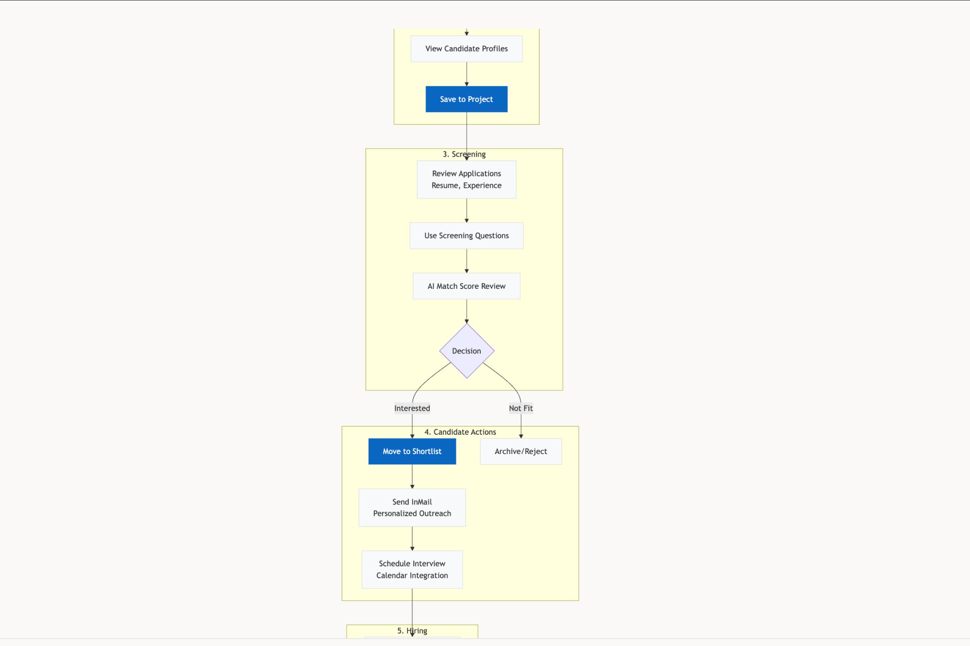
Visualizing The Path Forward
When you move from a gap to a real solution, you're following a clear, sequential flow where each step logically builds on the last.
This diagram shows how prioritized gaps get funneled into specific solution types, from high-ROI fixes to larger feature builds, and each requires its own tailored handoff package.
The economic impact here is significant. In the fast-paced world of SaaS, fit gap analysis has been shown to reduce project failure rates by up to 30% in major implementations. Even better, one analysis of over 500 product teams found that those using this technique during iteration phases saw a 25% improvement in product-market fit scores. You can discover more insights about these findings and their impact.
The quality of your handoff directly determines the quality of your execution. A rushed handoff creates a ripple effect of rework, questions, and delays.
A meticulous handoff turns ambiguity into alignment. Take the example of modifying a trip mid-ride in a service like Waymo. A simple feature request becomes a complex web of possibilities. A proper handoff kit, like these test cases for a mid-trip change, ensures every scenario is considered before a single line of code is written. It’s the ultimate form of "measure twice, cut once."
The takeaway is this: for your next project, create one definitive 'handoff kit' for a single prioritized gap. Don't just file a ticket. Build a package containing an updated user flow, a simple prototype, and five key test cases. This exercise will make the abstract process concrete and give your team a repeatable blueprint for clarity and speed.
Common Questions About Fit Gap Analysis
People often treat a fit gap analysis like a one-time renovation project, a massive effort you only undertake when the foundation is cracking. But this view misses the point entirely.
The most effective analysis isn't a singular event. It's a continuous diagnostic habit.
How Often Should You Really Run This Analysis?
Of course, a major, wall-to-wall analysis is crucial during a new system implementation or a complete product redesign. That's non-negotiable. But thinking of it only in those terms is a massive mistake.
The real leverage comes from integrating "mini" analyses into your regular product discovery cadence. Before kicking off any new feature epic, you should be running a quick, focused fit gap analysis on just the relevant user workflow. This lightweight approach keeps the product tightly aligned with evolving user behaviors without the crushing overhead of a formal, months-long project.
What’s the Biggest Mistake Teams Make?
The most common failure I see is treating fit gap analysis as a purely technical documentation exercise. The classic mistake is one person disappearing into a cave and emerging a week later with a giant spreadsheet of requirements. Nobody else understands it or feels any ownership. That artifact is dead on arrival.
A successful analysis is a strategic, cross-functional conversation from day one. It's not a deliverable; it's a shared understanding.
You absolutely need engineers, designers, and business stakeholders in the room together. This is the only way to ensure the "as-is" map is accurate, the "to-be" vision is feasible, and the prioritized gaps have real buy-in from the people who will actually have to close them.
Can You Use Fit Gap Analysis For Smaller Features?
Absolutely. The principles scale down perfectly, and honestly, it's a great way to build the muscle.
Imagine you're adding a "dual timezone display" to a scheduling app, a seemingly small enhancement.
The 'As-Is': Users are forced to manually calculate time differences, often leading to missed meetings.
The 'To-Be': A clear interface that shows both timezones automatically.
The 'Gap': The missing UI component and the logic to power it.
A quick analysis immediately prompts the critical questions that get missed otherwise.
Does the new component handle daylight saving correctly? Does it default to the user's browser timezone or a manually set one? How is the second timezone selected and displayed without cluttering the interface?
Applying the framework, even on this small scale, ensures you ship a complete solution, not a half-baked feature that creates a whole new set of user problems.
A fit gap analysis turns ambiguity into a clear roadmap. But the analysis itself can become the bottleneck. Figr accelerates this entire process by learning your live application, automatically mapping user flows, and generating the key artifacts—PRDs, prototypes, and test cases—that translate findings into action. It helps you ground every decision in your product's actual context, so you can stop guessing and start building what your users truly need. Explore how at https://figr.design.