
An hour after launch, the dashboard starts filling up. A few top-box ratings. One lukewarm middle score. Then the comment every product manager has seen and learned to dread: “It's fine.”
That's the moment you realize you collected responses, not insight.
Question design often takes the blame for poor results. While that is sometimes fair, a weak survey frequently fails before the first question appears. The customer satisfaction survey introduction gets treated like boilerplate, when it is the first experience of the research itself. Users decide in those first seconds whether this is a respectful request, a manipulative interruption, or a chore they will rush through.
I think of it as the survey's unboxing moment. Before anyone rates your product, they're rating your ask.
The Moment Before the Feedback
Last week I watched a PM send a post-release survey after a messy sprint. The team wanted signal on onboarding friction, but the intro said almost nothing beyond “Please complete this short survey.” No context. No reason this person had been selected. No indication of how the feedback would be used. The results were exactly what you'd expect: thin, cautious, forgettable.

The hidden mistake is simple. Teams treat the introduction as admin copy. Users experience it as a trust test. If the opening feels generic, they assume the survey is generic too. If it feels disconnected from what they just did in the product, they won't believe anyone plans to act on it.
That matters because the survey intro often sits inside a fragile moment. A customer may already be frustrated, confused, or mildly disappointed. According to customer satisfaction metrics research summarized by Drive Research, 80% of respondents would stop doing business with a company because of a poor customer experience, and 96% of consumers globally admit customer service determines their brand loyalty. A survey introduction can be the first touchpoint in that recovery loop.
The unboxing moment
A strong intro does four human things at once:
- It proves relevance: Why am I seeing this now?
- It lowers suspicion: Is this anonymous, and will anyone misuse this?
- It respects time: How long will this take?
- It creates consequence: Will this change anything?
If you want inspiration beyond generic popups, a library of all customer feedback examples can help you see how different teams phrase asks, acknowledge context, and invite honest responses.
The practical shift is to stop writing introductions like legal disclaimers and start writing them like product experiences. The same discipline you use to capture and analyze product feedback should begin at the first sentence, not after the survey closes.
The intro isn't a preface. It's the first question users answer silently: “Is this worth my attention?”
The Anatomy of an Irresistible Introduction
A good introduction is a compact. You ask for attention, and in return you offer clarity.

The structure doesn't need to be ornate. It needs to be complete. Survey best practices summarized by Hanover Research on customer satisfaction metrics recommend that introductions clearly state purpose and include demographic questions for segmentation, which helps teams measure General Satisfaction, Customer Perception, Customer Loyalty, and Likelihood to Recommend.
Purpose comes first
People give better feedback when they know what decision they're informing.
Bad opening:
“We value your feedback.”
Better opening:
“You recently completed onboarding. We're reviewing where setup feels unclear so we can improve the first-run experience.”
The difference is not politeness. It's specificity. The user understands why they were chosen and what kind of reflection you need from them.
Time estimate must be honest
Nothing destroys trust faster than “quick survey” copy attached to a slow, multi-screen form. If it's one minute, say one minute. If it includes an open text field and some branching, don't pretend otherwise.
A useful intro gives a real expectation:
| Element | Weak version | Strong version |
|---|---|---|
| Time | “Take a moment” | “This takes about 2 minutes” |
| Scope | “Tell us what you think” | “We're asking about your last support interaction” |
| Outcome | “Your input matters” | “We use these responses to prioritize fixes” |
Privacy language should sound human
Users don't need a wall of compliance text in the first screen. They need enough assurance to answer honestly. State whether responses are anonymous, whether data is aggregated, and whether any account information will be attached.
This is what I mean: privacy copy should reduce fear, not increase reading load.
Practical rule: if your privacy explanation sounds like terms and conditions, rewrite it until a busy PM could skim it in one breath.
End with a clear invitation
The call to action is often an afterthought, but it shapes momentum. “Start survey” is fine. “Share your experience” is better when you want reflection. “Help us improve onboarding” works when the purpose is concrete and immediate.
Demographic questions deserve the same care. They can be useful for segmentation, but they shouldn't appear to interrogate the user before trust exists. If you ask them, frame why they help and keep them relevant.
For teams who want to sharpen this kind of microcopy, a strong UX writing guide for product managers is often more useful than another survey template collection.
Writing for Humans Not Respondents
The fastest way to ruin a decent survey is to write it for “respondents” instead of people.
That sounds obvious, but you can see the difference instantly. One intro sounds like software generated it. The other sounds like a team that understands where the user is, what just happened, and why this interruption might be worth accepting.
A friend at a Series C company recently debated whether to ask for feedback in an in-app modal or via email. The team had just shipped a redesign to a complex billing workflow. The modal would catch users in the moment. The email would allow more thoughtful answers. Which one was right?
Both could work. Both could also fail.
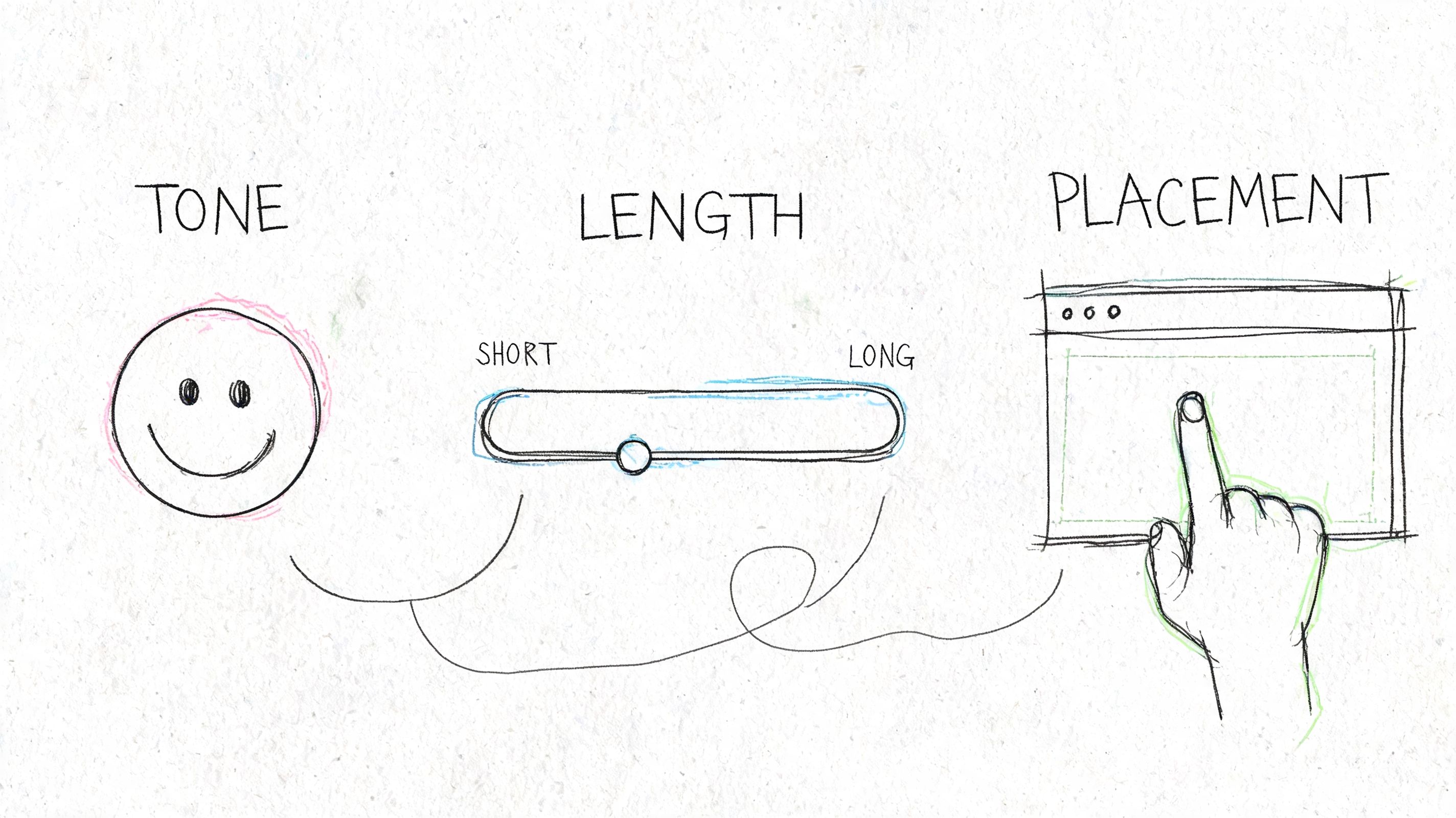
Tone is a product decision
If the user has just completed a task, conversational language usually performs better because it matches the rhythm of the moment. If the survey follows a support issue or billing problem, a more grounded tone works better than cheerful brand voice. Nothing feels stranger than breezy copy after a frustrating experience.
Ask yourself three things before writing the intro:
- What emotional state is the user likely in: relieved, annoyed, curious, rushed?
- What memory are you trying to capture: immediate friction or considered reflection?
- What relationship do you already have: new user, regular customer, or at-risk account?
Those choices belong in product strategy, not just copy review.
Placement changes the meaning
A survey shown right after a key action says, “We care about this moment.” A survey sent days later says, “We care about your considered judgment.” Neither is universally better.
But timing mistakes are expensive. Goodays' summary of common customer satisfaction survey mistakes notes that surveys sent within 30 days of each other can yield 20-40% more negative and less detailed responses. That's the operational cost of bombarding people instead of choosing moments that make sense.
Here's a simple decision frame:
| Channel | Best use | Main risk |
|---|---|---|
| In-app modal | Immediate task feedback | Feels intrusive if it blocks progress |
| Embedded post-action prompt | High-context reaction | Easy to ignore if visually weak |
| Longer reflection, richer comments | Loses context if sent too late |
The deeper point is behavioral. At scale, feedback systems become incentive systems. If customers learn that every meaningful interaction triggers another survey, they stop seeing feedback as influence and start seeing it as tax.
Keep intros short enough to survive reality
Mobile users skim. Busy users skim harder. Dense openings die on small screens because they ask too much before giving any value back.
A few cues help:
- Use one job per sentence: purpose, time, privacy, then invitation
- Avoid stacked gratitude: one “thanks” is enough
- Name the recent experience: support chat, checkout flow, onboarding, export, whatever happened
If your team is choosing among channels, this walkthrough is worth watching before you decide how broad or narrow your request should be.
The point isn't just to ask. It's to ask in a way that fits the user's moment. That's why the best teams treat survey intros as part of their broader methods for user research, not as an isolated pop-up managed at the end of a sprint.
A badly placed survey can make a healthy product feel needy.
Templates That Work and How to Adapt Them
Templates are useful right up to the moment they become invisible.
Most intros fail because they sound like they could have been sent to anyone. “Tell us how we're doing” is polite, but it throws away the one thing product teams have that generic survey software does not: context. Evidence summarized by Easy Feedback's survey examples discussion shows that personalization using product context can lead to 30-50% higher response rates.

The basic gist is this: start with a reusable pattern, then adapt the first sentence using the user's recent behavior.
Three base templates
Post-onboarding
Generic:
“Thanks for signing up. We'd love your feedback on your experience.”
Adapted:
“You just finished setup. We're reviewing what felt clear and what felt confusing during onboarding. This should take about 2 minutes.”
Why it works: it ties the ask to a completed milestone and narrows the memory window.
Feature-specific feedback
Generic:
“Please rate your satisfaction with our product.”
Adapted:
“You used the new reporting workflow today. We're checking whether it helped you complete the task you came for, or slowed you down.”
Why it works: it anchors the response to one workflow instead of forcing the user to average their whole product relationship.
Churn or cancellation
Generic:
“We're sorry to see you go. Please tell us why.”
Adapted:
“You canceled your plan today. If you're open to it, tell us what made the product stop fitting your needs. We review this feedback when prioritizing retention fixes.”
Why it works: it respects the moment and avoids pleading.
How to personalize without sounding creepy
The trap with contextual intros is overfitting. Just because you can reference every click doesn't mean you should. The line is simple: mention what helps the user orient, not what makes them feel watched.
Good personalization uses categories of behavior:
- completed onboarding
- tried a new feature
- contacted support
- abandoned a workflow
- downgraded or canceled
Poor personalization reads like surveillance:
- exact timestamps
- overly specific click trails
- references to behavior the user may not remember
A better structure looks like this:
| User context | Intro angle |
|---|---|
| New user | Clarify first-run friction |
| Power user | Ask about efficiency and edge cases |
| Recently blocked user | Focus on what prevented task completion |
| Returning inactive user | Ask what changed, or what pulled them back |
Adapt by segment, not just event
New users often need permission to be blunt. Power users need evidence that you can handle nuance. Someone who just hit an error needs a lower-friction ask than someone who finished a successful workflow.
That's why a reusable intro should have flexible parts:
- the triggering event
- the audience segment
- the promised outcome of the feedback
- the tone
For teams looking to formalize those patterns, Figr's VOC template is a useful reference point for organizing what you want to hear and when.
Generic surveys collect opinions. Contextual surveys collect usable product signal.
How to Know If Your Introduction Is Working
A survey introduction is not finished when it sounds polished. It's finished when the response pattern improves.
That means you need to evaluate the intro as a testable hypothesis. Did the wording create more starts? Did the new framing increase completion? Did open-ended answers become more specific, or just longer?
Snap Surveys' guidance on building customer satisfaction surveys points to two useful constraints. AI-generated intros under 50 words that adapt to user segments can increase NPS scores by 18%, and mobile-first surveys see a 25% abandonment rate from intros that exceed 75 words. The lesson isn't “use AI” by itself. It's that length and relevance are measurable variables, not stylistic preferences.
What to measure beyond response rate
Response rate matters, but it can flatter bad surveys. A forced in-app modal may get starts while still producing poor answers.
Track a fuller set:
- Start rate: how many users who saw the intro began the survey
- Completion rate: how many finished after starting
- Open-text depth: are comments specific enough to guide a decision
- Answer consistency: do scale ratings and comments align, or suggest confusion
- Segment variance: does the intro work similarly across user types and devices
A short internal review can reveal a lot. Read the first screen, then read ten comments from completed surveys. Are the comments tied to the moment you thought you were measuring? If not, the intro may be framing the task poorly.
What to test
You don't need elaborate experimentation to improve the opening. A few sharp comparisons are enough.
Try testing:
| Variable | Version A | Version B |
|---|---|---|
| Framing | Statement | Question |
| Context | Generic intro | Trigger-based intro |
| Length | Under 50 words | Longer explanatory intro |
| CTA | “Start survey” | “Share your experience” |
The most useful tests isolate one thing at a time. If you change tone, length, and placement all at once, you'll get movement without understanding.
Don't ignore accessibility and consent
A high-performing intro that excludes users is still a failed product decision. Keep language plain. Make sure screen readers can parse the entry screen. Avoid time estimates that create pressure if there's no save state. If demographic questions are sensitive, explain why they're asked and make optionality clear where appropriate.
Many of the same mistakes show up in broader measurement practice, which is why it helps to revisit the UX metrics teams often get wrong before turning survey data into roadmap confidence.
If your intro improves starts but weakens comment quality, you didn't improve the survey. You only made it easier to click.
Your Next Survey Will Be Different
Every survey is an economic exchange. You're asking for attention, memory, and honesty, all from someone who owes you none of them.
That's why generic introductions underperform. They ask for labor without demonstrating care. They sound mass-produced, even when the product team behind them is thoughtful. A stronger customer satisfaction survey introduction does the opposite. It shows the user you know which moment you're asking about, why their perspective matters, and what you intend to do with it.
There's also a systems lesson here. Teams often complain that customers give shallow feedback, but the feedback system itself trained that behavior. If the intro feels vague, people answer vaguely. If it feels targeted and respectful, they're much more likely to tell you what happened.
So don't redesign your entire research program this week.
Pick one survey you already send. Find one real behavioral trigger in your product, something like onboarding completion, a support resolution, or feature adoption. Rewrite the first sentence so it reflects that exact moment. Then compare the answers you get.
That's how you move from collecting ratings to collecting signal.
If you want to build feedback loops around real product context instead of generic forms, Figr helps product teams ground UX decisions in live app behavior, design systems, and actual workflow data so the next survey you ship starts from a better understanding of the moment you're asking about.
