It’s 10:15 AM on a Tuesday, right in the middle of a sprint. Your product management dashboard shows a perfect burndown chart, sloping down exactly as it should. Everything looks on track. Yet the engineering channel on Slack is quiet. Too quiet. A developer just admitted they spent three days on a task estimated at four hours.
Why the disconnect?
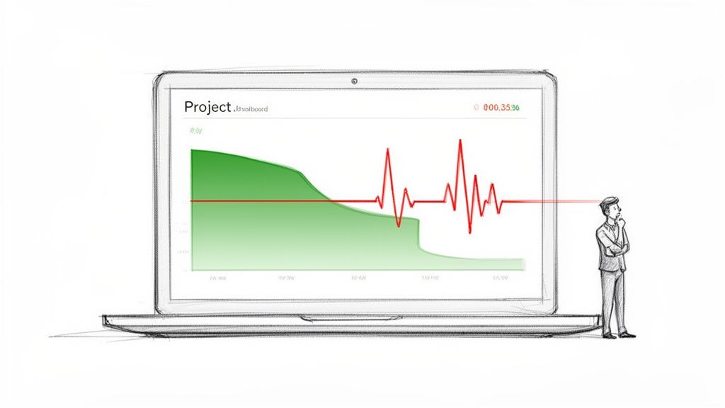
The problem was a string of unforeseen edge cases and API dependencies nobody caught during planning. This is why so many teams are rethinking their approach to agile development metrics. The dashboard looked green, but the reality felt red. It’s a classic case where the numbers paint a picture of progress that feels alien to the people doing the work.
This article is about reframing those metrics. It’s about shifting them from report cards for management to diagnostic tools for the team.
That shift changes everything.
From Speedometer to EKG
Think of your development process not as a conveyor belt, but as a biological system. Traditional metrics are the speedometer, telling you how fast the engine is churning. They measure raw output. That’s valuable, but it's only half the story. The most meaningful agile metrics are more like an EKG for your development process. They reveal its underlying health.
An EKG doesn't measure speed: it measures rhythm and stress. It tells you if the system creating the motion is healthy. Are there blockages? Is the rhythm steady? Is a catastrophic failure imminent? This is what modern agile metrics should do. They help you answer the real questions.
- Are we actually moving fast, or are we just busy?
- Are we heading in the right direction, or efficiently driving toward an iceberg?
- Is our process sustainable, or are we burning out the team to hit a number?
Last week, I saw a product leader celebrate a high velocity score. At the same time, their lead engineer was quietly planning a massive refactoring project to pay down the technical debt they racked up chasing that score. The speedometer read 120 mph, but the EKG showed a system under dangerous strain.
This is what I mean: one set of numbers tells you if you're moving, the other tells you if you'll actually arrive at your destination in one piece.
Team Motion vs. Customer Progress
It's the end of the sprint. The burndown chart looks perfect, velocity is trending up, and a mountain of tickets sits in the "Done" column. That’s Team Motion. But did any of it actually ship? Can a customer log in and use it? That’s Customer Progress.
Confusing the two is the most common way agile metrics send otherwise great teams chasing the wrong things.
The Restaurant Kitchen Analogy
Imagine your product team is a restaurant kitchen. A customer places an order: that’s the moment a need is born. The second their food arrives at the table, hot and ready, is the moment value is delivered.
Everything in between is just process.
Lead Time is the total time from when the customer places their order to when the food arrives. It’s the full, end-to-end customer experience. It’s their perception of your speed.
Cycle Time is the time from when the chef starts cooking the dish to when it’s ready on the pass. This is just the "active work" part of the process.
Too many teams obsess over Cycle Time. They celebrate trimming the cooking time from 10 minutes down to 8. Fantastic. But what if the ticket sat on the rail for 30 minutes before the chef even saw it? Or what if the finished dish sat under a heat lamp for 15 minutes because a server was busy? The customer doesn’t care about the chef's personal best, they just know they waited 53 minutes for their meal.
Optimizing one part of the system in isolation doesn't create speed, it just moves the bottleneck. The goal isn't to complete tasks faster. It's to deliver value sooner.
I once watched a product manager celebrate a massive spike in team velocity. They were closing story points at a record clip. The problem? Those "done" features were piling up in a QA and deployment queue for weeks. Sales was promising features that technically existed in a code repository but were invisible to customers, creating a storm of frustration for everyone.
They were measuring the sizzle in the pan, not the satisfaction at the table.
Introducing Flow Metrics
This is where Flow Metrics change the game. They force a shift in focus from internal activity (like story points) to the observable flow of value all the way to the customer. They are the core of modern agile development metrics because they measure the entire system, not just the people working in it.
By focusing on Lead Time and Cycle Time, you start asking much better questions.
- Where is work just sitting and waiting?
- What's the biggest delay between "in progress" and "in the customer's hands"?
- Is our process a smooth-flowing river, or a series of stagnant ponds?
The best teams use metrics to see their process through their customer's eyes. They know a completed task provides zero value until it's delivered. This journey starts the moment a need is identified, which is why a solid process for how to collect customer feedback is the true starting line for any meaningful metric.
How To Diagnose Your Development Workflow
If your development process is an engine, then metrics are your diagnostic gauges. But to truly understand what's happening, you need to look at the traffic, not just the engine. Think of your workflow as a highway system. How many cars are getting to their destination, and how much time are they spending stuck in traffic?
This is where a few critical agile development metrics come into play. They don't just measure a single car's speed, they diagnose the health of the entire system.
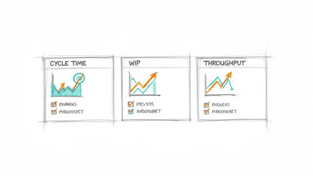
Throughput: The Rate of Arrival
Throughput is the number of work items finished per unit of time. It’s the highway equivalent of counting how many cars pass a specific exit every hour. It’s not about how fast any single car is going, it’s about the total volume of successful arrivals.
A team might complete 5 features in one sprint and 8 in the next. Their throughput is a simple count. It is a direct measure of output and, when tracked over time, becomes a powerful forecasting tool. Are we delivering more or less value this quarter than last? Throughput gives you the raw, unfiltered answer.
Work in Progress: The Cars on The Highway
Work in Progress (WIP) is the number of tasks your team is actively working on at any given moment. On our highway, this is the total number of cars currently between the on-ramp and their destination. It’s a measure of system load.
This is the metric most teams ignore, and it’s the one that silently kills productivity. A high WIP limit is like letting too many cars onto the highway at once. What happens? Gridlock. Everyone slows down. Some cars might even break down from the stop-and-go stress.
In a development team, this translates to cognitive overload and constant context switching. When a developer is interrupted, it can take over 23 minutes to regain focus. When a team has 20 items "in progress," it means each developer is juggling multiple tasks, losing precious time with every switch.
This concept map visualizes how team motion (activity) must flow through a value delivery system to become real customer progress (outcomes).
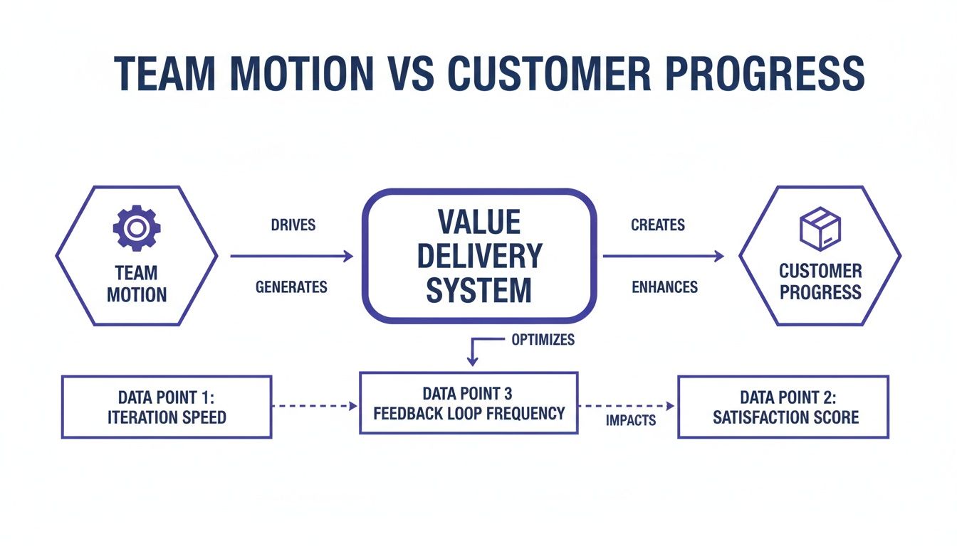
The diagram shows that metrics like WIP and Cycle Time are gatekeepers that determine how efficiently motion becomes value.
A friend at a Series C company told me their team cut their cycle time in half within a month. Their secret? They enforced a strict WIP limit. The team initially resisted, feeling it would slow them down. In reality, it forced them to focus, collaborate to finish tasks, and stop starting new work until old work was delivered. The highway cleared, and everyone got to their destination faster.
Flow Efficiency: The Percentage of Time Moving
Flow Efficiency is the ultimate diagnostic. It measures the percentage of time a task is being actively worked on versus the total time it spends in your system (its Cycle Time). In our analogy, it's the ratio of time a car spends driving compared to the time it spends sitting in traffic jams.
Flow Efficiency = (Active Work Time / Total Cycle Time) x 100
A low Flow Efficiency score reveals that your process is full of waste. The work is just waiting. Waiting for review, for QA, for deployment, for a decision. It exposes the "traffic jams" in your workflow.
For many teams, it’s a shocking revelation to find their Flow Efficiency is below 15%. This means a task that took two weeks to complete only received about 1.5 days of actual, hands-on-keyboard work. To effectively diagnose these bottlenecks, exploring various developer productivity tools can provide valuable insights into where time is being lost.
The basic gist is this: to improve your speed, you don't necessarily need to code faster. You need to eliminate the waiting. For a deeper look into the components of this metric, you can check out our guide on the cycle time calculation formula. Focusing on Flow Efficiency moves the conversation from "why aren't you working faster?" to "what is stopping the work from flowing?". That is a much more productive question.
Measuring The Predictability And Quality Of Your Work
It’s the end of the sprint review. The velocity chart is up and to the right, and the ticket count looks impressive. A week later, the support channel is on fire. A new feature, rushed to meet a goal, is causing a cascade of failures for your most active users.
This is the moment speed becomes an illusion. Driving fast is pointless if the wheels are about to fall off. The most mature agile teams get this: flow metrics are only half the story. The other half is about predictability and quality, making sure what you ship actually works and that your team can accurately forecast what it can do.
The Master Chef's Final Inspection
Think of your team as a master chef running a high-end kitchen. The chef doesn't just cook fast, they taste as they go. There's a meticulous process of quality control at every station, all leading to a final inspection before any dish leaves the kitchen. That final look is the difference between a happy diner and a returned plate.
In software, two key agile development metrics act as this final quality check.
- Change Failure Rate (CFR): This shows how often a deployment to production causes a failure. It’s a direct signal of your deployment process’s stability. A high CFR is like a chef who constantly has to remake dishes because they were plated wrong.
- Escaped Defect Rate: This tracks the number of bugs found by users in production, not by your internal QA process. These are the most expensive and trust-eroding bugs. They are the equivalent of a chef sending a dish with an undeclared sprinkle of almonds to a diner with a nut allergy.
I once saw a team obsessively optimize for velocity. Their story point completion went through the roof, but so did their escaped defect rate. The product became so unstable they had to halt all new feature work for an entire sprint, a "bug bash," just to fix what they had broken. They hit their speed targets but sacrificed customer trust to do it.
Predictability as a Forecasting Muscle
The other side of the quality coin is predictability. This isn't about making rigid, unbreakable commitments. It’s about building a team’s ability to reliably forecast what they can accomplish.
Sprint Predictability measures the ratio of work a team commits to versus what they actually deliver in a sprint. A team that consistently hits 80-90% of its forecast has a stable, predictable process. A team with volatile predictability, swinging from 50% one sprint to 120% the next, is likely struggling with unclear requirements, surprise blockers, or just plain bad estimation.
Predictability isn't about hitting a target for a manager's report. It's about earning the trust of the organization by demonstrating that you understand your own workflow. It’s the foundation for making reliable promises.
Here's what I mean: a predictable team can confidently tell leadership a major feature will be ready in Q3, and leadership can build a launch plan around that promise. An unpredictable team forces the entire organization into a reactive state, constantly adjusting plans based on last-minute surprises.
The key to improving predictability isn't working harder, it's thinking deeper. A team building a file upload feature can proactively map every potential failure state before writing a single line of code. This includes everything from network drops to permission errors. This proactive analysis, which you can explore in this Dropbox Failure States map, prevents these issues from becoming escaped defects later.
This zoom-out moment reveals a fundamental economic truth: fixing a bug in production is exponentially more expensive than preventing it during design. Predictability isn't just an engineering metric, it’s a measure of capital efficiency. By investing in upstream quality, you reduce downstream costs. For teams looking to formalize this process, exploring methods for continuous quality improvement can provide a structured path forward.
Turning Raw Metrics Into Actionable Insights
Metrics are just numbers until you use them to make a decision. A dashboard full of charts is useless if it doesn’t change how your team behaves. This is about bridging that gap, turning the raw data from your agile development metrics into real, actionable insights.
The practice of measuring work is a delicate instrument. Handled poorly, it becomes a weapon. This is the zoom-out moment. Most metric initiatives fail because they’re treated as a report card for management. This creates powerful incentives to game the numbers, turning a useful diagnostic tool into a performance.
A friend at a Series B company once told me their team’s cycle time magically dropped by 40% in a single quarter. How? Engineers simply started marking tickets "in progress" later and "done" earlier. The measured time shrank without the actual workflow changing one bit.
They weren't delivering value any faster.
They were just getting better at the game.
From Report Card to Mirror
The basic gist is this: to avoid gaming the system, the data must serve the team first. The goal isn't to report up, it's to reflect back. When teams own their metrics, they use them to self-correct rather than to impress. Visualization is the key to making this shift happen.
Two powerful visualization tools can transform abstract numbers into a tangible story about your workflow: Cumulative Flow Diagrams and Control Charts. They are the mirrors that show a team not just what happened, but how it happened.
The Cumulative Flow Diagram: Your Workflow X-Ray
A Cumulative Flow Diagram (CFD) is your workflow's living history. It tracks the total number of work items in each stage of your process over time. Imagine colored bands stacking on top of each other, where each color represents a status like "To Do," "In Progress," or "In Review."
A CFD doesn't just show you progress, it reveals the physics of your system. The shape of the bands tells you where work is flowing and, more importantly, where it is getting stuck.
For instance, a CFD with a constantly widening ‘In Progress’ band is a visual alarm that your Work in Progress (WIP) is too high. It’s the graphical equivalent of a traffic jam. The team doesn't need a manager to point it out, they can see the blockage forming themselves. You can see how many "in-between" stages can exist and cause hidden queues in artifacts like this task assignment example.
The Control Chart: Finding Your Rhythm
If a CFD shows the volume of work, a Control Chart shows its predictability. It plots the cycle time for every task your team completes, showing exactly how long each piece of work took from start to finish. The chart includes a mean and standard deviation lines, revealing the natural rhythm of your delivery.
A control chart with dots clustered tightly around the average shows a predictable, stable process. A chart with dots scattered wildly shows an unpredictable system plagued by interruptions. As Donald G. Reinertsen outlines in The Principles of Product Development Flow, managing and visualizing queues is one of the most critical factors in improving development speed and predictability. When you're measuring predictability, statistical tools like the five-number summary can give you quick insights into your data's distribution and flag potential issues.
This completely changes the conversation in retrospectives. Instead of a vague discussion about "why are we so slow?", a team can point to a specific dot on the chart and ask a much better question:
"What caused the cycle time of this specific task to spike to 12 days last Tuesday?"
That question doesn't seek a culprit. It seeks a cause. It turns blame into curiosity and defensiveness into diagnosis. This is how raw numbers become collective wisdom.
Building Your First Meaningful Metrics Dashboard
It’s the end of a long retrospective. The team has debated feelings and anecdotes for 90 minutes. You leave the room with a vague sense that things could be better, but no clear idea of where to start. This is the moment most improvement efforts die.
The way out is to stop guessing and start measuring. But the thought of implementing a full suite of agile development metrics can feel overwhelming. The key is to resist the urge to measure everything.
Start with just three.
Your Starter Pack: The Essential Trio
Don't boil the ocean. Begin with the vital signs of your workflow. These three metrics, when viewed together, provide a surprisingly clear picture of your system's health.
- Cycle Time: How long does it take for work to get done, from start to finish? This tells you your actual speed.
- Work in Progress (WIP): How many tasks are you juggling at once? This tells you your level of focus.
- Throughput: How many work items are you completing per week or sprint? This tells you your actual output.
That’s it. Think of this as your dashboard’s first version. It won't be perfect, but it will be real. It replaces subjective feelings with objective data, giving your team a common language to discuss what’s actually happening.
A Four-Step Plan to Get Started
Getting this initial dashboard running is simpler than you think. It's a small project that pays dividends almost immediately by making your process visible.
Here's a simple, four-step checklist to get you from zero to one.
- Define Your Workflow Stages Clearly: Get the team in a room and agree on the exact steps a task goes through. What does "In Progress" actually mean? When is something truly "In Review"? Write it down. A shared understanding of the process is the foundation for any meaningful measurement.
- Instrument Your Project Management Tool: Configure your tool (like Jira, Linear, or Azure DevOps) to track the time an item spends in each of those defined stages. Before you can measure a process, you must understand it. This detailed UX audit comparing task creation in Linear versus Jira shows precisely how tool design impacts the workflow you'll eventually measure.
- Build a Simple Dashboard: Use your tool's built-in analytics or a simple spreadsheet to visualize the three core metrics. Don't aim for a masterpiece. A basic line chart for Cycle Time and a simple bar chart for Throughput is more than enough to start.
- Dedicate Time for Review: This is the most critical step. Block 15 minutes in every single retrospective to look at the dashboard as a team.
This last step is where the magic happens. The goal of the review isn't to judge or assign blame. It's to foster curiosity.
Ask one simple question: "What is the most surprising thing these numbers show us this week?"
This question invites observation, not accusation. It turns the metrics into a conversation starter, a neutral third party in the room that simply reflects reality. This approach aligns with research showing that a balanced set of metrics is most effective. For instance, combining flow metrics with estimation helps ground empirical data with forward-looking analysis. You can explore the latest research on agile metrics to learn more about this balanced approach.
In short, the goal is not to have perfect data from day one. It is to start a conversation grounded in objective reality. That conversation, more than any single metric, is what will ultimately improve your team's performance.
Ready to turn your product thinking into production-ready artifacts? Figr is an AI design agent that helps product teams generate PRDs, user flows, edge cases, and high-fidelity prototypes that mirror your existing product. Stop staring at a blank canvas and start shipping faster. Learn more at https://figr.design.
