
Monday morning, 9:12 a.m. The weekly dashboard is open, the launch recap is still pinned in Slack, and nothing looks catastrophic. No outage. No pricing fire. No public complaint spiral. But active customers are thinning out anyway. A few cancel this week. A few more next week. Revenue doesn't collapse. It erodes.
That's the kind of problem experienced product teams learn to fear.
I watched a PM deal with this exact shape of ambiguity not long ago. She had solid growth, a busy roadmap, and a customer success team that could point to dozens of healthy accounts. Yet renewals kept getting softer around the edges. Her question wasn't “Are we losing users?” She knew that. Her question was harsher: “Why didn't we see the pattern sooner?”
That's really what what is churn analysis comes down to. It isn't a vanity report or a monthly retention ritual. It's the disciplined practice of finding the pattern inside customer departure, then turning that pattern into product action.
The best teams don't treat churn as a single number. They treat it as a signal system.
The Slow Leak No One Is Watching
A retention problem rarely starts with a cancellation screen. It starts earlier, in small behavioral changes that look easy to dismiss during a busy week.
A customer finishes setup but never reaches a repeat-use habit. Another account stops adding teammates after the initial rollout. A previously active buyer still logs in, but touches fewer core workflows each week and then leaves at renewal. By the time churn shows up cleanly in revenue reporting, the product has usually been broadcasting warning signs for weeks.
That is why churn analysis matters to product teams. It turns scattered signs of disengagement into a usable decision system, so PMs can act before loss shows up as a finance problem.
Churn is a behavior story, not just a finance metric
Board decks flatten churn into a single percentage. Product work cannot. Useful churn analysis breaks the problem into four operational questions: which users are leaving, what changed before they left, which accounts now resemble that pattern, and which intervention is likely to change the trajectory. Those questions connect analytics directly to product choices.
Teams miss this when they treat churn as one blended rate. A single number can hide several different failure modes at once: weak onboarding for new accounts, unmet workflow needs for expanding teams, or poor fit between the promise made in acquisition and the product users meet. The right response is different in each case.
Practical rule: If your dashboard reports one aggregate churn rate, your team is measuring the outcome and obscuring the cause.
Early exits usually point to a trust break
Timing is often the clearest clue. Recent cohorts that fade quickly after activation usually signal friction near the first-value experience, misaligned expectations, or a rollout that shipped before the path to value was stable. The pattern is easy to miss in top-line retention charts and obvious once you examine cohorts and account behavior, which is why guides on how to analyze customer churn are more useful when they connect loss patterns to specific moments in the user journey.
That is also why onboarding gets so much scrutiny in serious churn work. If users disengage soon after activation, the problem often sits in the first lived experience of the product: unclear setup, delayed value, too many steps, weak team adoption cues, or no convincing reason to return. Product teams that want to reduce early churn usually revisit onboarding flows, activation milestones, and guided setup. Work like transforming user onboarding from abandoned to loved becomes relevant because retention improvement often starts with design changes, not with a better churn report.
Churn analysis is useful when it does more than name the leak. It should tell PMs where the promise broke, which users felt it first, and what product change is worth testing next.
The Language of Departure Key Churn Metrics
Monday morning, the dashboard shows that churn has increased. Finance is concerned about recurring revenue. Customer success is worried about renewals that appear shaky. Product is observing usage declines and debating whether those accounts have churned yet.
All three teams may be right. They are just measuring different forms of departure.
That distinction matters because remediation depends on the metric. If PMs treat every loss signal as the same problem, they ship the wrong fix. A pricing issue gets sent to onboarding. A weak expansion path gets mislabeled as retention. A segment with low product fit disappears inside an average.
Start with the baseline everyone should define the same way
Customer churn rate measures the share of customers lost from the group you started with during a given period:
(Customers Lost During Period / Total Customers at Start of Period) × 100
The denominator is the trap. Teams often mix start-of-period customers with end-of-period counts, or they include newly acquired customers and dilute the result. Once that happens, trend lines stop being comparable across months, and any dashboard built on top of them becomes harder to trust.
A stable formula is not analytics hygiene. It is decision hygiene.
Customer churn, revenue churn, and net retention answer different operating questions
These metrics sit next to each other on dashboards, but they point to different product problems.
| Metric | What it tells you | What it can hide |
|---|---|---|
| Customer churn | How many accounts left | Whether the lost accounts were low-value or strategically unimportant |
| Revenue churn | How much recurring revenue left through cancellations or downgrades | Whether losses are concentrated in a specific cohort, plan, or use case |
| Net retention | Whether expansion offsets contraction and churn inside the existing base | Which product behaviors created the outcome |
A product can keep logo churn in check while losing expansion room inside mature accounts. It can also lose a visible number of small customers while preserving revenue quality. Those are not equivalent situations, and they should not trigger the same roadmap response.
Net retention is especially useful because it forces PMs to look past account counts. The standard SaaS formula is:
[(Starting MRR + Expansion - Contraction - Churn) ÷ Starting MRR] × 100%
The practical read is simple. If net retention weakens while customer churn stays flat, the problem may sit in plan fit, feature packaging, seat expansion, or perceived value after initial adoption. The account is still there. The product is capturing less of the opportunity.
For teams that want cleaner operating context around these signals, it helps to pair churn reporting with key UX metrics for product teams. Usage depth, task success, and repeat engagement often explain why a retention metric moved before a cancellation record appears.
A metric only earns space on the dashboard if a team can act on it
This is the standard I use when reviewing churn dashboards with PMs. Every metric needs an owner, a likely failure mode, and a plausible product response.
If customer churn rises in recently acquired self-serve accounts, inspect activation friction and expectation-setting. If revenue churn is concentrated in one pricing tier, review packaging, downgrade paths, and whether the promised workflow is being adopted. If net retention slips in otherwise healthy enterprise accounts, check for stalled seat expansion, weak cross-team usage, or missing admin value that limits broader rollout.
That is also why churn analysis works best when product and customer success share the same scorecard. Resources that explain how to track metrics with Sift AI are useful here because instrumentation only matters if the team can connect a number to a repeatable intervention.
Good churn analysis does not stop at naming the loss. It separates the kind of loss, ties it to a product mechanism, and gives PMs a sharper brief on what to change first.
Four Lenses for Viewing Why Users Leave
Monday's dashboard shows churn up three points. Revenue is still on plan, support volume looks normal, and no single feature release explains the shift. This is the moment when a blunt churn rate stops being useful. PMs need a view that isolates where retention is failing, for whom, and which product decision likely caused it.
The four lenses I keep returning to are cohort behavior, timing, workflow drop-off, and root-cause segmentation. Together, they turn churn analysis from a reporting exercise into a diagnosis your team can act on.
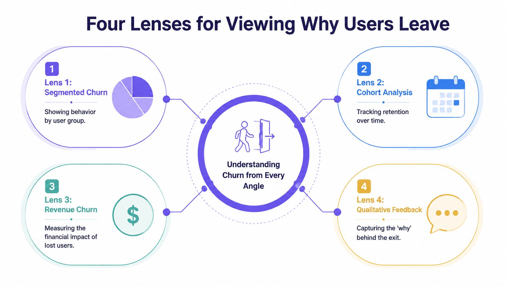
Cohorts show whether your product is getting better for new customers
Cohort analysis groups users by a shared start point, usually signup, activation, or first payment, then compares how retention changes across those groups over time. That comparison matters because aggregate churn can hide a product that is improving for one segment while failing for another.
Chargebee's guide to retention cohorts explains how cohort tables expose contraction and retention differences across acquisition periods, which is exactly why PMs should read them alongside release history and go-to-market changes. If a March cohort activates well but a May cohort falls off in week two, the issue often sits upstream of cancellation. A pricing page changed. Onboarding added friction. Sales started promising a workflow the product does not support cleanly yet.
Good cohort work does more than answer, “Are newer users churning more?” It helps you tie a retention drop to a specific change window, then turn that finding into a product investigation.
Timing shows when intervention still has a chance to work
Survival analysis examines how churn risk changes across the customer lifecycle. It is useful because the same churn rate can come from very different patterns. One product loses users in the first ten days. Another keeps accounts stable until renewal, then loses them in a cluster tied to weak expansion, trust issues, or procurement friction.
That timing changes the playbook.
If risk spikes before users complete setup, the fix usually lives in activation design, setup defaults, and guided workflows. If risk spikes close to renewal, PMs should inspect realized value, admin visibility, reporting credibility, and multi-user adoption. Teams that skip this lens often overinvest in broad engagement campaigns when the underlying problem is a narrow failure window.
A churn event usually starts before the cancellation date. Product teams need to find the slide while there is still time to change the outcome.
Funnel analysis isolates the workflow that breaks retention
Funnel analysis connects churn to a concrete user path. Signup to activation. Activation to first outcome. First outcome to repeated use. Team creation to collaboration. Each step narrows the problem from “retention is down” to “users are stalling at this handoff.”
That level of precision is what makes churn analysis useful to product teams. A high drop-off between integration setup and first report suggests implementation friction. Strong first-use rates paired with weak second-week return often point to shallow value or poor habit formation. Those are different product problems, and they require different fixes.
Funnels get sharper when event data is paired with direct observation. Teams often find the core failure in session reviews, support transcripts, and onboarding calls, especially when they are identifying patterns in text and video alongside quantitative drop-off. The event says users abandoned the workflow. The qualitative evidence explains why.
Root-cause segmentation identifies which users are leaving for the same reason
Root-cause segmentation groups churn by shared traits or behaviors such as plan type, acquisition source, account maturity, feature adoption pattern, support burden, or team structure. The point is not to create more slices. The point is to separate different churn mechanisms that are being averaged together.
A self-serve account that never activates should not sit in the same bucket as a mature enterprise workspace that fails to expand. One is often an onboarding and expectation-setting problem. The other may reflect missing admin controls, weak cross-team collaboration, or unclear ROI for broader rollout.
This lens becomes far more useful when PMs review behavior in product context rather than reading static event counts. Teams doing analyzing real product context with Figr can connect segment-level churn patterns to actual interface decisions, workflow dead ends, and moments of confusion. That is where analysis starts informing remediation, not just reporting loss.
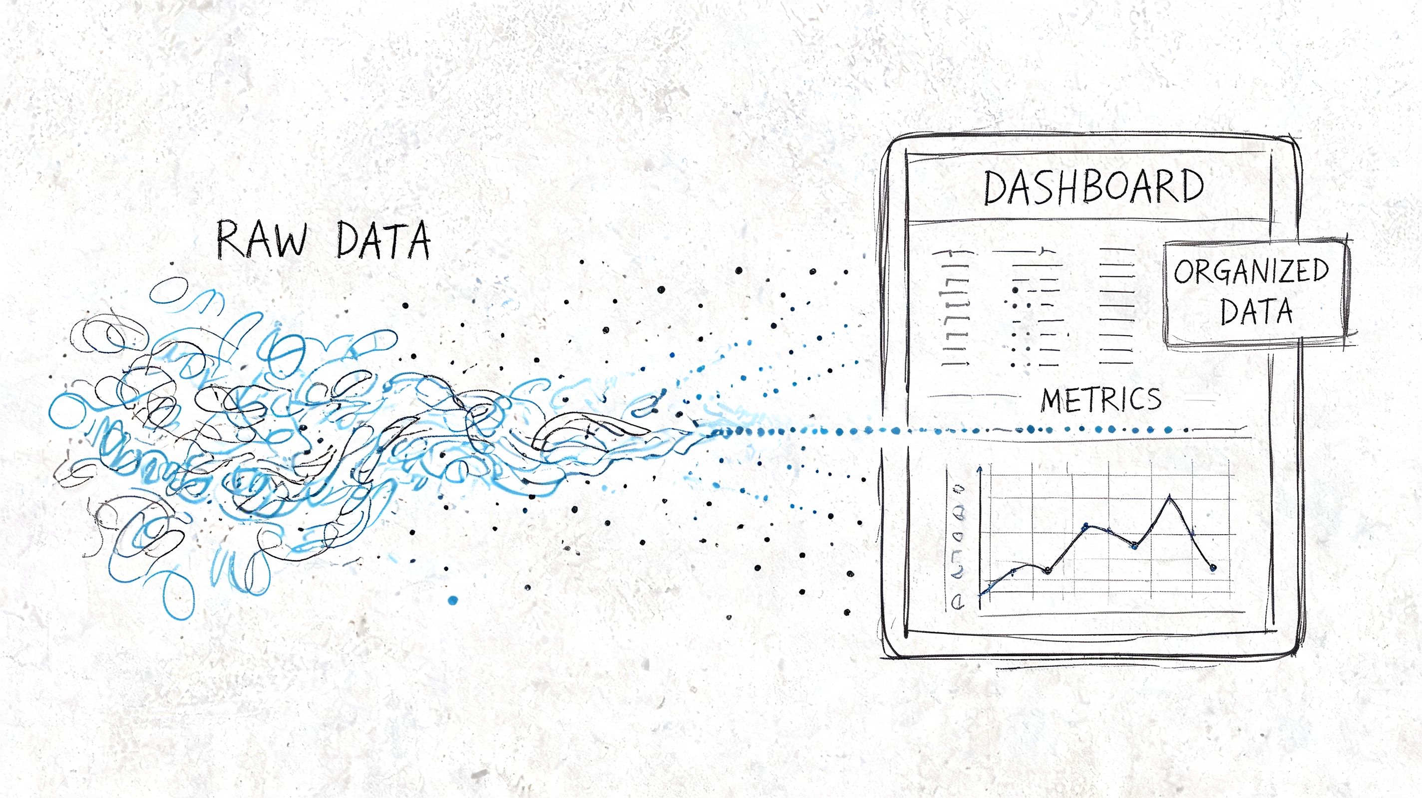
Running the Analysis From Data to Dashboard
On Monday, the dashboard says churn rose. By Tuesday, three teams have three different explanations. Support blames ticket backlog. Marketing points to lead quality. Product suspects the last release. Without a shared analysis path, churn becomes a debate about opinions instead of a diagnosis tied to user behavior.
The job here is to reduce ambiguity. A useful churn workflow does two things well: it defines the customer state changes that matter, and it shows them in a form PMs can act on without translating a warehouse schema in their heads.
The minimum viable dataset
Start with enough structure to answer one question clearly: who left, when, and what changed before they left?
That usually means five data groups:
- Customer identity: a stable account or workspace ID
- Lifecycle dates: signup date, activation date, cancellation date
- Plan context: pricing tier or revenue band
- Behavioral events: the actions that represent adoption in your product
- Support and friction signals: tickets, skips, pauses, complaints, or failed setup steps
Those fields rarely live in one system. Billing may own cancellation dates, product analytics may own usage, and support may own the clearest evidence of friction. Waiting for a perfect pipeline is usually a governance choice disguised as rigor. PMs can do meaningful churn analysis long before the data model is polished, as long as IDs match and event definitions are stable.
If a team wants to move from descriptive analysis into prediction later, the next layer usually involves feature selection, class imbalance handling, and validation. IBM's overview of customer churn analysis is a better reference point for that progression than a dashboard tutorial. For product teams, the immediate value comes earlier. You need a retained-versus-churned view that can be tied back to product decisions.
A simple cohort query PMs can reason about
A first query should answer a plain-language question. Do customers from one signup period leave faster than customers from another?
WITH customer_cohorts AS (SELECTcustomer_id,DATE_TRUNC('month', signup_date) AS cohort_month,DATE_TRUNC('month', cancellation_date) AS churn_monthFROM customers),cohort_activity AS (SELECTcohort_month,churn_month,COUNT(*) AS customersFROM customer_cohortsGROUP BY 1, 2)SELECT *FROM cohort_activityORDER BY cohort_month, churn_month;This query is simple by design. It creates a shared artifact that product, engineering, and customer success can inspect together. Once the cohort pattern is visible, the next questions become sharper: did a release change time-to-churn, did a pricing shift affect one segment, did activation slip for newer accounts, did support burden rise before cancellations increased?
That sequence matters. Teams often build a dashboard full of filters before they agree on the decision each chart should support.
What the dashboard should actually show
A churn dashboard should help a PM decide where to intervene first. It should not try to summarize every retention question in one screen.
I start with four views:
| View | What to look for |
|---|---|
| Cohort heatmap | Darkening loss in early months for newer cohorts |
| Retention curve | The point where active accounts drop sharply |
| Segment comparison | Whether one plan, persona, or industry leaves faster |
| Support overlay | Whether churn aligns with ticket volume or specific issue types |
Each view answers a different product question. The cohort heatmap shows whether the problem is getting worse for newer customers. The retention curve isolates timing, which is often more useful than aggregate churn because it points to onboarding, habit formation, or renewal risk. Segment comparison tells you where to focus discovery. The support overlay keeps the team honest when product friction is being absorbed by humans instead of fixed in the interface.
A strong dashboard also connects operational inputs to customer outcomes. That is why Figr's guide to tracking design velocity belongs in the same planning conversation. If redesigns, experiments, and fix cycles are invisible, PMs can spot churn but still fail to reduce it.
One rule is easy to ignore and expensive to violate: every chart should map to a likely product action. If early retention drops after a setup redesign, review the setup path. If one segment churns after repeated permission errors, fix roles and admin controls. If support tickets spike before cancellations, reduce the source of confusion instead of staffing around it.
If you want a quick visual explanation of how these dashboards come together, this walkthrough is a decent starting point:
What Your Churn Is Telling You
Monday morning, the dashboard looks stable. Overall churn barely moved. By Thursday, the PM responsible for onboarding is explaining why a "simpler" setup change produced a wave of cancellations in accounts created two weeks earlier. The average hid the damage. The cohort timing exposed it.
That is the job of churn analysis at this stage. It turns a loss metric into a product diagnosis.

Good interpretation starts with mechanism
Teams get stuck when they label churn as a pricing problem, a market problem, or a customer success problem too early. The better question is narrower: what experience changed before users left, and which users felt it first?
A few patterns show up often enough to deserve disciplined attention:
- Early churn clustered near activation usually points to setup friction, unclear first-run guidance, or a product promise that takes too long to become real.
- Churn concentrated in one segment usually means the product fits that group worse than your pipeline suggests. Sales may have pulled in demand the product cannot support well.
- Customer churn holding steady while revenue churn worsens often means larger accounts are keeping seats but reducing spend, downgrading plans, or failing to expand because the product is no longer earning broader adoption.
- Support demand rising before cancellations usually means users are working around product confusion until the cost of that effort outweighs the value they get.
These are not conclusions. They are working hypotheses with product implications. Strong PMs treat each pattern as a testable explanation tied to a specific workflow, release, or unmet job to be done.
Reading rule: Start with what changed in user experience, adoption, or perceived value. The percentage alone rarely identifies the cause.
Benchmarks are useful for context, weak as a verdict
External benchmarks can keep teams from overreacting to normal category behavior, but they are a poor substitute for product judgment. A churn rate that looks ordinary for your market can still signal a serious design or positioning problem if the losses cluster around a specific moment in the journey.
That is why the shape of churn matters more than the headline number. If cancellations spike after setup, fix setup. If they appear after a feature handoff between admin and end user, fix role clarity and permissions. If they arrive at renewal after months of low engagement, the issue probably started far earlier than the contract date.
Benchmarks tell you whether you are unusual. They do not tell you what to change on Monday.
The strongest signal links departure to a product event
Useful churn analysis creates a chain of evidence. A release ships. Activation slows. Support contacts rise for one workflow. A newer cohort leaves earlier than the prior one. That sequence gives a PM something to investigate and a designer something to redesign.
The same logic applies beyond onboarding. A segment that churns after repeated reporting failures may not need better email nudges. It may need a simpler reporting model, clearer defaults, or fewer dependencies between teams. An enterprise account that never reaches steady usage after security review may have bought the product, but not trusted it enough to roll it out thoroughly.
Churn analysis extends beyond simple reporting by providing direct input for product design. Teams using AI solutions for digital product leaders can speed up pattern detection, yet the primary value comes from connecting those patterns to decisions about flows, permissions, defaults, messaging, and roadmap priority.
When you can tie churn to a broken moment in the product, the conversation changes. You are no longer debating whether churn is high. You are deciding which experience is causing avoidable loss.
The Remediation Playbook for Product Teams
Monday morning. The dashboard shows churn up again, support is asking for a fix, and sales wants a save play. The wrong response is a broad retention initiative with six owners and no testable hypothesis. Product teams get better results when they treat churn patterns as design problems tied to a specific user moment.
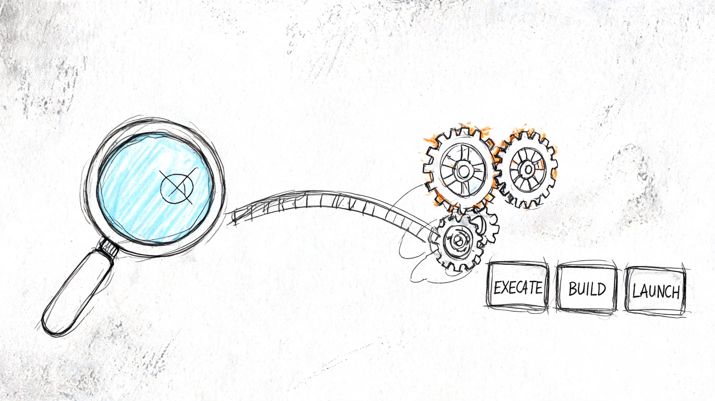
A useful remediation playbook answers one question: which product change should this team ship first, and how will we know it worked?
If you see this, do this
| Churn signal | Product response |
|---|---|
| Newer cohorts churn earlier than older ones | Review onboarding steps, activation copy, and release changes introduced for those cohorts |
| One segment leaves faster than others | Check segment fit across roadmap, packaging, and sales handoff. Then redesign for the job that segment actually hired the product to do |
| Drop-off inside a key workflow | Simplify the step, remove unnecessary choices, and test a shorter path to task completion |
| Users stall after repeat pauses or skips | Add a targeted re-engagement prompt and remove the blocker causing the pause |
The pattern behind many retention problems is not the first success. It is the second commitment. A user creates one report but never creates another. A team invites one colleague but never completes rollout. A customer connects one integration but stops before the workflow becomes routine.
That is the point where interest either becomes habit or expires.
Product teams often overreact here. They launch pricing reviews, retention councils, and broad lifecycle campaigns before checking whether one broken step is doing most of the damage. In practice, the higher-return move is usually narrower and faster.
Try this sequence:
- Rewrite the first-run path: remove optional decisions, tighten guidance, and make the first value moment easier to reach.
- Design for the fragile second action: add prompts, defaults, and in-product support around the next meaningful task after initial success.
- Build segment-specific fixes: if one user group leaves for a repeatable reason, tailor that path instead of forcing every customer through the same journey.
- Review releases against retention, not intent: a shipped feature matters only if adoption and cohort retention improve after launch.
Good churn remediation is an operating habit, not a one-off project. PMs should pair each churn signal with an owner, a product change, and a decision date. If the intervention works, standardize it. If it fails, cut it quickly and test the next highest-confidence fix.
That discipline is why retention work pays back across the product. A clearer setup flow can reduce support volume, improve activation, and raise the odds that an account expands later. Teams using AI solutions for digital product leaders can speed up pattern detection, but the key advantage comes from turning those patterns into concrete changes in flows, defaults, prompts, and handoffs.
Common Pitfalls and the Future of Churn Analysis
The biggest churn mistakes aren't technical. They're interpretive.
Teams use the wrong denominator. They blend all customers into one average. They react to a short-term fluctuation and miss the deeper cohort pattern. Or they build a gorgeous dashboard that never gets tied to a release decision, onboarding experiment, or support process change.
The more interesting mistake is newer.
The churn most teams don't model
A lot of B2B product teams still assume churn is mainly about features, onboarding, and support quality. Those matter. But enterprise customers often leave for reasons that sit outside the visible product flow. Security concerns, data handling anxiety, and procurement friction can stall trust before adoption really begins.
According to Amplitude's discussion of compliance churn, an IBM survey found that this kind of compliance churn accounts for 25% to 35% of B2B losses. That's a major blind spot if your model only tracks clicks, sessions, and support tickets.
When teams correlate retention with the adoption of trust signals such as SSO, survival analysis can uncover patterns that pure feature analysis misses. That's not just a data detail. It's a product strategy correction.
Where churn analysis is going
Modern product work is getting tighter loops between analytics, design, and QA. The future isn't another dashboard tab. It's a workflow where churn signals trigger a concrete design review, a narrower hypothesis, and a testable product variation.
Start smaller than you think. Instrument one critical user event. Pick one cohort definition. Run the simplest retention view you can trust. Then ask a hard question about one segment that leaves earlier than it should.
That first pass won't solve churn.
It will make it visible, which is usually the moment product work begins.
If your team is tired of diagnosing churn in one tool and redesigning fixes in another, Figr is worth a look. It helps product teams move from behavioral insight to production-ready artifacts by grounding design work in real product context, from UX reviews and flows to prototypes, edge cases, accessibility checks, and analytics-informed variations.
