Credit: Evolv AI
Great user experience (UX) design is no longer optional; it's essential for any digital product. If your design fails to meet user expectations or feels confusing, users will leave and never return.
Users demand seamless, intuitive interfaces that guide them effortlessly toward their goals. Yet, many designers fall into common traps—overcomplicating layouts, inconsistent visuals, and poor navigation—which leads to user frustration and missed opportunities.
Without a user-centered approach, even the most beautifully crafted designs can fail. That’s why understanding the essentials of UX can make or break the success of your product.
In this blog, you’ll learn 10 practical UX design tips to elevate your every UX design. We’ll cover everything from maintaining familiar navigation patterns to improving visual hierarchy.
By the end, you’ll have actionable insights that will help you design more intuitive, engaging, and user-friendly interfaces. Let's dive in!
Top 10 Practical UX Design Tips for Your Next Project
Crafting an exceptional user experience requires both creativity and thoughtful strategy. To help you build more intuitive and user-friendly digital products, here are ten practical UX design tips that will guide you through the process.
1. Prioritize Simplicity
Credit: Figma
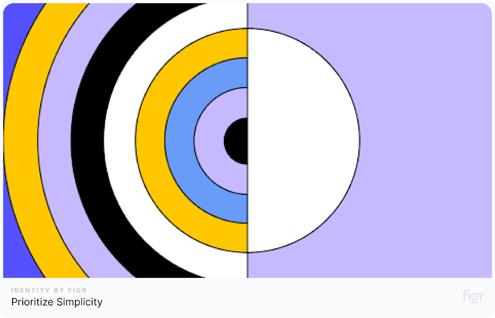
Simplicity is the foundation of great UX design. When users interact with your product, they expect an easy and intuitive experience.
Overloading them with unnecessary elements, features, or information can create confusion and frustration, driving them away.
Why simplicity matters:
- Clarity: A simple design makes it easier for users to understand what they need to do. By eliminating distractions, you allow them to focus on their goals.
- Faster decision-making: When the design is clean and focused, users can quickly make decisions and complete tasks without second-guessing their actions.
- Improved user engagement: A streamlined experience leads to more engagement, as users are less likely to abandon tasks due to frustration.
How to Achieve Simplicity in UX Design:
- Remove unnecessary elements: Evaluate each element in your design and ask if it adds value to the user experience. If it doesn’t, remove it.
- Minimize user input: Avoid requiring users to fill out too many forms or navigate through multiple steps. Focus on essential interactions only.
- Use simple navigation: Keep navigation menus clean and organized. Limit the number of options to prevent decision fatigue.
- Focus on core features: Highlight the key features of your product and ensure they are easy to find. Avoid cluttering the interface with secondary functions.
Example of simplicity in action:
For example, you are registering on a fitness app. A complex design might ask you for multiple details like “Favorite Workout Time” or “Preferred Training Location.”
A simplified approach would only ask for the essentials like name, email, and password. This reduction in unnecessary steps results in a smoother and faster onboarding process.
By focusing on simplicity, you create an experience that feels natural, helps users achieve their goals efficiently, and ensures they keep coming back.
Now, let’s dive into another critical aspect of UX design that ensures your users have a consistent and intuitive journey—maintaining consistency throughout your design.
2. Ensure Consistency
Credit: UXPin
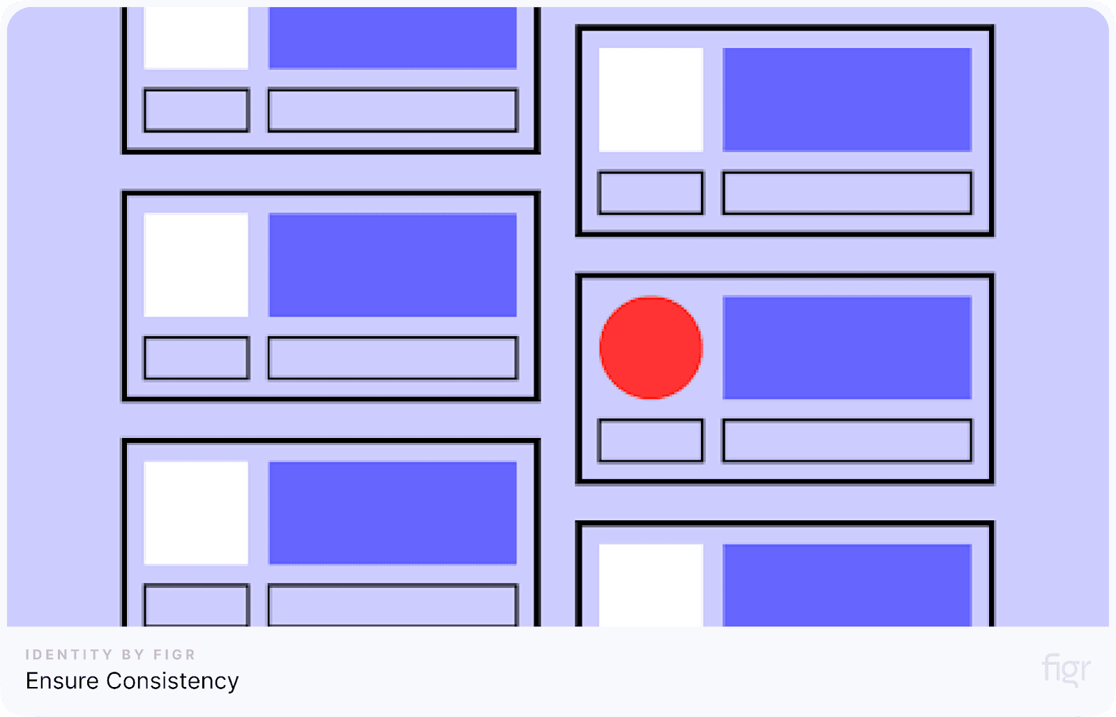
Consistency in UX design is about making sure that every part of your interface feels familiar and intuitive to users, regardless of where they are on your platform.
When your design elements, like color schemes, buttons, icons, and typography, remain consistent across all pages, users can navigate your site or app more confidently.
A consistent user interface builds trust, reduces confusion, and enhances the overall experience.
Here’s how you can ensure consistency in your design:
- Use a uniform color scheme: Choose a primary color palette for your design and stick to it throughout the interface. This helps with brand recognition and keeps the design visually cohesive.
- Maintain typography standards: Ensure that headings, body text, and other typographic elements are consistent in size, weight, and font style across all pages.
- Consistent iconography: Use the same style of icons (outlined, filled, or minimalist) throughout the design to avoid visual clutter. Mixing icon styles can confuse users.
- Standardized navigation: Keep your menus, navigation bars, and call-to-action buttons uniform in design and placement. This enables users to know exactly where to look and click, no matter which page they are on.
Figr Identity plays a vital role in maintaining consistency within your design system. By enabling designers to create and manage reusable tokens for colors, typography, and components, Figr Identity ensures that your entire design remains cohesive and scalable.
Whether you’re working on a small project or a large-scale application, Figr Identity helps you keep everything aligned, saving time and effort while delivering a polished user experience.
With consistency in place, let's explore how white space can further enhance your design by giving it balance and clarity.
3. Use White Space Effectively

Credit: Milk and Tweed
White space, also known as negative space, is the empty area between design elements, and it plays a crucial role in improving both the aesthetics and usability of a design. \
Many designers overlook the importance of white space, but using it correctly can make your design feel clean, organized, and easier for users to navigate.
White space can:
- Improve readability: When there's enough space around text, it becomes easier for users to focus on the content without feeling overwhelmed.
- Guide user attention: White space helps you highlight important elements like call-to-action buttons, ensuring users know where to look or click.
- Create a balanced layout: Adding space between elements, like images and text blocks, gives your design a more professional and balanced feel.
For example, an e-commerce website with sufficient white space around product listings and navigation menus will make the shopping experience more enjoyable by reducing visual clutter.
This keeps users focused on the products, rather than distracted by a cramped layout. With white space creating balance, let’s now look at how responsive design can ensure your layout adapts seamlessly to different devices and screen sizes.
4. Optimize for Mobile Responsiveness
Credit: Tech Prastish
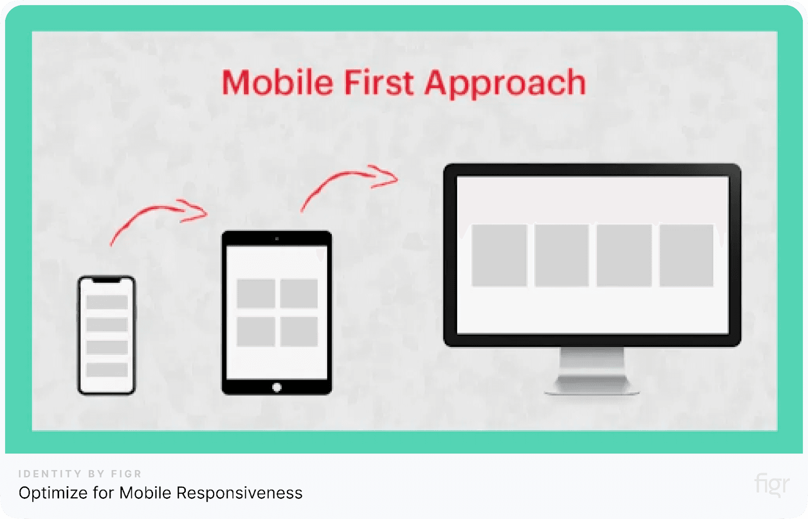
With the increasing number of users accessing websites and apps on mobile devices, ensuring that your design is responsive across various screen sizes is essential.
A responsive design adjusts and adapts to the device being used, whether it’s a smartphone, tablet, or desktop, providing a seamless user experience regardless of the platform.
To optimize for mobile responsiveness:
- Simplify the layout: Ensure that the layout is clean and elements are organized to fit smaller screens without overcrowding.
- Use scalable fonts and images: Fonts and images should resize proportionately to ensure readability and clarity on all devices.
- Prioritize touch-friendly elements: Buttons, icons, and interactive elements need to be large enough for users to click easily without accidentally selecting the wrong option.
- Test across multiple devices: Always check how your design looks on various screen sizes to ensure a consistent experience across devices.
For example, think of a travel booking platform that users access both on mobile and desktop.
On mobile, the booking form should be easy to fill out with clear buttons and input fields. The layout should be adjusted to prevent users from scrolling excessively or zooming in to view content.

Figr Identity can help you maintain consistent design systems while optimizing for responsiveness. With its customizable grids and component layouts, you can create scalable, production-ready components that adapt seamlessly to various devices.
This ensures that your mobile and desktop designs maintain uniformity without sacrificing functionality.
Now that your design is responsive, let’s explore how color and contrast can enhance usability and visual appeal.
5. Make Navigation Intuitive
Intuitive navigation is a cornerstone of good UX design. Users should be able to find what they’re looking for quickly and effortlessly.
If users have to spend too much time figuring out how to navigate your site or app, they may become frustrated and leave.
Creating a clear, intuitive navigation system helps keep users engaged and ensures a smoother user experience.
To make navigation intuitive:
- Use clear labels: Navigation menus and buttons should be labeled with straightforward, descriptive text that indicates their purpose clearly.
- Group related items logically: Categories and menus should be structured in a way that groups related content together, making it easier for users to find what they need.
- Include a search function: A well-designed search bar is essential for users who know exactly what they are looking for but want to get there quickly.
- Use breadcrumbs: Breadcrumbs are helpful for showing users where they are on a site and allowing them to backtrack easily if necessary.
- Keep navigation consistent: The layout, placement, and appearance of navigation elements should remain the same across all pages to maintain familiarity.
For example, take a food recipe website. A well-organized navigation system with clear categories like "Desserts" or "Main Courses" helps users find their desired recipes with ease. Adding breadcrumbs allows users to retrace their steps effortlessly.
By utilizing clear labels, logical groupings, and consistent navigation elements, you can create a seamless browsing experience that keeps users on track.
Next, let’s look at how color and contrast can further improve the usability and aesthetics of your design.
6. Focus on Accessibility
Accessibility in UX design means making your website or app usable for everyone, including individuals with disabilities.
By focusing on accessibility, you create a more inclusive experience that benefits a wider audience, ensuring no one is left behind.
Here’s how to improve accessibility in your design:
- Use alt text for images: This allows screen readers to describe images to visually impaired users.
- Ensure keyboard navigation: All interactive elements, like buttons and links, should be accessible through keyboard navigation.
- Provide sufficient color contrast: Make sure text and background colors contrast enough to be easily readable by users with visual impairments.
- Offer captions or transcripts for multimedia: This is especially important for videos to assist hearing-impaired users.
By adhering to the Web Content Accessibility Guidelines (WCAG), you can make your designs more user-friendly and compliant with international standards.
Figr Identity supports accessibility by allowing designers to generate well-structured components and maintain consistent design tokens that meet accessibility requirements.
Whether it's managing colors with optimal contrast or ensuring proper element spacing, Figr Identity simplifies accessibility management for design systems.
Ensuring accessibility is a necessity in delivering a seamless, inclusive user experience.
With accessibility covered, ensuring your designs are inclusive and user-friendly, let's now focus on another critical aspect of UX—creating visually distinct and readable content by establishing a clear content hierarchy.
7. Establish a Clear Content Hierarchy
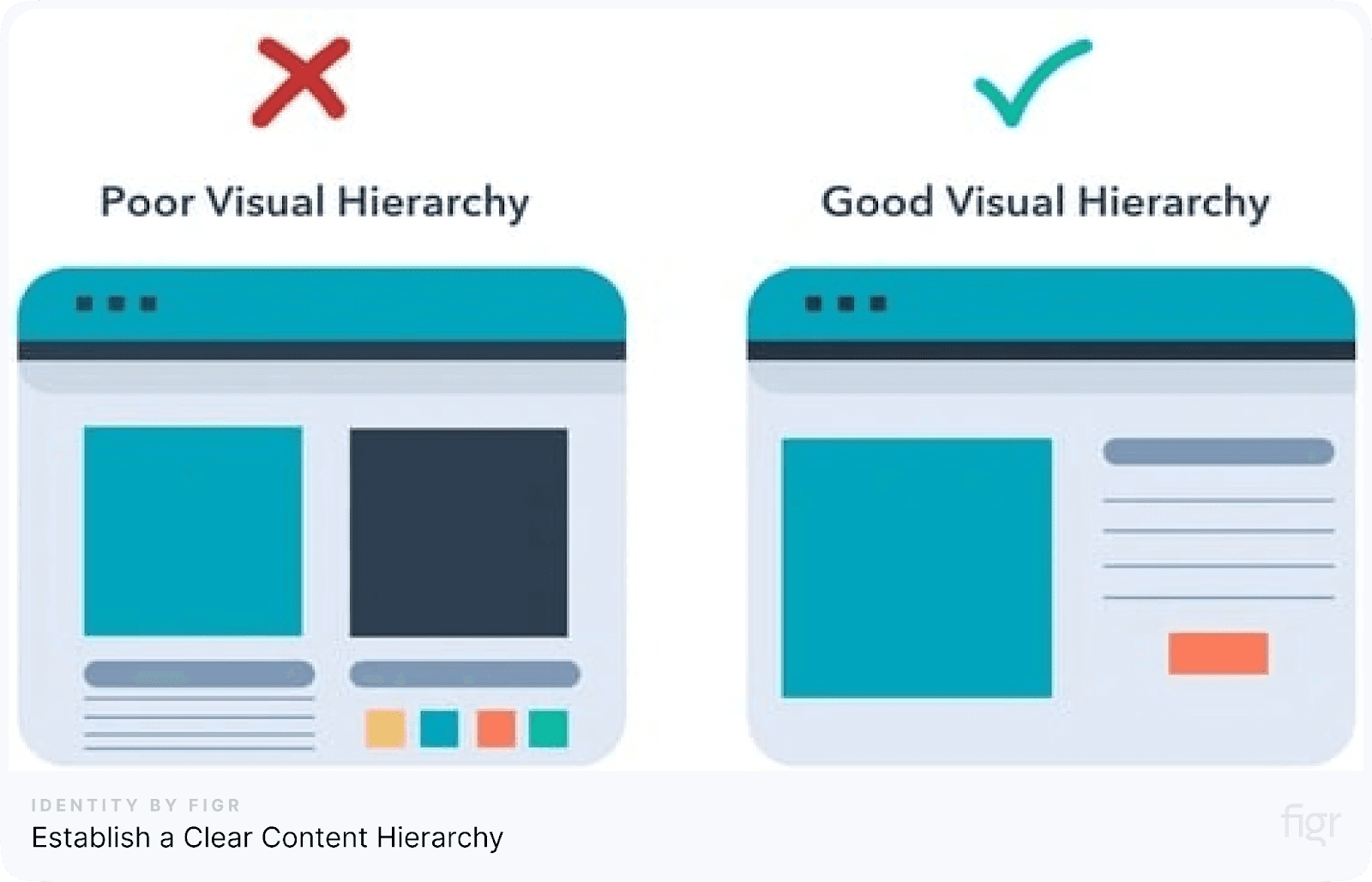
Credit: Hubspot
A well-structured content hierarchy helps users navigate through the information on your website or app with ease.
Without clear prioritization, users can feel overwhelmed or confused, leading to a frustrating experience.
To establish an effective content hierarchy, consider the following:
- Use larger text for important elements: Headlines and primary messages should be visually prominent. Larger fonts naturally grab attention, signaling the most important information.
- Highlight key information with bold or different colors: Bold or colored text makes important information stand out from the rest of the content.
- Break down content with subheadings: Using subheadings creates clear sections within your page, making it easier for users to scan and find what they need quickly.
- Implement proper spacing between elements: Don’t let your content look cramped. Adequate spacing makes it easier to read and improves the overall design.
- Use bullet points and lists: Organizing information into bullet points or numbered lists makes it easier to digest, especially for mobile users.
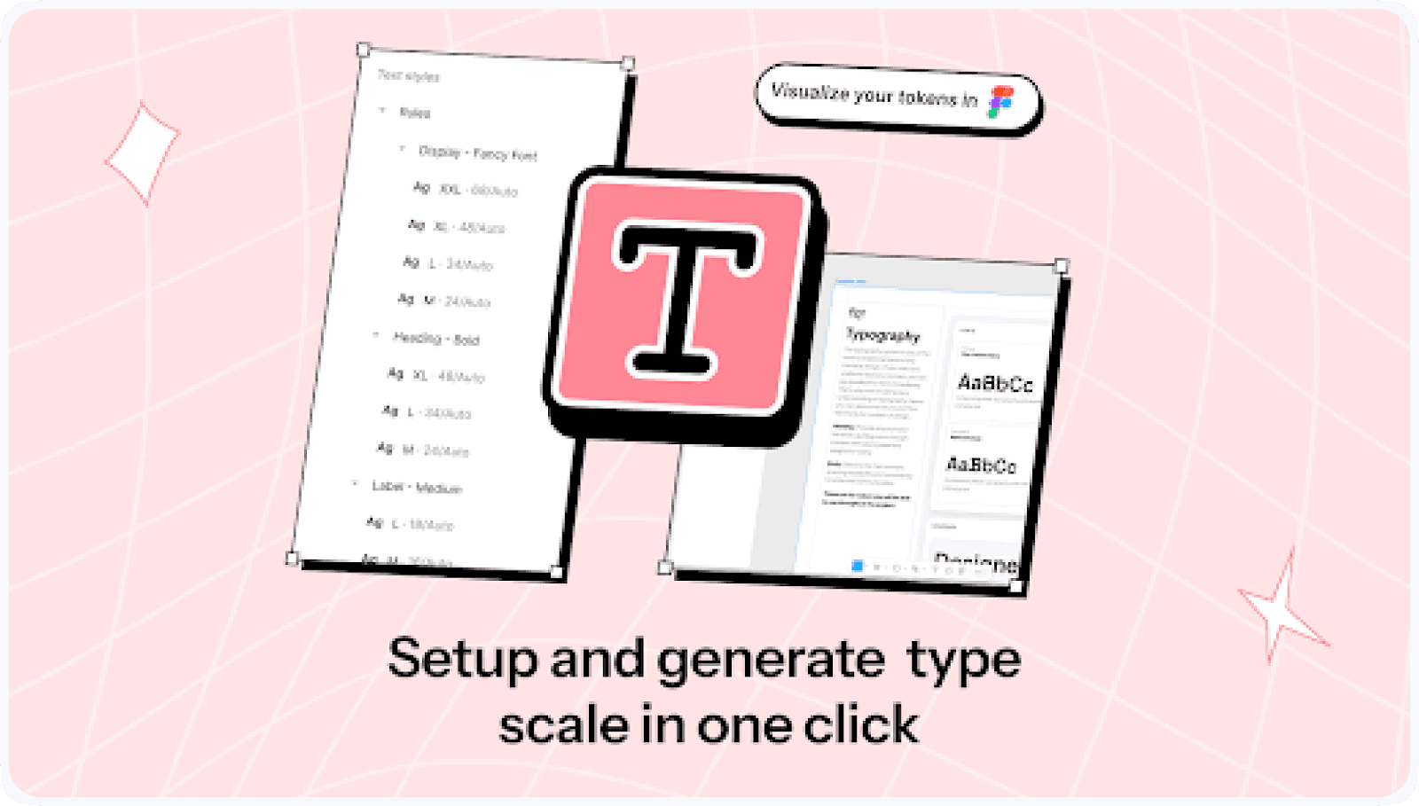
Figr Identity can assist you in maintaining a consistent hierarchy across your designs.
With instant token generation for typography and other style elements, Figr Identity enables you to create a type scale that defines a clear hierarchy between font sizes.
This ensures your content is consistently structured and visually clear, enhancing readability and maintaining design cohesion across your project.
By establishing a clear content hierarchy, you’ll guide users’ attention effortlessly, ensuring they can find the most important information without any confusion.
With a solid content hierarchy in place, the next step is to enhance your design further by focusing on color and contrast.
8. Use Color and Contrast Wisely
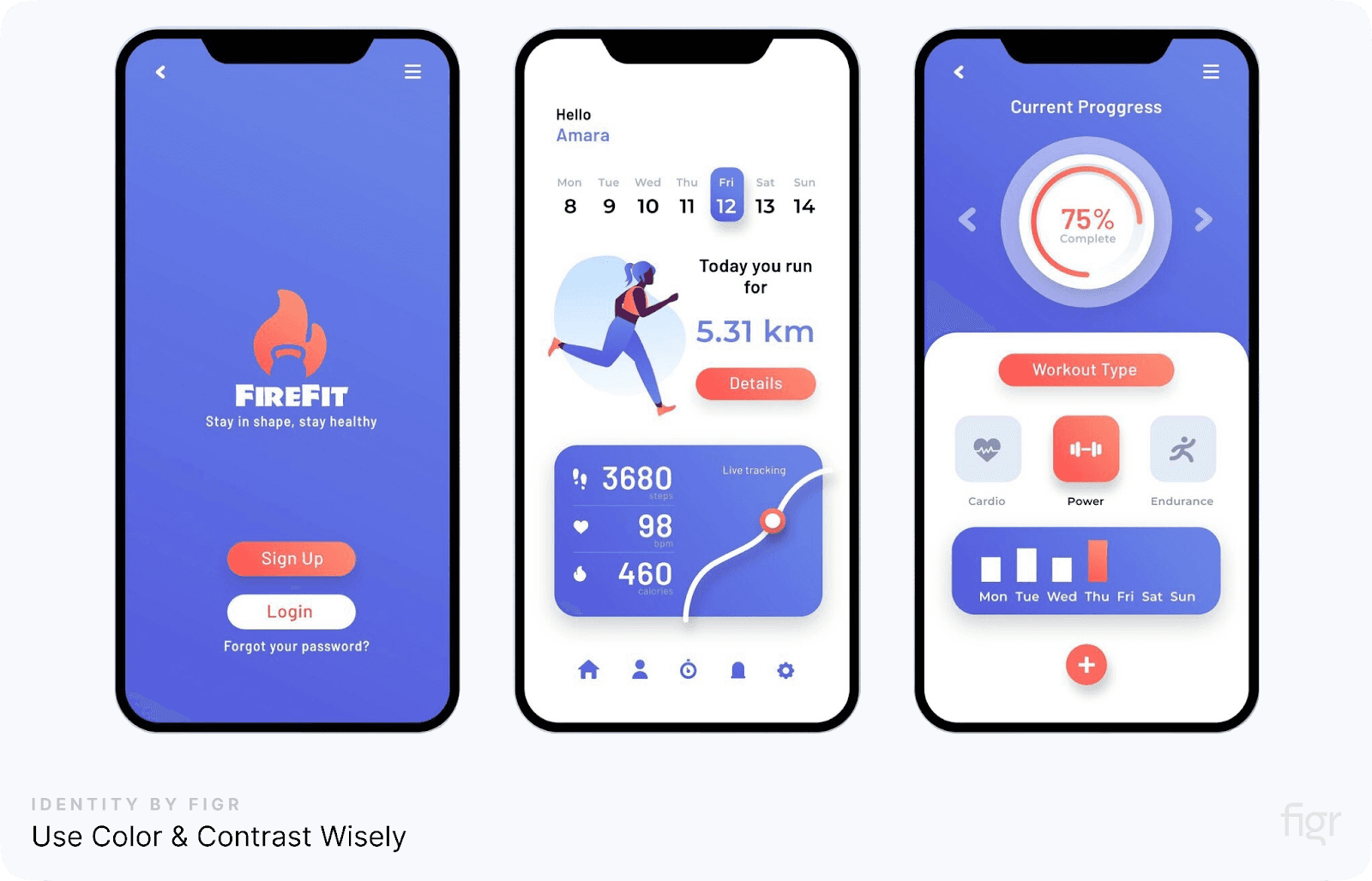
Color and contrast are not just aesthetic choices; they play a vital role in guiding users through your design and enhancing the user experience.
Proper use of color can help distinguish different elements, highlight key actions, and ensure that your design is accessible to all users, including those with visual impairments.
Here’s how to effectively use color and contrast in UX design:
- Create focus: Use high contrast between text and background to make key elements stand out, such as call-to-action buttons.
- Ensure accessibility: Ensure that your color choices are accessible to users with color blindness or other visual impairments. Use tools like contrast checkers to meet accessibility standards.
- Group related elements: Use similar shades for elements that belong together to create a sense of visual unity and organization.
- Avoid overwhelming users: Limit your color palette to a few key colors to avoid visual clutter. Overuse of vibrant colors can cause distraction and confusion.
When using Figr Identity, you can easily manage your color schemes and design tokens. With its Instant Token Generation feature, you can create and apply consistent color palettes across your entire project.
This helps maintain visual coherence while ensuring accessibility through customizable contrast settings.
By mastering the use of color and contrast, your designs can guide users more effectively. Now, let's explore how micro-interactions can add subtle yet impactful layers of engagement to your design, enhancing the overall user experience.
9. Leverage Micro-Interactions
Micro-interactions are small design elements that subtly engage users, providing feedback and enhancing the overall experience. These interactions can be as simple as a button changing color when clicked or as complex as an animated progress bar.
The power of micro-interactions lies in their ability to make an interface feel intuitive and responsive, keeping users connected to their tasks.
Here are some tips to effectively leverage micro-interactions:
- Offer immediate feedback: Micro-interactions provide instant responses, like showing a visual confirmation when a button is pressed or an action is completed.
- Guide user actions: Subtle animations, such as a shaking password field when the wrong entry is made, help users understand what went wrong and what they need to correct.
- Increase user engagement: Adding small interactive elements, like a heart icon that pulses when a user 'likes' something, makes the experience more enjoyable and encourages further interaction.
- Create a smoother flow: Micro-interactions improve navigation, such as adding hover effects or transition animations that help users move between different parts of a website smoothly.
Micro-interactions might seem like minor details, but when implemented correctly, they significantly improve the user experience by making interactions more fluid, engaging, and enjoyable.
Next, let's explore how optimizing load times can further improve the overall user experience.
10. Optimize Load Times
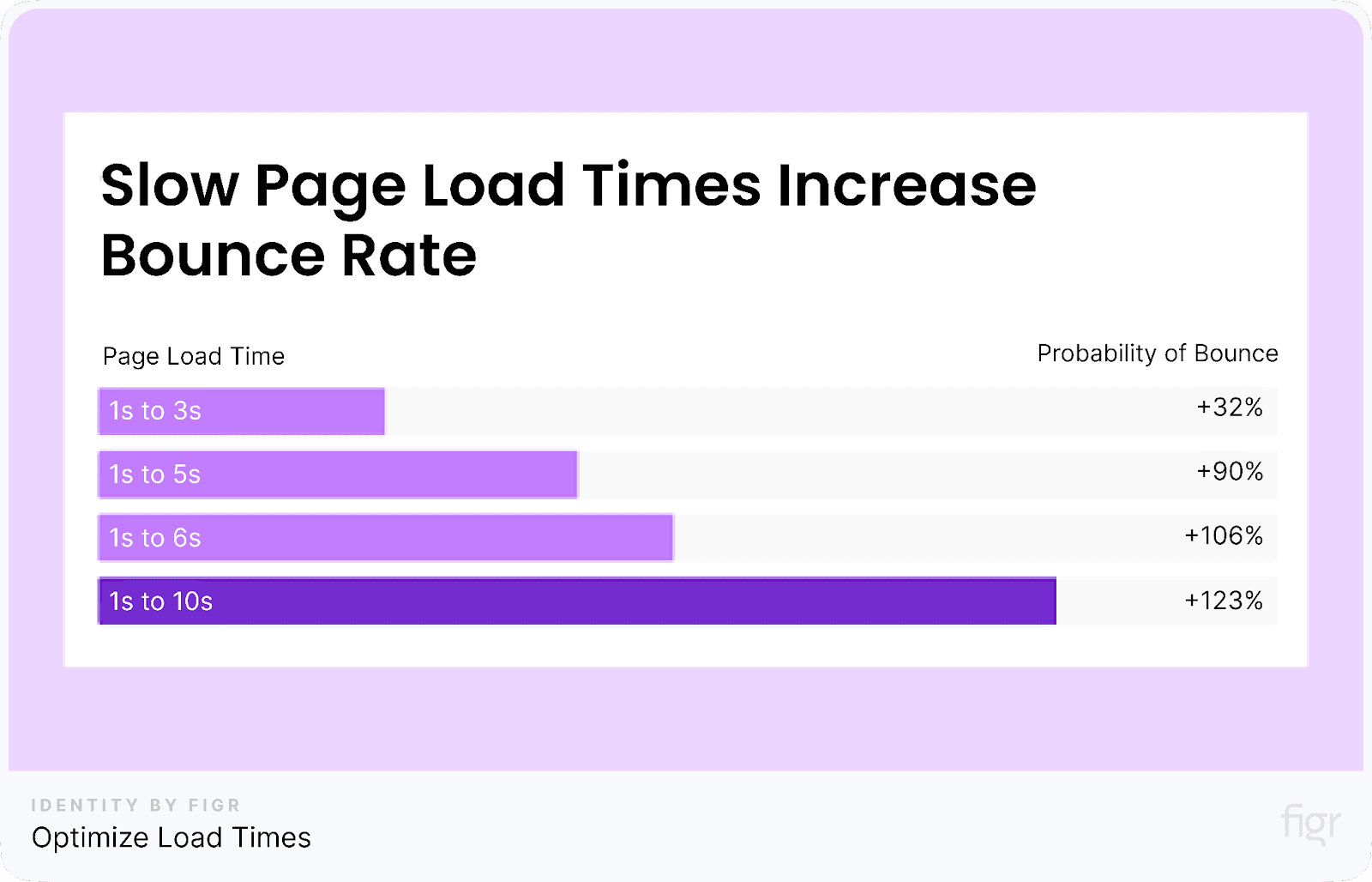
Credit: Sem rush
A fast-loading website or app is essential for delivering a positive user experience. Slow load times can lead to frustration and cause users to abandon a site altogether.
Whether it’s a shopping platform or a service-based site, ensuring quick access to content is crucial for retaining users.
Here are some simple ways to optimize load times:
- Compress images and assets: Large images and heavy files slow downloading speeds. Use image compressors or export images in formats that balance quality and size.
- Minimize code: Reducing the amount of code (like unnecessary JavaScript or CSS) helps speed up the site. Tools are available to clean up and minimize code without losing functionality.
- Use browser caching: This allows users to store parts of your website locally, so they don’t have to reload everything each time they visit.
- Optimize for mobile devices: Ensure that the website or app runs smoothly on mobile devices by adjusting layouts and minimizing data usage for faster load times.
- Prioritize critical content: Load the most important content first, so users can start interacting with your website or app while other elements load in the background.
Faster load times mean users can interact with your platform quickly and efficiently, improving their overall experience and satisfaction.
Conclusion
Great UX design is about making the user’s journey smooth, enjoyable, and effortless. By applying these practical tips you can significantly enhance the user experience on your website or app.
As you implement these UX design tips, managing and scaling your design systems can become complex. That’s where Figr Identity comes in.
It simplifies the entire process by offering instant token generation for colors, typography, spacing, and more. You also get real-time live previews to fine-tune your components before exporting, ensuring every detail is spot-on.
Need production-ready components? Figr Identity helps you build scalable, cohesive design systems with ease.
Make your design workflow smoother, more efficient, and ready for future growth with Figr Identity—the perfect tool for designers looking to elevate their projects! Your users will thank you for it!


