Monday, 9:07 a.m. The kickoff deck is closed, the team sounded aligned on the call, and now one designer or product pair is staring at an empty file with a deadline already attached. A usable flow is due by Friday. Stakeholders want it to feel intuitive. Engineering wants something buildable. Leadership wants proof that the team is making decisions, not placing bets.
That moment exposes the actual job.
Teams often treat early product design like a referendum on taste. The strongest designer sketches first. The most confident PM frames the problem. A senior stakeholder drops a preference that hardens into direction. Hours disappear, and the team still has no shared way to judge whether the idea fits the user, the business, or the constraints.
I saw that pattern last week. A product team spent most of an afternoon debating a checkout step none of them had watched users complete. They had opinions, strong ones. What they lacked was a shared method. Without an agreed ux design method, the conversation stayed stuck in taste instead of moving toward evidence.
Methods give teams traction. They create a sequence for learning, deciding, and testing before the expensive work begins. Good designers still use judgment. Good PMs still make trade-offs. The method keeps that judgment tied to something more reliable than whoever spoke last in the meeting. If you’ve worked with teams hiring product designers, you’ve seen the same thing. Talent helps. Shared process is what keeps talent from getting trapped in circular debate.
The deeper reason for this focus is economic, not aesthetic. Better UX methods reduce rework, surface risk earlier, and make it easier to spot weak assumptions before they reach code. That is usually where teams lose time, budget, and trust.
This guide covers 10 methods product teams use, from research and testing to systems and experimentation. For each one, the goal is practical: when to use it, where it breaks, what to measure, and how AI agents such as Figr can speed up synthesis, draft artifacts, and automate the repetitive steps that usually slow the team down. If you want a broader foundation in user research methods, that pairs well with the playbooks that follow.
1. User Research and Contextual Inquiry
A team is reviewing a drop-off in onboarding. The dashboard shows where people quit. The support queue shows what they complain about. Then someone watches a customer try to finish setup between Slack messages, a spreadsheet lookup, and a spotty mobile connection. Suddenly the problem looks different.
Contextual inquiry puts the product back into the user’s real working conditions. You observe people in their environment, using their device, with their interruptions, constraints, and habits in full view. That is where hidden dependencies show up. A copied value from another system. A manager approval that happens outside your product. A browser tab left open as a safety net.
A simple visual helps anchor the mindset.
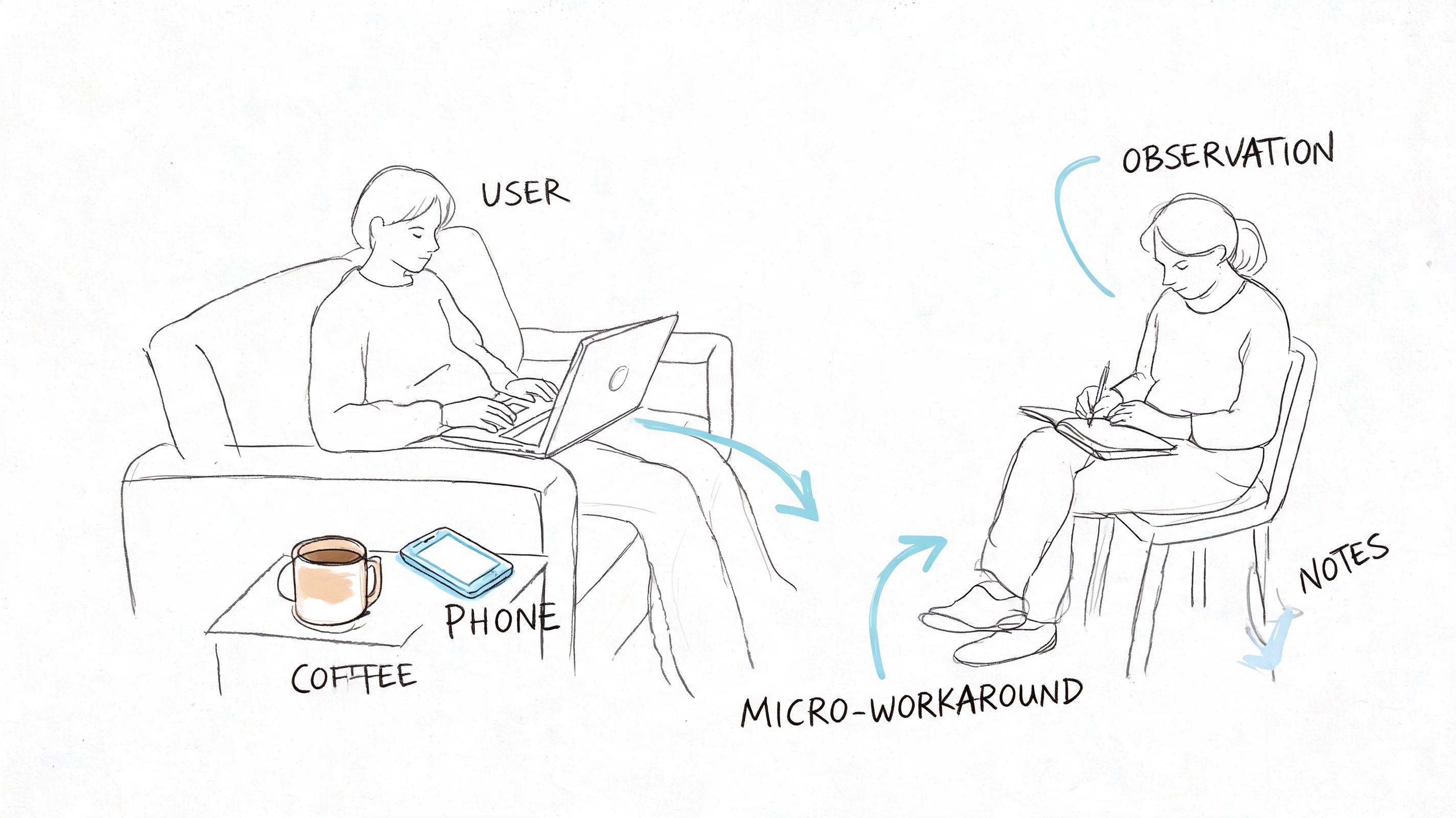
I’ve seen teams describe an onboarding flow as “simple” because each screen looked clean in Figma. Then they sat in on three field sessions. One customer was copying IDs from a spreadsheet. Another was waiting on legal approval in Slack. A third was trying to finish setup on weak cellular service between meetings. The interface was only part of the job. The surrounding workflow was the actual design problem.
What contextual inquiry reveals
Used well, user research methods expose the gap between what users say and what they do under pressure. People often ask for fewer steps, then accept extra steps if those steps reduce risk or confirm they are doing the right thing. They may dismiss a feature in an interview, then reach for it the moment uncertainty rises.
That changes product decisions fast.
A strong contextual inquiry study usually answers four practical questions:
- What triggers the task: What happened right before the user opened your product?
- What else is involved: Which tools, messages, files, or approvals sit outside your interface?
- Where friction appears: What causes hesitation, rework, switching devices, or abandonment?
- What success looks like in context: Did the user finish the screen flow, or finish the actual job?
How to run it without turning it into theater
Bring a discussion guide. Do not bring a script you are determined to complete. You need consistent prompts across sessions, but you also need room to follow the moment when a user pauses, opens another tool, or invents a workaround you never designed for.
A few field rules help:
- Observe before explaining.
- Ask “what happened here?” more often than “would you use this?”
- Capture the environment, not just the screen.
- Include PMs and engineers in live sessions or playback reviews so findings do not die in a research repository.
The common failure mode is over-directing the session. Once the researcher starts steering every action, the participant stops working naturally and starts performing competence. The notes look tidy. The findings get weaker.
What to measure
Contextual inquiry is discovery work, but it still needs output you can use. Track patterns such as task completion blockers, tool switching, approval dependencies, error recovery behavior, and points where users seek reassurance. I also look for frequency of workaround types across sessions. If five people solve the same problem outside the product, that is not edge-case noise. That is product scope trying to get your attention.
For teams that want a practical handoff into evaluation, the Figr usability testing guide helps turn field observations into realistic scenarios for later test sessions.
Where AI agents help, and where they don’t
AI speeds up the heavy admin around research. It can cluster notes, summarize repeated friction points, draft journey maps, and turn raw observations into candidate hypotheses for the team to test. Figr is useful here when teams need to capture the current product state quickly and connect observed issues back to specific flows and screens.
AI does not replace field judgment. It will not notice the political approval process happening in Slack, the handwritten checklist taped to a monitor, or the tension in a participant’s voice when they say, “I usually wait until my manager is online for this part.” A practitioner catches those signals and decides what matters.
Use AI to reduce synthesis time. Use humans to interpret behavior in context.
Later, if the team starts arguing from memory or preference, go back to the recordings and notes.
2. User Testing and Moderated Testing Sessions
A participant lands on a prototype, scans the page, hovers over the primary button, and stops. Then comes the sentence every product team should pay attention to: “I don’t know what happens if I click this.” In that moment, the interface stops being a set of design decisions and becomes a test of whether the product’s logic matches the user’s expectations.
Moderated testing works best after the team has a real solution direction on the table. The question is no longer “what problems exist?” It is “can people use what we built, and where does it break?” That makes this method useful before expensive implementation work begins, especially on high-risk flows like onboarding, checkout, permissions, reporting, and account settings.
The quality of the session usually depends on task design more than moderator talent. A vague prompt gets vague behavior. A realistic prompt exposes where labels, hierarchy, and interaction design fail under pressure. “You need last month’s invoice before a finance review” will reveal more than “go find billing.”
The Figr usability testing guide is a practical starting point for writing scenarios, defining success criteria, and keeping sessions consistent across rounds. If the team is preparing larger decision cycles around the same flow, an actionable sprint framework helps connect test findings to decisions instead of leaving them as a pile of observations.
What experienced teams look for is not just whether a participant completes the task. They watch for hesitation, backtracking, misread labels, false confidence, and the moments where people create their own workaround inside the interface. Completion alone can hide serious usability debt if users succeed by brute force.
What works:
- Scenario-based tasks: Tie each task to a believable job, deadline, or consequence.
- Tight scope: Test the few flows where failure would be expensive or hard to reverse later.
- Neutral moderation: Ask follow-up questions without teaching the interface.
- Fast iteration between rounds: Change the design after a small batch of sessions and test again.
- Clear success markers: Time to completion, error points, confidence, and whether users can explain what just happened.
What fails in practice:
- Rescuing participants too early: The team loses the signal that justified the session.
- Using coworkers or power users as stand-ins: Their mental model is already contaminated by internal knowledge.
- Treating every comment as equal: One strong opinion matters less than repeated failure across multiple sessions.
- Testing polished visuals with fuzzy interaction logic: Users may like the look and still fail the task.
AI agents help with the parts that usually slow teams down. Figr can document the tested flow, organize notes by screen, cluster similar breakdowns across sessions, and generate a first pass at issue severity. That cuts hours of manual synthesis. It also makes it easier to compare round one against round two without relying on memory.
Human judgment still decides what to fix first. A senior practitioner can tell the difference between a wording issue, a broken mental model, and a problem caused by the scenario itself. AI can summarize the sessions. It cannot reliably decide whether a confusing step is acceptable friction, missing guidance, or evidence that the workflow should be redesigned.
Moderated testing earns its keep because it catches expensive mistakes while they are still cheap to change. It also gives teams something better than opinion. Direct evidence from real users trying to complete real tasks.
3. Design Sprints
Monday morning. The roadmap is blocked, the team has three competing ideas for the same problem, and every stakeholder can defend a different direction. A design sprint earns its place in that moment. It compresses debate into a bounded process, then forces the team to put something in front of users before opinions spread any further.
The value is not speed by itself. The value is decision pressure with evidence attached.
A sprint works best at a real product crossroads. A new onboarding model. A risky workflow change. A feature expansion that could reshape navigation, pricing, or setup. In those cases, a sprint gives the team one week to define the bet, test a believable version, and decide whether the idea deserves more investment. An actionable sprint framework helps here, especially when day one would otherwise dissolve into vague goals and recycled debates.
I’ve seen the method fail for a predictable reason. The team runs the workshop, builds the prototype, gets user reactions, and then nothing changes because the actual decision-maker treated the sprint as advisory theater. If nobody in the room can approve the direction, reject it, or cut scope, the sprint turns into an expensive calendar event.
What makes a sprint productive:
- One sharp decision to answer: Keep the problem narrow enough that the team can resolve it.
- Pre-recruited users: Testing breaks down when recruiting starts too late.
- A prototype built to learn, not impress: Rough screens often expose weak logic faster than polished UI.
- A decider with authority: Someone has to make the call when trade-offs surface.
- Clear success criteria: Define what would count as enough signal before the week begins.
Common failure points:
- Overloading the sprint with unrelated questions: The team leaves with partial answers to everything and conviction about nothing.
- Packing the room with spectators: Extra attendees add commentary, not clarity.
- Treating the prototype like a launch candidate: That pushes energy into visual refinement instead of learning.
- Confusing user enthusiasm with validation: People may like the concept and still fail the task.
This distinction is important because product development rarely fails from a shortage of ideas. It fails when weak options stay alive too long, absorb design and engineering time, and delay a hard call.
AI changes the mechanics of sprint work more than the core logic. Figr can turn rough concepts into testable flows faster, generate alternate directions for comparison, document decisions as the week unfolds, and help teams keep prototype states organized across rounds. That shortens the messy middle. It does not replace the judgment required to frame the sprint well, choose what to test, or interpret mixed user reactions.
A strong sprint is a decision system. By Friday, the team should know whether to proceed, revise, or stop. That outcome is more useful than a wall full of sticky notes and a room full of unresolved optimism.
4. Analytics-Driven User Behavior Analysis
Monday morning. The team is staring at a conversion chart that fell off a cliff over the weekend. Product thinks the new pricing page caused it. Marketing blames traffic quality. Design suspects mobile layout issues. Analytics-driven user behavior analysis is how you stop arguing from instinct and start tracing what users did.
Used well, this UX design method turns product behavior into a map of friction. It shows where people hesitate, loop, abandon, or recover. It also exposes a hard truth many teams avoid. The screen with the drop-off is not always the source of the problem. Users often arrive confused because of what happened one or two steps earlier.
That changes how the work gets done.
A useful analytics pass starts with a specific question tied to a product outcome. Where does activation stall? Which step creates the highest abandonment for first-time mobile users? What path do retained customers follow before they adopt a second feature? Broad dashboard tours produce commentary. Focused questions produce decisions.
The teams I trust with analytics work usually follow a simple pattern:
- Start with one decision: Identify the product choice the analysis needs to support.
- Read behavior by segment: New users, returning users, admins, buyers, and mobile visitors often break in different places for different reasons.
- Trace paths, not just funnels: A drop-off rate matters less if users are finding a successful alternate route.
- Pair events with context: Session replays, support tickets, interviews, and on-page feedback explain the behavior behind the metric.
- Check instrumentation before acting: Broken event tracking creates false confidence fast.
Instrumentation is the trade-off that gets underestimated. Teams want insight, but analytics quality depends on naming events well, defining success consistently, and keeping implementation clean across releases. If the signup completion event fires twice, or the onboarding checklist event never fires on iOS, the analysis is already compromised.
I have seen teams redesign a weak-performing screen when the actual issue was event logic, not user behavior.
That is why strong behavioral analysis includes three layers. First, confirm the data can be trusted. Second, isolate where friction concentrates. Third, form hypotheses that can be tested in design or research. Skip the first step and the rest turns into expensive storytelling.
Figr helps with the slow part. It can connect product flows to interface states, surface patterns across sessions, and organize likely causes into a working list the team can inspect. That speeds up triage. It does not remove the need to choose the right metric, question suspicious tracking, or separate correlation from cause.
A few signals are especially useful in practice:
- Exit rate at key decision points
- Time-to-complete for core tasks
- Repeated backtracking between screens
- Error frequency by device or browser
- Feature adoption after onboarding
- Retention differences by acquisition source or role
Common failure points are predictable. Teams watch aggregate conversion and miss that one high-value segment is struggling. They treat every spike as meaningful when traffic mix changed. They optimize for click-through on an intermediate screen while task completion gets worse downstream.
Behavior leaves evidence. Good product teams know how to read it, challenge it, and connect it back to design choices they can change.
5. Usability Heuristics and Heuristic Evaluation
A release review starts at 4:30 p.m. The flow works in the happy path demo. Then someone tries to edit a shipping address after selecting express delivery, and the interface drops them into a dead end with no clear recovery. No lab study was needed to catch that. A disciplined heuristic review would have flagged it days earlier.
Heuristic evaluation is a structured inspection of an interface against established usability principles. Reviewers check whether the system keeps users oriented, uses familiar language, supports error recovery, reduces memory load, and stays consistent across screens and states. Done well, it exposes friction before recruiting users, booking sessions, or writing another line of code.
It earns its keep in three situations. Before formal testing, it clears obvious issues so research time goes to harder questions. During redesigns, it helps teams separate cosmetic complaints from real usability defects. In inherited products, it surfaces old interaction debt that everyone learned to work around but new users still hit.
The trade-off is straightforward. Heuristic review finds likely problems, not actual behavior in the wild. It is strong at identifying confusing labels, weak system feedback, broken hierarchy, and messy edge cases. It cannot show how a stressed buyer behaves under deadline pressure or why a new admin abandons setup halfway through.
That limitation is healthy. It keeps the method in its lane.
“Users will figure it out” usually means nobody has reviewed the flow with enough rigor.
The teams that get value from heuristic evaluation score issues by severity, frequency, and business risk. A small copy mismatch should not sit in the same backlog tier as a payment failure with no recovery path. Without that triage, the output becomes a long critique document that feels smart and changes nothing.
A practical review process looks like this:
- Use multiple evaluators: Different reviewers notice different failure modes, especially across content, interaction, and accessibility.
- Review by task: Walk through realistic scenarios such as first-time checkout, password reset, or invite acceptance. Random clicking produces weak findings.
- Map findings to heuristics: Tie each issue to a principle so feedback stays grounded.
- Assign severity and evidence: Note what breaks, who it affects, and what the likely consequence is.
- Turn findings into actions: Each issue needs an owner, a recommended fix, and a decision on whether to validate it in user testing.
Common failure patterns show up fast:
- Opinion dressed up as expertise: “I would never use this” is not a useful finding.
- No product context: Consumer onboarding, enterprise admin tools, and internal dashboards fail in different ways.
- Ignoring states and edge cases: Empty states, error states, permissions, and handoffs are where many products break.
- Stopping at the audit: Heuristic evaluation should sharpen the next design pass or research plan, not replace them.
AI can speed up the mechanics. Figr can scan flows, cluster recurring usability issues, and draft a first pass against common heuristic categories so the team starts from a structured review instead of a blank page. That saves time during audits of large products. Human judgment still decides whether a flagged issue is real, how severe it is, and whether fixing it is worth the trade-off.
This method has more operational value than many teams give it credit for. It creates a repeatable quality bar, especially in fast-moving product cycles where design decisions can drift into taste and habit. It also pairs well with low-fidelity work. Teams refining structure or labels can review early concepts before visual polish hardens weak choices. If you need to reset the foundation first, revisit wireframe basics.
One more practical note. Heuristic findings often reveal where polished presentation is masking weak interaction logic. That matters when teams are preparing stakeholder demos or app store visuals. Strong mockups can sell the concept, but the underlying flow still needs scrutiny. For teams packaging those assets, Ryplix Studio for generating converting app assets is a useful reference point.
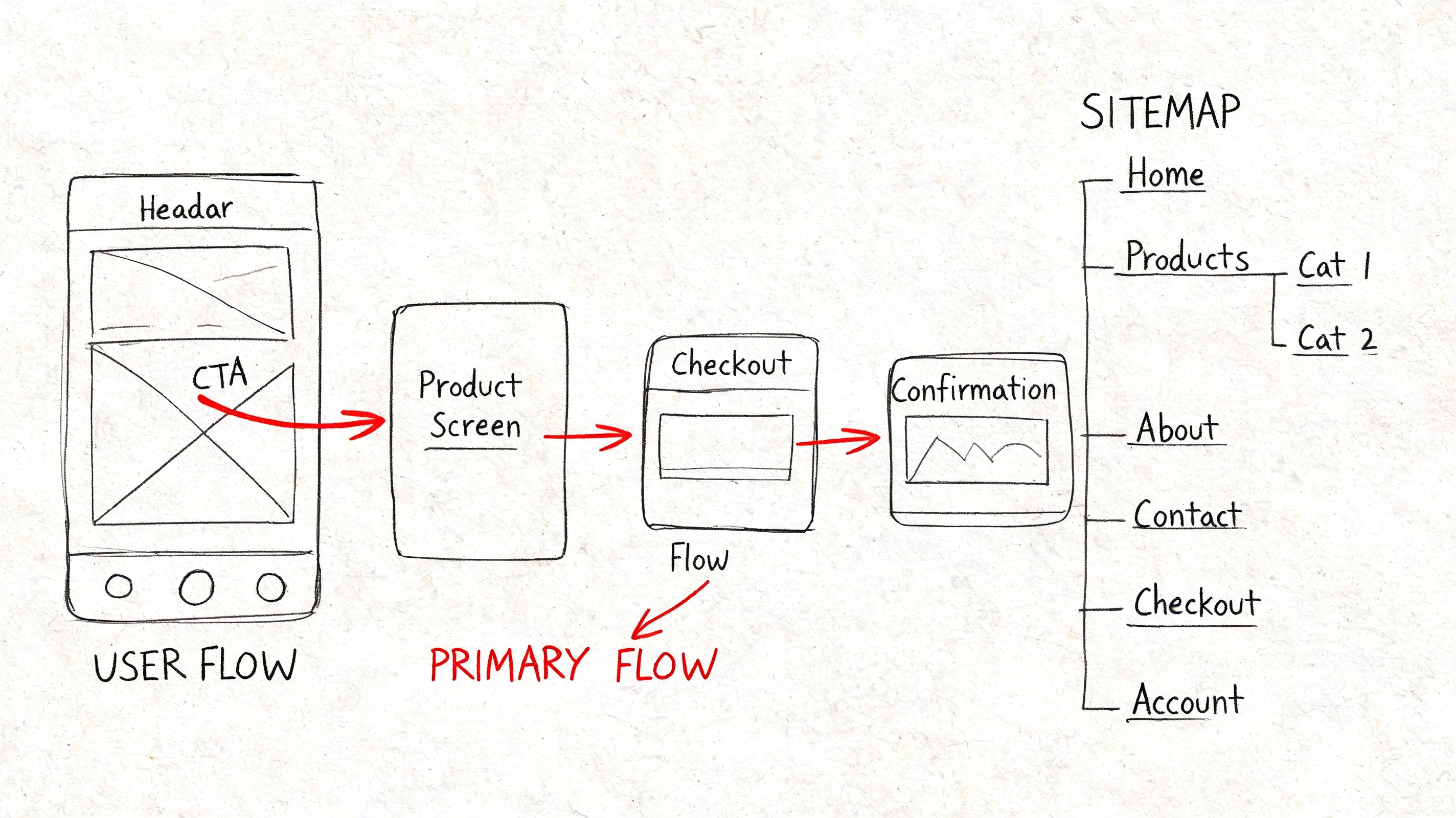
6. Wireframing and Information Architecture (IA) Mapping
A redesign review starts. The team is proud of the new screens. Then someone asks a basic question: “Where would a first-time user find billing?” The room goes quiet, because three different people give three different answers.
That is not a visual design problem. It is a structure problem.
Wireframing and information architecture mapping force decisions that polished UI often postpones. What content exists, which tasks matter first, how screens connect, what users can ignore, and where the product will break under edge cases. Good teams settle those questions early, while changes still cost minutes instead of weeks.
Structure before polish
Wireframes are useful because they strip away decoration and expose logic. A rough screen with bad spacing can still reveal whether the user knows what to do next. A polished mockup can hide the opposite.
If you need a reset, revisit wireframe basics. Low-fidelity artifacts make disagreement productive. Teams will move boxes, rewrite labels, and challenge page order faster when nobody is defending visual craft that took hours to produce.
Information architecture mapping adds the system view. It shows how navigation, content hierarchy, search, category logic, and cross-links work together across the product. That matters because users do not experience one screen at a time. They build a mental model from repeated cues, labels, and pathways. If those patterns drift, task completion slows down and support volume usually rises with it.
What works:
- Map the task before the screen: Start with user goals, entry points, and decision paths.
- Annotate the wireframes: Include rules, state changes, dependencies, permissions, and system responses.
- Test the structure with real content: Placeholder labels make bad IA look cleaner than it is.
- Track success with practical signals: Time to key task, misclicks, search reliance, and drop-off between steps reveal whether the structure is doing its job.
What fails in practice:
- Treating sitemap and workflow as the same artifact: One shows hierarchy. The other shows behavior.
- Designing only the happy path: Empty states, dead ends, backtracking, and error recovery shape trust.
- Locking IA too early: Products change. Navigation and grouping should change with them.
- Using wireframes as presentation theater: If the artifact cannot answer “why is this here?” it is not doing enough work.
AI helps with speed, not judgment. Figr can generate first-pass wireframes, organize screens into probable flows, suggest labels from product context, and surface missing states that teams often forget in early drafts. That shortens the setup work. Designers still need to make the hard calls about hierarchy, cognitive load, and business trade-offs. Automation gets the team to a useful draft faster. It does not decide whether the draft makes sense for actual users.
Teams also need a clean handoff between structural work and stakeholder-facing visuals. If you are packaging concepts for reviews or marketing prep, Ryplix Studio for generating converting app assets can support that asset layer. The underlying job here stays the same. Get the structure right before style makes weak decisions look finished.
7. Accessibility Audits and Inclusive Design Testing
A release goes live. The main flow passes QA, conversion looks stable, and support tickets stay quiet for a few days. Then a customer writes in with a blunt note: the checkout button never receives keyboard focus, the error message is never announced by a screen reader, and the modal traps them halfway through payment.
That is not a niche failure. It is a product quality failure.
Accessibility audits expose interaction debt that polished mockups often hide. Weak heading structure, unlabeled controls, low contrast, missing status feedback, tiny hit areas, and inconsistent focus order show up fast when someone uses a keyboard, a screen reader, voice input, zoom, or high-contrast settings. Those same flaws also hurt people using a phone one-handed in bright sun, rushing through a task, or recovering from a mistake under pressure.
Audit the experience, not just the code
Strong accessibility work combines three layers: automated checks, manual review, and task-based testing with assistive technology. Automated scanners catch repeatable issues such as missing alt text, color contrast failures, and some ARIA errors. Manual review finds the structural problems automation misses, like whether the page hierarchy makes sense or whether an error message appears at the right moment. Real usage testing shows whether a flow is workable from start to finish.
Teams frequently encounter this problem: A product can pass a scanner and still be painful to use.
A useful audit asks practical questions:
- Can a keyboard-only user complete the primary task without getting stuck?
- Does the screen reader announce labels, state changes, and errors in a useful sequence?
- Are interactive targets large enough and spaced well enough for touch and motor variability?
- Does content stay understandable at 200 percent zoom or with reduced motion settings?
What works:
- Start at the component level: Buttons, forms, menus, modals, tables, and alerts spread defects everywhere when they are built wrong once.
- Test real journeys: Sign-up, checkout, search, account recovery, and settings changes reveal more than isolated screens.
- Include content review: Clear labels, predictable instructions, and specific error copy do as much work as code fixes.
- Track defects by severity and recurrence: Teams need to know which issues block task completion and which ones keep reappearing across releases.
What fails in practice:
- Using overlays as a substitute for product work: They may patch symptoms, but they do not repair broken semantics, poor flows, or confusing language.
- Waiting until final QA: By then, design patterns and front-end decisions are expensive to change.
- Treating accessibility as a specialist handoff: Designers, engineers, QA, and content people all create access problems, so all of them need shared standards.
- Testing only ideal conditions: Accessibility problems often appear during error recovery, interrupted sessions, and dense workflows.
The metrics should stay concrete. Track keyboard task completion rate, screen reader success on core flows, contrast compliance in shipped components, accessibility bug reopen rate, and time to remediate severe issues. Those numbers give teams something better than vague intent. They show whether access is improving release by release.
AI can speed up the mechanics. Figr can flag missing states, surface contrast risks, and help teams apply tokenized decisions more consistently across screens. It can also support early flow reviews before teams invest in higher-fidelity prototyping for product teams. The judgment still belongs to the team. Someone has to decide whether the experience is understandable, forgiving, and usable by people who do not interact with the product in the default way.
8. Rapid Prototyping and Iterative Testing
Perfectionism is one of the most expensive habits in product work. It delays learning while giving the team the comforting illusion of progress.
Rapid prototyping breaks that cycle. Build just enough to answer the question in front of you. Test it. Revise it. Repeat.
Learning speed beats polish
A rough prototype is often more useful than a polished one because it keeps attention on behavior, not decoration. If the core flow fails in wireframe form, adding motion and visual refinement won’t rescue it. It will only hide the problem longer.
That’s why prototyping for product teams is less about tools and more about discipline. You need a clear learning goal for each round. Are you testing discoverability, trust, comprehension, sequence, or perceived effort? If you can’t answer that, the prototype will sprawl.
A product lead I know uses a simple rule: every prototype should make one uncertainty smaller. Not all uncertainty. One.
Build the cheapest artifact that can change someone’s mind.
What works:
- Time-boxed iterations: Short cycles prevent endless refinement.
- Variant testing in prototype form: Compare meaningful alternatives.
- Decision logs: Capture why changes were made, not just what changed.
What doesn’t:
- Overbuilding the first version: You’re buying confidence too late.
- Collecting broad feedback: Ask focused questions tied to the learning goal.
- Ignoring handoff implications: Prototype logic should still map to build reality.
This method has become more urgent because time pressure pushes many teams to skip research entirely. Nielsen Norman Group notes that 70% of UX projects skip user research due to time constraints, as cited in Marvel’s overview of common UX methods. Rapid prototyping gives teams a practical middle path. It doesn’t replace foundational research, but it can make learning small, frequent, and less ceremonial.
AI-assisted tools help most when they collapse setup time. Figr’s product-aware prototyping approach is useful here because it starts from existing context, design systems, and product patterns instead of making teams rebuild the same scaffolding every round.
9. A/B Testing and Multivariate Testing
A/B testing sounds scientific enough that teams sometimes use it as cover for weak thinking.
The experiment itself isn’t the insight. The setup is.
When teams test the wrong thing, with a fuzzy success metric, on a flow they barely understand, they get numbers that feel decisive but answer almost nothing. When they test a focused hypothesis against a meaningful behavior, this ux design method becomes one of the cleanest ways to learn at scale.
Test decisions, not decoration
The best A/B tests usually start from a sharp product question. Will showing plan limits earlier increase qualified upgrades? Does changing the order of form fields reduce abandonment for first-time users? Will a stronger reassurance message improve completion for a high-anxiety step?
A/B testing works after you’ve narrowed the problem. It’s not a substitute for discovery. It’s what you use when multiple plausible answers remain and behavior can settle the argument.
What works:
- One primary metric: Choose the outcome that matters most.
- A documented hypothesis: State what you expect and why.
- Follow-up analysis: Learn from segment differences, not just overall lift.
What doesn’t:
- Testing tiny cosmetic details with no user rationale: Easy to run, hard to learn from.
- Changing multiple variables too soon: You won’t know what caused the result.
- Stopping at “winner found”: A result without explanation is fragile.
This matters more in complex organizations because generic methods often break against stakeholder silos and product sprawl. One reason teams are searching harder for ROI-oriented UX methods is that interest in “ux design method roi metrics” has grown, while content still lags practical measurement needs. That gap is described in Aguayo’s discussion of methodologies for solving UX problems.
The zoom-out moment is simple. Experiments are organizational instruments as much as design ones. They let teams argue less about preference and more about consequence.
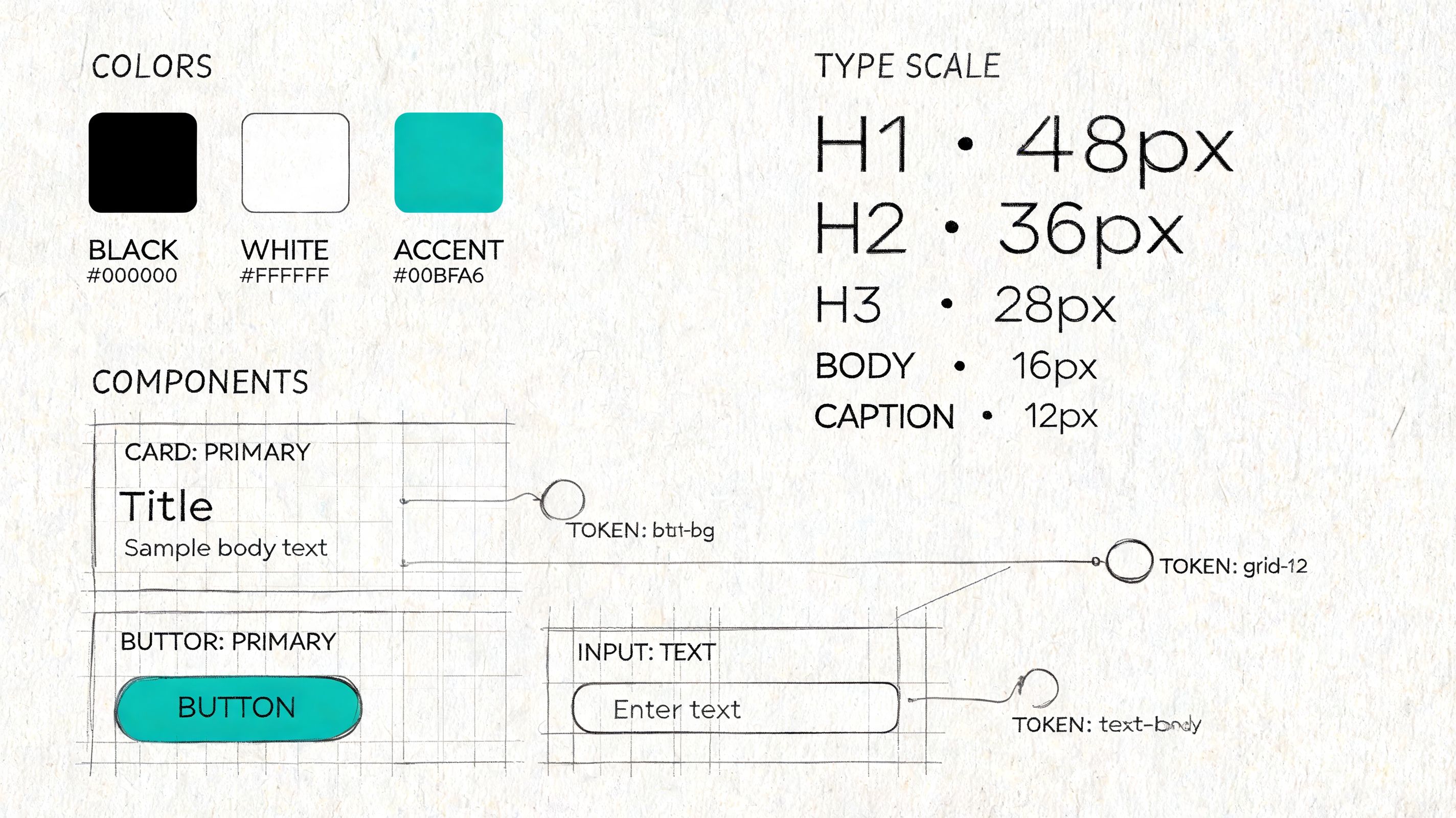
10. Design System Development and Token-Based Design
A product team ships a new checkout flow on Friday. By Monday, support has screenshots from three different versions of the same button. Engineering copied an older component, design used a newer file, and marketing published a landing page with a third color value that almost matches both. Nothing is broken in isolation. The product still feels unreliable.
Design systems address that problem at the operating level. They turn scattered UI decisions into shared rules that design and code can apply the same way. Token-based design makes those rules portable by defining values for color, spacing, typography, radius, motion, and states in a format teams can implement across products and platforms.
Systems reduce decision drag
Consistency matters, but the practical gain is speed with fewer regressions. Teams stop re-litigating basic choices and spend more time on workflow clarity, edge cases, and product behavior. In mature teams, a system is less a pattern library and more a contract. It defines what “done” looks like for interaction states, accessibility defaults, and implementation quality.
The hard part is scope. I have seen teams try to build a perfect system before they have stable product patterns. That usually creates documentation nobody trusts. The stronger path is narrower and less glamorous. Start with repeated components that carry real product risk, then connect them to tokens that can survive redesigns and replatforming work.
What works:
- Audit before standardizing: Inventory the UI that already exists, including the messy exceptions. Repeated patterns reveal where a system will save time first.
- Start with high-frequency components and core tokens: Buttons, inputs, alerts, spacing, type scale, and color roles usually pay back faster than obscure edge-case components.
- Write usage rules, not just specs: Show when to use a component, when not to use it, and what breaks accessibility or clarity.
- Set governance with real owners: Design, engineering, and product need a clear path for proposing changes, reviewing impact, and versioning updates.
- Track adoption: Measure component reuse, token coverage in code, variance in UI patterns, accessibility defects, and time to ship common flows.
What doesn’t:
- Building a component graveyard: A large library with weak adoption creates false confidence and more maintenance work.
- Token names tied to appearance instead of purpose: Names like
blue-500age badly. Semantic names likeaction-primarysurvive theme changes better. - Letting design files and production drift apart: Once teams see mismatch, they stop trusting the system and return to one-off fixes.
- Treating governance as design-only work: Engineering constraints, release cadence, and migration cost shape the system as much as visual standards do.
AI changes the workflow here in useful, very specific ways. Figr can import Figma design systems, carry token definitions into generated artifacts, and keep early exploration closer to the product’s actual UI language instead of generic patterns. That shortens setup time and reduces avoidable drift. It does not solve governance, naming, or migration strategy. Teams still need to decide which primitives deserve permanence, how changes roll out safely, and which exceptions are signs of product growth versus system decay.
10 UX Design Methods Comparison
| Method | Implementation complexity | Resource requirements | Expected outcomes | Ideal use cases | Key advantages |
|---|---|---|---|---|---|
| User Research & Contextual Inquiry | High, in-situ planning and flexible execution | Skilled researchers, travel/time, recording equipment | Deep qualitative insights into workflows, constraints, and unmet needs | Early discovery, complex physical workflows, product-market fit research | Reveals unarticulated needs and real-world workarounds; builds team empathy |
| User Testing & Moderated Testing Sessions | Moderate, structured sessions and facilitation skills | Moderators, participants, recording tools, lab/remote setup | Direct identification of usability problems and mental models | Usability validation of prototypes, pre-launch checks, iterative design | Quickly exposes task-level usability issues with rich user reasoning |
| Design Sprints | High intensity but time-boxed and structured | Cross-functional team commitment, facilitator, rapid prototyping tools | Rapid prototype and validated concept within days | Time‑boxed problem solving, feature validation, alignment sprints | Compresses months of work into a week; aligns stakeholders and reduces risk |
| Analytics-Driven User Behavior Analysis | Moderate to high, requires instrumentation and analysis pipelines | Analytics platforms, event tracking, data analysts, governance | Scalable quantitative patterns: funnels, cohorts, retention, drop-offs | Prioritizing high-impact improvements, measuring post-release impact | Objective, large-scale behavior insights that inform prioritization |
| Usability Heuristics & Heuristic Evaluation | Low to moderate, checklist-based expert reviews | UX experts, review time, simple documentation tools | Rapid list of common usability issues with severity ratings | Early-stage reviews, competitor audits, screening before user tests | Fast, inexpensive screening that works on low-fidelity designs |
| Wireframing & Information Architecture (IA) Mapping | Low to moderate, requires IA skills and versioning | Designers, IA tools (Figma, Miro), stakeholder input | Clear structure, flows, and low-fi blueprints for development | Organizing content, planning flows, handoff and documentation | Separates structure from visuals; speeds iteration and handoff |
| Accessibility Audits & Inclusive Design Testing | Moderate, mix of automated and manual testing | Accessibility specialists, assistive tech users, testing tools | Compliance gaps, remediation priorities, improved inclusive usability | Legal compliance, accessibility remediation, broad-audience products | Expands addressable market and improves usability for all users |
| Rapid Prototyping & Iterative Testing | Low to moderate, rapid cycles requiring discipline | Designers, prototyping tools, frequent user feedback | Fast validated learning and incremental design improvements | Early concept validation, agile teams, multiple design directions | Fails fast to learn quickly; reduces late-stage rework |
| A/B Testing & Multivariate Testing | Moderate to high, requires experiment design and stats | Experimentation platform, sufficient traffic, analysts, dev support | Quantitative evidence of which variants improve target metrics | Conversion optimization, funnel improvements, feature comparisons | Provides statistically grounded, real-user performance data |
| Design System Development & Token-Based Design | High, governance, tooling, and cross-team alignment | Dedicated design/dev team, Figma/Storybook, documentation effort | Reusable components, consistent tokens, faster delivery at scale | Multi-product organizations, scaling teams, long-term consistency | Ensures consistency, reduces design debt, accelerates development |
From Method to Momentum
The pattern shows up late on a Thursday. Product wants to ship. Design says the flow still feels shaky. Engineering has already priced the edge cases. Analytics shows drop-off, but no one agrees on why. At that point, the question is rarely, “Which UX method do we believe in?” Rather, the question is, “What kind of risk are we carrying right now?”
That is how strong teams choose methods. They match the method to the uncertainty in front of them. If the risk is poor understanding of the user’s real environment, run contextual inquiry. If the risk is interaction clarity, test the task flow with real people. If the risk is inconsistency across screens and teams, tighten the design system and token usage.
Ambiguity gets expensive fast. Teams that argue from taste burn calendar time, lose confidence, and create avoidable rework for engineering. Good UX methods are not ceremony. They are ways to reduce uncertainty before it turns into build costs, support tickets, and rushed redesigns.
The pressure gets sharper as organizations grow. Silos form. Opinions harden. Dashboards proliferate. Handoffs get noisy. Teams can end up with plenty of activity and very little shared understanding of the user problem. That is usually not a design maturity issue alone. It is an operating model issue.
The practical move is simpler than it sounds. Do not try to operationalize all ten methods in one quarter. Start with the feature already causing friction, then ask a blunt question: are we still learning the problem, or are we validating a proposed solution? That split narrows the method quickly and keeps the team from reaching for the wrong artifact.
A useful weekly default looks like this:
- If discovery is weak: Observe a user in context and document what the environment changes about the task.
- If clarity is weak: Run a moderated usability session and note where hesitation, misread labels, or false confidence appear.
- If the team is arguing from anecdotes: Pull analytics, trace the funnel, and compare behavior across entry points or segments.
- If consistency is breaking trust: Audit component usage, token drift, and accessibility regressions across the flow.
That habit is more important than methodological purity.
The teams that improve fastest are usually not the ones with the longest process documents. They are the ones that know how to choose the lightest method that can answer the next important question, then act on what they learn. In practice, that often means combining methods instead of treating them as isolated exercises. Research frames the problem. Prototypes make it testable. Analytics checks whether the live product behaves the way the team expected.
AI changes the speed of that loop when it is connected to real product context instead of generating generic outputs in isolation. Figr is one example. It connects live product state, analytics, design systems, accessibility checks, and prototype generation, which cuts setup work that often prevents teams from running the method they already know they need. That is the useful role for AI in UX practice. Less busywork, faster evidence, and tighter handoff between discovery and delivery.
The blank canvas is never blank. It already contains assumptions, constraints, inherited patterns, and deadline pressure. A solid UX method helps teams expose those forces early enough to make better decisions, and enough momentum to keep shipping without guessing.
If your team is tired of starting UX work from scattered screenshots, old Figma files, and stakeholder memory, Figr gives you a practical way to turn product context into usable design artifacts. It captures your live app, imports your design system, connects analytics to flow decisions, and helps PMs, designers, and QA teams move from idea to validated UX with less rework.
