
It's 4:47 PM on Thursday. Your VP just asked for something visual to anchor tomorrow's board discussion. You have a PRD. You have bullet points. You have 16 hours and no designer availability.
This is the moment abstract ideas crumble.
That pressure reveals a core truth: the real work isn’t dreaming up features, it's translating them into something a stakeholder can feel and an engineer can build. For too long, we’ve treated prototyping as just making pretty, clickable pictures. But what if that misses the entire point?
A prototype isn't a sterile blueprint: it's a dress rehearsal. A static mockup is a photograph of a building, but a prototype is the construction site walkthrough. It’s where you find the hidden wiring, the awkward corners, and the surprising views you never saw in the architectural drawings.
Beyond Mockups: The Case for Context-Aware Prototyping
This guide isn't about just making things clickable. It’s about a different way of thinking: context-aware prototyping.
The basic gist is this: a prototype’s value is directly tied to how much reality it contains. Instead of starting from a blank screen, this approach grounds every design decision in the real environment of your live product. It forces you to consider existing user flows, your established design system, and the learned behaviors of your current users.
We wrote a whole piece on how context is the new canvas if you want to go deeper.
This approach moves you past asking "What does it look like?" and helps you definitively answer "How does it actually work under real-world pressure?" What happens when a user has a slow network connection? The prototype should simulate it. Does this new component clash with an existing one? The prototype will reveal it.
Why This Matters Now
Just last week, I watched a PM present a new onboarding flow. It looked beautiful in Figma. But the very first question from an engineer was, "How does this handle the five different account states a new user might have?"
The prototype, built in a vacuum, had no answer. The meeting stalled. Two weeks of design work were suddenly on the line.
This is a story I’ve seen play out countless times, and the financial hit is real. Research shows that every $1 invested in UX, which includes prototyping, can deliver up to $100 in returns. For more data, check out this breakdown on the impressive ROI of UX design.
Prototyping isn’t just a step in the process. It’s a critical tool for strategic alignment and risk reduction.
This guide will give you a workflow to put these ideas into action. You'll learn to build prototypes that de-risk development, get your teams aligned, and empower you to make confident decisions much, much faster.
Grounding Your Prototype in Product Reality
A prototype built in a vacuum is a beautiful lie. It’s an elegant solution to a problem that doesn’t actually exist in the messy, complicated world of your live application. The first, most crucial step in any meaningful prototyping workflow is to anchor your exploration in the soil of your actual product.
This isn't about starting from scratch; it's about starting from what's real.
This is what I mean: by ingesting what already exists, your prototype becomes an evolution, not an invention dropped from the sky. It inherits the quirks, constraints, and realities of your current user experience. Think of a city planner who needs the current city map, with all its traffic patterns and zoning laws, before proposing a new building. Without that map, you’re just drawing a fantasy.
Capture Your Existing World
Before you can design the future, you have to understand the present. This means capturing your live application’s context: its user flows, its component behaviors, and the unwritten rules of its design system. How many clicks does it really take for a user to complete a core action? What are the actual load times between screens?
These aren't minor details. They're the baseline reality you are trying to improve upon.
A friend at a Series C company recently told me his team spent a month designing a new feature, only to realize late in the game that it was technically incompatible with their authentication flow. The entire concept had to be scrapped. Why? Because their prototype assumed an ideal state, ignoring the legacy code that governed their real product.
This visual shows the direct line from investment in this kind of deep-dive prototyping to measurable returns.
The process is clear: investing time upfront to ground your work in reality leads to prototypes that solve real problems, which in turn delivers a stronger business return.
From Vague Ideas to Actionable Artifacts
Grounding your prototype isn’t a passive activity. It’s an active process of creating artifacts that reflect reality. This could mean:
- Mapping existing user flows: Not how you think they work, but how they actually function. Recording a real session can reveal unexpected friction points.
- Documenting component states: What does a button look like when disabled, loading, or successful? Capturing these ensures your new designs don't break established patterns.
- Analyzing engagement data: Where are users dropping off? Which funnels are underperforming? This data provides the "why" behind your redesign efforts.
For example, a team redesigning the Shopify checkout setup didn’t start with wireframes. It started by analyzing CSV data on merchant engagement and meticulously mapping the existing information architecture. Only then could they see the real drop-off points and design a truly effective new setup flow.
The goal is to make the invisible visible. When you map out the current state, you’re not just documenting; you’re building a shared understanding across your entire team.
This zoom-out moment reveals a fundamental truth about product development. Teams don't fail because their ideas are bad; they fail because their ideas are disconnected from the product's operational reality. The economic incentive is to close this gap. Ambiguity is expensive. Rework is expensive.
In short, your first move isn't to open a design tool. It's to open your own product and see it with fresh eyes.
Mapping the Unseen States and Edge Cases
Ever notice how a truly great user flow feels solid, almost inevitable? That feeling doesn't come from just designing the happy path.
The happy path, where every click is perfect and every action succeeds, is the tip of an iceberg. It's the 10% everyone sees. But lurking below the surface is the other 90%: the edge cases, error states, and empty states that can quietly sink your project. This is where prototyping moves beyond visualizing an idea and starts stress-testing a system.
We often get stuck asking, “what if the user does this?” A much better question is, “what are all the ways the system can respond?”
That small shift changes everything. It moves the focus from unpredictable user behavior to the predictable states of your application. You can’t control every user action, but you can, and must, define every system reaction. What happens when the network drops mid-upload? What if a user tries to freeze a card that's already frozen? These aren't user mistakes; they are system states that demand a designed response.
From a Single Screen to a State Machine
Here’s a true story. Last quarter, a product manager at a fintech company shipped a new file upload feature. Engineering estimated two weeks. It took six.
Why? The PM specified one screen for the "happy path" upload. But once development started, the engineers discovered 11 additional states they had to build for.
They kept coming back with questions about things like:
- Empty State: What does the uploader look like before any file is selected?
- Loading State: The progress indicator during the upload.
- Success State: The confirmation message after a successful upload.
- Error State (File Type): The message for an unsupported file format.
- Error State (File Size): The warning for a file that's too large.
- Error State (Network Drop): What happens if the connection dies mid-upload?
Each hidden state required a design decision, and each decision required the PM’s input. The two-week estimate was for a single screen; the six-week reality was twelve screens plus a storm of "what should happen when..." conversations. Proactively mapping these states is non-negotiable, and as we've found, these edge cases can cost 50-100x more after launch.
Systemic Mapping in Action
The gist is this: treat every component not as a static element, but as a small state machine. A task card with "Approve" and "Reject" buttons isn't just two actions. It's a component with a whole life cycle of states: pending, approved, rejected, reassigning, and the error state if an action fails.
When you map these states out ahead of time, it transforms the development process. A fantastic example is this interactive task assignment prototype, which visualizes every possible state of the component before code gets written. The prototype becomes the single source of truth.
When you map every state, you're not just designing screens. You are designing resilience. You are designing a system that anticipates failure and handles it gracefully.
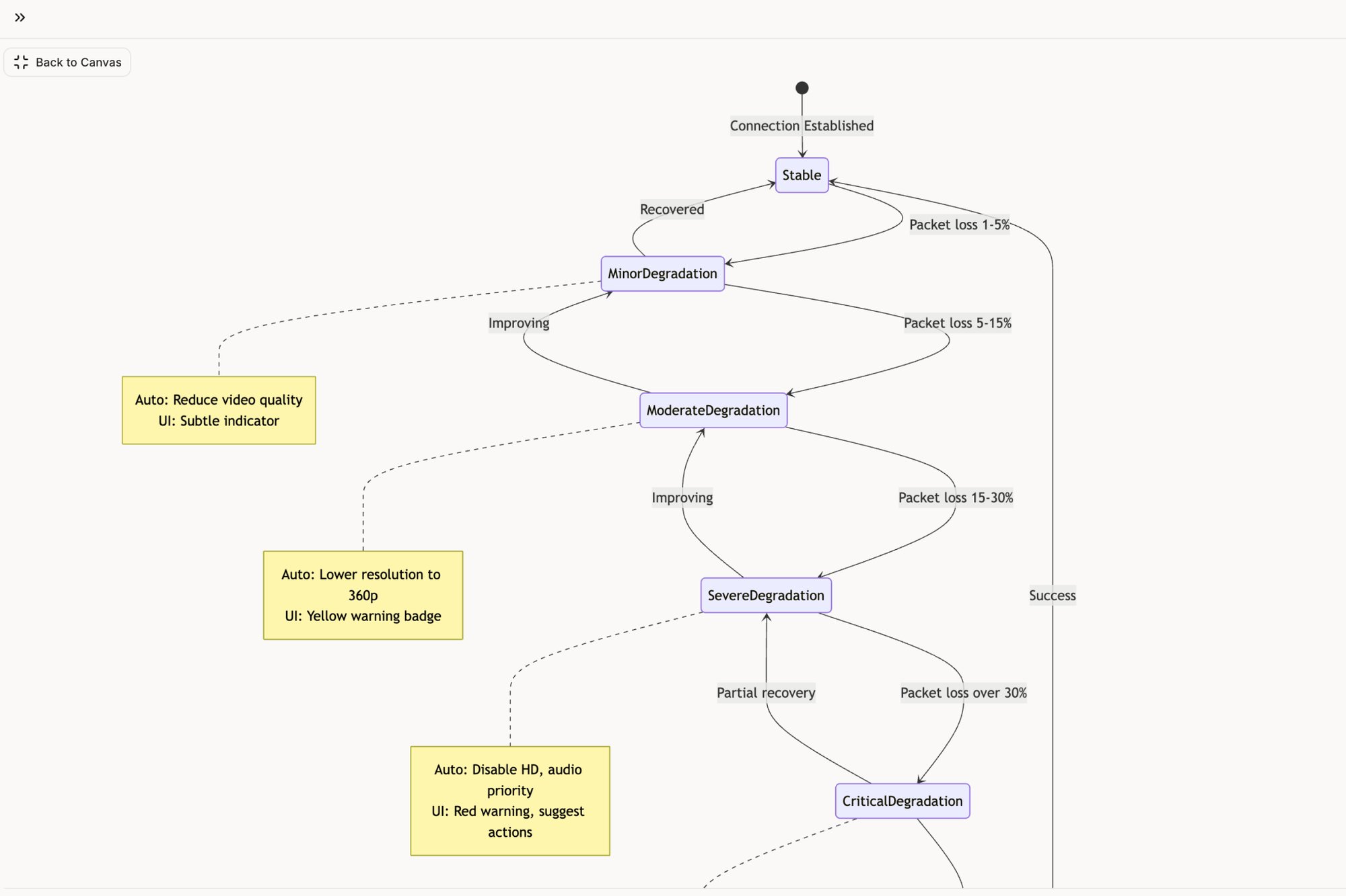
This thinking applies to entire user flows, not just individual components. Complex interactions have dozens of potential failure points. Think about a video call. The system needs clear states for low bandwidth, packet loss, and reconnection attempts. Exploring a complete user flow map for Zoom's network degradation shows just how deep this rabbit hole can go.
This is where true product quality is born. It’s the difference between a product that feels solid and one that feels brittle. By using your prototype to map these unseen states, you’re moving from designing an interface to engineering an experience.
Building Interactive Prototypes That Answer Real Questions
Static screens tell stories. Interactive prototypes run experiments. This is the critical jump from a visual idea to a functional simulation where your assumptions must survive contact with reality.
The point isn't just to make things clickable. It's about building prototypes that force an answer to specific, high-stakes questions. Can a user actually navigate your new checkout flow? Is the UI you designed genuinely intuitive, or does it just look that way on a slide?
Think of it like the difference between a car's blueprint and a driving simulator. One shows you the design; the other lets you feel how it handles on the road.
This hand-drawn sketch shows the kind of detailed thinking that goes into mapping a complete user journey before a single line of code is written.
What's crucial here is how the flow connects different states and decisions. It moves beyond isolated screens to tell the story of a cohesive experience.
From Visuals to Verifiable Hypotheses
An interactive prototype turns every design choice into a testable hypothesis. Instead of debating opinions in a conference room, you can put a realistic simulation in front of users and just watch what they do. That shift is fundamental.
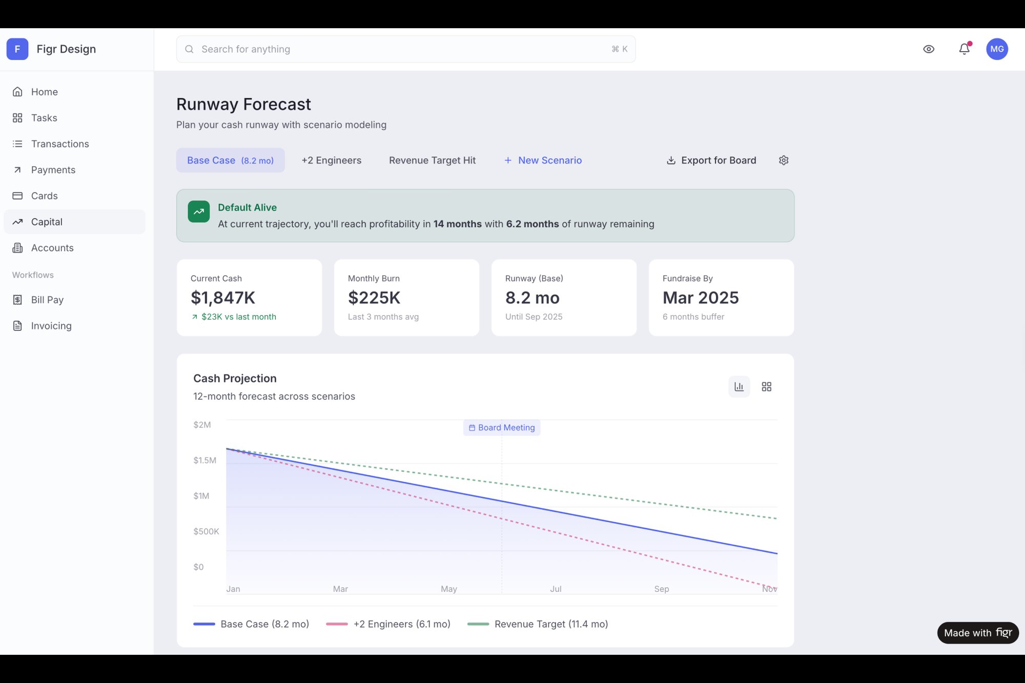
Last week, I saw a team present a prototype for a new feature that helps founders forecast their runway, a notoriously complex task. Instead of showing static tables, they built an interactive tool that felt real. The conversation immediately went from "I think this is confusing" to "Let's test if users can successfully adjust their burn rate and see the outcome."
You can see how this works in this high-fidelity Mercury runway forecasting UI. It brings a complex data interaction to life long before any development begins.
The Business Case for Interaction
The value here isn't just theoretical; it's backed by data. The landscape of prototyping in UX design has a massive business impact. Nielsen Norman Group research shows that a one- to ten-second jump in mobile load time can spike bounce rates by 123%. Lightweight, testable prototypes are simply non-negotiable. You can learn more about the future of UX from Nielsen Norman Group's research.
This level of rigor is why effective product development software is so essential. It gives teams the frameworks they need to build, test, and validate these interactive models efficiently.
A prototype isn't a demonstration of your final design. It's an engine for generating answers and reducing uncertainty.
The goal is to create an artifact that feels so real that the feedback you get is about the experience itself, not the tool you used to build it. This means focusing on the micro-interactions, transitions, and data states that mimic the final product.
Here’s the bottom line: if your prototype can’t answer a critical business or user question, it’s not finished. It's still just a picture. By building interactive models, you move from presenting ideas to proving them. That is how you build products with confidence.
From Prototype to Production-Ready Handoff
The last mile of prototyping is often the most treacherous: the handoff. I’ve seen it happen time and again where a brilliant prototype fails to become a brilliant product. This isn't a design failure; it's a communication failure. The handoff isn't a single event, like dropping a file in a shared folder. It’s a process of translation.
Think of your interactive prototype as a musical score. It has the notes, the timing, and the emotional intent. Handing over static screens is like giving an orchestra the lyrics and telling them to figure out the melody. It always leads to improvisation, dissonance, and a final product that sounds nothing like you intended.
What I mean is, it's not about just exporting to Figma. It's about generating comprehensive documentation directly from the prototype itself. The prototype must become the single source of truth that spins off every artifact the engineering team needs to build with absolute clarity.
Turning Prototypes into Specifications
The old way was a mess. A design file here, a PRD there, and a spreadsheet of user stories somewhere else. This creates information silos and practically invites ambiguity. A modern workflow treats the prototype as the central hub from which all other documents are born.
This means your prototype doesn't just show the happy path. It explicitly documents:
- Complete User Flows: Visual diagrams mapping every step, decision, and loop a user could possibly take.
- Detailed Test Cases: A full suite of scenarios covering happy paths, edge cases, and ugly failure states.
- Accessibility Notes: Annotations specifying ARIA roles, tab order, and screen reader behavior for every interactive element.
When these artifacts are generated directly from the interactive model, they are inherently connected. There’s no room for misinterpretation because the documentation is a direct reflection of the validated design.
The Economics of a Bad Handoff
What's the real cost of a poor handoff? It’s not just a few extra meetings. Ambiguity is the single most expensive bug in software development.
A study by the Systems Sciences Institute at IBM found that the cost to fix an error found after product release was four to five times as much as one uncovered during design. It gets worse: an error found during the maintenance phase can cost up to 100 times more. Every vague requirement or undocumented state in a handoff document is a potential post-launch bug. It’s a tax on your engineering velocity, paid in rework and blown deadlines.
The quality of your handoff directly predicts the quality of your final product. A clear handoff isn't a courtesy; it's a core risk mitigation strategy.
A clear, documented handoff transforms the conversation from "What should this do?" to "How do we best build this?". You can dive deeper into how to automate the designer-to-developer handoff to make this process even tighter.
Building the Bridge to Engineering
A truly effective handoff preempts engineering questions. Before a developer has to ask, "What happens if the API call fails here?", the answer should already exist in the documentation generated from the prototype.
For example, automatically generating QA instructions from your interactive flows ensures that what you designed is what actually gets tested and shipped. This set of test cases for a Waymo trip modification was created directly from the prototype, covering dozens of scenarios that might have otherwise been missed. This is the bridge between design intent and engineering execution.
Here's your grounded takeaway: stop treating the handoff as a final step. Instead, view it as the continuous process of generating clear, actionable instructions from a living prototype. When you do that, you transform your prototype from a simple design artifact into a production-ready blueprint.
Your Next Step Toward Grounded Prototyping
We've journeyed from the chaos of a last-minute request to a repeatable process for prototyping UX design. The theory is clear, the path is mapped.
But a map is useless until you take the first step. Action is what matters.
Your next move isn’t to overhaul your entire process tomorrow. That’s how initiatives fail. Instead, start small. Start with something you think is simple.
This week, pick one existing, deceptively straightforward user flow in your product. Maybe it's the password reset flow. Perhaps it's the process for inviting a new team member. Or even something as mundane as the file upload sequence.
Instead of just looking at the final success screen, your task is to make the entire journey visible. Use a tool to map every single intermediate step.
What does the screen look like the millisecond a user clicks "upload?" What error do they see for a duplicate filename? How does the UI confirm a successful password reset?
Think of it like an electrical schematic. You aren't just looking at the lightbulb; you are tracing every wire, switch, and circuit breaker that makes it work. This exercise alone will reveal the hidden complexity in your product more powerfully than any article ever could.
You can see an example of this kind of deep dive in this Dropbox File Upload Pathfinder, where every single failure mode is considered.
This is the work. It’s not glamorous, but it is foundational.
Make the invisible visible. Start there. That is how you begin to build with undeniable confidence.
Frequently Asked Questions About Prototyping
Whenever you introduce a new workflow, questions pop up. It's natural. Moving to a structured prototyping process often brings up practical concerns about speed, responsibility, and tools. Let's tackle some of the most common ones.
Is Prototyping Just for Designers?
That’s a classic misconception. While designers often drive the visual and interactive parts, prototyping is absolutely a team sport.
Product managers lean on prototypes to see if the business logic and user flows hold up. Engineers use them to spot technical hurdles or API needs way before a single line of code is written. A good prototype isn't a design asset; it's the shared language the entire team uses to talk about the product.
Won’t This Just Slow Us Down?
This is the old "sharpen the axe" paradox, isn't it? Does it take a few extra hours to stop and sharpen the axe? Sure. But does it save you days of hacking away with a dull blade? You bet.
Prototyping can feel slower at the start because it forces everyone to confront messy details early. But that initial time pays for itself over and over by preventing weeks of rework, scope creep, and those painful "this isn't what we talked about" meetings. An hour spent getting a flow right in a prototype can easily save 10 hours of development pain later.
How Much Fidelity Is Enough?
Fidelity isn't a simple on-or-off switch; it’s a spectrum. The right level depends entirely on the question you’re trying to answer.
- Low-fidelity prototypes are your go-to for validating the big picture. Think simple user flows or wireframes. They answer questions like: Are we solving the right problem in the right order? A basic user flow map is perfect for this.
- High-fidelity prototypes come in when you need to test the feel and nuance of an interaction. Does this animation feel natural? Is the data presented clearly? For that, you need something that looks and feels like the real deal, like this interactive dashboard.
The rule of thumb is simple: build just enough fidelity to get a believable answer to your most urgent question. No more, no less.
What’s the First Step for My Team?
Start small. Seriously. If your team is just getting started, the first step is to get a solid handle on the fundamentals. Understanding What is User Experience Design is the foundation for everything else.
Once you have that baseline, don't try to boil the ocean. Pick one small, existing feature and just try to map out all its edge cases. That single, focused exercise will demonstrate the value of this process more powerfully than any big presentation ever could. For the full methodology, from fidelity selection to agile integration, see our rapid prototyping guide.
When prototyping for the web specifically, our guide on how to prototype a website covers the patterns that cut rework.
Ready to stop building beautiful lies and start prototyping with real product context? Figr is an AI design agent that learns your live app, design system, and analytics to generate high-fidelity prototypes, user flows, and test cases that are grounded in reality. Ship UX faster and with more confidence. Explore Figr today.