
It’s 10:15 AM on a Tuesday, three weeks before the big launch. The prototype looks slick in Figma, the product requirements are locked, and engineering is ready to build.
But there’s a quiet hum of a question in the room: will real users actually get it?
This is the invisible moment where confident roadmaps collide with human reality. We often treat usability testing as a final checkbox, a quick validation step before shipping. But that’s like asking a building inspector to check the foundation after the walls are up. Its true power is diagnostic, not just confirmatory.
This guide isn’t about treating usability testing as a gate. Think of it as a set of binoculars. It’s the tool that turns your team's assumptions into hard evidence, showing you the subtle disconnects that separate a good product from one that feels indispensable.
Before we jump in, getting the basic terms straight is a good idea. It helps align the team on what you're actually trying to achieve. You can find a quick rundown of key concepts in this Usability Testing Glossary.
Why This Matters Now More Than Ever
This isn't just a niche activity for big tech anymore. A 2023 analysis by User Interviews found that 67% of organizations now run usability tests as a core part of their development process. Why? The economics are clear. Teams that test consistently report an 85% improvement in product usability, which can slash customer support tickets by up to 40%.
The process is a simple, repeatable loop: ask the right questions, gather insights from watching real people, and improve the product based on what you learned.
This simple flow shows how structured questions lead directly to insights that fuel product improvements. We’re about to walk through how to conduct testing that surfaces deep insights, not just surface-level feedback. This is how you set the stage for a product people actually want to use.
Defining Your Mission: What Are You Really Testing?
Before you write a single task or recruit a single participant, you need a sharp, falsifiable hypothesis. A vague goal like "See if the design is user-friendly" is a compass pointing everywhere at once. It will only lead you to fuzzy, unactionable feedback.
What you need is a mission statement.
Something like: "A new user can successfully set up their first project in under three minutes without using the help docs." Now that is a mission. It tells you who to recruit, what tasks to write, and exactly how you'll define success. Think of this as the difference between a casual chat and a scientific experiment: one is anecdotal, the other has controls and measurable outcomes.
This precision elevates your work from opinion-gathering to genuine data collection. Are you testing for efficiency, discoverability, or satisfaction? Each of those goals requires a totally different lens.
Pinpointing Your Focus Area
To craft a powerful mission, you have to decide which part of the user experience you're dissecting. Not all tests measure the same thing, and knowing the difference is the first step toward getting real insight.
There are three primary areas you'll likely investigate:
Efficiency: How quickly and easily can users get something done? This is all about time, clicks, and effort.
Discoverability: Can people find the features or information they need without being told where to look?
Satisfaction: How does the user feel after interacting with the product? This gets at their confidence, frustration, and overall perception.
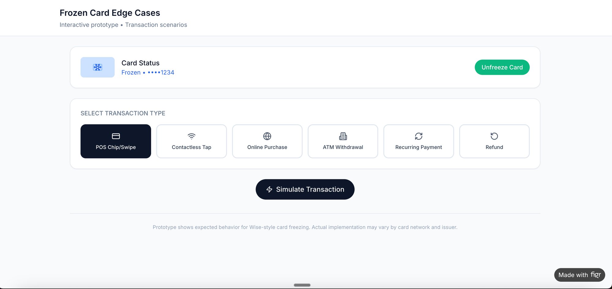
A colleague at a fintech company was recently testing a new "freeze card" flow. Their goal wasn't just "can users freeze their card." It was far more specific: "Can a stressed user, believing their card was just stolen, freeze it in under 15 seconds with zero errors?" That level of specificity transformed a generic test into a critical business insight, with clear test cases to validate the flow.
From Goals to Measurable Metrics
Once you have a clear goal, you have to translate it into metrics. This is how you actually prove or disprove your hypothesis. Vague goals produce vague data, but specific goals produce sharp, undeniable numbers.
The basic gist is this: a well-defined objective in your UX research plan gives you a clear problem to solve and helps you design better tests. Without it, you're just collecting opinions.
Tying goals to metrics is what makes your findings credible. This table shows how high-level ambitions connect directly to tangible measurements you can track.
The Art of the Ask: Crafting Scenarios and Scripts
Your test script isn't a cage, it's a guardrail. It keeps the session on track without crushing the very sparks of natural discovery you're trying to capture.
The single worst mistake you can make? Leading the witness. A question like, "So you just click the big green button to continue, right?" poisons the well immediately. It tells the user what you expect them to do, not what they would do.
Instead, you craft scenarios.
A scenario gives the user a world to step into, a real motivation to act. "Imagine you just got a notification about a suspicious transaction on your account. Show me how you'd secure your card." That one sentence creates context and a clear goal. Suddenly, the user isn't just clicking on a prototype, they're solving a personal problem.
This isn't just a nice-to-have, it's how modern product teams work. The 2023 State of User Research report found that 80% of UX researchers run usability tests often or always, making it the second-most common method. That’s no surprise when 85% report usability gains from the practice. A huge part of that success comes from scripting four to six realistic tasks that make prototypes feel like the real deal. You can get the full story in the full user research report.
The Anatomy of a Flexible Script
Think of your script as a flexible tool, not a rigid checklist. It needs to anticipate forks in the road and prepare you to navigate them without grabbing the steering wheel.
Your script has to account for two main possibilities: the struggle and the breeze-through.
When a user gets stuck: Have gentle nudges ready. Not answers, but prompts. "What were you expecting to see there?" or "Talk me through what you're looking for right now." These questions keep them engaged without giving away the solution.
When a user succeeds quickly: Don't just move on. This is an opportunity. Have follow-up questions prepared to probe their thinking. "That seemed easy for you, was that what you expected?" or "What made you confident that was the right next step?"
This is what I mean: the script's job is to create the conditions for observation, not to dictate the outcome. It provides structure, but the most valuable insights often come from the moments you didn't plan for.
Preparing the Right Artifacts for Testing
The script is only one half of the equation, the artifact you put in front of the user is the other. The fidelity of your prototype has to match the questions you're trying to answer.
For a simple flow validation, a wireframe might do the trick. But if you’re testing nuanced interactions, you need something that feels real.
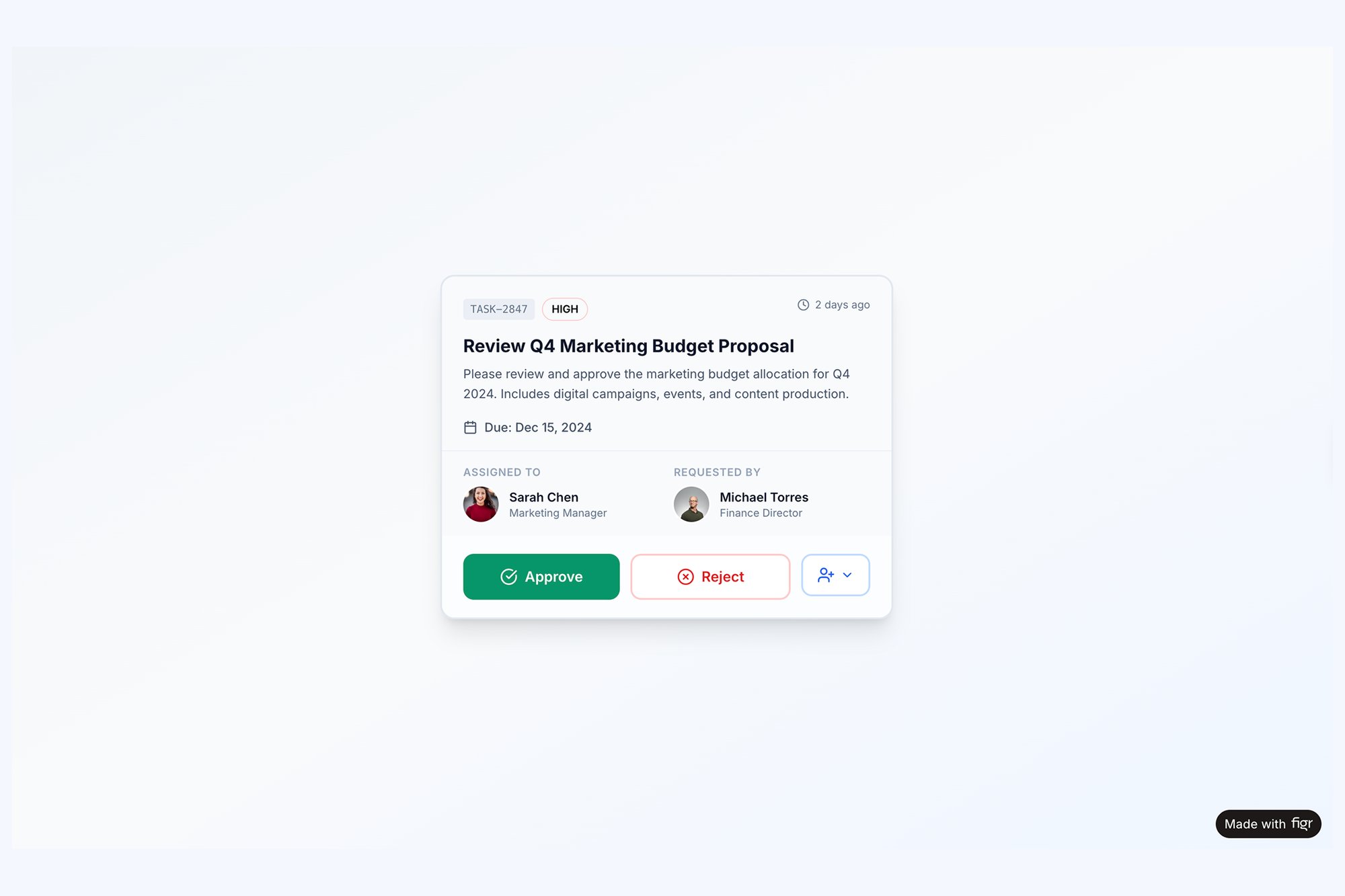
I remember a friend at a SaaS company telling me about a test they ran on a new task assignment component. The wireframe test went fine. But when they tested a high-fidelity prototype, users got confused about what happened after they clicked "Approve." The static wireframe couldn't show the subtle animation and status update that the real component would have. The feedback was completely different.
That’s why the right artifact is critical. When testing a complex component with multiple states, a high-fidelity prototype is non-negotiable. An interactive task assignment component that simulates all possible states lets you see how users react to post-action feedback, something a static image could never reveal.
The goal of a script and prototype isn't to test the user's ability to follow instructions. It's to test your interface's ability to support their intentions.
Ultimately, all this preparation is about creating a believable simulation. The more realistic the scenario and the artifact, the more authentic the user's behavior will be. That’s where you find the insights that actually matter. And if you're looking to streamline the question-writing process, you might find some useful ideas in our article about AI tools that generate interview questions for user research.
From Observation to Insight: Analyzing the Results
The session's over. The participant has logged off. You're left with hours of recordings, a pile of scattered notes, and a head buzzing with memorable quotes.
Now what?
Raw data isn't insight. It doesn't magically transform into improvements. You have to connect the dots to illuminate the path forward, moving from individual moments to systemic patterns.
“User #3 couldn’t find the export button” is just an observation.
“Four out of five users struggled to locate the export functionality because its icon is inconsistent with our design system” is a genuine insight. That's the goal.
Uncovering Patterns with Affinity Mapping
This is where the real work begins. The most effective way I've found to start is with affinity mapping. Think of it as building a puzzle without the box top: you have all the pieces, but you have to find the relationships yourself.
The process is simple: write every distinct observation, quote, or pain point on its own sticky note (virtual or physical). Then, just start clustering them. Group notes that feel related, even if you can’t quite name the theme yet. Slowly but surely, categories will emerge from the chaos.
You’re not just organizing data here. You're building a narrative about the user experience. You'll see small clusters form around confusing navigation, then larger ones around an unclear value proposition. A friend at a Series C company told me they call this phase "finding the gravity," as all the small observations start pulling toward a larger, central problem.
Blending Numbers with Narratives
Your analysis should never be purely qualitative or quantitative. A powerful report weaves them together into a story backed by data.
Which of these is more compelling?
“Some users found the onboarding confusing.”
“The task completion rate for onboarding was only 40%, with three separate users mentioning the instructions were ‘confusing’ and ‘overwhelming.’”
The second statement has teeth. The metric gives you the scale of the problem, while the quotes provide the human texture. This blend is what convinces stakeholders to act.
For something complex like a file upload, just noting the failures you saw isn't enough. A robust analysis means mapping out every single point of failure. We did exactly this when we created a detailed edge case map for Dropbox's file upload, which revealed dozens of scenarios that needed clear design solutions before they ever frustrated a real user.
Benchmarking Your Usability Score
To ground your findings, you need benchmarks. One of the most durable is the System Usability Scale (SUS). Decades of data show the average SUS score hovers around 68. A score below this signals 'poor' usability, the kind that makes the 88% of users who abandon an app after one glitch leave for good.
For accessibility-focused tests, the Accessibility Usability Scale (AUS) provides a similar benchmark. A 2023 review revealed a stark reality: one in two screen reader users scored apps at 56 or below, highlighting critical gaps in digital equity. You can find more data on usability testing benchmarks and accessibility. These scores give you an objective measure of quality.
Your job isn’t just to report what happened. It’s to explain why it happened and what business impact it will have if left unaddressed.
This is the crucial zoom-out moment. Usability isn’t just a feature, it's an economic force. Every friction point you identify is a leaky hole in the bucket of user retention and revenue. Fixing them isn't just "making it prettier," it's a direct investment in the business's bottom line.
The final step is translating these insights and hard numbers into a compelling report. This artifact is your tool for driving change. And if you're looking for ways to speed this up, check out our guide on AI tools that generate usability test reports.
End your analysis by creating a prioritized list of findings. A simple framework works best: rank each issue by user impact (High, Medium, Low) and engineering effort (High, Medium, Low). This transforms your research from a collection of problems into a clear, actionable roadmap for improvement.
From Insight to Action: Driving Change
The last participant has logged off. You're left staring at a digital mountain of session recordings, transcripts, and hastily typed notes. This is the moment where most usability testing efforts either succeed spectacularly or quietly wither away.
A report that gathers dust on a server is a failed project.
The final, most critical step is translating what you found into prioritized, actionable tickets for the product and engineering teams. A raw data dump isn’t a plan, it’s noise. The best reports don't just list problems, they recommend solutions and, more importantly, rank them by impact and effort.
This is where many teams falter. They present a long list of user frustrations without a clear path forward, overwhelming stakeholders and ensuring nothing gets done.
From Severity to Strategy
Your first move is to impose order on the chaos. A simple but effective framework is the Severity Score, which helps you triage issues with discipline. It forces you to move beyond "this felt clunky" to a structured assessment of harm.
You can categorize every issue you uncovered into one of four levels:
Critical: Blocks a user from completing a core task. Think of a broken "Proceed to Payment" button. This is a five-alarm fire.
High: Causes significant frustration and may lead a user to abandon the task, but a workaround exists. It’s painful, but not a total dead end.
Medium: A minor problem that creates friction but doesn't prevent task completion. Annoying, but not a dealbreaker.
Low: A cosmetic issue or minor annoyance that has a negligible impact on the user's ability to complete their goal.
This framework immediately separates the catastrophic failures from the trivial annoyances. It gives you a defensible way to say, "We must fix these three things now, and these other ten can wait."
Speaking the Right Language to Stakeholders
Once your issues are prioritized, you have to sell the solutions. A single, monolithic report rarely works because different stakeholders care about different things. You have to translate your findings into their native language.
For product leaders, frame your findings around business impact.
Like this: "Fixing this confusing checkout flow could reduce our cart abandonment by an estimated 15%, which translates to a potential revenue lift of $250,000 per quarter."
For engineers, provide clear context and irrefutable evidence. Give them the "why" behind the ticket. Instead of just writing "Change button color," provide a short video clip of a user struggling and explicitly state, "Four out of five users couldn't see the primary CTA because its color failed accessibility contrast checks." This transforms a subjective design request into an objective problem to be solved. We used this approach when mapping a new, clearer Shopify checkout setup flow to get stakeholder buy-in.
Just last week, I watched a PM present their usability findings. They led with a two-minute highlight reel of users sighing, squinting, and saying, "I'm lost." It was brutally effective. The emotional weight of watching real people struggle did more to convince the room than any spreadsheet ever could.
To bring this all together, a prioritization matrix is your best friend. It helps you visually map out issues based on both their severity for the user and the effort required from your team, making it dead simple for everyone to see what the top priorities are.
Connecting Usability to the Bottom Line
The basic gist is this: you must connect the dots from user frustration to business metrics. This is the zoom-out moment where you realize that usability testing isn't a cost center, it's an economic driver.
It’s about reducing expensive development rework by catching flaws in a low-cost prototype. It’s about lowering customer support costs because the interface is intuitive. It’s about increasing customer retention because the product doesn't just work, it feels good to use.
In short, it’s about making the entire product development lifecycle more efficient and more profitable. By turning qualitative observations into a clear, prioritized, and data-backed plan, you close the loop. You ensure that the time users gave you results in a better product for everyone. Many teams are now using specialized platforms to bridge this gap, and you can learn more about AI tools that turn user feedback into product roadmaps in our related guide.
Your Next Step: Don't Wait for Perfect
The biggest barrier to starting usability testing isn’t your budget or your schedule. It’s a mirage on the horizon: the perfectly prepared test.
We imagine a formal lab with two-way mirrors, a statistically significant pool of participants, and a prototype so polished it could practically ship tomorrow. This pursuit of perfection is a form of productive procrastination. It feels responsible, but it delays the one thing that actually matters: watching a real human interact with your work.
Your next step is not to write another comprehensive research plan.
It’s to run one small, scrappy test. This week.
The Fifteen-Minute Insight Engine
Find a colleague from another department, someone who hasn't been staring at your project for the last six months. Grab them for fifteen minutes.
Don't give them a long preamble or a detailed backstory. Just give them a single, clear task on your current prototype. Maybe it's a Figma link, a staging build, or even a high-fidelity prototype of a single feature.
Your only job is to watch them and listen as they think aloud. The insights you'll get from that single, imperfect session will be more valuable than weeks of internal debate over button colors or copy. You'll witness a moment of hesitation that reveals a flaw in your navigation, or a confident click on the wrong element that exposes a misleading label.
The goal isn’t to find every problem. The goal is to find one problem you didn’t know you had. That first discovery is what builds the momentum for a more structured process later.
A friend at a startup calls this "hallway usability testing." It’s not rigorous, but its return on investment is massive. Research from the Nielsen Norman Group confirms this, showing that even informal tests with a handful of users can uncover the vast majority of critical issues. In fact, testing with just five users typically reveals about 85% of the problems.
Start Now, Not When It's "Ready"
This lightweight approach transforms usability testing from a heavy, ceremonial event into a regular, reflexive habit.
Instead of a massive project you have to plan for, it becomes a simple question you ask every week: "Who can I watch use this for a few minutes?"
Building this habit fundamentally changes how you think about your product. You start anticipating user confusion before you write the code. You begin to see your interface not as a collection of features, but as a conversation with a person. That is how you build products people love.
Common Usability Testing Questions
Even with a perfect plan in hand, a few questions always seem to pop up when teams get into the weeds of usability testing. These aren't just minor details, they're the kind of fundamental choices that can make or break your entire study.
Getting these right is the difference between collecting a folder full of noisy, confusing data and capturing a clear signal you can actually act on. Let’s tackle the most common ones.
How Many Users Do I Really Need?
The classic, time-tested answer from the folks at Nielsen Norman Group is five. It's not a random number.
With just five users, you can expect to uncover around 85% of the usability problems on your site or app. This is the magic number for qualitative testing, where your goal is to find friction and understand why things are breaking, not to get a statistically significant result.
Now, if you're running a quantitative test to benchmark something specific, like time on task or completion rates, you'll need a much bigger sample. Think 20 or more users. But for most teams just starting out, focusing on 3-5 users for each of your key personas is the fastest way to find the most painful problems.
Moderated Versus Unmoderated Testing
So, what's the real difference between these two, and when should you use each? It all boils down to control versus scale.
Moderated testing is a live conversation. You have a facilitator guiding a participant through the tasks, which means you can ask follow-up questions on the fly. "I noticed you hesitated there, what were you thinking?" This is how you get the rich, qualitative context: the why behind the clicks.
Unmoderated testing happens on the participant's own time. They use a platform that records their screen and voice as they complete the tasks you’ve set up. It’s way faster, easier to scale, and often captures behavior in a more natural setting (no one's watching over their shoulder). The trade-off? You can't ask clarifying questions in the moment.
The right choice really depends on your goal. Need to dig deep into why users are getting confused? Go with moderated. Need to quickly validate a flow with a larger group? Unmoderated is your friend.
Your product's success depends on understanding real user behavior. Figr helps you move from guesswork to evidence by generating test cases, mapping edge cases, and building high-fidelity prototypes grounded in your actual product context. Stop shipping blind and start designing with confidence. Explore Figr today.