
You’ve built a design system with standardized components, well-defined foundations, and a structured workflow. However, the real challenge lies in the adoption of the design system. Without proper integration, even the most well-crafted system risks being ignored.
In Part 3, we discussed how to bridge the gap between design and development by ensuring that your system’s components translate seamlessly from Figma to code. But adoption goes beyond just technical implementation—it’s about getting teams on board and ensuring that your design system becomes a core part of daily workflows. Without a structured approach, designers may stick to old habits, leading to fragmented designs and wasted effort.
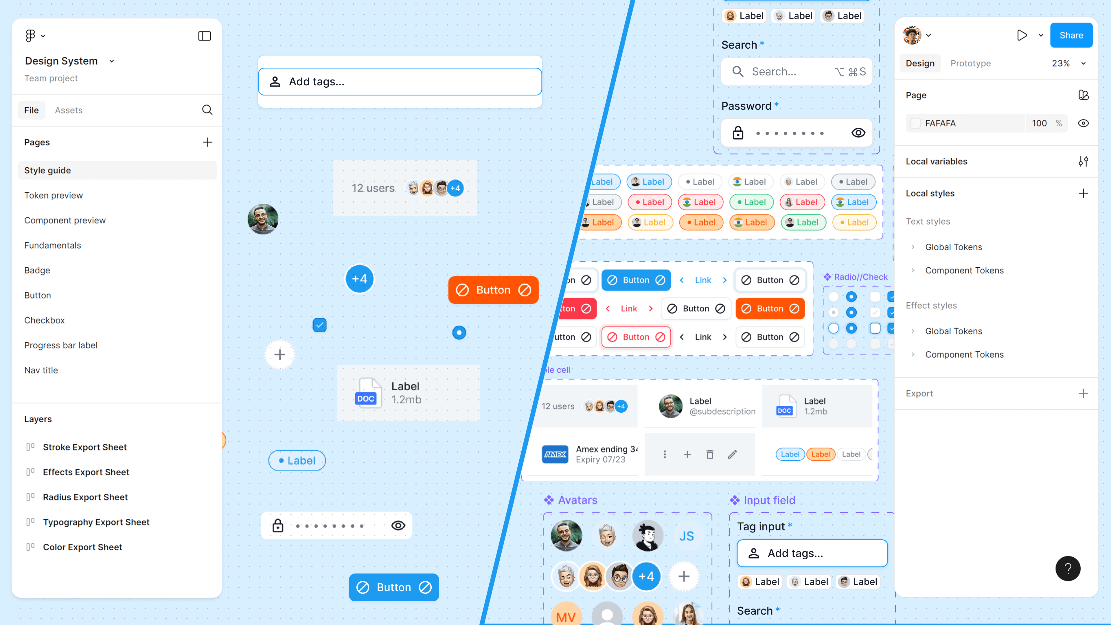
Consider Figma file organization without clear guidelines—files become chaotic, making collaboration inefficient. A design system works the same way. Strong design ops practices, including clear documentation, structured onboarding, and cross-team collaboration, ensure that the system becomes a seamless part of daily workflows.
In this blog, we’ll explore how to increase the adoption of a design system at scale, ensuring it’s not just a set of unused guidelines but a core driver of efficiency, consistency, and innovation.
A Design System isn’t a Project. It’s a Product, Serving Products. - Nathan Curtis
How to Overcome These Barriers?
1. Show Quick Wins with Measurable Impact
To convince designers to adopt a new system, highlight short-term benefits. Instead of pitching a long-term vision, show how the system speeds up design and development today.
- Example: Track how long it takes to design a feature without a design system vs. with reusable components. If a button redesign takes 5 minutes instead of 30, that’s a tangible win.
2. Tiered Onboarding and Role-Specific Tutorials
Not all team members will adopt the system at the same pace. Implement a tiered onboarding approach:
- Beginner: Introduce Figma file organization best practices, such as structured naming conventions and auto-layout usage.
- Intermediate: Show how to leverage design tokens and reusable components to maintain consistency.
- Advanced: Train power users to contribute to the system, ensuring scalability.
- Example: Create role-specific guides product designers focus on UI kits, while developers learn how to integrate tokens into codebases.
3. Communicate a Clear Roadmap & Celebrate Wins
A transparent adoption roadmap helps the team understand why system-based design matters and what milestones to expect.
- Set clear goals: “By Q2, 80% of new UI components should come from the design system.”
- Celebrate milestones: Feature success stories in team meetings "This design system saved 20% of development time this sprint."
Design system adoption in startups isn’t just about documentation and guidelines it’s about proving immediate value, addressing resistance, and making onboarding effortless. By demonstrating quick wins, streamlining Figma organization, and fostering team buy-in, startups can successfully scale their design system without disrupting their fast-moving culture.
How Can You Effectively Pilot Your Design System?
A design system is only as good as its adoption. Think of it like launching a new coding framework inside a dev team if you introduce it without clear benefits and structured onboarding, people will either resist it or misuse it. A well-planned pilot phase ensures that the system is battle-tested in real-world scenarios, refined based on feedback, and gradually embedded into workflows.
1. Choose a Strategic Pilot Project: Small, Impactful, and Representative
Rolling out a design system across an entire product at once can be overwhelming and counterproductive. Instead, start with a focused pilot project one that is small enough to be manageable yet complex enough to validate key aspects of the system.
What Makes a Good Pilot Project?
A dashboard settings page or a user profile management section is a great starting point. These interfaces typically contain:
- Tokenized elements – Color, spacing, typography, and shadows.
- Reusable components – Buttons, inputs, form elements, modals, dropdowns.
- Interactive states – Hover, focus, disabled, and error states.
- Cross-functional collaboration – Requires both designers and developers to work closely.
Why It Works
Think of it like testing a new transit system in a single neighborhood before city-wide expansion. If the routes are optimized, people use it, and feedback is positive, you can gradually scale it.
Example Framework:
- Before: Designers manually build UI, and developers write custom styles for every feature.
- After: Tokens are auto-synced, components are pre-built, and handoff is seamless with Storybook and token integration.
2. Build Early Buy-in Through Cross-Functional Collaboration
A successful pilot isn't just a test; it’s an opportunity to convince designers and developers that a system-based approach is more efficient. One of the biggest reasons design system adoption fails? Not talking enough with the team.
How to Make Adoption Seamless?
- Host a structured kick-off session: Walk through the new system’s implementation and workflow.
- Show real-world use cases: Demonstrate a redesigned screen using tokens and base components.
- Address concerns early: Encourage questions from developers and iterate based on their feedback.
Example: Suppose tokens and base components are ready. As a design system lead, you can:
- Create a short presentation explaining how Storybook integration works, how tokens sync, and how handoff happens.
- Show a before-and-after comparison of a screen designed with and without the system.
- Conduct a live implementation demo, where a developer integrates a UI element using the system.
- Take questions and document blockers that arise in the process.
Outcome: Instead of forcing adoption, this approach educates the team, making the transition smoother.
3. Establish a Continuous Feedback Loop for Iteration
A pilot isn't just a test run it’s the first iteration of a living system. To increase the adoption of the design system at scale, you need a structured way to measure what’s working and what’s breaking.
How to Track Success and Iterate?
- Define clear success metrics:
- Are designers using components instead of rebuilding UI?
- Are developers writing less redundant CSS?
- Has the design-to-dev handoff improved?
- Create an open feedback loop:
- Set up a Slack channel dedicated to design system queries.
- Use Notion or Jira to log component requests and bugs.
- Conduct bi-weekly retros to discuss adoption blockers.
Example Framework:
- Critical fixes – Token inconsistencies, missing component variants.
- Enhancements – New component requests based on recurring needs.
- Future improvements – Optimizing the system for long-term scalability.
Think of it like running a beta release of a product gathering feedback, fixing critical issues first, and iterating based on user behavior.
The Pilot is the Gateway to Design System Adoption
A structured pilot proves the value of a design system in a controlled setting. By focusing on small, impactful changes, actively collaborating with designers and developers, and refining based on feedback, you:
Show quick wins that convince the team to adopt the system.
- Increase adoption at scale by solving real workflow pain points.
- Create a system that evolves based on real-world usage.
The key? Talk more. Test more. Iterate often.
Driving Design System Adoption: From Skepticism to Advocacy
Design system adoption isn't about flipping a switch; it's about cultivating a shared belief. Even the most meticulously crafted system will languish if your team remains unconvinced. To achieve design system adoption at scale, you need to align designers, developers, and product managers around a common vision, transforming them from users to advocates. This requires more than just compliance it demands fostering a culture where everyone champions the system's values. This is also an important part of design ops.
Tailoring the Value Proposition: Speak Their Language
A generic pitch falls flat. Designers, developers, and product managers have distinct needs. Your task is to demonstrate how the design system directly addresses their specific pain points. This is how to convince designers to adopt the new system.
For Designers:
- Streamlined Workflows & Unified UI- Standardized, reusable components eliminate redundant design work, ensuring visual consistency across products. Think of it as a well-stocked toolkit—instead of crafting each element from scratch, you have pre-built, refined components at your fingertips. This allows you to focus on creative problem-solving rather than repetitive tasks, while also improving Figma file organization and overall Figma workflow efficiency.
- Rapid Iteration: Token-based design empowers rapid UI iteration. Imagine tweaking a single color token and seeing it propagate across your entire design – no more manual updates across countless screens. This accelerates prototyping and facilitates quick adjustments based on user feedback.
- Scalable Collaboration: Organized Figma files, leveraging components and libraries, enhance efficiency, particularly in large-scale projects. Finding and using the right element becomes a breeze, even with multiple designers working on the same file.
For Developers: Efficiency, Alignment & Scalable Code
- Single Source of Truth: A centralized repository (e.g., Storybook, design tokens, API-driven components) minimizes design drift and ensures everyone works from the same blueprint. This is a fundamental reason why we should adopt system-based design it’s like having a shared engineering spec, eliminating confusion, and reducing rework across teams.
- Streamlined Development: Pre-built, well-documented components significantly reduce frontend inconsistencies and accelerate development cycles. Instead of rebuilding every button, form, or modal from scratch, developers can leverage tested, scalable components, leading to faster, more predictable deployments.
- Seamless Handoffs & Visual QA: Clear specs in Figma (auto-layout, constraints, properties) ensure accurate implementation while minimizing back-and-forth communication. It’s like providing developers with a detailed construction plan, reducing ambiguity. Additionally, stronger regression testing frameworks and better visual QA workflows prevent unexpected UI inconsistencies, making collaboration smoother.
For Product Managers: Predictability, Scalability & Competitive Edge
- Predictable Timelines: Standardized components and established workflows lead to more accurate UI development timelines, improving project planning and resource allocation. With designers and developers leveraging pre-built elements, estimations become more reliable, reducing the risk of scope creep and last-minute delays.
- Reduced Technical Debt: A well-maintained design system simplifies product scalability and long-term maintenance, minimizing technical debt. Instead of dealing with inconsistent UI patterns or redundant code, teams can build on a structured, evolving foundation, making future iterations smoother and cost-effective.
- Faster Prototyping & Iteration: Design systems enable rapid prototyping for user testing, allowing teams to validate concepts early and iterate based on feedback. This reduces the risk of building misaligned features and accelerates go-to-market speed.
- Improved Design-to-Code Quality: A unified design-to-code workflow improves consistency, accessibility, and overall code quality. By integrating modernized processes, teams stay on par with industry leaders, ensuring they are competitive in a fast-evolving digital landscape.
A design system is like a well-organized toolbox. Instead of rummaging through a disorganized mess, you have the right tools at your fingertips, labeled and ready for use. This speeds up the entire building process and ensures a consistent, high-quality outcome.
Hands-On Training and Continuous Support: Empowering Your Team
Introducing a design system is just the first step. To increase the adoption of the design system at scale, your team needs hands-on training and ongoing support to use it effectively.
Actionable Engagement Strategies:
- Interactive Workshops: Conduct workshops demonstrating component libraries, token syncing, and Storybook integration. Make it hands-on, allowing participants to experience the system's benefits firsthand.
- Demo Days: Organize regular showcases where teams present how they've used the system in real projects. This fosters a sense of community and shared learning.
- Pair Programming & Design Jams: Facilitate cross-functional collaborative sessions to tackle real UI challenges using the design system. This reinforces its practical application.
- Structured Onboarding: Create comprehensive onboarding materials (video walkthroughs, tutorials, Q&A sessions) to help new hires understand the system's value from day one.
Example: Let's say your design system includes a robust set of UI components and a token system. Instead of simply announcing their availability, host a workshop demonstrating:
- How tokens sync between Figma and code, ensuring design-code consistency.
- How Storybook previews mirror Figma designs, providing a clear visual reference for developers.
- A live redesign of a screen using system components, highlighting improvements in consistency and development time.
- A hands-on challenge where designers refactor an existing screen using system components, solidifying their understanding.
Feedback Loop: Driving Continuous Improvement
A design system is a living entity, constantly evolving based on usage and feedback. If your team feels their voices aren't heard, design system adoption will suffer. Implement structured feedback mechanisms to encourage active participation in the system's growth.
Capturing and Acting on Feedback: A Structured Approach
- Dedicated Communication Channel: Set up a Slack channel, Notion board, or GitHub discussions where designers and developers can report bugs, request new components, or discuss improvements. This ensures transparent, real-time conversations and helps track common issues.
- Regular Feedback Forms: Periodically distribute structured surveys to collect quantitative and qualitative insights. Some example questions to include:
- How often do you use the design system in your workflow? (Daily, Weekly, Occasionally, Rarely)
- What components do you find most useful?
- Are there any missing components or patterns you frequently need?
- What’s your biggest challenge when using the system?
- How intuitive do you find the documentation? (1-5 scale, with room for comments)
- Would you like more workshops or hands-on training? If yes, in what format?
- Iteration Cycles & Transparent Updates: Based on feedback, plan structured iteration cycles where updates are prioritized by impact and frequency. Use changelogs, release notes, or monthly updates to inform the team about new components, bug fixes, or documentation improvements.
- By embedding feedback loops into your design system workflow, you foster collaboration, increase adoption, and ensure continuous improvement.
Example:
- Identify: Designers are struggling with a specific component's responsiveness.
- Prioritize: Developers need a new component variant for a key feature.
- Implement: Address the responsiveness issue and develop the new component variant.
- Communicate: Announce the updates and improvements to the team.
This iterative approach demonstrates that feedback is valued and acted upon, encouraging ongoing engagement.
Building a Culture of Design System Advocacy
Driving design system adoption is about more than just implementing a new tool. It’s about building a culture where everyone believes in its value. By tailoring your message, providing hands-on learning, and continuously iterating based on feedback, you transform skepticism into advocacy. This is how to convince designers to adopt new systems and how to convince designers to adopt new systems.
Seamless Design System Integration: Making It a Core Workflow
Integrating a design system isn’t about adding extra steps it’s about embedding it into your existing workflows so it feels natural. Companies like Google (Material Design), Airbnb (Design Language System), and IBM (Carbon Design System) have adopted design systems at scale because they reduce inconsistencies, improve collaboration, and accelerate development.
Think of your design system as the framework of a well-engineered bridge it ensures stability, scalability, and smooth movement between design and code. The more integrated it is, the less friction teams experience.
Why Integration Matters
- Consistency Across Platforms: Ensures UI/UX remains uniform across web, mobile, and other touchpoints.
- Faster Development: Pre-built components allow devs to focus on logic rather than recreating elements.
- Streamlined Handoffs: Tools like Storybook, Design Tokens, and Figma Variants enable smooth design-to-code transitions.
How to Seamlessly Integrate Your Design System
- Sync Design and Code – Leverage Storybook for UI components, automate token updates via API and ensure Figma components match code implementations.
- Build Dev-Friendly Documentation – Use zeroheight or Notion to document patterns, naming conventions, and best practices.
- Encourage Adoption via Real Use Cases – Show how real screens and flows improve when built with the system.
- Create Training & Demos – Host walkthroughs, Q&A sessions, and interactive onboarding for both designers and developers.
By making your design system an inseparable part of daily workflows, you increase adoption, efficiency, and long-term scalability.
Integrating with Development (GitHub/Storybook): Bridging the Gap
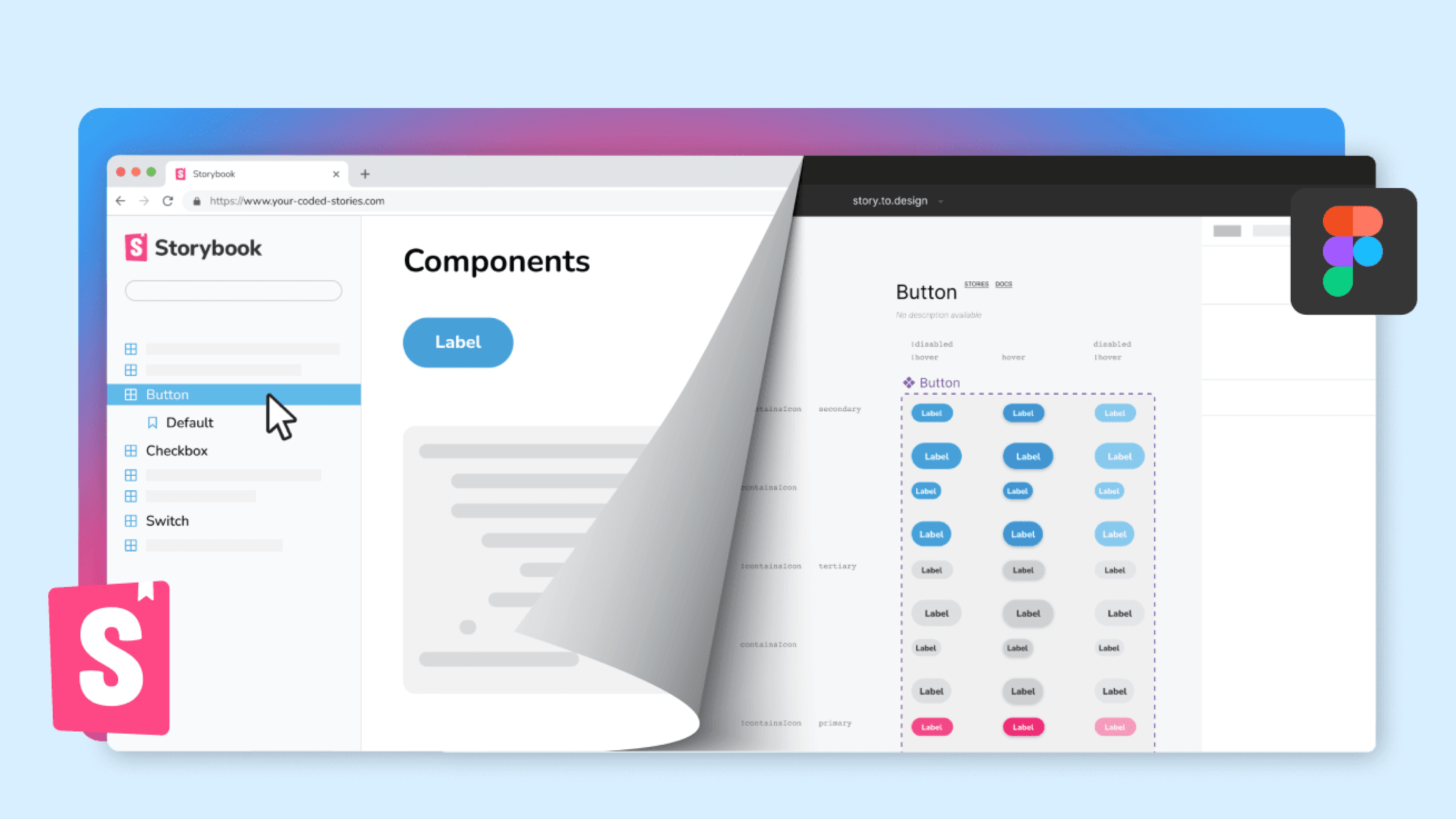
Bridging the gap between design and development is crucial. Your design system should seamlessly connect with development tools.
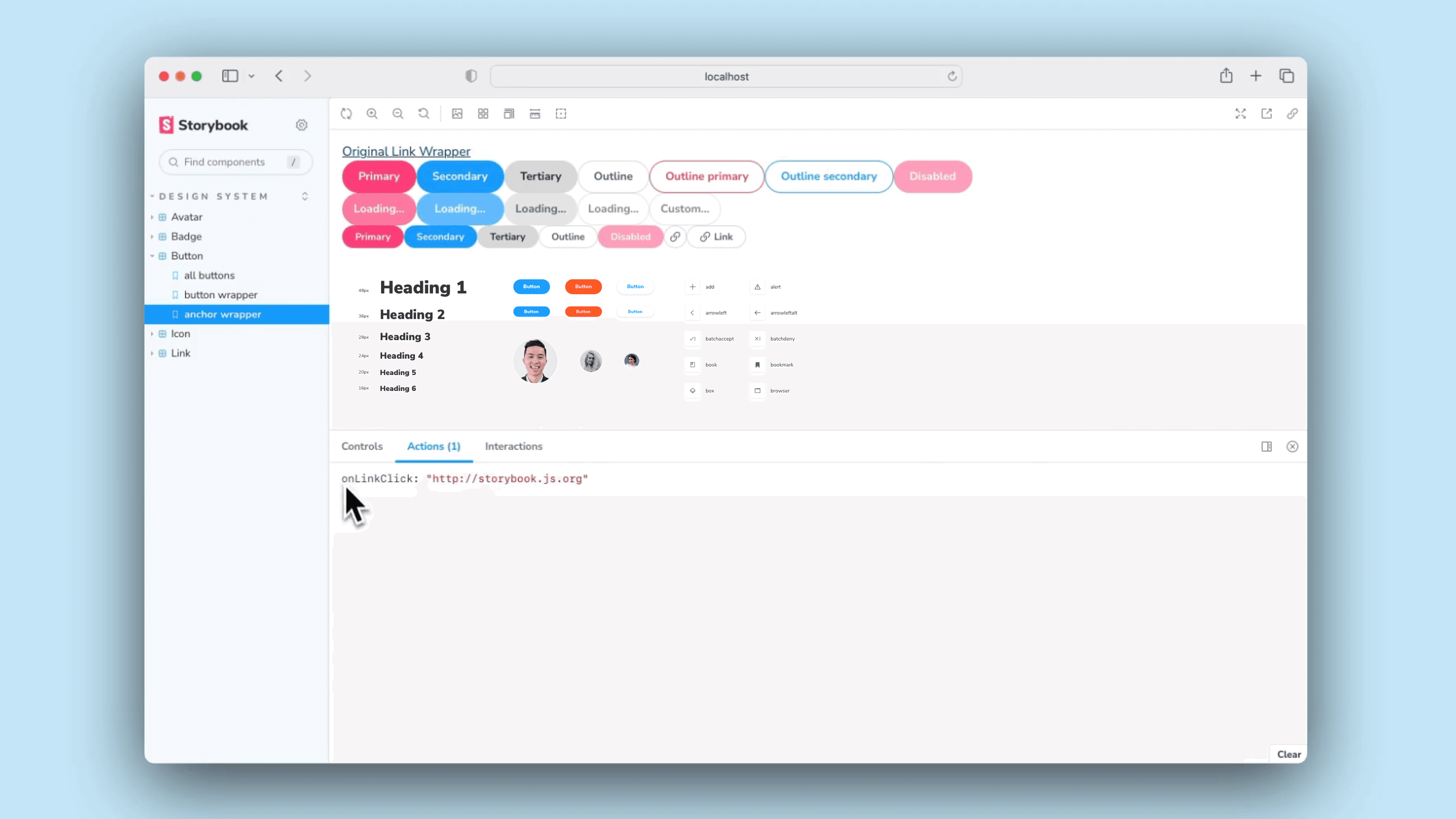
Integrating your design system with Storybook establishes a single source of truth for UI components. It acts as a live, interactive catalog, ensuring designers and developers stay aligned throughout the implementation process. Instead of relying on static documentation, Storybook allows teams to test, iterate, and visualize components in an isolated environment before deployment.
Think of it as a detailed construction manual developers get clear specifications, interactive previews, and code-ready implementations, reducing ambiguity and minimizing UI drift.
Key Benefits of Using Storybook:
- Interactive Component Library: Provides a real-time sandbox where developers can explore, modify, and test components in different states and themes.
- Improved Collaboration: Serves as a bridge between design and code, ensuring Figma components match production-ready elements.
- Regression Testing & Accessibility Checks: Works seamlessly with visual testing tools (Chromatic, Percy) and a11y plugins to catch UI inconsistencies before release.
Enhancing Storybook with Add-ons & Plugins
Storybook’s extensive add-on ecosystem allows teams to customize and optimize their workflows:
- Docs Add-on: Auto-generates documentation with component usage examples, props tables, and API references.
- Controls Add-on: Enables designers and developers to tweak component properties in real-time.
- Knobs & Args Add-ons: Allow teams to experiment with different configurations dynamically.
- Theming Add-on: Provides real-time previews for dark mode, accessibility settings, and multi-brand systems.
- Token Syncing Add-ons (e.g., Figma Tokens Plugin): Ensures consistent design token application across design and code.
By embedding Storybook into your design system workflow, you ensure seamless handoffs, improved efficiency, and scalable component management just like big companies such as Shopify, Microsoft, and GitHub do.
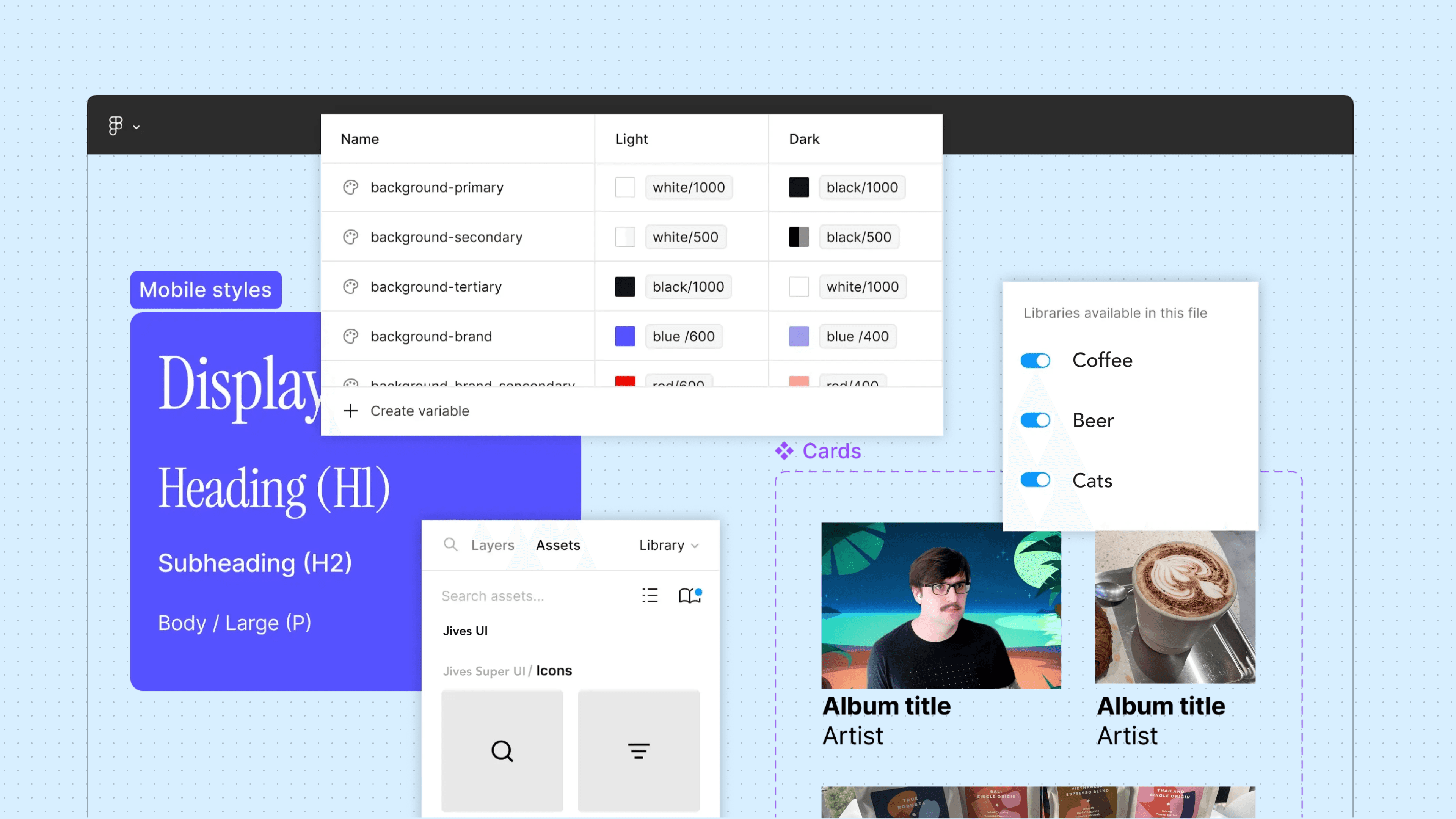
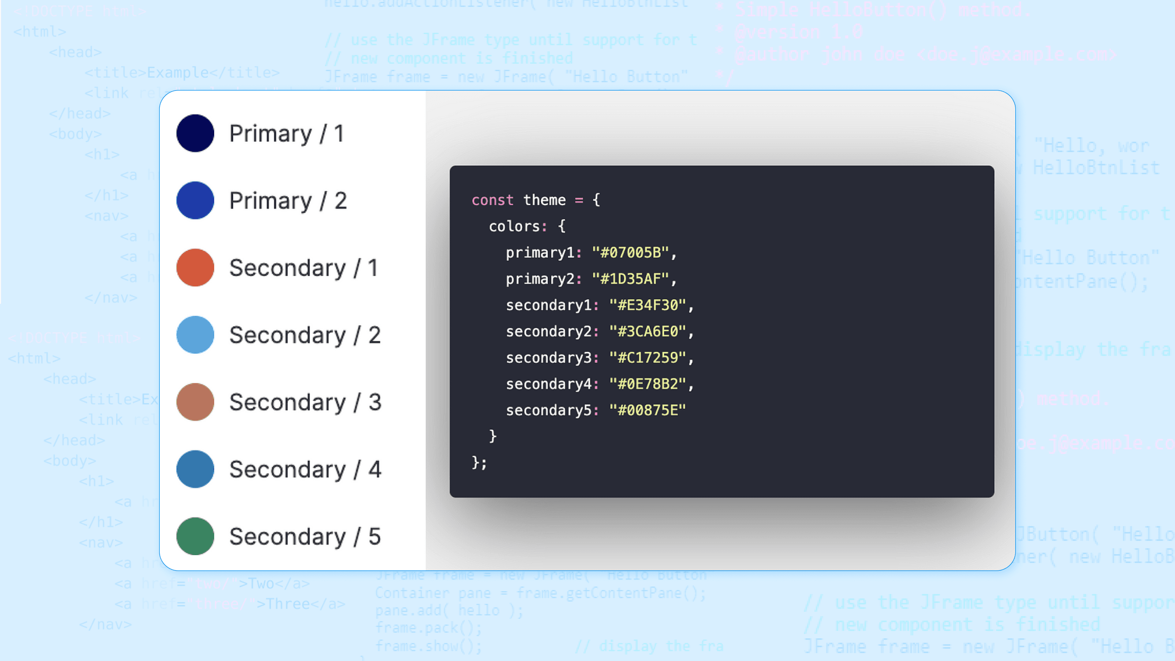
- Design Token Syncing: Automating the synchronization of design tokens between Figma and code (e.g., using plugins or APIs) is crucial. This ensures that design changes are reflected in the codebase automatically, minimizing manual updates and preventing design drift. It's like having a universal translator, ensuring that design decisions are communicated accurately to the development team.
Optimizing Team Processes and Handoffs: Smooth Transitions
Streamlining processes and handoffs is vital for efficient collaboration.
- Templates & Checklists: Creating standardized templates for design specs and checklists for design reviews ensures consistency and thoroughness. It's like having a standardized operating procedure, ensuring that every project follows the same best practices.
- Style Guides & Documentation: Comprehensive style guides and documentation provide a single source of truth for design decisions. This is crucial for onboarding new team members and ensuring everyone adheres to the same standards. It's like having a company handbook, providing clear guidelines for design and development.
Example: Imagine a new feature rollout. Instead of designers creating specs from scratch and developers rebuilding components, the process becomes streamlined:
- Designers pull existing components from the Figma Team Library.
- Design tokens automatically update the codebase.
- Developers reference the Storybook component library for implementation.
- Handoff is smooth, using standardized templates and checklists.
To Conclude -
Adoption doesn't happen in isolation - it depends on strong foundations and clear measurement. See how it all connects in our complete guide to design system best practices.
For the complete framework covering tokens, components, documentation, and measurement, see our guide on design system best practices.
So, there you have it! Driving design system adoption isn't like trying to convince your cat that a bath is a good idea (spoiler alert: it probably won't be). It's more like introducing your team to a super-powered Swiss Army knife for design and development. At first, they might be intimidated by all the gadgets, but once they see how much easier it makes everything – from slicing through design inconsistencies to tightening up development timelines – they'll be hooked. Just remember, it's a journey, not a sprint. Keep talking, keep tweaking, and keep celebrating those wins. Before you know it, your design system will be less of a "new thing" and more of a "can't live without it" thing. And that, my friends, is the sweet spot. Adoption is only half the battle - next, learn how to measure and prove the impact of your design system to keep leadership invested. For the complete framework covering tokens, components, documentation, and measurement, see our guide on design system best practices.