It’s 4:47 PM on Thursday. Your VP just asked for something visual to anchor tomorrow's board discussion. You have a PRD. You have bullet points. You have 16 hours and no designer availability. The presentation you cobble together looks… off. Buttons aren’t quite lining up, spacing feels random, and the whole thing is just a little bit fractured.
This isn’t a failure of a single slide. It's the symptom of a missing foundation.
The basic gist is this: a grid system is the invisible architecture that brings order to the natural chaos of product development. Think of it as the foundational grammar for placing every element, from text and images to buttons, ensuring everything aligns perfectly across every conceivable screen. It’s less a set of rigid rules and more a shared understanding of space.
The Invisible Architecture Holding Your Product Together
Without a grid, every placement decision is a debate. A developer might code "a little space" as 8 pixels, while the designer envisioned 12. These tiny misalignments compound quickly, creating what we all know as "design debt." A button that’s two pixels off here and four pixels off there slowly erodes a user’s trust.
It just feels unprofessional.
A grid replaces that ambiguity with a shared, mathematical certainty. It’s the silent partner to your design system, providing the structure that every other decision builds upon. Does this ensure that whether a user is on a tiny iPhone or a massive 32-inch monitor, the proportional relationships between elements feel right? Absolutely. This isn’t just about looking good; it's about creating a predictable and intuitive experience.
A grid system is to a product designer what a city plan is to an architect. It provides the streets and blocks that allow for creative construction while ensuring everything connects logically and serves the inhabitants.
This structural integrity is a core part of a mature design process. To get it right, your grid needs to be grounded in a solid user experience design strategy. This alignment makes design decisions faster and keeps everyone on the same page. Ultimately, this leads to better scalability, a topic we cover in our guide on how design systems drive seamless scaling. The impact is significant: according to Adrenalin, established design systems can lead to an 83% greater brand consistency, which is critical for building user trust. You can dive into more data by reading the full report on strategic design systems.
The Three Core Types Of Grid Systems
A grid isn't just one thing. Think of it as a family of related concepts, each solving a different piece of the layout puzzle. If interface design is a form of city planning, these three types are the blueprints that ensure everything from skyscrapers to sidewalks feels intentional and connected.
The whole point is to bring a sense of order and harmony to the screen.
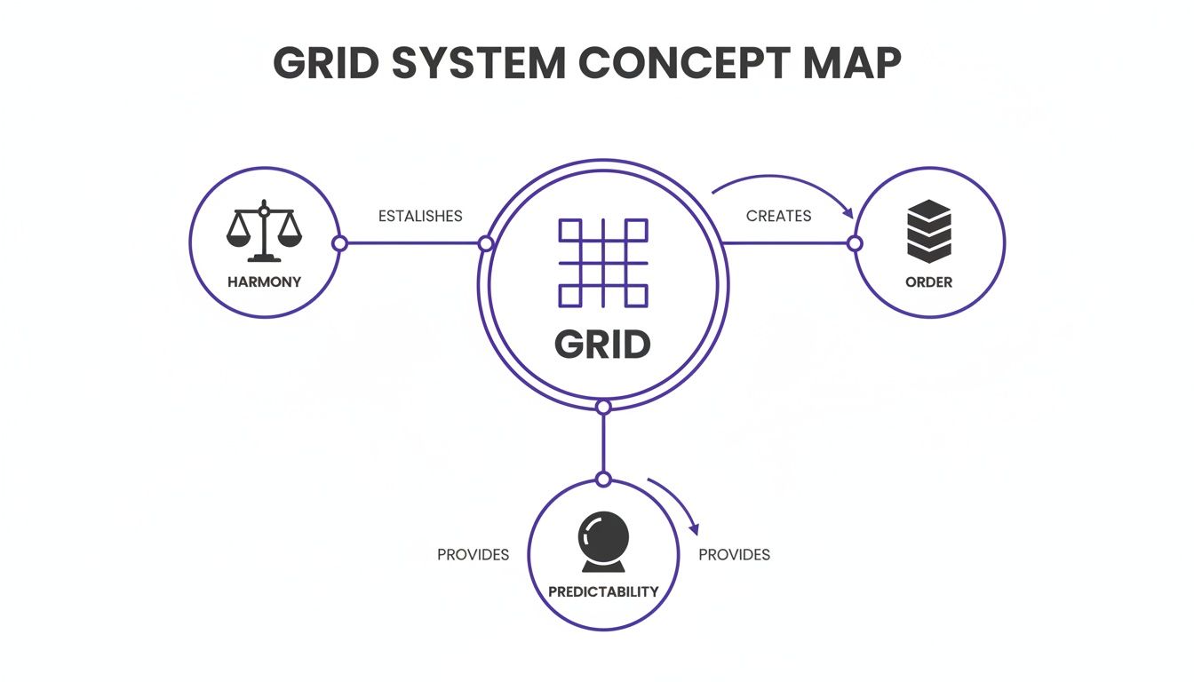
This map shows how a central grid structure radiates outwards, turning abstract layout rules into a predictable and orderly user experience. It's the invisible foundation for good design.
The Column Grid
First up, and by far the most common, is the column grid. This is the absolute workhorse of responsive web design. It carves up the horizontal space of a screen into a set of vertical columns, with consistent spacing, known as gutters, in between.
Think of these columns as the main avenues of our city. They dictate where the major structures (UI elements) can go and how traffic (content) flows. A 4-column grid might work for a phone, while a 12-column grid is standard for a complex web dashboard. A friend building an e-commerce app recently told me they cut layout bugs in half just by enforcing a strict 12-column grid.
It’s that effective.
The Baseline Grid
Next is the baseline grid, the unsung hero of vertical rhythm. This is a series of evenly spaced horizontal lines that text sits on, just like the lines on notebook paper. Why does this matter? It guarantees that all text elements, no matter their size or weight, share a common vertical alignment.
In our city analogy, the baseline grid is like having consistent floor heights in every single building. It creates a subtle but powerful sense of harmony that makes content far easier to read. When typography aligns perfectly across columns, the entire interface feels more polished and professional. Users will never notice it, but they’ll definitely feel it.
The Modular Grid
Finally, we have the modular grid. This is what you get when you combine a column grid with horizontal rows, creating a matrix of cells, or modules. This structure is perfect for wrangling complex, data-heavy interfaces where content needs to be organized both horizontally and vertically.
These modules are the city blocks of our interface. They create defined spaces for discrete chunks of content, like cards on a dashboard or product listings on an e-commerce page. By designing within these self-contained modules, teams can build layouts that are both highly structured and surprisingly flexible.
For a deeper dive, you can learn more about how to design with grids in our detailed guide. This approach ensures that even the most complex screens feel organized and easy to navigate.
So what if we have this underlying structure? Is this just about making things look tidy?
Not even close. The real power of a grid goes way beyond aesthetics. It hits everything: speed, collaboration, and whether your product can scale without falling apart. The grid gives designers and developers a shared, objective language. That single change dramatically cuts down on friction.
This is what I mean: you stop saying things like, "Can you nudge that button a bit to the left?" Instead, you say, "Let's align that to the second column." This isn't just about saving time. It kills the cognitive load of trying to guess what someone means, freeing up the team to solve real user problems.
From Handoff to Launch, Faster
This shared language has a compounding effect on how fast you can move. When a developer gets a design built on a predictable grid, they can translate it into code much faster. They aren't guessing at spacing values or trying to reverse-engineer a designer's intent from a static image. The rules are set.
For the user, this translates into a product that just feels right. Our brains are pattern-matching machines. A consistent grid creates a predictable rhythm, making the interface easier to scan, learn, and navigate. Users don't consciously see the grid, but they feel its effect in how effortless the product is to use.
The Economic Impact of Consistency
At scale, this isn't just a design principle; it's a major economic driver. Last week, a product manager at a B2B SaaS company told me their team was struggling to keep things visually consistent as they scaled from one product to three. A unified grid system, baked into a larger design system, is the cure.
The grid system acts as the enforcement arm for a design system. It ensures that every new component, screen, and user flow adheres to the same foundational principles of layout and spacing, preventing the slow creep of design debt.
The economic case is clear. Organizations that get design systems right see a substantial return. In fact, enterprises with mature systems report an average 135% ROI from increased efficiency and less rework. You can learn more about the financial benefits of design systems and how they directly drive business value. This isn't a small optimization; it's a strategic advantage.
From Theory To Reality: How Grids Shape Real Products
Let's make this real. A friend at a Series C fintech company told me their team burned an entire sprint just fixing layout inconsistencies before a major launch. The problem? Their initial designs had no formal grid.
This led to dozens of unique, arbitrary spacing values that developers were forced to guess at. This is the exact chaos a grid is built to prevent. The grid is where design intent becomes engineering reality. It’s the practical application of all the theory, turning abstract rules about alignment into tangible product artifacts.
Grids in Action: Simplifying Complexity
Think about a complex user flow, like setting up a merchant's checkout experience. Without a grid, the sheer number of form fields and toggles can quickly become a disorganized mess. A strict column grid acts as scaffolding, aligning all these separate elements into a clean, scannable interface. You can see how a redesigned Shopify Checkout Setup leaned on this principle to guide the user's eye and simplify a difficult process.
But a grid’s power isn't just for page layouts. It governs the internal logic of individual components, too. Take a simple UI element for managing tasks. A grid defines the consistent placement of icons and text, making sure that even as the component’s state changes, its structure stays coherent. This Task Assignment Component shows how a grid enforces that visual consistency across multiple interactive states.
A grid system is the silent force that ensures a user never has to re-learn your interface. It creates a muscular memory for your product, making navigation and interaction feel second nature.
This becomes even more critical when mapping out complex failure states. What happens when a file upload fails? A well-defined grid system provides the blueprint for handling these edge cases gracefully. It ensures error messages pop up in a consistent, predictable spot. Mapping these flows, as seen in this Dropbox File Upload analysis, brings a calming order to what would otherwise be a chaotic user experience.
The Zoom-Out: Why This Discipline Pays Off
So, why does this structural discipline matter at scale? The economics are simple. Every moment a designer and developer spend arguing over pixel placement is a moment not spent on a core user problem.
In his book Diffusion of Innovations, Everett Rogers explains how certain ideas spread and become adopted. A key factor is "observability," the degree to which the results of an innovation are visible to others.
A grid system has low observability to users but high observability to internal teams.
It’s an internal innovation whose primary benefit is reducing friction and wasted effort. By setting rules upfront, you create a more efficient system that frees up cognitive capacity to focus on what users actually see and value. To see how these principles apply to creating flexible layouts for any device, check out our guide on responsive design best practices. It is the next logical step.
Implementing Your Grid From Figma To Code
So, you’ve got a beautiful grid theory. Now what?
An idea on a design canvas is one thing; making it real and consistent in a live product is something else entirely. It’s a journey from a designer’s intent to a developer’s codebase, and every step has to stay in lockstep. The goal is to translate the visual rules from your design tool into functional rules in your code.
Building The Source of Truth in Figma
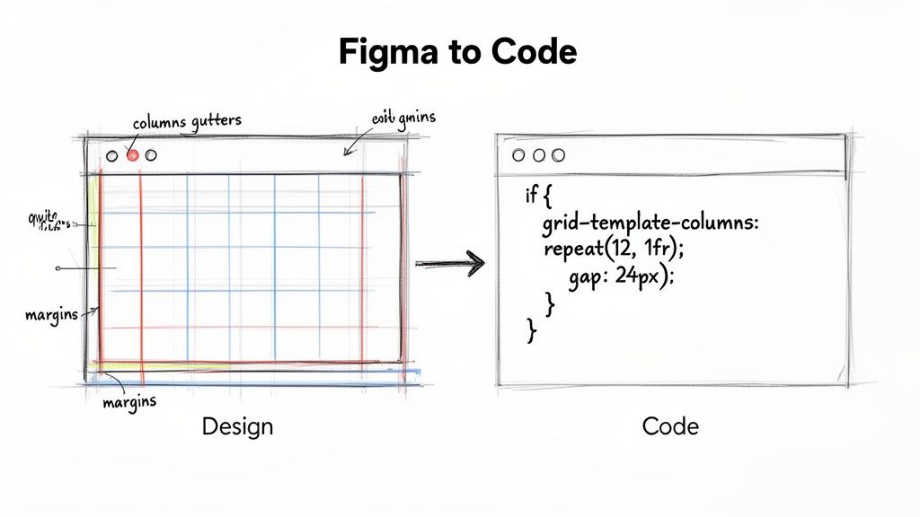
It starts in your design file. In a tool like Figma, this means setting up Layout Grids and, critically, saving them as Styles. This isn’t just for convenience: it’s how you create a single source of truth for your entire team.
When setting up your grid, you’re making three core decisions:
- Columns: How many vertical slices will your layout have? A 12-column grid is a flexible standard for the web, while 4 or 6 columns often works better for mobile.
- Gutters: This is the breathing room between the columns. Consistent gutters are what keep your interface from feeling cluttered.
- Margins: The empty space on the left and right edges. Margins are essential for framing your content and giving it room to breathe.
Once you define these properties and save them as a Style, any designer can apply the exact same structure to a new screen with a single click. No more "Wait, I thought we were using 16px gutters." The grid becomes an explicit standard.
Bridging The Gap to Development
A grid in Figma is only half the job. The real test is whether it survives the journey into production code. This handoff is precisely where most grid systems fall apart.
In short, the goal is a one-to-one translation. Your Figma properties should map directly to CSS properties. A 12-column layout with a 24px gutter in Figma becomes CSS Grid or Flexbox code that programmatically enforces those same rules.
The handoff isn't about tossing a design over the wall. It’s about translating a shared language.
grid-template-columns: repeat(12, 1fr)is the developer’s way of saying, “I understand and will enforce the 12-column system we agreed on.”
Modern tools are starting to automate this bridge. A tool like Figr, for instance, can capture your product’s structure and enforce your design system’s rules, including grid definitions, on any new prototype. This is a powerful shift. The grid moves from being a suggestion in a design file to an automated constraint in your workflow. You can see a similar principle at work when you use tools like design tokens, which you can learn more about in our guide on how to use design tokens.
Your Next Step: Start a Grid Audit
You don’t need to boil the ocean. A formal grid system isn't some monolithic project that requires a steering committee and a six-month roadmap. The biggest mistake teams make is thinking it has to be a massive, top-down initiative.
It doesn’t.
The most grounded, achievable thing you can do is start with an audit. Your next step isn’t to design a new grid from scratch. It’s to find the one you already have, even if it’s messy and unintentional.
From Unseen Chaos to Actionable Insight
Pick one critical user flow in your product. Maybe it’s the checkout process, the main dashboard, or the new user onboarding sequence. Capture every single screen.
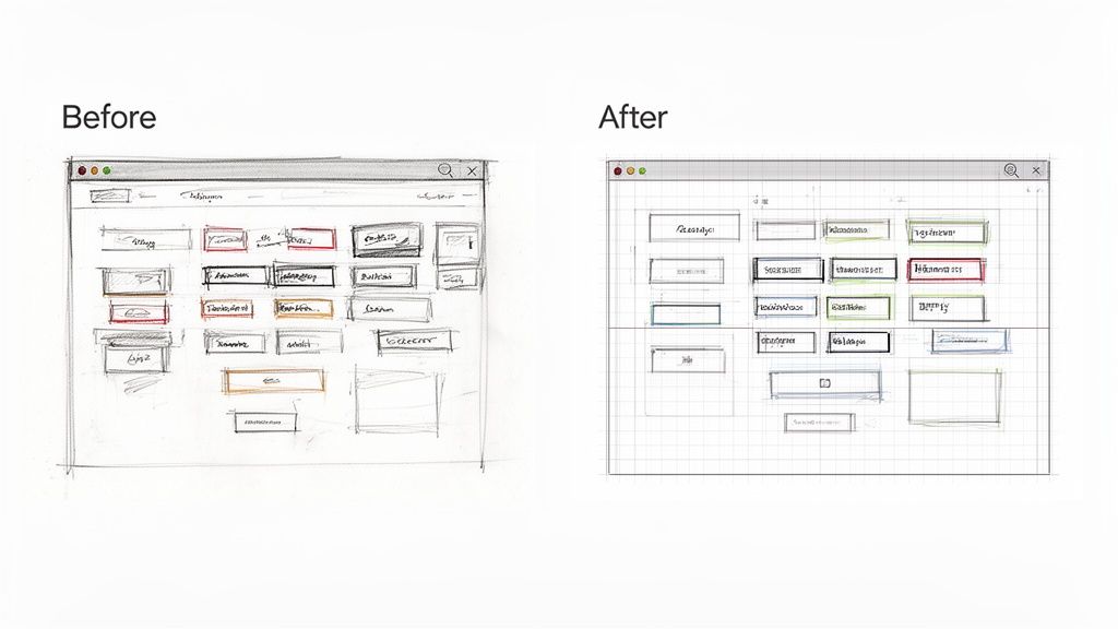
Now, draw boxes. I mean that literally. Open the screenshots in whatever tool you use and draw red boxes around the key elements. Then ask yourself one simple question: do these boxes line up?
Is there a consistent pattern? Do you see common horizontal and vertical lines where elements snap into place, or is it a sea of near-misses and arbitrary spacing? Are all your primary action buttons the exact same distance from the right edge of their containers?
Surface the Hidden Debt
You will almost certainly find inconsistencies you’ve never consciously noticed before. A button that’s 16px from the edge on one screen and 20px on another. A heading that’s aligned with an icon in one view but is just slightly off in the next.
This is what I’m talking about. This simple exercise surfaces the hidden "design debt" that quietly slows your team down. These aren't bugs, but they are symptoms of an inefficient system. Each tiny misalignment represents a moment where a designer or developer had to make an isolated decision. Those moments add up.
The goal of a grid audit is not to find blame. It is to make the invisible work of alignment visible. It transforms abstract complaints about 'inconsistency' into concrete, measurable evidence that a shared structure is needed.
Map this one flow. Document a handful of the most obvious misalignments. Then, show it to your team. Don't frame it as a problem to be solved tomorrow. Frame it as an opportunity you’ve uncovered. This evidence is how you build a compelling, bottom-up case for a formal grid.
That's the first real step. It's not about grand architecture. It's about finding a single loose thread and pulling on it to reveal the strength a cohesive structure can bring. This is how you begin to build the invisible framework that makes a product feel deliberate, professional, and deeply intuitive.
Ready to move from auditing chaos to creating order? Figr is an AI design agent that understands your product's existing structure to generate user flows, prototypes, and edge cases that are automatically consistent. Stop guessing at alignment and start shipping faster with a tool that enforces your design system from the very first click. Learn more at Figr.
