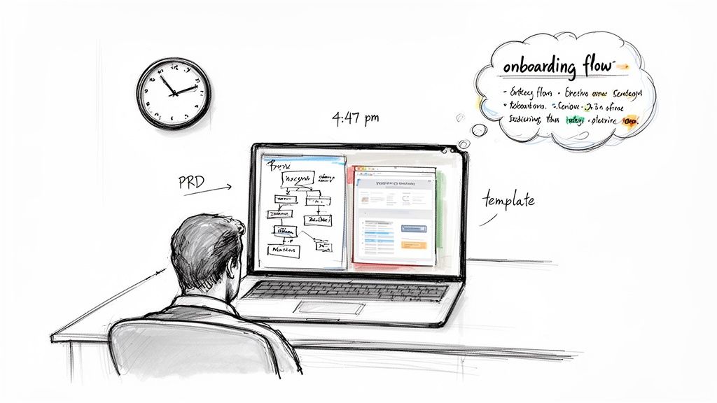
It’s 4:47 PM on Thursday. Your VP just asked for something visual to anchor tomorrow's board discussion. You have a PRD. You have bullet points. You have 16 hours and no designer availability.
This moment is a kind of pressure cooker. It forces a bad choice. Do you sketch a crude wireframe that undersells the idea, or grab a generic template that misses the point entirely?
This isn't a resource problem. It’s a translation problem. The friction of turning a good idea into a tangible artifact that your team can actually build is the single greatest drag on software development. And that moment of pressure reveals a deep split in how we think about app design software.
The Two Worlds: Blank Canvas vs. Living Blueprint
For decades, the dominant tools operated on a "Blank Canvas" principle. Think of a digital drafting table: powerful for creating from nothing, but completely disconnected from your existing product. It assumes every project starts from a perfect, pristine zero.
This approach creates a hidden tax. When a design is created in a vacuum, it always misses the nuances of the live application. Always. Research in the Harvard Business Review confirms that ambiguity during the design-to-development handoff is a primary cause of expensive rework. The blank canvas has no memory. It can't tell you how a new flow impacts the five existing screens it touches.
The alternative is a newer approach I call the "Living Blueprint".
This method flips the entire process. Instead of opening an empty file, it starts by understanding your live product: its components, its logic, its design system. It gives you a starting point that’s 80% of the way there because it's grounded in your product's reality.
This is what I mean: it’s not just about moving faster. It's about designing with higher fidelity from the very first click, which kills the expensive back-and-forth between teams. It respects the fact that you aren't building a brand-new app.
You're evolving one.
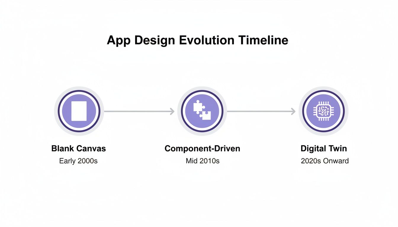
A Brief History of Drawing the Future
Not long ago, app design software was just a drawing tool. Think of it as an architect’s drafting table set up in an empty field. You could design a beautiful building, but your drawing had no memory of the city, its power grid, or its plumbing.
This was the "Blank Canvas" era, led by tools like Sketch and the first versions of Figma. They gave designers incredible power to craft pixel-perfect screens. The focus was entirely on the artifact: the screen.
But this created a new problem. As teams scaled, so did the chaos. One designer’s "primary button" was a slightly different shade of blue than another's.
So the industry evolved.
The Component-Driven Compromise
The next phase was the "Component-Driven" era, which brought us design systems. The idea was simple: create a shared library of reusable UI components. A single source of truth for every button, modal, and form field. It was a huge step forward for consistency.
But it was still a compromise.
Design systems gave teams consistent parts, but the assembly was still entirely manual. The software knew what a button looked like, but it had no idea where it belonged in a user flow or why it was even there. A friend at a Series C company told me he spent a week meticulously documenting a new sign-up flow with his company’s approved components. When engineering saw it, they discovered it broke three downstream dependencies. The components were right, but the context was completely wrong.
The Leap to Living Blueprints
Today, we're in another shift, this one forced by economic reality. The friction between a static design file and a live, dynamic application creates massive budget overruns. The old way of working is just too slow.
This pressure is creating a new category of app design software.
These tools are not for drawing. They are for thinking. They work less like a static image and more like a "Living Blueprint" of your actual product. Instead of starting with an empty canvas, you start with the reality of your live app.
A living blueprint doesn't just represent the "what" of your design; it understands the "where" and "why". It knows how a change to one screen will ripple across the entire user experience because it’s connected to the system as a whole.
This evolution tracks a bigger trend. Why are low-code and no-code platforms projected to capture a huge slice of a market growing toward a trillion dollars? Because the industry is desperate for faster, more context-aware ways to build. Following best practices for mobile app design is critical, but the goal is no longer just to build faster. It's to build smarter.
How to Choose an Engine, Not Just a Tool
Picking a new design tool used to be a job for the design team. Not anymore. Today, it’s a strategic decision for the entire product organization. The slickest demo means nothing if the tool can’t connect to how your team actually builds software.
To make the right call, you have to look past feature checklists. The real test is how well a tool plugs into your specific reality. A tool's true value isn't measured by its features, but by how much "what if" conversation it eliminates.
The basic gist is this: your evaluation should focus on four pillars that measure a tool's connection to your actual workflow, not just its features in a vacuum.
The Four Pillars of Modern Evaluation
A modern evaluation asks better questions. Does this tool reduce friction, or just move it somewhere else?
Workflow Integration: How well does it plug into your ecosystem? Can it pull from Figma, push to Jira, and understand the structure of your live app? Real integration means it speaks the language of your other systems fluently.
Security and Compliance: Does it meet enterprise-grade security standards? For any tool that touches your product code, this is non-negotiable. You need proof of SOC 2 compliance, clear data handling policies, and support for Single Sign-On (SSO).
Intelligent Automation: Does it automate tedious work? The real test is whether it can proactively spot missing edge cases, generate UX review documentation, or create test cases automatically. This is the line between a tool that helps you create and one that helps you think.
Data Grounding: Can design decisions be backed by real user behavior? A powerful design tool connects to your product analytics. It should let you see how a proposed change might impact a key user funnel.
Thinking about these pillars helps separate a simple prototyping tool from a true design partner. For a deeper dive, explore the differences between product roadmap tools and design prototyping tools. You're not just buying software; you’re choosing an engine for your entire product development process.
The Rise of the Citizen Designer
The real slowdown in software development isn't code. It's the friction-filled gap between a business need and a developer’s first line of code. It’s that tangled chain of meetings, mockups, and misunderstandings.
This is a structural problem. And it’s creating a new role on product teams: the "Citizen Designer".
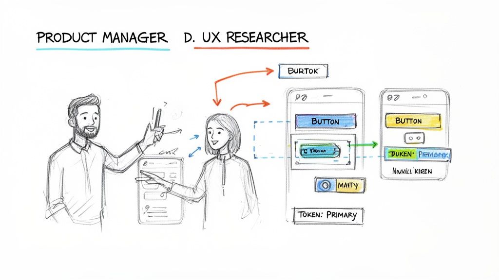
This isn't a job title. It’s a behavior. It's the Product Manager who needs to show, not just tell. It’s the UX Researcher who steps in to build a high-fidelity artifact because it's faster than writing a ten-page document.
The Spreadsheet Analogy
We've seen this before. Think about what spreadsheets did for finance. Before tools like Excel, any real financial analysis was locked in the accounting department. Spreadsheets blew that wide open. They gave anyone with a bit of logic the ability to model complex scenarios.
The exact same thing is now happening with app design.
New tools give non-designers the power to create interactive user flows. By learning from your live app and its design system, the software handles the visual polish automatically. This frees the PM to focus on the flow, the logic, and the user value.
Shortening The Feedback Loop
Last quarter, a PM at a fintech company shipped a file upload feature. Engineering estimated 2 weeks. It took 6. Why? The PM specified one screen. Engineering discovered 11 additional states during development. Each state required design decisions. Each decision required PM input. The 2-week estimate assumed one screen, the 6-week reality was 12 screens plus 4 rounds of 'what should happen when...' conversations.
This is the cycle the Citizen Designer breaks.
With context-aware software, that PM could have generated the initial flow herself in hours. The designer would then get a draft that's already 80% correct.
This isn't about replacing designers. It’s about elevating them. It frees them from repetitive screen production so they can focus on complex, strategic work. You don't need to be a visual design expert to explore a user flow, just like you don't need to be an accountant to build a simple budget. If you're just starting, there are many excellent free wireframing tools to help take that first step.
This lets everyone do what they do best.
AI Is Becoming a True Design Partner
Imagine an AI that acts less like a tool and more like a seasoned partner. The kind who doesn’t just generate ideas, but reviews your work and points out a structural weakness you missed. This is the new reality of AI in app design software. It’s a quiet shift from creation to genuine thought partnership.
AI is making its mark in three critical ways.
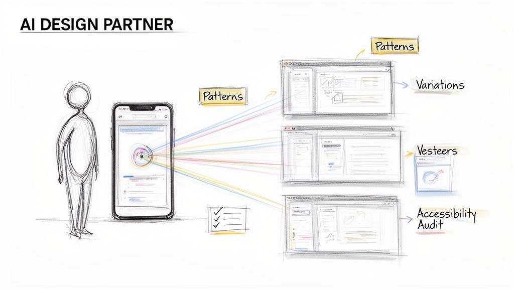
AI as Pattern Recognizer
Great UX is built on familiar patterns. Why reinvent the login screen? AI agents can analyze vast libraries of screens to suggest proven UX patterns for the exact job you're doing. Last week, I watched a product manager struggle with a file-sharing flow. The AI didn't just spit out a screen. It proposed three distinct interaction patterns, each with a rationale. This turns a guessing game into a strategic choice.
AI as Generative Explorer
The best ideas often surface after exploring multiple paths. But who has time to manually design five versions of one screen? AI does. This is the power of "Generative Exploration". An AI partner can create multiple high-fidelity variations in minutes. It’s not about generating random images; it’s about generating informed possibilities. Understanding the tech behind this, like AI chat completions, is becoming essential for product leaders.
AI as Proactive Auditor
One of the costliest parts of development is the back-and-forth caused by missed details. What if a user’s name is too long? Is this button color compliant with accessibility standards? An AI partner acts as a tireless auditor, proactively scanning for these issues before they reach a developer.
It can automatically:
- Run accessibility checks against WCAG standards.
- Enforce the use of your official design system components.
- Identify missing edge cases and error states humans easily forget.
In short, this new class of AI is a partner that augments your team’s ability to think, explore, and validate. It cuts the manual labor so teams can focus on the high-judgment work of curation and strategy. Learn more in our guide on how AI can accelerate your product design workflow.
Your Next Step: From Thinking to Doing
The distance between a great idea and a shipped feature is a minefield of tedious work. Copy-pasting, manual screen recreation, and a thousand tiny choices that bleed your team’s focus dry.
The next wave of app design software is here to close that gap. The point isn’t just to design faster. It’s to design with confidence, knowing every decision is tied to the reality of your actual product.
From Creation to Curation
This shift changes the work itself. Time is not a conveyor belt; it's a switchboard. You stop being a digital artist staring at a blank canvas. Your role becomes more like a curator. The software gives you smart options, all based on proven patterns and your own app's DNA. Your job is to pick, polish, and connect the pieces into a flow that makes sense.
It’s the difference between mixing concrete by hand for every brick and building with high-quality, pre-fabricated modules. You spend your time on the architecture, not the manual labor. For a look at how this plays out, check out a workflow that gets you from PRD to prototype in just a couple of hours.
A Grounded Takeaway
Theory is one thing. Here’s your next step.
Sometime next week, block off 90 minutes. Pick one small, existing feature in your app that needs a tweak. A new filter. An extra step in a signup flow.
But instead of opening a blank Figma file and starting from scratch, find a tool that can grab your live app’s context first. Then, ask it to generate the user flow for that small enhancement. Watch how it uses your existing components. See how it understands your current layouts.
The action is to experience the profound difference between creating in a vacuum and iterating within a context-aware environment. Don't just read about it. Feel it.
This simple test will tell you more about your team’s hidden drag than any spreadsheet ever could. You'll see the tax you’ve been paying without even knowing it.
Frequently Asked Questions
A few questions always come up when product leaders look at a new class of app design software. The hesitation makes sense. Let's tackle them head-on.
Does AI-driven app design software replace UX designers?
No. It makes them more valuable. This is the most important question. By automating the soul-crushing work of creating standard screens, these tools free up your designers to solve the problems only they can. What problems? The ones that actually drive the business forward. This means more time for deep user research, wrestling with novel interaction challenges, and shaping product strategy.
How does this software handle security with my live app?
Enterprise-grade tools are built with security as a non-negotiable foundation. The best platforms use a one-way capture through a secure browser extension. This means the tool only ever sees the front-end structure and styles of your application. It never touches your back-end data. Think of it like taking a very detailed, interactive photograph: it captures the appearance, not the contents of the vault. Look for hard credentials. You should expect SOC 2 compliance and support for Single Sign-On (SSO) as table stakes.
Can these tools handle our company’s custom design system?
Yes, and this is what separates modern, context-aware tools from generic template libraries. The best app design software is built to import and learn from your team’s existing system. Top solutions integrate directly with tools like Figma to pull in your real component libraries, variables, and design tokens. When the software generates a new user flow, it uses your brand’s actual visual language, not a cheap imitation. This guarantees consistency from the very first screen.
Ready to see what a context-aware design partner can do for your team? With Figr, you can stop recreating screens and start shipping features with real confidence. Capture your live app, import your design system, and get production-ready artifacts in minutes, not days.
Explore the Figr platform and see for yourself.
