We treat agile software development metrics like a speedometer. We glance down, check the number, and decide if we’re going fast enough. But what if that’s the wrong instrument entirely? What if a team’s process isn't a straight road, but a switchboard, with dozens of potential connections and misdirections?
Thinking this way changes the questions you ask. It’s no longer about speed. It’s about flow.
Your Dashboard Is a Mirror, Not a Scorecard
A dashboard glows with charts: velocity, burndowns, cycle times. Teams often treat these numbers like a high score to beat. This is a trap, a fundamental misunderstanding of why agile metrics exist.
They are not a scorecard for judging people.
They are a mirror reflecting the system your team works within. They show you where the flow of value is smooth and where it’s stuck in traffic. A wildly fluctuating velocity chart isn’t a sign of a "bad" team. It's a reflection of a system choking on shifting priorities or a flood of unplanned work.
From Judgment to Diagnosis
The real goal is to stop asking, "Is our velocity good?" and start asking, "What is our velocity telling us about our process?" This shift in mindset changes everything. It’s the difference between driving improvement and driving fear.
When metrics become a mirror, they spark curiosity. When they’re a scorecard, they invite gaming the system.
This perspective is critical now more than ever. The 17th State of Agile Report highlights that the top reason organizations adopt agile is to manage changing priorities, a challenge cited by 64% of respondents. With so many teams new to this world, getting the philosophy right from day one is everything.
The basic gist is this: good metrics help you ask better questions, not just find simple answers.
The purpose of measurement is not to produce numbers but to gain insight. A metric's true value is the conversation it starts.
I recently watched a PM at a SaaS company reframe their metrics entirely. They stopped celebrating "high velocity" sprints. Instead, they started digging into why certain tasks had such long cycle times. It led them straight to a massive bottleneck in their code review process, a problem everyone felt but no one could name.
By treating the metric as a diagnostic tool, they fixed a systemic issue. Their predictability improved naturally as a result. That’s using the dashboard as a mirror. It shows you the truth of your system so you can have an honest conversation about making it better. For teams ready to build this kind of reflective dashboard, it’s worth seeing how you can build a product management dashboard that includes design metrics and velocity.
Two Views Of Agile Metrics
Let's contrast the two mindsets. Seeing them side-by-side clarifies the mental model you should be aiming for.
The flawed view leads to vanity metrics and local optimizations that hurt the whole system. The effective view leads to real, sustainable improvements.
This is the foundation. From here, the following sections will give you the specific metrics to put in your mirror, showing you how to measure flow, forecast the future, and finally connect your team's work to what customers actually care about.
Gauging Your Team's True Speed with Flow Metrics
Before you can make a river flow faster, you must understand its currents. The same goes for building software. To get past the vague feeling of being "busy" and actually understand your team's capacity, you need to watch how work moves.
This is what flow metrics do. They are the language we use to talk about the journey of work from an idea to something real.
Let's use an analogy: a local coffee shop. It's a surprisingly good model for a software team. If you owned this shop, you’d track a few key things to make sure it runs well, even if you didn't call them "metrics."
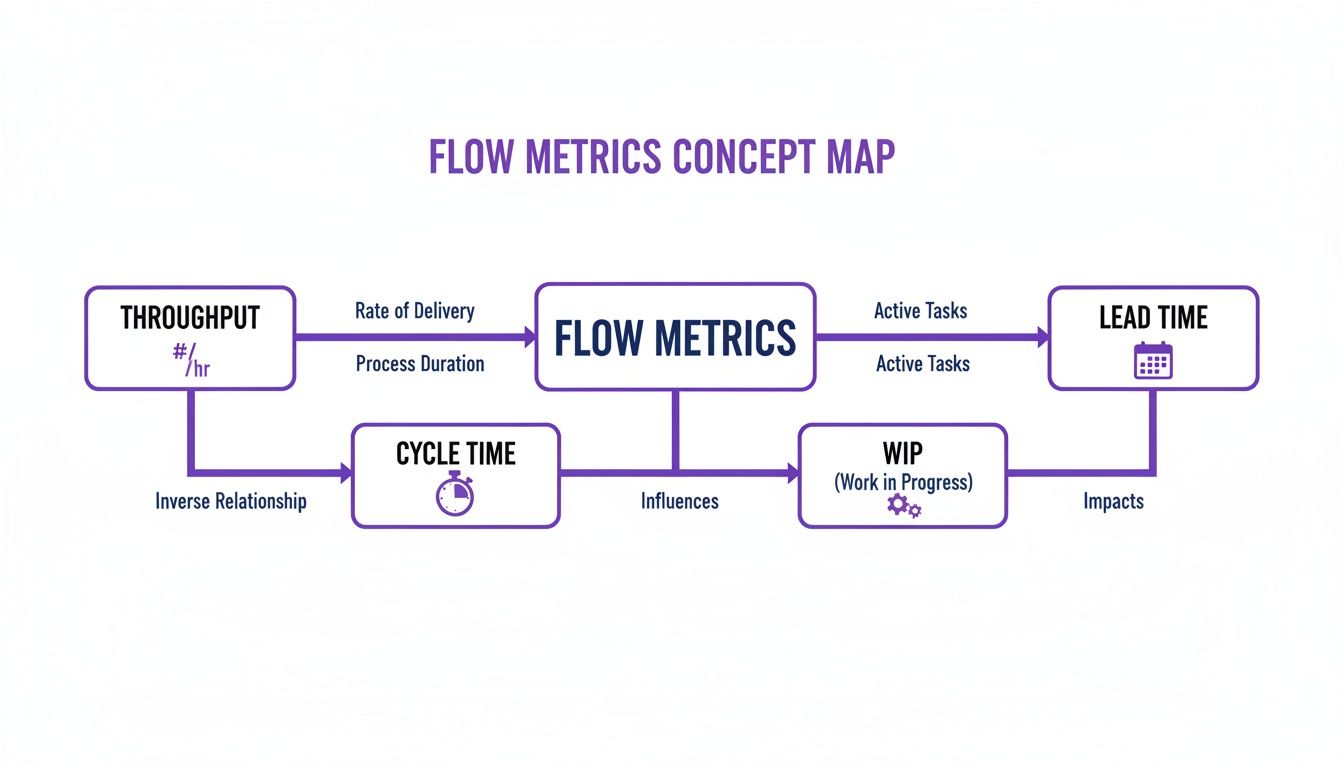
The Four Essential Currents
There are four core metrics that measure the flow of work. Let's break them down using our coffee shop.
Throughput: How many coffees do you hand to customers each hour? For a software team, this is the number of work items you finish in a set period, like a week or a sprint. It’s your rate of delivery.
Work In Progress (WIP): How many orders are your baristas making at any single moment? In software, it’s the count of every task that's been started but isn't yet done. It shows you how much your team is juggling.
Cycle Time: How long from when a barista starts making a coffee until it's in the customer's hand? For a team, this is the clock starting when a developer begins a task and stopping when it’s ready to go live. It’s a measure of execution speed. You can get into the nitty-gritty with this guide on the cycle time calculation formula.
Lead Time: This is the customer's entire journey, from getting in line to order to holding their coffee. For software, it’s the total time from an idea being accepted into the backlog to when it’s live for users. It measures the total wait.
These four metrics are tied together. You cannot change one without affecting the others.
A team that obsesses over cutting Cycle Time without limiting its Work In Progress is just a team signing up for burnout. They're trying to make every coffee faster by starting all of them at once. The result is chaos, spills, and cold coffee.
Just last week, I saw a product manager getting frustrated. His team had delivered only three small features in a two-week sprint. Their throughput felt low. But a quick look at their board showed 15 items "In Progress." The team wasn't slow; they were swamped.
By simply agreeing to limit their WIP to just five items in the next sprint, they finished eight. They didn't work harder. They worked smarter by focusing.
Speed vs. Wait: The Crucial Difference
A powerful insight emerges once you start tracking these numbers. A big part of this is understanding cycle time vs. lead time, which reveals so much about your process. Simply put, Cycle Time is how fast your team can build. Lead Time is how long your customer has to wait.
Why does this distinction matter so much? A company can have incredibly fast engineering teams (low cycle times) but still take months to ship anything of value because ideas sit in a backlog cemetery for ages (long lead times). This points to a problem not with engineering, but with planning and prioritization. The bottleneck isn't your barista; it's the disorganized, mile-long queue.
You don't need fancy tools to track this stuff. Most project management software like Jira or Linear already has this data. The hard part isn't collecting the data, it's having the discipline to look at it.
Your first step is simple: make the numbers visible. Put up a basic chart showing your team’s weekly throughput, average cycle time, and a snapshot of WIP. This isn't for judging people. It's about creating a shared, objective picture of your process. It’s the first step toward turning that process from an invisible force into something you can all consciously shape together.
Forecasting The Future With Stability Metrics
Flow metrics tell you how fast you’re going right now. But leadership and stakeholders rarely ask about your current speed. They ask when you’ll arrive.
That question isn't about speed. It’s about predictability. And predictability is only possible if you have a stable system.
This brings us to stability metrics, the second major group of agile software development metrics. They help us shift from looking at the present to forecasting the future.
Velocity: The Misunderstood Predictor
The most famous, and most abused, stability metric is Velocity. So many teams treat it as a scoreboard for speed or productivity. They start comparing velocity between teams, which makes as much sense as comparing a marathoner’s pace to a sprinter’s.
Here’s the thing: velocity's real job isn't to measure speed. It's to help a team find a predictable rhythm. It measures the amount of work (usually in story points) a team can realistically get through in one sprint. Its power isn’t in the number itself, but in its consistency over time.
A friend at a Series C company told me their biggest red flag wasn't a team with low velocity. It was a team with erratic velocity. A chart that jumped from 15 to 40 and back down to 20 was a sign of pure chaos. It meant priorities were constantly changing, dependencies were a mess, and unplanned work was derailing every single sprint.
Stable velocity is the sound of a healthy, predictable system. Erratic velocity is the sound of a system in distress. It’s a call to investigate the sources of volatility.
To use velocity correctly, you must treat it as a team’s internal barometer. It’s for them and them alone, a tool to make better promises for future sprints. This trust is key. Agile projects have just a 9% failure rate compared to 29% for Waterfall projects, largely because of this iterative, predictable way of working.
Quality as a Pillar of Stability
Shipping fast means nothing if what you ship is broken. This is where the second critical stability metric comes in: Defect Rate. It simply tracks the number of bugs that pop up after a feature goes live. Think of it as a direct measure of your quality and a crucial balancing metric for your flow.
If your team doubles its throughput but the defect rate triples, you haven't gotten more efficient. You’ve just started outsourcing your quality control to your customers. They won't be happy about it.
A stable, low defect rate tells you that your development and QA processes are in sync. It’s proof that speed isn’t coming at the expense of a solid product.
When you track both velocity and defect rate, you build a powerful framework for forecasting. Stable velocity helps you answer, "How much can we do?" and a low defect rate ensures that what you do deliver is solid. This combination builds real trust with leadership, far more than any empty promise to "move faster."
And if you're looking to get even more sophisticated with your predictions, it’s worth checking out AI tools for forecasting the impact of product changes.
Connecting Output To Outcomes With A Customer Lens
You shipped. Your throughput is high, your cycle time is low. The flow metrics are green across the board.
So what?
The ultimate measure of an agile team’s success isn’t how much it builds. It's whether any of it matters to a customer. This is the moment to zoom out. All the metrics we’ve covered so far are about output: the speed and volume of what you produce. Now we have to connect that output to an outcome.
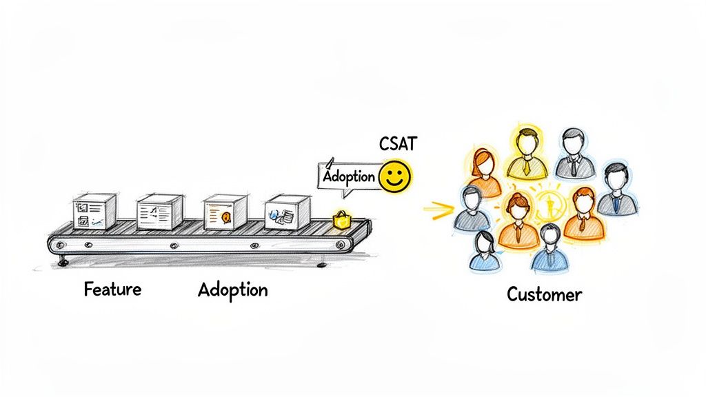
This image gets it right. Without the customer at the end of the line, the conveyor belt is just a motion machine, making things that go nowhere.
Shifting Focus From The Factory To The Customer
Why does this distinction matter? Because teams that fixate only on output metrics inevitably build "feature factories." They become incredibly efficient at churning out code that nobody uses. The incentives are all wrong: the reward is for shipping, not for impact. This is a colossal waste of talent, energy, and money.
True agile maturity means tying the team’s work directly to what the business and its customers actually need. It’s about building feedback loops that tell you not just if you built the feature right, but if you built the right feature in the first place.
This is where customer-centric agile software development metrics come in. They’re the compass that makes sure the engine you’ve so carefully optimized is pointed in the right direction.
Here are the ones that matter most:
- User Satisfaction (CSAT/NPS): This is the bottom line: how do users feel about your product? Net Promoter Score (NPS), for example, asks a simple question: "How likely are you to recommend this product?" It sorts your users into Promoters, Passives, and Detractors. If that score is climbing, your work is creating real value.
- Feature Adoption Rate: What percentage of your intended audience is actually using that new feature? A high adoption rate means you solved a real problem. A low rate is a huge red flag that you may have built something nobody wanted.
- Task Success Rate: Can users actually do the thing the feature was designed for? This often means watching real users or digging into product analytics to see if they complete a workflow without errors or just giving up halfway through.
A feature shipped is an assumption. A feature adopted is a validation. Outcome metrics are what separate assumptions from validated learning.
When you start tracking these, the entire conversation changes. Retrospectives stop being just about "what slowed us down?" and start including questions like, "did this feature actually move our customer satisfaction score?" It forces a much deeper level of thinking.
Weaving The Customer's Voice Into Your Sprints
I once watched a product manager at a B2B SaaS company do this brilliantly. After every big release, her team didn't just check if the servers were stable. They immediately sent a two-question CSAT survey to the users who had just tried the new feature.
They paired that number with qualitative feedback they gathered through a structured voice of the customer process.
They created a direct line from the code they shipped on Friday to the customer's real-world experience on Monday. This wasn't some separate research project; it was part of their definition of "done." That feedback loop became their most valuable asset, telling them exactly where to invest their energy next sprint.
This is how you ensure all the efficiency you gained from optimizing flow is aimed at work that creates undeniable value. You stop celebrating the launch and start celebrating the adoption.
Visualizing Your System Of Work
Numbers on a spreadsheet are just numbers. They tell you what happened, but they rarely tell you why. To get to the why, you have to see your work in motion. This is the difference between data collection and storytelling.
A raw number is an answer. A good chart is a question. The goal is to build a dashboard that asks the right questions about your team’s delivery process, revealing the friction points you can't see in a list of tasks.
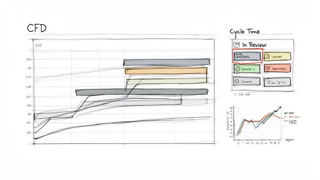
Spotting Bottlenecks with Cumulative Flow Diagrams
The single most powerful tool for seeing your workflow is the Cumulative Flow Diagram (CFD). Think of it as an X-ray of your process. A CFD shows each stage of your workflow—'To Do', 'In Progress', 'In Review', 'Done'—as stacked, colored bands, tracking how many work items are in each stage over time.
The magic is in the shape of those bands.
- Parallel Bands: If the lines are more or less parallel, work is flowing smoothly. Good.
- Widening Bands: If a band for a specific stage starts to swell, it means work is getting stuck. You’ve just found a bottleneck.
Last quarter, a team I was advising couldn't figure out why their cycle times were so unpredictable. Their CFD made it painfully obvious. The 'In Review' band was constantly expanding, showing that code was piling up faster than it could be reviewed. That stage had become a black hole.
This chart wasn't just data; it was undeniable proof. It gave them the ammunition to carve out dedicated, uninterrupted review blocks for their senior engineers. In short, they cut their average cycle time by 40% in just two sprints.
Understanding Process Stability with Control Charts
While a CFD shows the whole system, a Control Chart for cycle time tells you how predictable you are. It plots the cycle time for every finished task against an average and standard deviation. It gives you a clear, honest picture of what “normal” looks like for your team.
Any task that falls way outside the standard deviation is an outlier that’s begging for a conversation. Why did this one task take ten days when most take two? This visual turns your retrospective from a guessing game into a focused investigation.
As projects get bigger, this kind of insight is non-negotiable. For product managers in large enterprises, visualizing workflow is vital for managing UX at scale.
Visualizing Complexity Before You Build
The best way to fix a problem is to prevent it from ever happening. Visualization isn't just for looking back at a sprint; it's a critical tool for looking forward, preventing the kind of rework that kills your metrics.
A feature that sounds simple in a meeting can hide a monster of complexity. Mapping it out reveals the hidden work. For example, a "simple" 'Assign a Task' component might have dozens of states once you account for approvals, rejections, and reassignments. Seeing this visually helps everyone grasp what they're truly building. You can see how a simple idea explodes into multiple scenarios when you view these component states.
Or take file uploading. The happy path is easy. What about all the ways it can fail? Mapping the complete user flow, including network drops and permission errors, shows the true engineering cost. Exploring a map of Dropbox File Upload failure paths makes this complexity visible before a single line of code is written.
This kind of proactive visualization stops scope creep in its tracks. It leads to better estimates and more stable agile software development metrics down the line. It turns an abstract idea into a concrete map of the work ahead.
Your First Step After This Article
You’ve just read a lot about agile metrics. It's easy to get lost in the theory. So what now?
Don't try to boil the ocean. A massive, company-wide metrics initiative is a recipe for analysis paralysis and endless meetings. Your goal for the next sprint is much smaller, and because of that, much more powerful.
Pick one metric.
Focus on the Heartbeat of Your Process
Start with Cycle Time. If you track nothing else, track this. It’s the true heartbeat of your development process.
Forget story points and velocity debates for a moment. Cycle Time measures one simple thing: how long it takes from the moment work starts on a task to the moment it’s considered done. It tells you, in plain days, how fast your team can actually deliver a piece of value.
It’s a number that needs no translation. Everyone from an engineer to the CEO understands what "five days" means. It forces a brutally honest conversation about what's really happening in your workflow. For instance, you can use a simple tool to analyze and generate Test Cases for a scheduling tool to better understand the time required.
Your Three-Step Action Plan
Here's exactly what to do over the next two weeks. No fancy tools required.
- Define Your Start and End Gates: Before the sprint kicks off, get the team in a room (or a call) and agree on the definitions. Does "work started" mean the ticket was moved to 'In Progress'? Does "work finished" mean it’s merged? Or deployed? Write it down where everyone can see it. Stick to it.
- Track Every Single Item: For the next sprint, track the cycle time for every story, task, and bug. A simple spreadsheet is all you need. Just two columns: start date and end date. That's it.
- Discuss the Outliers, Not the Average: In your next retrospective, don't waste time on the average cycle time. Averages hide the most interesting stories. Instead, pull up the two extremes: the task with the shortest cycle time and the one with the longest.
Then, ask two very simple questions.
What went so right with the fast one? And what got in the way of the slow one?
That single exercise will ignite a conversation that’s worth more than any dashboard. It turns a number from a sterile report card into a collaborative tool for finding and fixing real problems. This is what agile metrics are for: starting the conversations that actually lead to improvement.
For a broader look at how different metrics fit together, this is an excellent resource: A Guide to Agile Development Metrics for Modern Teams.
It's smart to be skeptical of metrics. We've all seen them introduced with a big presentation, only to become background noise or, worse, a weapon.
Let's cut through the noise and tackle the real questions teams have when they start measuring their work.
Are These Metrics Even Agile?
Yes, absolutely. In fact, they’re what make Agile principles tangible. Scrum and Kanban are built on values: collaboration, responding to change, shipping working software. But how do you know if you're actually living those values?
Flow metrics are the proof. They give you the hard data to ground your retrospectives in reality, moving the conversation from "I feel like we're slow" to "Our cycle time for this type of work is trending up. Why?"
We Measure Nothing Today. Where Do We Start?
Don't boil the ocean. Trying to track everything at once is a fast path to confusion and burnout.
Start with one metric: Cycle Time. It's simple, highlights friction in your workflow almost immediately, and is easy for the whole team to understand. (When did we start this, and when did we finish it?)
Once your team gets comfortable talking about cycle time, introduce your next move: Work in Progress (WIP) limits. The combination of these two is the foundation for a predictable and healthy process.
Can't Teams Just Game These Metrics?
Of course. Any metric can be gamed if it's used to punish or reward. If you announce a bonus for the team with the "lowest cycle time," you'll suddenly find your backlog full of tiny, trivial tasks. This is exactly why metrics must be a mirror for the team, not a scorecard for management.
The best defense? Focus on trends and outliers, not absolute numbers. More importantly, the conversation must always be about the system, not the people. If a metric looks off, the question isn't, "Who is slowing us down?" It's, "What's in our process that's causing this?"
Ready to move from abstract metrics to tangible artifacts? Figr is an AI design agent that turns your product thinking into production-ready designs and documentation. It helps you visualize complex flows, uncover hidden edge cases, and generate test cases directly from your designs, ensuring the work you measure is the right work to begin with. Design confidently and ship faster with Figr.
