
You’re staring at a new feature request. The PRD is solid, the user stories are clear, but the visual form it should take feels like fog. Do you start with a grid? A single column? A dashboard? Every choice feels arbitrary without a clear framework. A website is not just a container for information; it is a constructed environment designed to guide a user from point A to point B with minimal friction. The layout, the very bones of the page, dictates whether that journey is intuitive or infuriating.
This is the central challenge. The layout isn't decoration, it's the architecture of attention. It silently tells a user what matters most, what to do next, and where to find value. Choosing the right structure is less about aesthetics and more about aligning the interface with the user's intent. Getting this wrong means adding cognitive load, creating drop-off points, and ultimately, shipping a less effective product. It is the difference between a user feeling in control and feeling lost.
This article moves past abstract theory. We will break down 10 foundational web layout ideas, not as templates, but as strategic tools for solving specific product problems. For each pattern, we will cover the core concept, its ideal use case, and how to rapidly prototype it. You will see how a simple dashboard layout, like one we redesigned for Intercom’s support hub, can unify support and analytics data into a single, actionable view. This guide provides the vocabulary and tactical approaches needed to turn that foggy feature request into a clear user experience.
1. Component-Based Grid Layouts
Imagine a digital product not as a set of static pages, but as a collection of LEGO bricks. Each brick is a self-contained component: a search bar, a user profile card, a data table. A component-based grid layout is the baseplate that lets you snap these bricks together in a structured, predictable way. This is one of the most foundational web layout ideas for building scalable software. It treats the layout not as a painting, but as an engineered system.
This modular approach, popularized by frameworks like Google's Material Design and Shopify's Polaris, directly mirrors how modern design systems function. When your layout grid and your component library speak the same language, development velocity increases.
You stop designing pages and start composing them.
Why This Layout Works
The core benefit is consistency at scale. Each component is built to be independent yet aware of the grid's constraints, ensuring that spacing and alignment remain coherent across the entire application. This systematic approach is a product team's best friend: it reduces design debt, simplifies responsive design, and allows for rapid iteration. Need to add a new dashboard widget? You’re just adding a new "brick" to the grid, not re-architecting the page. A friend at a Series C company told me their team cut down new feature UI implementation time by nearly 40% after fully committing to a component-grid model.
Quick Implementation Tips
- Foundation First: Start with a 12-column grid as your baseline in prototyping tools. It offers maximum flexibility for dividing space: into halves, thirds, fourths, etc.
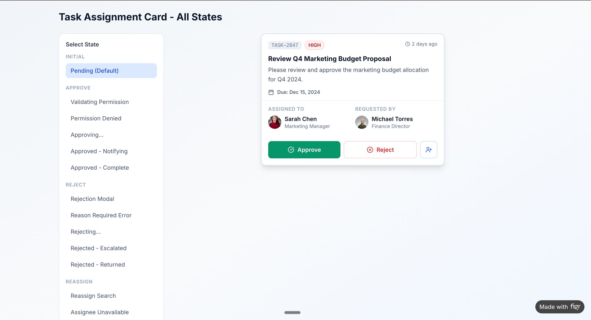
- Prototype with Purpose: Use real-world components from your library to test layouts. You could quickly prototype and test states for a task assignment card using Figr, ensuring it behaves correctly within the grid. Explore these component states in an interactive prototype here.
- Define Responsive Rules: Document your grid breakpoints (e.g., when columns stack or resize) based on your product analytics. Do not guess which screen sizes are most common for your users, know them. This ensures your layout decisions are data-informed.
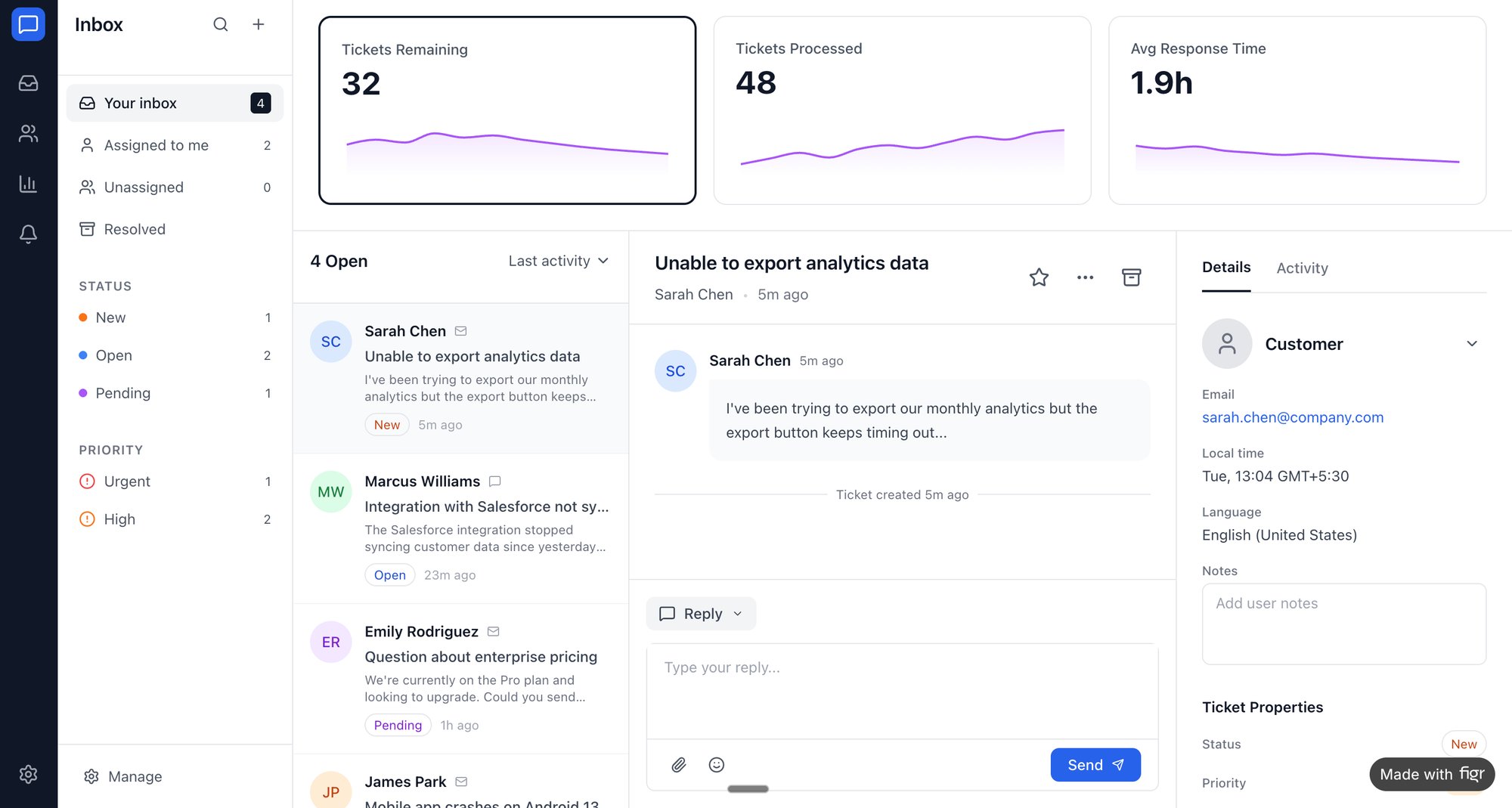
2. Data-Driven Dashboard Layouts
Think of a product dashboard not as a report, but as the cockpit of an airplane. Each gauge, chart, and number is a critical instrument, providing real-time feedback that informs the pilot's next move. A data-driven dashboard layout arranges these instruments to tell a clear story about performance, highlighting what needs attention and enabling quick, informed decisions. It’s one of the most vital web layout ideas for any software that runs on metrics.
This approach, championed by analytics platforms like Mixpanel and Amplitude, treats data not as an afterthought but as the central character. The layout's primary job is to decrease the time between seeing a metric and understanding its implication. When done right, does the dashboard not become an extension of the product manager’s own analytical thinking?
Why This Layout Works
The main benefit is cognitive efficiency. By organizing complex information hierarchically, the layout guides the user's eye from high-level KPIs to granular details without causing overload. A well-designed dashboard surfaces anomalies and trends, transforming raw data into actionable insights. It answers the question, "What is the most important thing for me to know right now?" This is a massive leverage point for product teams: it grounds every conversation in objective reality, killing "I think" in favor of "the data shows."
Quick Implementation Tips
- Prioritize Above the Fold: Place the 3-5 most critical metrics, the "at-a-glance" numbers, in prominent cards at the top. This is the first thing users see and should tell them if things are good or bad in under five seconds.
- Prototype with Realism: Avoid using placeholder data like "12,345." We used Figr to mock up an improved dashboard for Intercom, you can check out the new Intercom analytics dashboard. Using realistic data immediately reveals if your layout breaks when a number is unexpectedly large, small, or zero.
- Design for Workflows, Not Just Data: Map out the real-world questions different users ask. A CEO's view should be different from a marketing lead's. Create and test dashboard variants for these distinct user personas to ensure the layout supports their decision-making processes.
3. Responsive Single-Column Mobile-First Layouts
Picture designing a skyscraper. You do not start with the penthouse suite and hope the foundation holds. You start with the bedrock, ensuring the structure is sound from the ground up. A responsive, single-column, mobile-first layout is that bedrock for your digital product. It forces you to design for the most constrained environment first: a small mobile screen. This approach, a cornerstone of modern web layout ideas, treats the user experience not as a single masterpiece, but as an adaptable sculpture that reveals more detail as the canvas expands.
This philosophy, championed by pioneers like Luke Wroblewski, flips the old desktop-first model on its head. Instead of gracefully degrading an experience by removing elements for smaller screens, you progressively enhance it by adding them for larger ones. It’s a strategy of focus. You are forced to answer the most critical question first: what is the single most important thing a user needs to do here?
Why This Layout Works
The primary benefit is building a user-centric and future-proof product. By starting with a single column, you establish a clear, linear content hierarchy that works flawlessly on any device. This guarantees the core functionality is always accessible, which is non-negotiable when mobile traffic often accounts for the majority of users. A product manager I know at a popular fintech app noted that adopting this approach reduced their cross-device bug reports by over 30%. For a deeper dive, understanding responsive web design is fundamental.
Quick Implementation Tips
- Prioritize Ruthlessly: In your prototype, stack every element vertically. Does the flow still make sense? If not, your content hierarchy is wrong. This forces clarity.
- Define Breakpoints with Data: Use your product analytics to determine where to introduce multi-column layouts. Do not add a sidebar at 1024px just because it's a standard; do it because a significant user segment operates at that width.
- Test Touch Targets Early: For mobile-first designs, ensure all interactive elements have a minimum touch target of 44x44 pixels. You can generate specific test cases in Figr to have your QA team verify this, preventing usability issues before they hit production.
4. Sidebar Navigation Layouts
Picture a library. The main reading room is expansive, dedicated to deep focus, while the card catalog sits quietly to the side, always accessible but never in the way. A sidebar navigation layout functions as this digital card catalog for your application. It anchors your primary navigation to a fixed vertical column, leaving the majority of the screen for the main content. This is one of the most enduring web layout ideas, evolving from early desktop software into a staple for modern SaaS products.
This layout pattern, seen in tools like Figma, Notion, and Jira, provides a constant sense of place. It acts as a stable anchor, allowing users to move between complex sections without losing their navigational bearings. The main content area becomes a flexible stage, while the sidebar provides the consistent backstage controls.
Why This Layout Works
The core strength of this layout is contextual persistence. In applications with deep information architecture, keeping the main navigation visible reduces cognitive load. Users do not have to remember where they are or how to get somewhere else; the map is always available. A product manager at a B2B SaaS company noted their user session times increased by 15% after they switched from a top-navigation to a persistent sidebar. The change was attributed to users feeling more confident exploring different feature sets.
Quick Implementation Tips
- Map Before You Build: Use analytics data to inform your sidebar's information architecture. What are the top 5 most-trafficked sections of your app? Those are your candidates for top-level sidebar links.
- Prototype Both States: A collapsible sidebar is common, but it introduces complexity. Create variants showing both expanded and collapsed states early. You can quickly model and test these states, like in this task assignment component prototype, to ensure the user experience is intuitive for both.
- Active States are Non-Negotiable: Use clear visual cues, like color or typography weight, to indicate the user's current location in the navigation. This styling should be a core token in your design system.
- Consider Nested Levels: For complex products, use secondary navigation within the sidebar. Accordions or fly-out menus can help manage multiple levels of hierarchy without overwhelming the user.
5. Card-Based Layout Systems
Think of your content not as a continuous document, but as a deck of playing cards. Each card is a self-contained unit: a product listing, a project thumbnail, a user profile. A card-based layout system arranges these discrete packets of information in a flexible, scannable grid. This is one of the most effective web layout ideas for presenting varied content in a digestible format. It turns a firehose of information into an organized gallery.
This approach, famously used by Pinterest and central to Google's Material Design, treats each piece of content as its own small story. The layout isn't about flowing text down a page, it's about arranging these stories so a user can quickly identify what matters to them. From Trello boards to Netflix's content browser, cards provide a tangible metaphor for digital information.
Why This Layout Works
The primary benefit is scannability. By encapsulating related information, like an image, title, and description, into a single visual block, cards allow users to process complex datasets without feeling overwhelmed. This modularity is a product team’s dream for dynamic content. A colleague at a media startup mentioned their user engagement on a content-heavy discovery page increased by over 20% after switching from a traditional list view to a richer card-based system.
Quick Implementation Tips
- Define Variants: In your design system, create card variants for different content types and edge cases. What does a card look like with a long title or a missing image? Planning for this prevents layout breaks.
- Prototype Interactions: Cards are highly interactive. Use a tool like Figr to prototype hover, focus, and active states. You can see how different states for a task assignment card might behave in an interactive prototype here.
- Stress-Test with Data: Do not just design for the "happy path" with perfect content. Use real or near-real data to test your card layouts. This reveals how the system holds up with user-generated content.
6. Hero Section + Below-the-Fold Layout
Think of your landing page as a conversation with a new visitor. The hero section is your opening line: a bold statement designed to capture attention and establish immediate relevance. It's the digital equivalent of a firm handshake and direct eye contact. This classic layout, one of the most enduring web layout ideas, uses this high-impact area above the fold for a headline, a compelling image, and a single, clear call to action. The content below then acts as the logical continuation of that conversation.
This structure is the backbone of modern SaaS marketing, perfected by companies like Stripe and Slack. It treats the user's attention as a precious, depleting resource. The goal is not to show everything at once, but to make a promise in the hero section and then use the subsequent sections below the fold to deliver on it.
Why This Layout Works
The human brain is wired for storytelling, and this layout is a narrative structure. The hero is the inciting incident, grabbing the user's interest. The sections below are the rising action, providing social proof and feature details that resolve the initial tension: "Is this product for me?" It guides the user from awareness to consideration in a single scroll. A product manager I know at a B2B SaaS company found that redesigning their page to have a single, focused hero message increased their demo request conversion rate by 22%, simply by clarifying the initial promise.
Quick Implementation Tips
- Test Your Opening Line: Don't guess which hero variation works best. Use your product analytics to understand where users are coming from and what their intent is, then craft headlines that speak directly to that.
- Align Content to Intent: Ensure the content just below the fold directly addresses the promise made in the hero. If your hero says "Build websites faster," the next section better show exactly how.
- Prototype Mobile First: The hero section’s impact changes dramatically on smaller screens. Prototype the mobile and desktop views simultaneously to ensure the headline remains powerful and the CTA is accessible without awkward resizing.
7. Three-Column Layout with Sidebar, Main, and Auxiliary Panels
Think of a mission control console at NASA. On the left, mission-critical systems. In the center, the main shuttle trajectory. On the right, telemetry data from a specific sensor. This high-density view is what a three-column layout brings to a digital interface. This pattern divides the screen into a primary navigation sidebar, a central content area, and an auxiliary information panel, creating an orchestra of information rather than a solo performance.
This is the default language of modern enterprise software. Platforms like Gmail and Linear have made this layout iconic because it mirrors the cognitive workflow of their users: overview, primary task, and detailed context, all visible at once. It’s a layout that respects the user's need to cross-reference information without losing their place.
Why This Layout Works
Its power lies in information density and workflow efficiency. For complex tasks, users constantly need to switch between high-level navigation, the primary task, and contextual details. By keeping these three pillars visible, the layout drastically reduces the cognitive load of navigating away and back.
It turns a sequence of clicks into a single glance.
Quick Implementation Tips
- Map the Flow: Before building, map the user journey across all three panels. What triggers a change in the auxiliary panel? A clear user flow map is essential. You can visualize complex interactions, like a redesigned Shopify checkout setup, to understand how each panel should behave.
- Prioritize Focus: Use visual cues like subtle shadows or borders to establish a clear hierarchy. The central panel should always feel like the primary stage.
- Embrace Collapse: This layout is designed for wide screens. For smaller viewports, the auxiliary panel should be collapsible or transform into a modal. Don't try to cram all three columns onto a mobile screen.
8. Asymmetrical and Z-Pattern Layouts
Imagine a well-organized room where everything is not perfectly aligned. A reading chair is angled, a large painting is offset from the sofa, and a floor lamp creates a diagonal line of light. This isn't chaos; it's intentional balance. Asymmetrical layouts do this for a web page, breaking free from rigid symmetry to create movement and guide the eye along a natural path, often a Z-shape. This is one of the more expressive web layout ideas, treating the page as a dynamic composition.
This approach, seen on creative agency sites and Apple product pages, harnesses the natural scanning habits of Western readers. It deliberately places key elements like headlines, images, and calls-to-action at the turning points of this "Z" path. When done well, it feels less like a layout and more like a narrative, pulling the user through the most important content effortlessly.
Why This Layout Works
The core benefit is controlled visual storytelling. Symmetrical layouts are predictable, but asymmetry creates tension and visual interest that captures attention. By orchestrating where the user looks, you can establish a clear hierarchy of information without relying on font size alone. A colleague at a design-forward SaaS company found that their asymmetrical landing page had a 12% higher engagement rate on the primary CTA compared to their previous, centered layout. The Z-pattern simply guided more eyes directly to the button.
Quick Implementation Tips
- Anchor with a Grid: Start with an underlying grid, even if you plan to break it. Use the grid for foundational alignment, then intentionally offset key elements to create the asymmetrical balance. This prevents the design from looking messy.
- Balance with Visual Weight: Asymmetry isn't imbalance. A large, dark photo on the left can be balanced by a smaller, vibrant CTA and more white space on the right. Prototype these variations to see what feels right.
- Test the Path: Use heatmap tools or five-second tests to validate that users' eyes actually follow your intended Z-pattern. If heatmaps show attention getting stuck or skipping a key point, your visual cues need adjustment.
9. Sticky Header with Parallax Scrolling Layout
Think of a website as a stage play. The sticky header is the narrator, always present on the side, ready to guide you. The parallax scrolling is the dynamic stage scenery: background flats moving slower than the actors in the foreground, creating an illusion of depth and drawing you into the scene. This layout fuses persistent navigation with a cinematic, storytelling experience. It does not just present information; it reveals it.
This technique, often seen on high-end product showcases like Apple's pages, transforms scrolling from a simple utility into an engaging part of the narrative. It’s a powerful tool for guiding a user through a story, where the layout itself becomes a character.
Why This Layout Works
The primary benefit is a blend of usability and delight. A sticky header ensures that key navigation links are always accessible, reducing friction. The parallax effect, when used tastefully, creates a premium, immersive feel that captures attention and makes the content more memorable. A colleague at a creative agency mentioned their bounce rate on key landing pages dropped by 15% after implementing a subtle parallax story, because it encouraged users to keep scrolling to see what happened next.
Quick Implementation Tips
- Performance is Paramount: Heavy parallax effects can cripple performance on less powerful devices. Use hardware-accelerated CSS properties (
transform: translate3d) instead of manipulating top/left properties. Always test scroll performance rigorously. - Accessibility First: Motion can be a major issue for users with vestibular disorders. Use the
prefers-reduced-motionCSS media query to disable or significantly tone down parallax effects for those who request it. - Prototype the Pacing: The speed and intensity of the scroll effects matter. You can quickly mock up different parallax intensity variations and scroll-triggered interactions to find the right narrative pace. This helps you build detailed QA test cases.
10. Modular Split-Screen Layout with Comparison View
Imagine you’re a developer staring at two versions of code, trying to spot a single-character bug. Or a product manager weighing two competing designs before a stakeholder meeting. The mental strain is not just about spotting differences, it's about constantly shifting your focus. The modular split-screen layout treats your viewport not as a single stage, but as two parallel realities, allowing for simultaneous, frictionless comparison. It’s a foundational web layout idea for any tool that facilitates decision-making.
This pattern is the bedrock of productivity tools like GitHub, Linear, and Figma. It acknowledges a fundamental cognitive truth: our short-term memory is finite. By placing information side-by-side, the layout offloads the task of remembering what was on the previous screen, freeing up mental bandwidth for the actual work of analysis.
Why This Layout Works
The core value is clarity through juxtaposition. This layout removes ambiguity by enabling direct, one-to-one mapping between two sets of information. It excels in workflows that demand high-fidelity comparison, like code diffs, document revisions, or A/B test analysis. I recently watched a PM use a split-screen tool to compare the task creation flows of Linear and Jira; the side-by-side view made the UX differences so stark that the resulting UX audit document practically wrote itself. The layout turned a subjective debate into an objective analysis.
Quick Implementation Tips
- Prioritize the Primary Pane: Decide which side of the split-screen is the "source of truth" or primary action area and which is secondary. This hierarchy should guide user focus.
- Prototype the Interaction: Use a tool like Figr to simulate not just the static layout, but the interaction between the panes. For example, you can create a side-by-side comparison to analyze the setup speed of Cal.com versus Calendly, mapping the entire flow to see where friction occurs.
- Plan the Responsive Collapse: The split-screen is a desktop-first pattern. Define how the two panes will stack or transform into a tabbed view on smaller viewports. The goal is to preserve information hierarchy without overwhelming a mobile screen.
From Pattern to Production: Your Next Move
We have journeyed through a landscape of structural possibilities, from the disciplined order of component-based grids to the fluid narrative of parallax scrolling. Each of these ten layouts represents more than an aesthetic choice. They are fundamentally answers to questions about user intent and information hierarchy. Your user is not just looking at a screen; they are trying to accomplish a task, find a piece of information, or make a decision.
This is the core takeaway: a layout is not a container you pour your content into. A layout is a strategic decision that guides your user's attention and clarifies their path. The choice between a modular split-screen and an asymmetrical Z-pattern is a choice about what you want the user to see first, what you want them to compare, and what action you want them to take next. It is a product strategy decision disguised as a design decision. As Jakob Nielsen's research on eye-tracking patterns has shown for decades, where you place elements directly influences user behavior. The "F-Pattern" for reading web content isn't a trend, it's a documented human behavior you must design for or against with clear intent.
Translating Insight into Action
So, what is the next move? It is tempting to open a design tool and start experimenting with these new web layout ideas. But that would be skipping the most critical step.
The real work begins not with a blank canvas, but with a deep look at your existing product.
Your next step is to choose one, and only one, critical user flow. Is it the new user onboarding? The checkout process? The dashboard configuration? Pick the flow that has the highest impact on your key metrics. A friend at a SaaS company recently did this. They believed their complex settings page needed a complete overhaul. But after mapping the actual user journey, they found the real drop-off was much earlier. The problem wasn't the layout's complexity; it was the confusing single-column form that preceded it. They prototyped a simple split-screen layout for that form, allowing users to see instructions and input fields side-by-side. The fix was targeted and data-informed.
This is what I mean by moving from pattern to production.
- Identify the Job: What is the user truly trying to accomplish in this flow?
- Diagnose the Friction: Where does the current layout fail them? Is information hard to find? Is the next step unclear?
- Form a Hypothesis: Based on that friction, select a layout pattern from this list that directly addresses the problem. "We believe a card-based layout will help users better scan and compare product options."
- Prototype with Realism: Do not just draw grey boxes. Build a high-fidelity prototype that uses your actual product's context.
The Layout as a System
In short, mastering these concepts is not about memorizing a catalog of templates. It is about building a system for thinking. It is about developing the instinct to see a user problem and immediately connect it to a structural solution. This capability transforms you from a product manager who requests features into a product leader who shapes experiences. It closes the expensive gap between a vague idea and a testable artifact. By grounding your web layout ideas in user data and strategic intent, you create digital environments that feel less like a series of pages and more like an intuitive space built just for them.
Ready to move beyond theory? Instead of just sketching boxes, use Figr to capture your actual user flow, map out the edge cases, and generate a high-fidelity prototype in minutes. Figr helps you turn abstract layout ideas into concrete, testable artifacts based on your real product, so you can validate your next move with data, not just intuition.