Monday, 9:07 a.m. The invite says “Website Redesign Kickoff.” The room fills with familiar energy. The CEO wants the site to feel current. Sales wants the demo button larger. Brand wants more polish. Engineering wants fewer surprises. Nobody is wrong, and that's exactly why these meetings stall.
I've watched this scene play out enough times to know the issue isn't taste. It's the absence of a system. When a team treats web design and redesign like a visual refresh, every opinion gets equal weight. When the team treats it like product work, the conversation changes. You stop arguing about what feels better and start deciding what the site needs to do.
That shift matters because redesigns are expensive, frequent, and easy to get wrong. Website redesign cycles now average 2 to 3 years, according to VWO's web design statistics. If your operating model is “survive the redesign, then recover,” you're building a recurring source of chaos into the business.
The Redesign Kickoff That Never Ends
The kickoff usually sounds strategic. It rarely is.
A few years ago, a PM at a growth-stage SaaS company told me their redesign brief had three goals: make the homepage cleaner, improve conversions, and look more enterprise. That's not a strategy. That's three different jobs hiding in one sentence. “Cleaner” is subjective. “Improve conversions” is measurable. “Look more enterprise” is usually a proxy for credibility, which means the team hasn't translated a brand instinct into product language yet.
This is why redesigns drag. One group is solving for aesthetics. Another is solving for pipeline. A third is protecting implementation capacity.
The hidden trap in most redesigns
Teams often start too late. They start with screens.
What they have is a business alignment problem, a funnel problem, or a trust problem. The website is where those problems become visible. It isn't always where they begin.
That's also why “just modernize it” is such a dangerous brief. If your team is thinking about modernizing your website, the useful question isn't whether the interface looks dated. It's whether the current experience still supports how buyers evaluate, trust, and move through your product story.
Practical rule: If the kickoff produces more adjectives than metrics, pause the project.
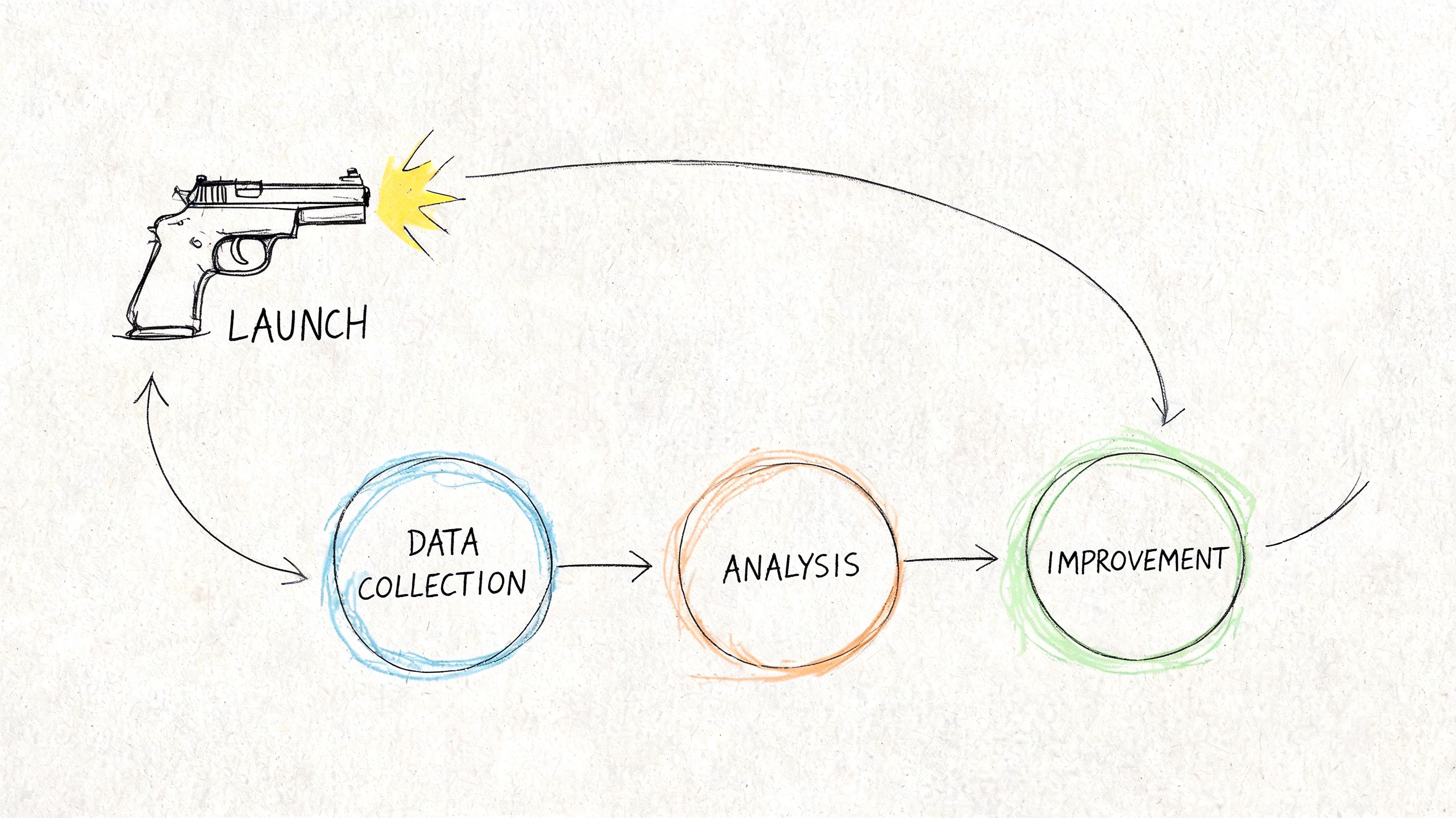
The redesign that works is never a one-off creative event. It's a continuous operating system with four parts:
- Diagnosis first: establish what's broken before anyone touches layout or visuals.
- Execution through constraints: use design systems, tokens, and prototypes to reduce drift.
- Launch as risk management: validate, test, and hand off with discipline.
- Post-launch learning: measure against baseline, then iterate.
That's the difference between a redesign that creates momentum and one that becomes a quarterly argument.
What experienced teams do differently
Experienced product teams name the redesign for what it is: a product intervention.
They ask different questions.
| Weak kickoff question | Better product question |
|---|---|
| Does this look modern enough? | Where are users dropping or hesitating today? |
| Can we refresh the brand? | Which trust cues are missing on high-intent pages? |
| Can we launch in one big push? | What can we validate before full rollout? |
That framing sounds small, but it changes everything downstream. It changes who owns decisions, what gets prioritized, and how success gets judged after launch.
The Pre-Mortem Audit
Monday morning, the redesign kickoff sounds healthy. Marketing wants a stronger story. Sales wants better lead quality. The CEO wants the site to feel current. By Thursday, the team is arguing about hero imagery while important risks stay unnamed.
A pre-mortem audit stops that pattern. It assumes the relaunch already underperformed, then forces the team to explain why in concrete terms. Where did users hesitate? Which pages attracted traffic but failed to move intent forward? What broke because the team redesigned from opinion instead of evidence?
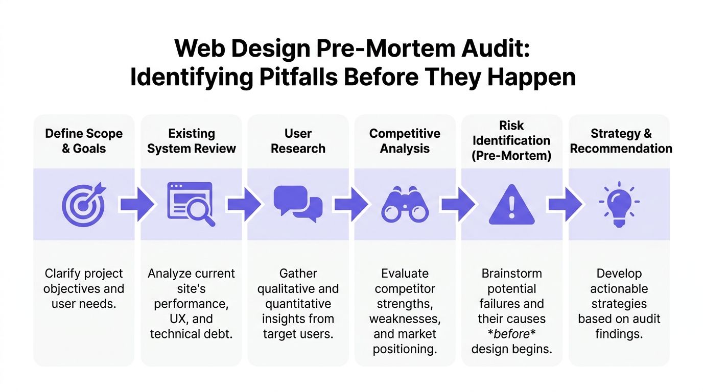
Start with a baseline, not a brainstorm
Redesigns go sideways when the brief is built from irritation. The homepage feels dated. Pricing feels weak. Navigation feels cluttered. None of that is useful until the team can tie it to user behavior and business impact.
Before initiating a website redesign, product teams should establish baseline metrics across at least two months of historical data, and track six engagement measures: bounce rate, average session duration, pages per session, new vs. returning user ratio, average page time, and organic search traffic, as outlined in Databox's guide to measuring website redesign success.
That baseline is the first layer of a redesign system. It gives the team a reference point for launch decisions now, and for post-launch judgment later. Without it, every debate turns into taste.
The audit stack I trust looks like this:
- Analytics baseline: traffic sources, entry pages, exits, assisted conversions, and page-level conversion performance.
- Funnel review: where users abandon demo requests, pricing exploration, sign-up, checkout, or contact flows.
- Behavioral evidence: heatmaps, scroll maps, search terms, and session recordings.
- Content and IA review: missing answers, duplicated pages, weak hierarchy, and dead-end journeys.
- Technical debt review: templates, components, or CMS patterns that are slow, brittle, or costly to change.
- Accessibility pass: obvious blockers before they get covered up by new visuals.
What a useful audit actually produces
A serious audit produces a decision log. It tells the team what to change, what to keep, and what to test before rollout.
Databox makes the point clearly: “Many organizations immediately resort to a redesign without even having the necessary data that can back the redesign results.” That matches what I see in practice. Teams can feel that the site is underperforming. They still need proof about where, for whom, and under which conditions.
The output should look like this:
| Audit finding | What it usually means | Better redesign response |
|---|---|---|
| High traffic, low lead generation | Message or path is weak | Rework value proposition and conversion path |
| Strong page views, short page time | Users don't find what they expect | Tighten hierarchy, relevance, and page intent |
| Exits spike on contact or checkout | Friction in a critical step | Simplify forms or reduce ambiguity in the flow |
| Returning users avoid key pages | Repeat evaluators aren't getting enough support | Improve comparison, proof, and product-detail pages |
That changes the conversation. The question is no longer whether a page looks better. The question is whether the page helps a user complete its job.
If you need a working framework to find and fix product UX flaws, use it to structure the audit around friction, failure points, and missing information.
The cost of skipping discovery
Skipping discovery rarely saves time. It pushes cost into later stages where it is harder to contain.
Engineering rebuilds pages that were never tied to a measurable problem. Content rewrites messaging without a funnel hypothesis. Design gets pulled into preference debates because nobody agreed on a baseline. Leadership then treats launch-week volatility as surprise, even though the team chose to work without a shared diagnosis.
That is why I treat the audit as part of the product lifecycle, not as a pre-project formality. The same evidence that explains why the redesign needs to happen should also shape the system, the prototypes, the rollout plan, and the metrics used after launch. If those pieces are disconnected, the redesign becomes a creative exercise with expensive follow-on work.
Name the failure modes early
I end the audit with one uncomfortable exercise. Ask each function how the redesign could fail.
Sales might worry that lead volume stays flat while lead quality drops. Support might flag that help paths become harder to find. Engineering might point to component sprawl or migration complexity. SEO might raise concerns about redirects, indexing, or lost authority. Product might call out a more subtle risk: a cleaner interface that explains less.
Good. Those are not objections. They are operating constraints.
A redesign team that names failure modes early can choose trade-offs on purpose. A team that skips this step usually discovers the same risks after launch, when fixing them costs more and trust is lower.
From Tokens to Prototypes
Once the audit is done, the project gets deceptively dangerous. Everyone feels progress because screens start appearing. This is also the point where inconsistency creeps in.
Last month, I watched a team burn a week arguing over button corner radius on a new workflow. Not because the decision mattered that much, but because their design system had become advisory instead of binding. Every redesign eventually pays for that kind of drift.
Constraints create speed
The fastest teams in web design and redesign don't start from a blank canvas. They start from tokens, components, and existing product patterns. That doesn't kill creativity. It channels it toward the problems users notice.
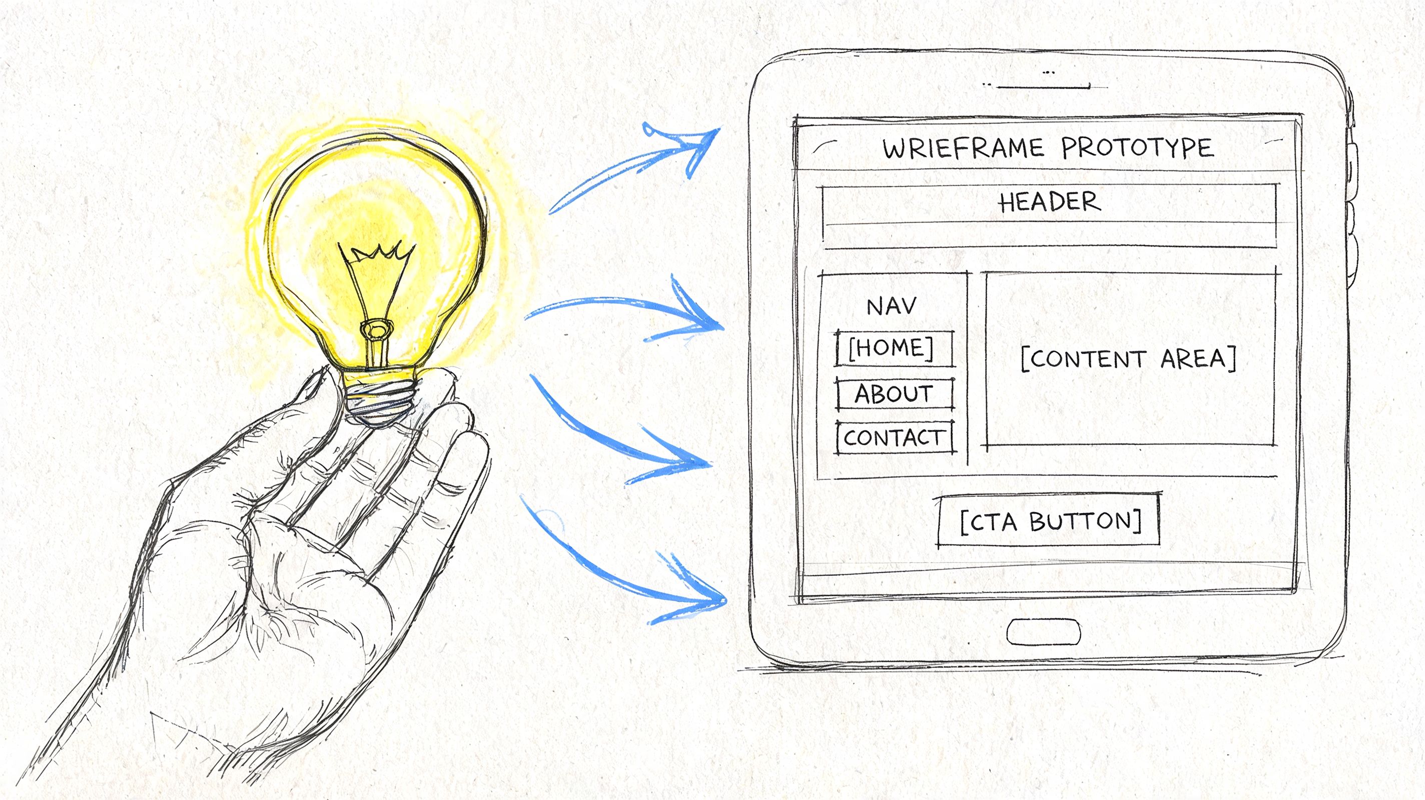
A practical execution flow looks like this:
Lock tokens early
Typography, spacing, color, elevation, border radius, and interaction states should stop being negotiable before page-level design begins.Map reusable components
Hero variants, social proof blocks, pricing rows, nav behaviors, forms, cards, and footers need one source of truth.Prototype in realistic context
Use real copy lengths, realistic edge cases, actual product screenshots, and plausible empty states.Pressure-test breakpoints and states
Hover, error, success, loading, disabled, long text, and localization edge cases reveal whether the system is real or just attractive.
For teams cleaning up system foundations, Figr's guide to design tokens is a useful reference because it turns token talk into implementation discipline.
Prototype the weird parts, not just the hero
Most redesign decks overinvest in polished top-of-funnel pages. Then the first live user hits an overloaded comparison table, a complex pricing selector, or a long request form, and the team discovers the actual design work hadn't happened yet.
That's a pattern worth naming. I call it hero-page bias. Teams polish the first screen buyers see and under-design the moments where buyers decide.
The prototypes that matter most usually include:
- High-intent forms with validation, errors, and success states
- Navigation transitions across desktop and mobile
- Product proof sections where screenshots, integrations, or workflows need clarity
- Dense pages such as pricing, docs hubs, or feature comparison views
A prototype is only honest when it includes the awkward states.
Accessibility belongs inside design execution
Accessibility is where redesign optimism meets reality.
Website redesign cycles now average 2 to 3 years, and 88% of users never return after a bad UX experience, while 96.3% of sites fail basic WCAG accessibility standards, according to VWO's web design statistics. Those numbers are blunt, but the operational point is sharper: if accessibility is deferred to QA, the team will discover structural issues when they are most expensive to fix.
I've seen this happen with contrast, focus order, mislabeled form controls, and component states that looked fine in static review but failed under keyboard navigation. Nobody intended to ship exclusion. The team just treated accessibility like compliance paperwork instead of design quality.
A simple way to avoid that is to require accessibility checks at three moments:
| Stage | What to verify |
|---|---|
| Token setup | color contrast, type scale, spacing consistency |
| Component design | focus states, labels, hit areas, error messaging |
| Prototype review | keyboard flow, screen order logic, dynamic states |
What works and what doesn't
What works is boring in the best way. Shared tokens. Reusable components. Prototypes built from real constraints. Cross-functional reviews that focus on behavior, not decorative preference.
What doesn't work is also predictable. Designers drawing one-off page treatments. PMs approving “close enough” states without edge cases. Engineers discovering missing interaction rules during implementation. Brand review arriving after the system is already fragmented.
If the redesign starts feeling artisanal page by page, stop. You're not building a website. You're accumulating future inconsistency.
De-Risking the Launch
The week before launch usually looks the same. Someone finds a broken state in the signup flow. Analytics events are missing from a key page. Legal wants copy changes. Sales asks whether the old comparison page will still exist. Engineering is trying to close bugs while everyone else is still making decisions.
That chaos does not mean the redesign is failing. It means launch is exposing whether the team built a release system or just a new interface.
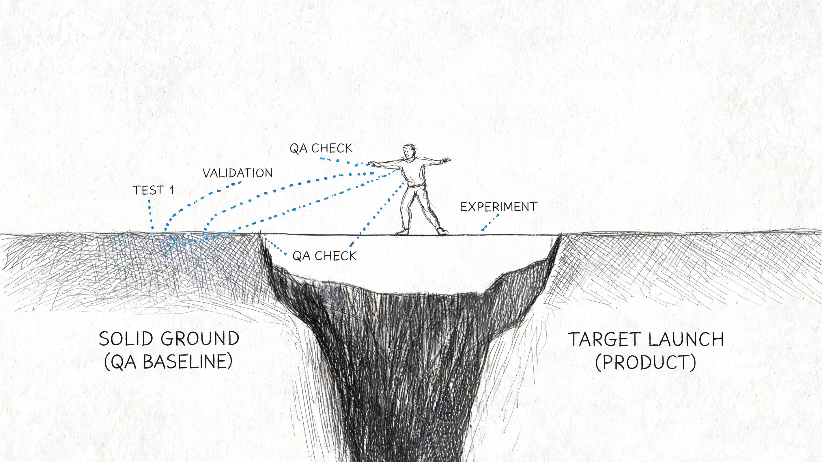
Validation before exposure
A redesign changes message hierarchy, trust cues, navigation patterns, and interaction cost all at once. Even when the work looks polished, some of those decisions will be wrong in production.
The practical response is to reduce blast radius before full exposure.
Teams that handle launch well do three things consistently:
Test the riskiest assumptions first
Validate message order, CTA placement, pricing presentation, proof blocks, and form sequencing before swapping the whole experience.Use staged rollout paths
Release by traffic slice, user segment, region, or page group when the stack allows it.Keep old and new versions comparable
Preserve baseline events, funnel definitions, and page-level reporting so performance can be judged against behavior, not opinion.
If your release process needs a practical companion, this guide to safe website updates is worth reviewing because it treats changes as operational risk, not just content edits.
What should be tested first
Equal testing across every page sounds disciplined, but it usually wastes time. Launch risk is concentrated.
Start with the parts of the site where failure affects revenue, trust, or task completion:
| Priority | What to test | Why it matters |
|---|---|---|
| Highest | Homepage message hierarchy, pricing, demo or signup flow | Direct effect on buyer movement |
| High | Navigation patterns, mobile layouts, proof sections | Shapes comprehension and trust |
| Medium | Blog templates, secondary marketing pages | Important, but less likely to block intent |
I usually ask one question to set priority: if this page underperforms for two weeks, who feels it first? Pipeline teams, support, and customer success often answer that faster than the design team can.
A launch plan gets sharper when each test has one hypothesis and one behavioral metric. Ten parallel experiments create noise. One clear test can change a decision.
QA is part of product delivery
Visual review is the easy part. Launch risk sits in behavior under imperfect conditions.
I want explicit checks for:
- Form logic across valid, invalid, partial, and repeated submissions
- Responsive behavior on meaningful breakpoints, not just a resized desktop browser
- Navigation paths for first-time visitors, returning users, and branded traffic
- Content resilience when copy expands, assets fail, or integrations respond slowly
- Analytics coverage for primary conversion events, error states, and drop-off points
Release controls matter here. Teams that use staged deployment, kill switches, and rollback rules make better decisions under pressure. This walkthrough on feature flag best practices is useful when a big-bang release creates more risk than the business needs to take.
Before signoff, run the live build with design, engineering, product, and the person who owns analytics instrumentation. Review the actual site. Click every important path. Confirm what will happen if the launch underperforms on day one, including who can revert what.
Here's a useful reference point for how teams think about modern mobile experience constraints and implementation details:
Handoff is a decision record
Launches get shaky when design hands over screens and engineering is left to infer intent. That is where drift starts.
A good handoff makes three things explicit: what is fixed, what is flexible, and what counts as a defect. That includes annotated states, edge-case behavior, fallback content, instrumentation requirements, and acceptance criteria tied to real user flows.
I have seen redesigns miss launch goals without any major bug. The team never aligned on behavior. The mockup looked right, the code looked close, and the shipped experience still created friction because nobody defined the decision logic underneath it.
File transfer is not handoff. Shared understanding is.
Closing the Loop with Post-Launch Measurement
Launch day creates a strange illusion of closure. The site is live, the redirects work, the screenshots look good, and everyone wants to move on. That's usually the moment the most important discipline should begin.
The redesign only proves itself when post-launch behavior is compared to the baseline you captured earlier.
Most teams stop where the real work starts
One of the clearest gaps in redesign practice is what happens after release. As noted in this analysis from a major web conference, many organizations lack a framework for measuring redesign success, testing variations, comparing funnel performance against baseline, and connecting design changes to business outcomes.
That gap is expensive because post-launch noise is easy to misread. A few good days don't prove the redesign worked. A few bad ones don't prove it failed. Teams need a way to separate novelty, seasonality, launch anomalies, and genuine behavioral change.
Build a redesign scorecard
I prefer a simple dashboard over an ornate one. It should connect directly to the pre-mortem audit.
A useful scorecard has three layers:
| Layer | Questions to answer | Example measures |
|---|---|---|
| Business outcome | Did the redesign improve the intended result? | conversion path performance, lead quality, task completion |
| Behavioral signal | Are users moving differently through the experience? | bounce behavior, page depth, session quality, exit patterns |
| Experience health | Is the new system holding up? | usability issues, support themes, accessibility regressions |
For teams defining UX metrics to measure, the key is not metric volume. It's metric alignment. If the redesign was meant to reduce friction in a request flow, your dashboard should make that visible without forcing the team to infer it from vanity trends.
A simple operating rhythm after launch
I've had the best results with a lightweight review cadence:
- First check, immediately after launch: confirm instrumentation, page integrity, redirects, and obvious path failures.
- Early review, once behavior stabilizes: compare key pages and flows against baseline.
- Follow-up review, at regular milestones: decide whether the redesign needs iteration, rollback on specific elements, or further experimentation.
Databox recommends validating redesign success at 3-month intervals post-launch through KPI milestone reviews, which is a useful cadence if your sales cycle or traffic profile supports it, as noted earlier in their redesign measurement guidance.
Working rule: Don't ask whether the redesign “worked.” Ask which assumption improved, which one failed, and what to test next.
Turn findings into the next iteration
This is what I mean: the redesign is a loop, not a reveal.
If users engage more thoroughly but convert less, maybe the experience became more informative and less decisive. If traffic holds but key pages lose momentum, maybe navigation is cleaner but message hierarchy got weaker. If desktop improves and mobile softens, the team may have designed responsiveness without designing for mobile behavior.
Those patterns should produce new hypotheses, not executive debate.
A practical post-launch review usually ends with three buckets:
Keep
Changes clearly supporting the intended outcome.Fix
Regressions, confusion points, instrumentation gaps, or broken states.Test next
The highest-confidence hypothesis emerging from real behavior.
That rhythm changes the economics of redesign work. Instead of waiting another cycle and doing another broad rewrite, the team learns continuously and spends effort where signal is strongest.
Your Redesign Is Never “Done”
A website redesign isn't an event you survive. It's a capability you build.
The teams that get good at web design and redesign stop treating the site like a brochure with occasional cosmetic intervention. They treat it like a product surface with users, jobs, drop-offs, trust signals, and maintenance costs. That mindset changes how they plan, design, launch, and learn.
In short, the most reliable system is simple: audit before opinion, execute through constraints, de-risk the launch, then measure what changed and keep going.
If you want a Monday-morning starting point, don't reopen your entire roadmap. Pick one high-traffic page. Pull its current analytics. Watch one session recording from a real user on that page. Then write down one friction point you can verify. That's enough to begin.
If your team is trying to make redesign improvements stick, study long-term design system strategies. The hard part isn't launching a cleaner experience. It's preventing entropy six months later.
If your team wants a faster way to turn audits, flows, prototypes, edge cases, and redesign QA into usable product artifacts, take a look at Figr. It helps product teams work from real app context instead of blank canvases, so redesign decisions stay grounded, testable, and easier to ship.
