
Credit: Zachary Monteiro
We’ve all been standing in front of a door, unsure whether to push or pull, or fumbling with a remote control just to turn on the right device. These daily frustrations aren’t just minor inconveniences—they’re signs of poor design that make our interactions with objects harder than they need to be.
At its core, design should simplify our lives, making things easy and intuitive to use. However, when design overlooks the needs and behaviors of users, the experience becomes frustrating instead of functional.
The Design of Everyday Things, by cognitive scientist Don Norman, tackles exactly this issue. Norman’s groundbreaking book explores why so many products fail to meet basic usability needs and introduces practical principles for creating better designs.
In this post, we’ll break down the key insights from Norman’s book, diving into foundational principles of good design, importance of human-centered design, the psychology of everyday actions, and more.
Overview of The Design of Everyday Things

Credit: Abdullah Al Noman
The Design of Everyday Things, written by Don Norman, is considered a cornerstone text in the world of design, especially user experience (UX) design.
Norman’s book dives deep into why some products are easy and even enjoyable to use, while others are a source of endless frustration.
He argues that these differences aren’t accidental; they come down to how well (or poorly) a product’s design considers the needs, abilities, and natural tendencies of its users.
Here’s a breakdown of the core elements of the book:
- Original and Revised Editions
- The first edition, published in 1988, was groundbreaking for its time, introducing designers to key concepts of usability and user-centered design.
- In the revised edition, released in 2013, Norman expanded on these ideas with updated examples, refining his thoughts on how digital advances impact design. This updated version reflects modern design challenges, like digital interfaces and automated systems.
- Premise of the Book
- The central idea is that design should serve human needs by making tasks intuitive and minimizing errors.
Norman emphasizes that when people struggle to use a product, it’s usually not the fault of the user but of the design.
- The book covers how designers can address this by focusing on usability principles that support clear, easy interactions.
According to Norman, effective design is invisible; it works so seamlessly that users barely notice it.
- Key Concepts Introduced by Don Norman: Norman’s book introduces a series of essential concepts that have become foundational in the field of UX design. Here’s an overview of some of the most significant ones:
- Affordances and signifiers: Affordances are the possible actions that an object offers, while signifiers are cues that indicate what actions can be taken.
- Discoverability and feedback: A well-designed product should make it clear how to use it and should offer feedback to confirm actions.
- Conceptual models and mappings: These are the mental models users develop about how a system works.
- The gulf of execution and evaluation: This concept describes the gap between what a user intends to do and what a product allows them to do (execution) and the gap between what happens and how well the user understands it (evaluation).
Through these concepts, Norman highlights the need for a human-centered approach to design—one that respects how people think, act, and process information.
His insights have shaped the field of design and also influenced how organizations view product development, focusing more on users and their experiences.
Principles of Good Design
Don Norman’s The Design of Everyday Things introduces foundational principles that help designers create products that are functional, user-friendly, and delightful.
These principles emphasize understanding human psychology and making products intuitive to use, reducing the need for users to struggle with confusing interfaces or controls.
Let’s dive into these principles and see how they guide the creation of effective designs.
1. Affordances and Signifiers
Affordances are what an object naturally allows us to do. For instance, a chair’s affordance is to sit, a button affords to press. Good design leverages affordances to make it clear what an object can do.
- Signifiers serve as hints or indicators that communicate how to interact with an object. For example, a door handle signifies that it can be pushed or pulled.
- Without clear signifiers, users might struggle with figuring out what actions are possible, leading to frustration and errors.
Example: Think of a button on a website. If the button looks like a clickable element, users will know to click it. Adding a hover effect can also act as a signifier, confirming the button’s action.
2. Discoverability and Feedback
A well-designed product enables users to easily discover available actions and provides feedback after each action to indicate success or next steps.
- Discoverability ensures that all possible actions are visible to users. When users can immediately see what they can do, they’re less likely to make mistakes.
- Feedback gives users an immediate response to their actions, confirming that the action was successful or needed correction.
Example: Think of an elevator button that lights up when pressed. The light serves as feedback, letting the user know the button has been activated.
3. Conceptual Models and Mappings
Conceptual models are the mental models that users develop about how things work based on experience and intuition. Good design aligns the product’s behavior with these models, making it easy for users to predict outcomes.
- Mappings refer to the relationship between controls and their effects. A logical mapping makes a product more intuitive. For example, turning a steering wheel right to make a car go right is a natural mapping.
- When mappings are clear, users don’t have to stop and think—they can act intuitively.
Example: A stove’s burner controls are arranged in the same layout as the burners, which helps users easily match the control with the corresponding burner.
With these foundational principles in mind, let's explore how The Design of Everyday Things emphasizes the importance of a human-centered design approach, putting user needs and experiences at the heart of the design process.
Human-Centered Design
Credit: Trone
Human-centered design (HCD) is the practice of creating products that focus on the needs, wants, and limitations of users.
Don Norman emphasizes that designers must prioritize understanding and empathy for the user, ensuring that products are functional, accessible, and intuitive.
Human-centered design is not just about making things look good; it's about making things that people find genuinely useful and enjoyable to use. Let’s break down the key elements of this approach and how it helps designers build better products.
1. Philosophy and Importance
The core philosophy of human-centered design is to approach design from the user’s perspective. It’s about asking questions like:
- What does the user need?
- How will the user interact with this product?
- Are there potential challenges or frustrations they might face?
By focusing on the user, designers can identify real-world problems and create solutions that feel natural and comfortable. This approach often requires a willingness to step back, observe, and understand the user’s environment and limitations before creating solutions.
2. User-Centered Design Approaches
To implement human-centered design, designers use specific methods that keep the user involved throughout the design process. These include:
- User research: Engaging with users directly to gather feedback on their preferences, routines, and challenges.
- Prototyping: Creating simple versions of the product to test with real users, identifying areas for improvement before full development.
- Iterative testing: Making continuous improvements based on feedback from each prototype, ensuring that the product evolves with the user in mind.
Example: Think of designing a mobile app. An HCD approach would involve testing an early prototype with users to see how intuitive the navigation is, making adjustments as needed based on user feedback.
3. Observational Insights and Task Analysis
A vital part of HCD is observing users in real scenarios to understand how they interact with products. Observational insights help designers spot issues that users might not consciously notice or mention. Task analysis involves breaking down each step a user takes to complete a task, identifying where confusion or frustration might occur.
- Observational insights: Watch how users interact with a product in their daily lives, uncovering pain points and areas for enhancement.
- Task analysis: Map out each step a user needs to complete a task to identify unnecessary steps or obstacles.
Example: When designing a website for easy navigation, observing how users click through different pages can reveal which steps might be unclear or take too long.
The Psychology of Everyday Actions

Credit: Observational Practices
Understanding how people interact with everyday objects is essential for creating intuitive designs. Don Norman explores the psychology behind actions in design, emphasizing that successful design should align with how people think, act, and respond.
By recognizing users’ natural behaviors and mental processes, designers can create products that are easy to use and also enjoyable. Let’s examine the core psychological concepts behind everyday actions in design.
Stages of Action: Execution and Evaluation
When people interact with a product, they go through two main stages:
- Execution: The user forms a goal and then takes action to achieve it. For example, deciding to turn on a lamp and then finding the switch.
- Evaluation: The user checks if their action achieved the intended goal. If they turned on the lamp, they would look to see if it lit up as expected.
Designers can simplify these stages by providing clear indicators (signifiers) that help users understand how to execute actions and evaluate outcomes.
Good design bridges the gap between what a user wants to do (execution) and what they observe after the action (evaluation).
Emotional Impact and Cognitive Processing
Emotions play a big role in how users perceive and interact with products. Positive emotions make experiences enjoyable, while negative ones lead to frustration and confusion.
Cognitive load, or the mental effort required to use a product, should be minimized in design to prevent overwhelming users.
- Reduce cognitive load: Make actions intuitive and easy to perform, so users don’t have to think too hard.
- Provide positive feedback: Reinforce actions with small cues, like sounds or visual changes, to make users feel successful.
For example, a successful shopping app minimizes steps to check out and provides visual confirmation for each completed step, keeping users feeling in control and informed.
Errors in Design: Slips and Mistakes
Errors are a natural part of user behavior. Norman categorizes errors as slips and mistakes:
- Slips: These occur when users intend to do something but accidentally perform the wrong action, like typing in the wrong field. Design can reduce slips by making common actions easy to identify and perform.
- Mistakes: These are errors in planning or decision-making, often due to confusing design or lack of information.
Good design anticipates user errors and prevents them from happening, or at least minimizes their consequences.
Norman introduces concepts like forcing functions (features that prevent errors) and lock-ins (steps that confirm an action) to guide users safely through tasks.
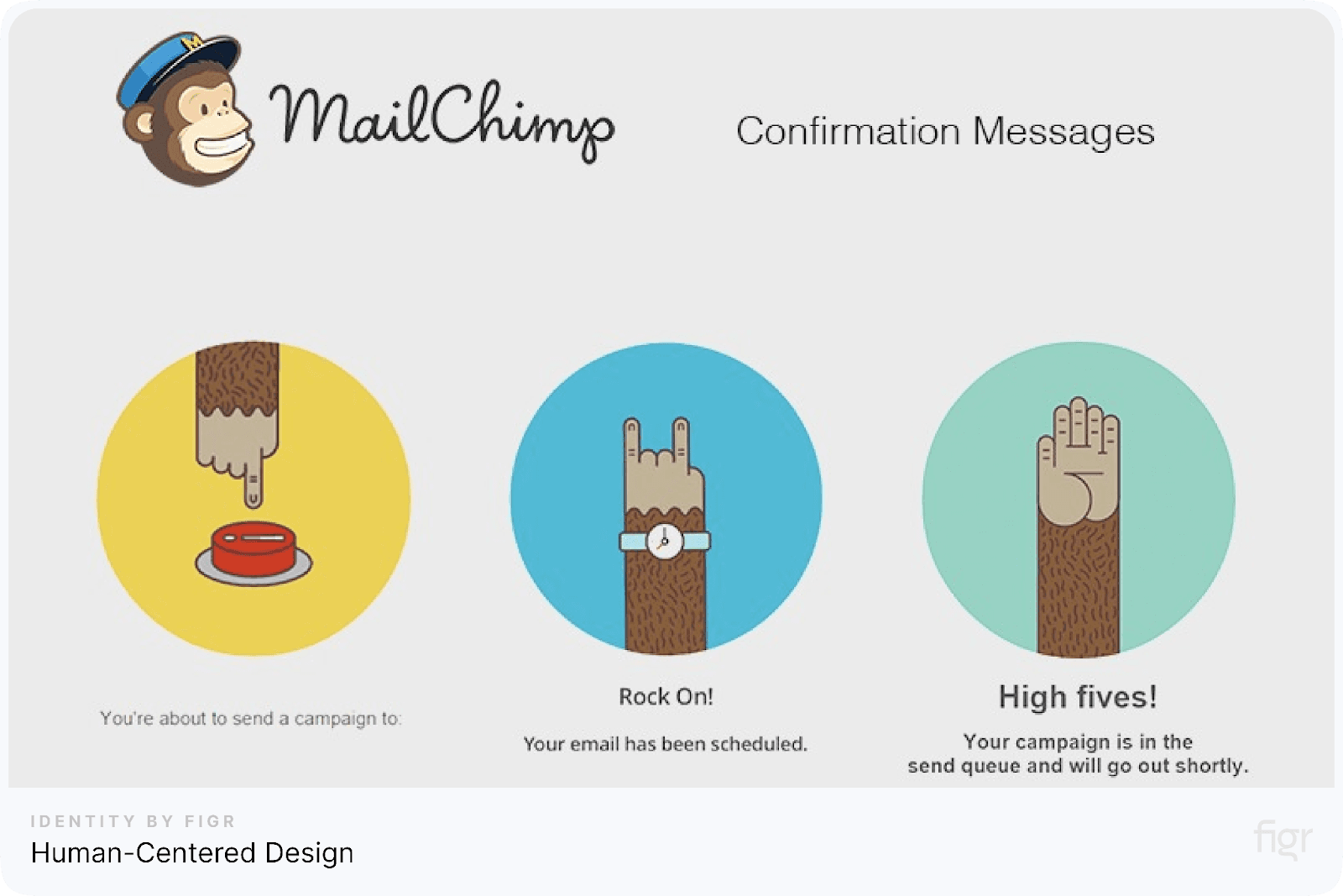
Example: In an online form, adding confirmation messages and clear labels can reduce slips, while reminders and warnings before submitting help users avoid mistakes.
Now, with these psychological principles in mind, designers can build products that feel natural and intuitive.
Next, let’s dive into how different types of knowledge—both in users’ minds and in the design itself—affect usability and shape the design process.
Knowledge in Design

Credit: Tok Resource
Effective design isn’t just about visuals; it’s about understanding how users process information and providing the right cues to guide them.
Don Norman introduces the concept of knowledge in design, explaining how designers can balance what users already know with what the design itself communicates.
This section covers the two types of knowledge involved in user interactions and how they affect usability.
1. Types of Knowledge: Declarative and Procedural
Knowledge can be divided into two categories:
- Declarative knowledge: This is factual knowledge, like remembering which button to press to turn on the lights. It’s knowledge users consciously recall when interacting with a design.
- Procedural knowledge: This refers to “how-to” knowledge, like knowing the steps to complete a task. Procedural knowledge becomes automatic over time, making users more efficient as they become familiar with the design.
For example, when a user knows that clicking the “Submit” button completes a form, that’s declarative knowledge. Knowing the steps to fill out each field before submitting is procedural.
2. Memory and Its Impact on Design
Good design minimizes the need for users to remember details, instead offering cues that help them complete tasks intuitively.
Norman points out that relying too much on “knowledge in the head” (what users must remember) increases cognitive load and can lead to errors.
Effective design combines knowledge in the head with knowledge in the world (information available in the environment).
To help users, designers should:
- Provide external cues: Use labels, icons, and instructions that remind users of essential steps.
- Minimize memory load: Create workflows that guide users through tasks without requiring them to remember too much.
For example, an online shopping app might provide a step-by-step checkout process, with clear icons and prompts for each stage, making it easy for users to know what to do next.
3. Balancing Internal and External Knowledge
Designers should balance internal (what users already know) and external knowledge (information provided within the design). Too much reliance on internal knowledge can confuse users, while too much external knowledge can clutter the interface.
How to balance knowledge in design:
- Use familiar symbols and icons: Common icons, like a shopping cart for the checkout process, leverage internal knowledge, helping users recognize actions quickly.
- Provide guidance for new features: Use tooltips, labels, and help icons for features that might not be immediately understood.
- Organize tasks logically: Arrange elements in a way that naturally leads users through the process.
Challenges in Design
Designing user-friendly products means tackling the various challenges that users face when interacting with systems and products.
Donald Norman identifies several common obstacles that can make designs confusing or difficult to use, from user errors to overly complex systems.
Here, we’ll explore some of these challenges and how you can approach them to create more effective, intuitive products.
1. Common User Challenges in Design
Users often encounter issues that make interaction with products frustrating or inefficient. Some of these challenges include:
- Lack of clear instructions: Without guidance, users may be unsure of how to start or complete tasks, leading to mistakes or hesitation.
- Confusing interfaces: Overly complex interfaces with too many options or unclear labels can make navigation difficult.
- Poor feedback: Users need confirmation that their actions are working as expected. Without feedback, they might think a task hasn’t been completed or was done incorrectly.
- High cognitive load: When users have to remember too much information, it can slow them down or cause errors.
Example: A microwave with multiple unmarked buttons and no clear labels for each function can lead users to press the wrong buttons, increasing frustration and reducing usability.
2. Addressing Errors and Designing Forgiving Systems
Mistakes are part of human nature, and good design should anticipate these errors.
Norman emphasizes the importance of designing forgiving systems—products that minimize the impact of user mistakes and make it easy for users to recover.
Key Principles of Forgiving Design:
- Undo options: Allow users to reverse actions, such as deleting files or changing settings, without permanent consequences.
- Error prevention: Use constraints and prompts to reduce the chance of mistakes. For example, alerting users when they attempt to exit without saving.
- Clear recovery paths: Provide guidance to help users recover from errors. A helpful “back” button or reset option can go a long way in reducing frustration.
Example: An email application that prompts users before sending an email without a subject line helps prevent embarrassing mistakes and improves user experience.
3. Iterative Design and Prototyping
Designing effective products involves constantly refining ideas based on user feedback. This iterative design approach enables designers to test prototypes, gather insights, and improve usability before the final release.
Iterative design is a key strategy for overcoming challenges because it identifies potential issues early on, allowing for timely adjustments.
Steps in the iterative design process:
- Prototype development: Create basic versions of the product to test functionality.
- User testing: Have users interact with the prototypes and provide feedback.
- Refinement: Use insights from testing to improve the design, adjusting elements like layout, functionality, and feedback mechanisms.
- Repeat: Test the improved design again, repeating the cycle until the design is user-friendly and effective.
Example: An e-commerce website might test different layouts to determine which one simplifies the checkout process. Through iterative testing, the designers can create a smooth, frustration-free user experience that minimizes cart abandonment.
Figr Identity supports designers in addressing these challenges by enabling them to create intuitive, error-forgiving systems.
With Figr Identity’s structured design tokens and customizable components, you can test, iterate, and refine user interfaces to minimize confusion and improve functionality.
Figr Identity’s cohesive design system ensures consistency across prototypes, making it easier to address feedback and improve usability with each iteration.
Now that we have a clear understanding of common design challenges and strategies for overcoming them, the next step is to dive into the Design Thinking Approach.
This approach provides a structured method for problem-solving that emphasizes empathy, creativity, and user-focused solutions. Let’s explore how design thinking can lead to innovative, user-centered products.
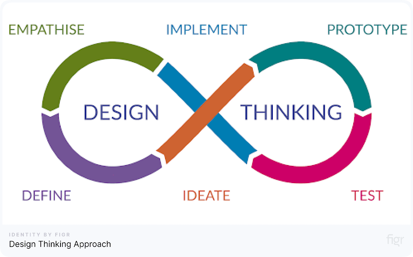
Design Thinking Approach
Credit: System-Concepts
Design thinking is a powerful, user-focused process for solving complex problems in a way that prioritizes the end-user's needs.
Rooted in empathy, creativity, and continuous testing, the design thinking approach enables designers to create practical solutions that genuinely resonate with users.
In The Design of Everyday Things, Donald Norman emphasizes the importance of understanding users’ behaviors and mental models—a core aspect of the design thinking approach.
Key Phases of the Design Thinking Process
Design thinking typically follows these five phases, each aimed at creating innovative, user-centered solutions:
- Empathize: Understand the users’ needs, experiences, and challenges. This stage involves observing and engaging with users to gain a deep insight into their pain points and behaviors.
- Goal: Gain a true understanding of users’ emotions and struggles.
- Example: Conducting user interviews and observing users interacting with a prototype.
- Define: Clearly identify the problem based on insights gathered during the empathize phase. This step helps align the design team on what needs to be solved.
- Goal: Formulate a problem statement that guides the design process.
- Example: "How might we make the checkout process smoother for first-time users?"
- Ideate: Generate a broad range of ideas and potential solutions. Creativity flows freely in this phase, as there are no wrong answers—just possibilities to explore.
- Goal: Encourage innovative ideas without constraints.
- Example: Brainstorming session where team members suggest solutions to make the checkout process easier.
- Prototype: Build basic versions of the most promising ideas. Prototypes don’t have to be fully functional; they simply need to capture enough of the idea to test and gather feedback.
- Goal: Test ideas quickly to identify which ones hold the most promise.
- Example: Creating a wireframe of the revised checkout page layout.
- Test: Gather feedback from users interacting with the prototype. Testing reveals what works, what doesn’t, and what needs refining. This phase often leads back to previous phases as insights are used to improve the design.
- Goal: Refine the solution based on real user feedback.
- Example: Observing users as they interact with the new layout and noting any issues they encounter.
Applying Design Thinking in Practice
Design thinking is iterative, meaning designers often cycle through these stages multiple times, refining the product with each cycle.
By focusing on real user needs and encouraging a flexible, solution-focused approach, design thinking produces results that are more aligned with users' expectations.
Double-Diamond Model of Design Thinking
The Double-Diamond Model is a visual representation of the design thinking process, breaking it down into two key phases:
- Discover & Define: The first diamond focuses on exploring the problem space. Designers seek to understand the issue thoroughly, then define the problem.
- Discover: In this phase, activities such as research, observation, and empathy-building are undertaken to gain insights into user needs.
- Define: This phase involves analyzing findings and formulating a problem statement, resulting in a clear definition of the problem to be addressed.
- Develop & Deliver: The second diamond framework focuses on the solution space. Designers brainstorm, prototype, and test ideas to develop a refined solution.
- Develop: Here, ideation and prototyping take place to draft potential solutions that can be tested.
- Delivery: In the final phase, testing and refining the solutions are done, culminating in a finalized solution that’s ready for release.
Interdisciplinary Collaboration in Design Thinking
Design thinking thrives on collaboration across different disciplines.
Input from a variety of perspectives, including product managers, developers, and marketers, enhances creativity and helps create solutions that are functional, marketable and scalable.
Example: A team designing a mobile app’s user interface would benefit from including developers (for technical feasibility), marketers (for user messaging), and customer support (for insights into user pain points).
Examples of Good and Poor Design
The difference between good and poor design can be seen in our everyday experiences. Well-designed products are intuitive, make tasks easier, and minimize frustration.
Poorly designed products, on the other hand, can leave users confused, hinder usability, and even create a sense of dissatisfaction.
This section explores some classic examples of good and poor design, showing how design choices impact usability and user experience. We’ll examine what makes certain designs effective and why others fall short.
Good Design Examples
1. iPhone Home Button (Original Model)

Credit: CNET
- Why it works: The original iPhone’s single, central home button became iconic for its simplicity and ease of use. It minimized the learning curve for users by offering a single, consistent way to return to the main screen.
- Principles applied:
- Simplicity: No need for multiple buttons or complex gestures.
- Discoverability: The button’s position makes it easy to find and understand immediately.
2. Google Search Interface
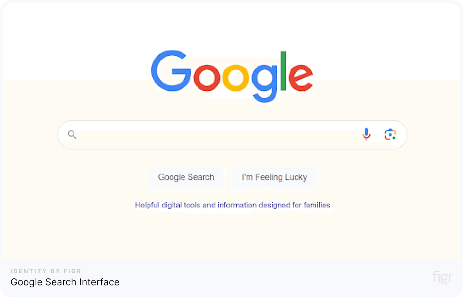
- Why it works: Google’s homepage is known for its minimalism. A single search bar with a button allows users to focus on their main task without distractions.
- Principles applied:
- Affordance and Signifiers: The search bar is prominent and self-explanatory.
- Feedback: Google instantly displays results or offers suggested search terms as users type.
3. Automatic Doors in Public Spaces

- Why it works: Automatic doors open as people approach, making entry easy and seamless. Users don’t have to stop, push, or pull—they simply walk through.
- Principles applied:
- Affordance: The doors automatically provide entry without requiring manual interaction.
- Feedback: Users see the door opening as they approach, signaling that it’s responding to them.
Poor Design Examples
1. Complex Remote Controls
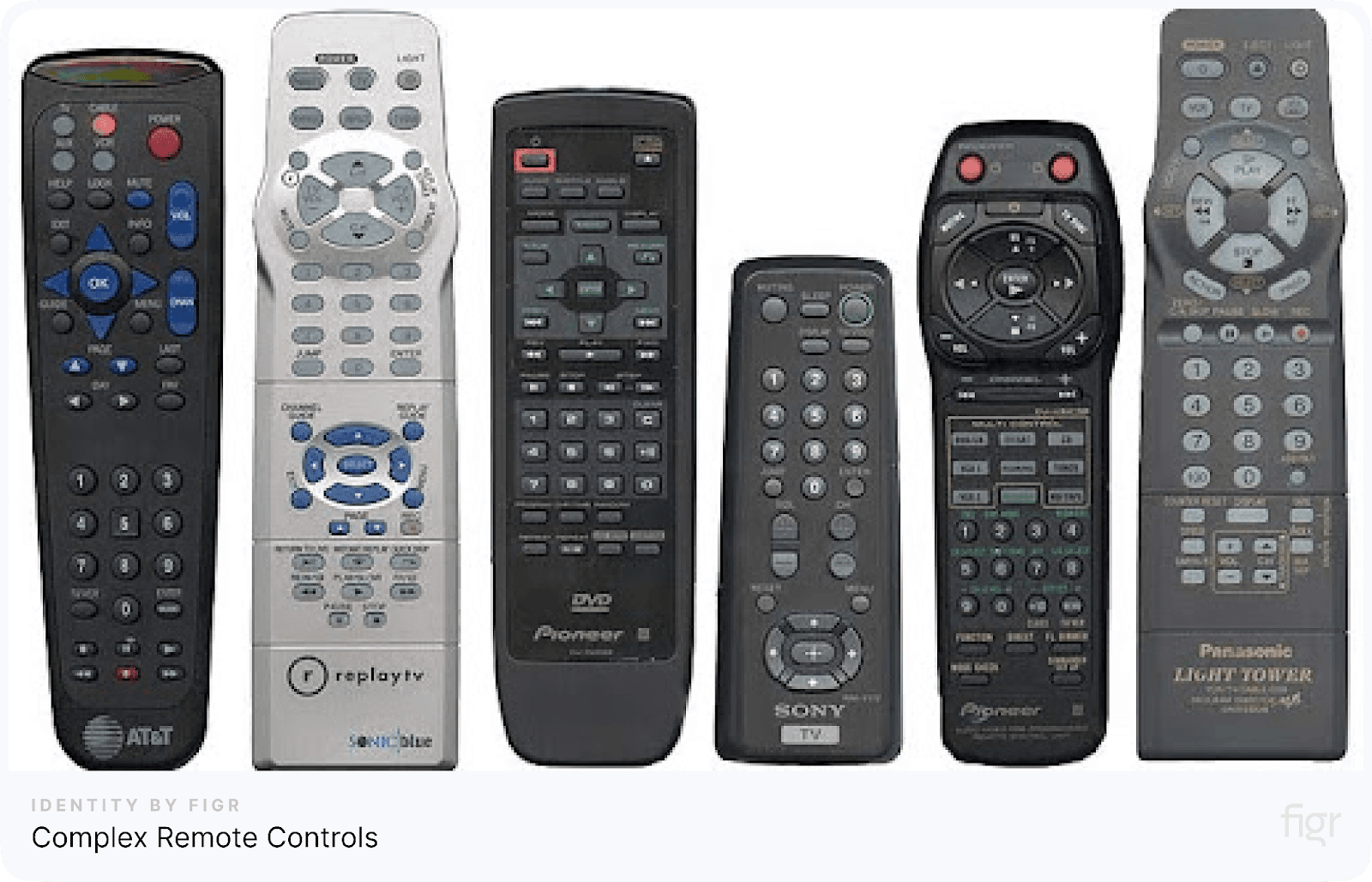
- Why it fails: Many remote controls are cluttered with buttons, making it difficult for users to find the right function quickly. Often, the controls are unintuitive, and users may press incorrect buttons out of confusion.
- Design issues:
- Overload: Too many buttons create cognitive overload for users.
- Lack of Affordance: It’s unclear what each button does without frequent reference to the manual.
2. Faucet Handles with Unclear Directions
- Why it fails: Faucets with ambiguous handles make it hard for users to know which direction is hot or cold. This can lead to mistakes, such as users accidentally using extremely hot water.
- Design issues:
- Lack of Signifiers: No clear indication of temperature control direction.
- Safety risk: Confusing controls can lead to scalding accidents.
3. Digital Keypads with Confusing Layouts
- Why it fails: Some digital keypads, such as those on ATMs or entry systems, have inconsistent or unfamiliar layouts. For example, keypads arranged in non-standard sequences (like placing the '0' at the top or randomly positioning numbers) make users pause, re-evaluate, or even make errors.
- Design issues:
- Lack of Standardization: Users expect a specific layout based on familiarity (usually a telephone or calculator layout). Deviating from this without clear reasons or instructions creates confusion.
- Higher Error Rate: A non-intuitive layout increases the likelihood of mistakes, slowing down the user experience and adding frustration.
Conclusion
In today’s world, where every second counts, users expect products that they can understand and use without a manual. The most successful designs are invisible—they do their job so seamlessly that users barely notice them.
The contrast between good and poor design is often evident in user satisfaction, highlighting why designers must focus on clarity, affordances, feedback, and error tolerance.
For teams looking to streamline their design process and ensure a user-friendly experience, products like Figr Identity are indispensable.
By helping designers organize and standardize essential design components such as color schemes, typography, and layout options, Figr Identity plays a crucial role in developing coherent, functional, and polished design systems.
Remember, every detail matters in design; even the smallest enhancement can make a significant difference in how users interact with your product.
With the right approach and product, such as Figr Identity, designers can continue to evolve, refine, and redefine what it means to create exceptional everyday designs.