It’s 4 PM on a Wednesday, and the staging build looks better in Figma than it does in the browser. Seafoam green is carrying the primary CTA, but the moment it sits beside a charcoal sidebar, blue links, and red error states, the system loses coherence. The color still attracts attention. It just no longer explains the interface.
That gap usually signals a product problem, not a taste problem. Teams often choose seafoam because it feels fresh, calm, and current. Those associations are real, but they are only the starting point. In UI, a color has to do operational work. It has to separate action from background, support hierarchy, preserve contrast, and signal brand personality without creating ambiguity.
A product lead at a Series C company described the pattern well. His team spent two sprints debating one accent color, then discovered that their preferred seafoam treatment weakened contrast in key states and collided with existing semantic colors. They had treated color as decoration applied late in the process, instead of treating it as part of the interface logic.
Josef Albers argued in Interaction of Color that color is perceived relationally, not independently. Product teams feel that principle every day. The same seafoam button can read as trustworthy on warm off-white, clinical on bright white, or low-energy against desaturated gray. Context changes meaning, and meaning changes behavior.
Seafoam also has a technical profile that explains its volatility on screen. Earlier source material notes a common seafoam reference around #93E9BE, a light, high-value green with substantial blue influence. That mix gives it brightness and softness at the same time. It can make an interface feel breathable, but it can also lose definition when backgrounds are too light or when adjacent accents fight for the same visual tier.
So the question is not which colors look nice with seafoam green. The better question is which combinations help a product do its job. Some palettes reduce cognitive load by making action states easier to parse. Some give seafoam enough contrast to feel deliberate rather than washed out. Others reshape its personality, pushing it toward wellness, finance, SaaS efficiency, or editorial sophistication.
That is the lens for the palettes that follow. Each pairing treats seafoam green as part of a design system. The goal is to help product teams choose supporting colors that clarify hierarchy, preserve accessibility, and make brand character legible at the speed of scanning.
1. Seafoam + Warm Neutrals
A user opens a budgeting app before work. They are not looking for visual novelty. They want the screen to feel orderly within a second, understand where to act, and move on without friction. Seafoam paired with cream, beige, or taupe handles that job well because it lowers background tension while keeping interactive elements distinct.
I call this palette Grounded Calm. It fits products that need emotional steadiness without the institutional chill that bright white and cool gray can create. Financial planning, wellness, guided onboarding, client portals, and settings-heavy SaaS products all benefit from that shift. The palette makes seafoam feel intentional instead of decorative.
Why it works in UI
Warm neutrals change the role seafoam plays in the interface. On stark white, seafoam can drift toward low-definition softness, especially in cards, chips, and light-outline controls. On cream or beige, the same seafoam gains edge separation because the background has a slightly lower visual temperature and a less clinical cast.
That matters for cognitive load.
Users scan interfaces by sorting elements into layers: structure, content, action, feedback. Warm neutrals are effective structural colors because they stay quiet without feeling blank. Seafoam can then own action and status with less competition. The result is a cleaner mental model. Users do not have to work as hard to distinguish what is static from what is clickable.
There is also a brand effect. Warm neutrals make seafoam read more human and service-oriented. The palette pushes it away from sterile health-tech tropes and toward reassurance, care, and maturity.
Practical rule: Let warm neutrals define the environment. Let seafoam mark change, choice, and progress.
A wellness onboarding flow shows the pattern clearly. Cream can hold the page background and cards. Taupe can handle labels, dividers, and inactive steps. Seafoam can mark the selected plan, the primary button, and the completion state. Each color has one job, which is the basic discipline behind a usable design system.
How to apply it without muddying the system
The strongest implementation pattern is role-based, not decorative:
- Seafoam for interaction and positive state: primary buttons, toggles, selected chips, progress indicators, confirmations
- Cream or beige for large surfaces: page backgrounds, modal interiors, cards, empty states
- Taupe for low-priority structure: borders, disabled controls, helper text, inactive tabs
That role separation prevents a common failure mode. If seafoam appears in backgrounds, accents, badges, and secondary controls at the same intensity, the interface starts to blur into one tonal field. The palette loses hierarchy. Warm neutrals fix that by absorbing the bulk of the surface area, which preserves seafoam for moments that deserve attention.
Accessibility needs more discipline here than many lifestyle color guides suggest. Seafoam is light by nature, and several soft pairings that look attractive in static mood boards collapse in real components. A seafoam button on cream, or taupe text on beige, can miss contrast targets quickly. Product teams should test the exact component states that matter: default, hover, disabled, selected, error-adjacent, and focus. Seafoam often performs better as a fill with dark text than as a text color on pale neutrals.
This palette is strongest when the product needs to feel reassuring, patient, and quietly premium. It reduces visual noise, clarifies role assignment inside the color system, and gives seafoam enough context to function as a decision signal instead of background decoration.
2. Seafoam + Navy Blue + White
A user opens a security dashboard before a board meeting. They need to scan risk, confirm system status, and act without second-guessing the interface. Seafoam, navy blue, and white works well in that context because it separates confidence from action. Navy carries authority. White clears cognitive space. Seafoam marks the moments that require response.
This palette is less about decoration than control. In enterprise UI, users build trust from repeated visual patterns. If navy consistently owns navigation, dense text, and structural containers, the product starts to feel stable. If white holds the main workspace, cards, and forms, content becomes easier to parse. Seafoam then gains a precise job description: selected states, success-adjacent feedback, active filters, chart emphasis, and confirmation cues.
That role clarity reduces search cost. Users do not have to decode whether a color is aesthetic filler or a functional signal.
The pairing also solves a brand problem. Seafoam on its own can read as optimistic, calm, even slightly soft. Add navy, and the same accent starts to feel disciplined. That shift matters in categories like fintech, cybersecurity, health platforms, and B2B procurement, where buyers want evidence of modern product thinking without any hint of fragility.
Teams usually weaken this palette by giving seafoam too many jobs. If it appears in links, primary buttons, hover states, badges, charts, tabs, and large background areas at the same saturation, the interface loses tempo. Everything starts asking for attention in the same voice. Navy and white stop acting as stabilizers and become passive backdrop.
A stronger allocation looks like this:
- Navy for structural certainty: navigation, headings, table text, input labels, and high-density information zones
- White for working memory relief: cards, content panes, modals, forms, and data-entry surfaces
- Seafoam for bounded feedback: selected controls, progress states, positive status, key data points, and limited-callout actions
The design system implication is straightforward. Assign the palette through semantic tokens, not one-off component styling. Map navy to text and structural surfaces, white to base and raised surfaces, and seafoam to interactive accent and positive state tokens. A token-based system earns its keep in this scenario because it preserves meaning as the product grows across dashboards, settings pages, tables, and mobile views.
Accessibility needs active testing here, not assumptions borrowed from mood boards. Seafoam often lacks enough contrast for small text on white, and white text on seafoam can fail once the tint gets too light. In practice, seafoam performs better as a contained fill, icon accent, focus-adjacent highlight, or chart color than as a body text color. Navy does the heavy lifting for text contrast. White keeps visual noise down.
Use this palette when the product needs to feel serious, current, and easy to trust under pressure. It gives seafoam a sharper function. Instead of floating through the interface as a pleasant brand color, it becomes a controlled signal inside a system that users can learn quickly.
3. Seafoam + Coral or Peach + Soft Gray
A user opens a marketplace app to compare options, save favorites, and make one final purchase. Those steps should not feel identical. Seafoam, coral or peach, and soft gray give product teams a clean way to separate low-pressure exploration from high-commitment action without making the interface feel cold.
This palette works best when the product needs social warmth and behavioral clarity at the same time. Seafoam carries actions with lower psychological cost, such as browse, filter, save, or sort. Coral or peach carries interpersonal and decision-heavy signals, such as live presence, limited-time prompts, primary conversion moments, or collaborator activity. Soft gray absorbs the excess energy so the product does not drift into toy-like territory.
Why the two accents should do different jobs
Seafoam reads as open and breathable. Coral reads as present and urgent. That difference gives the interface a stronger action grammar than a single accent color can provide.
In commerce, that grammar is useful. A listing page can use seafoam for comparison tools and saved items, then reserve coral for checkout triggers or stock-sensitive prompts. In a collaboration product, seafoam can organize the workspace while coral marks another person’s cursor, comment activity, or attention request. Users do not just see color variation. They learn a hierarchy of intent.
Many lifestyle blogs treat these pairings as aesthetic complements. The stronger product question is functional: which accent asks for light engagement, and which one asks for commitment? Loving It Green’s seafoam pairing discussion is useful as a visual starting point, but product teams still need to define interaction roles, accessibility thresholds, and token rules before this palette scales.
How to keep the palette mature
The failure mode here is overuse. If coral appears in too many places, every action feels equally urgent. If gray turns overly cool or dark, the palette loses warmth and starts to feel detached.
Use the roles consistently:
- Seafoam for exploratory actions: filters, tags, saved states, secondary buttons, hover cues, and lightweight feedback
- Coral or peach for concentrated emphasis: active collaboration markers, primary conversion points, alerts tied to people, and time-sensitive CTAs
- Soft gray for interface structure: cards, field backgrounds, dividers, inactive controls, and layout scaffolding
A portfolio platform shows the logic well. Gray gives the work room to breathe. Seafoam supports browsing and curation. Coral gives inquiries, featured projects, or live interactions a pulse. The result feels more human than a navy-led system, but still controlled enough for repeat use.
Design system implications matter here. Seafoam and coral should map to separate semantic tokens, not interchangeable accent swatches. One token family should represent low-stakes interaction. The other should represent urgency, human presence, or primary conversion. That distinction prevents teams from using both colors decoratively and erasing the behavioral signal.
Accessibility needs stricter rules than the palette suggests at first glance. Coral and peach often fail on white when used for small text, and pale seafoam can disappear on light gray surfaces. In practice, both accents perform better as fills, icons, chips, active outlines, and bounded highlights than as body text colors. Let darker neutrals handle reading tasks. Let color handle state and emphasis.
Use this palette when the product needs to feel approachable, social, and alive, but still predictable enough for users to build habits.
4. Seafoam + Deep Teal + Charcoal
Not every product wants contrast across families. Sometimes the right move is to stay cool, stay tight, and build hierarchy through depth instead of hue switching. Seafoam, deep teal, and charcoal do that elegantly.
This is Focused Depth. It’s ideal for interfaces where concentration matters more than personality. A code editor, a documentation product, a BI workspace, a research tool. These environments benefit from color continuity because abrupt palette shifts can create micro-distractions.
Why monochromatic systems feel calmer
Monochromatic cool palettes reduce decision noise. Seafoam becomes the forward note. Deep teal becomes the container and secondary action note. Charcoal handles language, precision, and legibility.
That creates a useful visual rhythm. Hover states and selected controls can brighten into seafoam. Section headers, nav bands, and layered panels can sit in teal. Text remains sharply readable in charcoal. The interface feels like one environment, not a stack of competing modules.
A documentation site is a great example. Deep teal in the sidebar sets an immersive frame. Seafoam on link hover and active anchors gives a clear sign of movement. Charcoal body text preserves readability over long reading sessions.
The system logic behind the palette
This approach works because it respects user focus. Instead of asking the eye to hop between unrelated color temperatures, it uses tonal progression. That’s easier to scan in sustained workflows.
A calm interface is often just a narrow interface, narrow in color range, clear in role assignment.
A few practical moves help:
- Bring seafoam forward sparingly: Hover states, selected tabs, toggles, active code references.
- Use deep teal for containment: Sidebars, grouped controls, chart layers, and section labels.
- Keep charcoal sacred: Body copy, tables, metadata, warnings that rely on legibility.
There’s one strategic twist worth noting. In a tightly cool system, a single warm accent can become highly meaningful if used rarely. That might be a warning indicator or a destructive action. You don’t need a colorful app. You need a color economy.
When your product’s value depends on sustained attention, this palette gives seafoam discipline.
5. Seafoam + Mustard Yellow + Off-White
This palette isn’t for every team. It has attitude, and attitude needs purpose. But if your product is trying to escape the endless corridor of blue, gray, and sterile white SaaS screens, seafoam with mustard yellow and off-white can create a memorable identity.
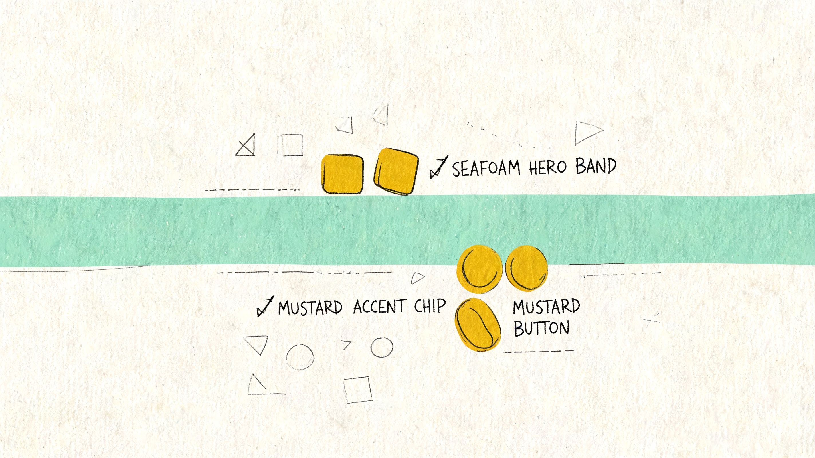
I think of it as Nostalgic Future. It borrows some analog warmth, then places it inside a clean digital shell. A course platform for creators, a consumer fintech app, a project tool for agencies, these can all benefit from a palette that feels distinct without becoming chaotic.
The strategic use of surprise
Mustard changes the emotional register of seafoam. Seafoam alone can read as soft wellness. Add mustard and it starts to read as editorial, playful, slightly unconventional. That shift can be useful when the brand wants to signal originality and taste.
An online education product is a strong fit. Seafoam can guide progress and completion. Mustard can spotlight prompts, featured lessons, or celebratory micro-moments. Off-white keeps the whole thing breathable and easy on the eyes during long sessions.
The risk is obvious. If mustard spreads beyond accent use, the interface can feel heavy or retro in the wrong way. This palette needs strong restraint and strong typography.
How to make it feel modern instead of themed
The trick is to let layout and type do the modern work while color adds flavor.
- Keep off-white as the main field: It reduces glare and gives both accents room to breathe.
- Use seafoam as the operational color: Inputs, progress, selected controls, and positive actions.
- Use mustard as punctuation: Highlights, empty-state illustrations, badges, and occasional emphasis.
A clean sans-serif type system helps. So does generous spacing. This combination can feel sharp in the hands of a product team with editorial instincts, but clutter will expose every weakness in it.
One more caution. Mustard often looks stronger in mockups than in production, especially across different screens. Seafoam already has known device-display and lighting considerations in digital contexts, as discussed earlier, so this pairing deserves extra on-device review before it graduates from Figma to code.
If your brand needs differentiation without gimmickry, this palette can do more than decorate. It can position.
6. Seafoam + Sage Green + Cream
Some interfaces need to lower the pulse the moment they load. A patient portal. A mindfulness app. A sustainability platform. In those products, the right palette doesn’t merely support usability. It changes the emotional temperature of the task.
Seafoam with sage green and cream creates that effect. It’s soft, but not weak. Organic, but not rustic. The result is what I’d call Botanical Harmony.
Why adjacent greens can feel safer
Using two related greens gives users continuity without monotony. Seafoam handles interaction and freshness. Sage adds maturity and steadiness. Cream keeps the environment warm enough to avoid the clinical chill that bright white often creates.
This matters in healthcare and wellness especially. If a user is reviewing test information, tracking symptoms, or managing a stressful task, the interface shouldn’t amplify tension. It should create enough calm that the information can land clearly.
I’ve seen teams try to solve this with pale blues alone. The problem is that blue can quickly drift into institutional or overly sterile territory. Seafoam and sage feel more embodied, more connected to natural materials and restorative spaces.
How to keep softness from undermining clarity
This palette works only if readability remains paramount. Cream backgrounds and muted greens can become too polite. The answer is to give text a darker anchor and to define roles sharply.
Soft doesn’t mean low-contrast. It means the surface is gentle while the hierarchy stays firm.
A few reliable assignments:
- Use seafoam for primary actions in encouraging flows: Continue, save, complete, confirm.
- Use sage for informational layers: Secondary navigation, grouped cards, helper panels, and educational callouts.
- Use cream as the canvas: Main surfaces, onboarding backgrounds, and long-form reading areas.
Then introduce a dark charcoal for text and critical icons. That final move is what makes the palette operational rather than merely beautiful.
A meditation app is the obvious example, but I think the more interesting use case is a patient-facing data portal. Medical information often arrives wrapped in intimidating visual language. Botanical Harmony can make the same content feel more navigable, more humane, without pretending the task is trivial.
7. Seafoam + Purple + Gray
Seafoam presents intriguing possibilities. Purple is one of the least obvious answers to colors that go with seafoam green, and that’s exactly why it can work so well in the right product.
Used carefully, seafoam, purple, and gray create a palette for tools that sit between creativity and technical precision. Design software, low-code platforms, data storytelling tools, AI workspaces. These products often need to support both exploration and rigor. A single conventional palette can flatten that duality.
The split between invention and control
Seafoam reads as approachable and active. Purple reads as imaginative, specialized, and a little higher-order. Gray keeps the structure disciplined. Together, they create a two-lane semantic system.
A design tool could use seafoam for collaboration, comments, and shared actions, then use purple for vector editing, advanced modes, or generative features. A developer platform might reserve purple for live environments or specialized system states, while seafoam handles staging, setup, and common actions.
This separation helps users understand not just what to click, but what kind of action they’re taking. That’s a deeper level of interface communication.
The role gray plays
Gray is doing more than filling empty space here. It prevents the two accents from arguing. It also gives the product a technical floor, especially when modules contain dense controls or code-adjacent content.
Try these assignments:
- Give seafoam the broadest exposure: Primary actions, common flows, search refinements, and collaborative states.
- Reserve purple for advanced or special contexts: Creative modes, premium features, simulations, or power-user tools.
- Use gray for structure: Panels, text hierarchy, disabled controls, and technical containers.
The important thing is consistency. If purple means “specialized mode” in one part of the app, it can’t suddenly mean “success” somewhere else. Color confusion compounds quickly in complex products.
A friend once showed me a low-code interface where every category had its own bright hue. The team thought they were improving discoverability. They’d built a carnival. This palette is the antidote. It gives you expressive range without surrendering control.
8. Seafoam + White + Dark Charcoal
Sometimes the strongest palette is the one that knows when to stop. Seafoam, white, and dark charcoal strip the system down to essentials. Seafoam becomes the sole chromatic signal. Everything else exists to make that signal legible.
This is Intentional Focus. It fits products where reading, writing, decision-making, or analysis dominate the session. A minimalist writing app, a documentation platform, a focused email client, a dense reporting interface. In these products, extra color often acts like interface static.
Why one accent can outperform many
When seafoam is the only color note, it becomes unmissable. Buttons, links, toggles, selected fields, active states. Users learn quickly that chroma equals action. That consistency lowers cognitive load because the product’s visual language is easy to internalize.
White creates pause. Dark charcoal creates authority and readability. Seafoam provides direction. The interface starts to feel intentional because nothing decorative is competing with the user’s task.
Apple’s core application language often works from this principle, even when the accent color varies by context. The lesson isn’t “copy Apple.” It’s that focused tools benefit from color scarcity.
The operating rules
This palette is simple, but not forgiving. If spacing, typography, and state logic are weak, minimalism exposes it immediately.
Use seafoam only where you want a user to act or notice a state change. If everything is accented, nothing is.
A few clean boundaries help:
- Seafoam is for interaction only: Buttons, links, active fields, selected rows, and hover states.
- White is the breathing room: Surfaces, work areas, modals, and content fields.
- Charcoal is the language layer: Body copy, labels, navigation text, and essential separators.
This palette also pairs well with strong type hierarchy. Since color isn’t doing as much decorative work, size, weight, spacing, and alignment have to carry more of the interface rhythm.
If you like the discipline of this approach but want a warmer counterpart, some teams also explore adjacent reads like these designer-approved salmon color matches, where a single accent color similarly defines the emotional tone of an otherwise restrained system.
8-Way Seafoam Green Palette Comparison
A seafoam palette usually fails for one of two reasons. The team treats it as a mood choice instead of a decision system, or they underestimate how much its softness changes hierarchy, contrast, and perceived brand intent.
The comparison below reframes each option as an operational choice for product teams. The useful question is not which pairing looks best in isolation. It is which pairing helps users parse screens faster, trust the product sooner, and move through tasks with less hesitation.
| Palette | Implementation complexity | Resource requirements | Expected outcomes | Ideal use cases | Key advantages |
|---|---|---|---|---|---|
| Seafoam + Warm Neutrals (Grounded Calm) | Low to medium. Mostly token swaps and saturation tuning | Minimal new assets, contrast checks, token setup | A calm, professional UI with lower visual noise | SaaS dashboards, wellness onboarding, product interfaces | Readable, approachable, accessible with careful contrast control |
| Seafoam + Navy Blue + White (Corporate Modern) | Medium. Requires hierarchy and contrast management | Design tokens, accessibility testing, possible secondary accent | A high-trust interface with clear structure and stronger authority cues | Enterprise analytics, security dashboards, B2B checkout flows | Strong contrast, professional tone, scales well across large systems |
| Seafoam + Coral/Peach + Soft Gray (Humanist Tech) | Medium. Needs saturation control and contrast validation | Contrast testing, illustration or campaign assets | A more human, energetic brand personality without losing clarity | Collaboration tools, e-commerce CTAs, creative platforms | Friendly, distinctive, useful across product and marketing |
| Seafoam + Deep Teal + Charcoal (Focused Depth) | Low to medium. Easier token mapping within a narrow hue range | Fewer base hues, strong typography, occasional accent support | A cohesive interface suited to concentration and longer sessions | Code editors, analytics tools, documentation sites | Cohesive, lower design friction, effective for dense information |
| Seafoam + Mustard Yellow + Off-White (Retro-Modern) | Medium to high. Accent balance must be tested carefully | Well-defined design system, accessibility validation, brand assets | A memorable identity with warmth and playfulness | Creative agency tools, online courses, consumer fintech | Distinctive, highly shareable, strong brand recall |
| Seafoam + Sage Green + Cream (Botanical Harmony) | Low. Analogous hues simplify token creation | Contrast checks for CTAs, token mapping | A gentle, sustainability-coded interface with low visual pressure | Wellness apps, sustainability platforms, healthcare portals | Signals care, calm, and environmental sensitivity |
| Seafoam + Purple + Gray (Creative Technical) | High. Two assertive accents require strict proportioning | Extensive accessibility testing, brand positioning assets | A premium, forward-thinking product feel that connects creative and technical audiences | Design tools, low-code platforms, data science UIs | Distinctive, premium, effective for mixed user identities |
| Seafoam + White + Dark Charcoal (Minimal High-Contrast) | Low. Works best with disciplined token use | Strong typography, generous whitespace, accessibility checks | A highly readable interface with focused attention and long-term visual durability | Writing apps, documentation, focused productivity tools | Accessible, reduces decision fatigue, visually timeless |
Two patterns matter here.
First, the easiest seafoam systems to maintain are the ones with fewer semantic arguments. Warm neutrals, sage, and white plus charcoal reduce debate about what each color means. That lowers design system entropy because teams can assign seafoam a narrower role set and keep state logic cleaner across product, marketing, and support surfaces.
Second, the more personality you add, the more governance you need. Coral, mustard, and purple can sharpen brand memory, but they also increase the chance that badges, charts, alerts, promotions, and CTA states start competing. In practice, these palettes work best when component libraries define strict color ratios, usage limits, and accessible fallback values from the start.
From Palette to Product
We’ve explored eight distinct systems for pairing colors with seafoam green. Each one does more than create a mood. Each one assigns roles. Warm neutrals ground seafoam. Navy lends it authority. Coral gives it social energy. Teal turns it inward and focused. Mustard makes it distinctive. Sage softens it. Purple sharpens its creative-technical duality. Charcoal and white make it precise.
That’s the key shift. Product teams often ask which colors that go with seafoam green look best, when the better question is which combination helps users understand the product fastest. A palette is a behavioral tool. It tells people where to look, what to trust, and how much effort a screen is about to demand from them. Why does that matter at scale? Because every moment of visual hesitation becomes multiplied across onboarding, conversion, support load, and retention.
Teams often don’t fail at choosing a decent palette. They fail at maintaining one. The seafoam button in Figma becomes one hex in marketing, another in engineering, and a third in a forgotten modal state. Soon the interface no longer feels intentional. It feels close enough. Users can feel that drift even when they can’t name it.
In short, the challenge is not picking colors, but implementing them consistently. Tooling starts to matter in this context. Figr is useful because it doesn’t just generate generic UI ideas. It learns from your live app, your existing design system, and the product context your team operates within. That means the palette decisions you make don’t stay trapped in a static file. They can flow into PRDs, user flows, prototypes, reviews, and exports with the same logic intact.
That consistency matters most with seafoam because seafoam is deceptively easy to misuse. Existing digital guidance around the color is still thin. Most public advice stops at aesthetic pairings and broad emotional language. Product teams still have to do the harder work themselves: test readability on real screens, define where seafoam belongs in a token system, and decide whether it acts as a primary action color, a success color, or a supporting accent. If you skip that step, your interface may look fresh in a presentation and uncertain in production.
So here’s the grounded next move. Don’t redesign your whole product this week. Pick one palette from this list that matches your product’s real job. If you run a dense B2B workflow, maybe that’s seafoam with navy and white. If you’re calming users through a sensitive process, maybe it’s seafoam, sage, and cream. If your team builds for creators, maybe seafoam with purple and gray gives you the right split between imagination and precision.
Then choose one contained component. A signup form. A dashboard card. A settings panel. A checkout modal. Apply the palette through tokens, not one-off overrides. Background. Primary text. Secondary text. Border. Primary action. Hover state. Disabled state. Look at it on desktop and mobile. Put it next to the rest of your system. Does it reduce noise, or add it? Does it clarify what matters, or merely add style?
That small experiment will tell you more than another week of debate. Color becomes useful when it leaves the mood board and starts doing work.
If your team wants help turning palette choices into production-ready UX, try Figr. It captures your live product, learns your design tokens, checks accessibility, and generates flows and prototypes that fit the system you already have, so seafoam green doesn’t stay a nice idea in Figma. It becomes a consistent part of how your product communicates.
