
Most people get this wrong. They think app user experience is about how an app looks. It’s not. A great app user experience is the invisible architecture that makes an app feel like an extension of your own thoughts, not a chore. It’s about how it feels to use.
The Invisible Architecture of App User Experience
Think of an app as a building. You don't actually see the structural beams, the plumbing, or the electrical wiring. But if those systems fail, the building is unlivable, no matter how beautiful it is. An app with confusing navigation or sluggish performance is that stunning building with faulty plumbing. It’s uninhabitable. Visual design is just the paint on the walls.
The real heart of app UX isn't aesthetics: it’s the mechanics of interaction. How effortlessly can someone get from point A to point B? Every bit of friction they encounter is what I call the Interaction Tax, the total cognitive effort your app demands. Every pointless tap, every confusing moment, every second spent staring at a loading screen adds to that tax.
From Function to Feeling
When the tax is high, users get frustrated and leave. When it's low, they feel competent and stay. This is the entire game. The fancy stuff only matters after you’ve nailed the basics.
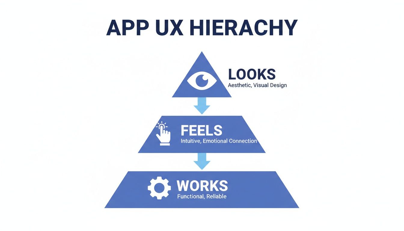
The pyramid says it all: your app must first work reliably. Then, it has to feel intuitive. Only after those two layers are rock-solid does its visual appeal truly add value. This isn’t just a design philosophy: it’s an economic reality. A user who can’t find the "buy" button doesn't care how pretty it is. A user waiting five seconds for their account balance to update feels anxious, no matter the font.
The experience is built on a foundation of speed, clarity, and predictability. Getting this foundation right is the core job of a skilled user experience designer.
The Cost of a Poor Foundation
Last week I watched a PM try to create a task in two different project management tools. The feature set was almost identical. The difference was the Interaction Tax. One tool required constant context switching and felt like a maze. The other was a straight line from intent to completion.
Those little moments of friction add up, fast.
A great app user experience is not the absence of frustration. It is the presence of clarity. It anticipates your next move and clears the path for you.
To build that kind of clarity, teams have to meticulously map out their user journeys. Techniques like card sorting are invaluable for structuring an app’s architecture in a way that just makes sense to people. The goal isn't just to build something that looks good, but something that feels right. And as we’ll see, users make that judgment in the blink of an eye.
Why The First 24 Hours Define Your App's Fate
That first day a user spends with your app is a high-stakes audition. And most apps fail it. I recently watched a friend download a promising new task manager, only to see him delete it in less than ten minutes. It wasn't a catastrophic bug. It was a thousand tiny papercuts of friction that left him feeling uneasy.
This is what I mean.
That first interaction is like a first date. It’s rarely one wrong word that ends things. It’s the small, cumulative mismatches that signal there won’t be a second date. A confusing onboarding flow, a screen that takes just a beat too long to load, a notification that feels irrelevant, each one erodes a little bit of trust and patience.
These aren’t just minor annoyances. They are symptoms of a flawed user experience, and they have massive financial consequences.
The Brutal Economics of First Impressions
This is where the rubber meets the road. That initial churn directly craters your business metrics. You paid to acquire a user, they opened the app once, felt confused or delayed, and then left forever. Poof. Your customer acquisition cost is instantly wasted, and their potential lifetime value evaporates. The economics are absolutely unforgiving.
The data paints an even starker picture. A staggering 71% of users churn within 90 days of installing an app. Worse, a full 25% abandon it on the very first day. This brutal reality shows how a poor app UX is the silent killer of retention, making a strong first impression non-negotiable. You can find more on this in this mobile app statistics report.
Preventing this initial drop-off isn’t just one battle among many.
For any product team, it is the battle.
Diagnosing the Day-One Disasters
So, what are the usual culprits behind this mass exodus? They almost always fall into three categories of failure.
- Onboarding Obscurity: The app fails to answer the user’s fundamental questions: “What’s in it for me?” and “How do I even start?” It either dumps them into a blank screen with no guidance or overwhelms them with a 12-step tour of features they don't care about yet.
- Performance Penalties: The app just feels sluggish. Every tap is followed by a pause. Every screen transition stutters. This breaks the user’s flow and makes the entire experience feel clunky and unreliable.
- Notification Noise: The app immediately demands permission to send notifications before it has earned the right. Worse, the first alerts are generic marketing spam, not the timely, contextual help the user was hoping for.
A friend at a Series C company told me their team obsessively watches session replays of first-time users. They treat every moment of hesitation or incorrect tap like a critical bug. Why? Because they know each one contributes to that day-one churn number. Visualizing this experience is crucial, which is why product teams need to understand what a user journey map is and how to build one.
The goal of the first 24 hours isn't to show the user everything your app can do. It's to prove that your app can do one thing for them, perfectly.
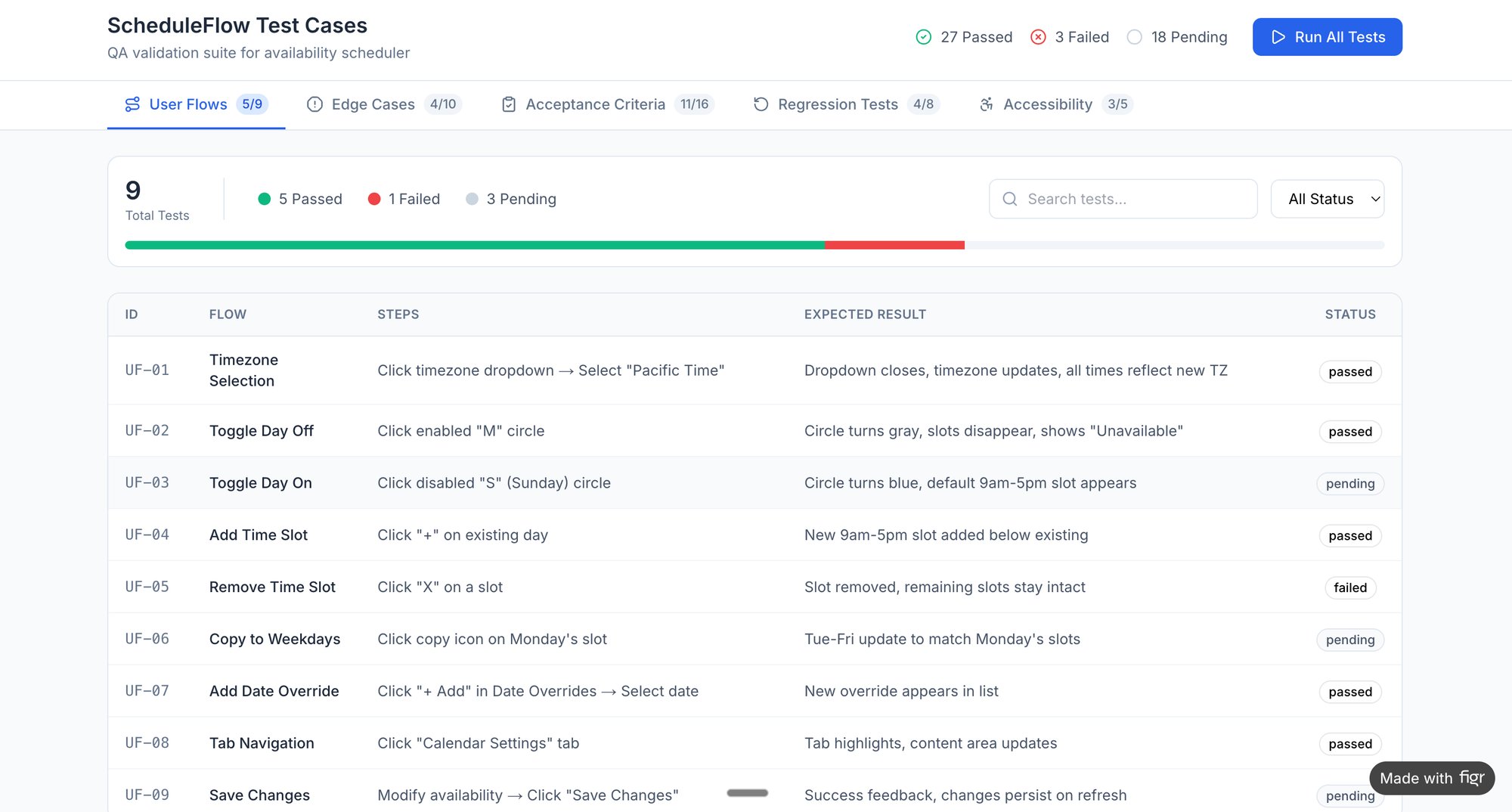
Ultimately, your app is just rented space on a user's phone. To earn a permanent spot, you have to deliver immediate, undeniable value. For instance, a detailed breakdown of a scheduling app like Cal.com reveals that even tiny differences in the setup flow can determine whether a user sticks around. Curious readers can explore the test cases for a scheduling flow to see just how scrutinized every single click is.
Stop thinking about your app as a collection of features. Start seeing it through the eyes of a skeptical first-time user. Ask yourself: what is the single most important promise my app makes? And how quickly and flawlessly can I deliver on it? Your app’s survival depends on that answer.
Performance As The New Bedrock Of UX
A fast app feels like a good conversation: fluid, responsive, and respectful. A slow one feels like being constantly interrupted. For years, we treated performance as an engineering chore, a piece of technical debt to be kicked down the road. That time is over. Speed is no longer a "nice-to-have" feature; it's the very ground your user experience is built on.
This isn't just about what users say they want. It’s about conditioning. As phones get more powerful and networks faster, our collective patience has simply evaporated. An app that felt quick three years ago now feels like it’s wading through mud. The baseline has shifted, and it is not shifting back.
A product manager at a fintech company I know shared a chilling story. They discovered a 400ms delay on their payment confirmation screen was causing a 7% drop in completed transactions. Four-tenths of a second, a delay you can barely perceive, was actively losing them money. This is the new reality.
The Millisecond Economy
The financial incentive is impossible to ignore. With 5G becoming the norm, users don't just hope for instant responses; they expect them. The companies that win will be the ones who obsess over shaving off every possible millisecond. Why? Because performance is a direct proxy for respect. A fast app respects my time. A slow one tells me my time doesn't matter.
Performance is the new bedrock of your app user experience. It’s the invisible layer that determines whether your design feels helpful or hostile, efficient or infuriating.
This completely reframes the discussion. Performance isn't just an engineering ticket in a backlog; it’s a core product and design responsibility. Every choice, from that beautiful high-resolution hero image to a slick animation, has a performance cost. Ignoring that cost is like an architect designing a skyscraper without considering the weight of the materials. The entire structure is at risk. For a deeper dive, check out our guide on how this applies to responsive design best practices.
From Lag to Abandonment
The data here is unforgiving. Studies show 77% of users will stop opening an app within just three days if it feels slow or drains their battery. That’s a shockingly small window. A screen that loads half a second too slow or a checkout flow that stutters is enough reason for someone to delete your app and never look back.
A user’s perception of your product's quality is now welded to its speed. You can't design a brilliant experience on top of a slow foundation. It’s like trying to have a deep conversation over a terrible phone connection: the friction of the medium just destroys the message.
The basic gist is this: to improve your app's user experience, start by measuring its speed. Audit your most critical user journeys, like the time it takes to create a task in your project management tool. Pinpoint every source of delay, because in today's app economy, every millisecond is a user you either keep or lose. Your next step should be a performance audit. Find your slowest screen and declare war on it.
How Personalization Creates Unbreakable Loyalty
Think about the last time you stayed at a hotel. There's the receptionist, who answers your questions as they come. Then there's the world-class concierge, who knows you prefer a corner table and has a car waiting for you at 5 PM without you asking. Most apps today are receptionists.
True personalization, the kind that forges loyalty you can't buy, is about becoming the concierge.
This isn’t just some marketing gimmick. It's a deep, architectural choice that completely changes the app user experience. It’s the difference between a travel app that merely lists your past bookings and one that sees you’ve just landed in a new city and offers up local transit options. One is a tool; the other becomes a trusted partner.
Personalization transforms an app from a passive utility into an indispensable companion. It’s about using context, not just data, to serve the user’s next need before they even have to ask.
From Data Points to Digital Companionship
A friend at a Series C e-commerce company told me a story that perfectly illustrates this. His team saw a massive lift in customer lifetime value after they tweaked their recommendation engine. The old one just looked at what users bought. The new one considered what they viewed, what they added to their cart, and, crucially, what they abandoned.
This shift in thinking changed everything. The app stopped saying, “People who bought this also bought…” and started communicating, “We see you, and we think you might like this instead.” That small change made users feel understood, not just targeted. It’s a powerful distinction. For more on this, check out our piece on using AI tools to segment users by their behavior patterns.
The economic impact is staggering. When apps use AI for personalization, users spend 201.8 minutes monthly compared to just 10.9 on the mobile web. They browse 4.2 times more products, convert at a 54% higher rate, and deliver a lifetime value that is 2.8 to 5 times higher. You can explore more on these mobile app trends to see the full picture.
Identifying the Moments for Personalization
So where do you start? Look for the moments of friction where a generic experience is failing your users. A classic example is the e-commerce checkout. So many companies struggle with high drop-off rates because they force everyone through the same one-size-fits-all flow.
A personalized app doesn’t just remember your name. It remembers your intent.
By mapping the entire journey, teams can pinpoint exactly where people get lost or frustrated. A detailed breakdown of a checkout process, like this new Shopify setup flow, can reveal dozens of hidden drop-off points that a smarter, context-aware experience could fix. Does the user need guest checkout? Are they a returning customer who needs their details pre-filled? A concierge knows. A receptionist makes you fill out the form every single time.
In short, personalization is a system of thinking, not a feature you bolt on. It demands a deep understanding of your users and the context they operate in. When you get it right, the app no longer feels like a piece of software you use, but a partner that helps you get things done. That's an experience users won’t just like: they’ll find it impossible to leave.
Your next step is to find a single, critical workflow in your app and ask a simple question. What would a great concierge do here? The answer will guide you toward a better app user experience and a much more loyal customer base.
Mapping The Unseen World Of Edge Cases
Imagine a master sailor. Their skill isn't judged in calm seas. It's proven in a storm, when the wind howls, the gear strains, and every choice matters. A great app user experience is the same. It's defined not on the perfect "happy path," but in the messy, unpredictable gales of real-world use.
Most product teams design for calm seas. They map the ideal flow: the user taps perfectly, the network is strong, every input is valid. But users live on spotty Wi-Fi, face conflicting permissions, and make simple human errors. Building for sunny days only is a recipe for disaster.
A good app user experience is ultimately defined by how gracefully it handles failure.
The Hidden Icebergs of Development
I once heard a product manager tell a story about a feature estimate gone wrong. He’d specified a single success screen for a file upload. The engineers came back with a two-week estimate. Six weeks later, they were still building.
Why the catastrophic delay?
The PM specified one screen, but the engineers found eleven additional states in the wild. What if the file is too large? What if the connection drops mid-upload? Or the user doesn't have the right permissions? Each of these "edge cases" was an invisible iceberg waiting to sink the project timeline.
This story is profoundly common. It's the source of endless tension between product and engineering, and the origin of countless frustrating user experiences. The failure wasn't the engineering estimate. It was the initial spec, which failed to map the unseen world.
An edge case isn’t a rare inconvenience to be ignored. It is an inevitable reality to be designed for. When you handle it well, the user doesn’t even notice a problem. They just feel guided.
This is where a systematic approach is non-negotiable. Proactively exploring a map of all potential upload failures for a service like Dropbox reveals the true complexity of a "simple" feature. Seeing these possibilities laid out turns abstract risks into a concrete checklist. You can see a detailed map of Dropbox's upload failure states to understand just how deep this rabbit hole goes.
Making the Invisible Visible
The critical shift is moving from reactive problem-solving to proactive mapping. Don't wait for engineers to discover edge cases during a sprint. Anticipate them during design and planning. This makes the invisible complexity visible to everyone.
A brilliant example is mapping out how an app handles network degradation. A video call on Zoom doesn't just work or fail. It degrades gracefully. It shows indicators for a poor connection, throttles video to preserve audio, and tries to reconnect. Each state is a deliberate design choice that turns a user nightmare into a manageable situation. Exploring these Zoom network degradation scenarios shows a masterclass in handling environmental failure.
This level of detail isn't just for complex tech. Consider a simple "card freeze" flow. What seems straightforward hides numerous states:
- What if the card is already frozen?
- What if a transaction is pending?
- What if the user freezes it by mistake and needs to unfreeze it immediately?
Each question represents a path a user can take. Mapping these paths, as seen in this simulation of the Wise card freeze flow, preempts user confusion and cuts the burden on your support team.
The takeaway is this: to improve your app's user experience, stop designing just the happy path. Pick one core feature in your app. Force yourself to map every single thing that could go wrong. Your engineers are already thinking about it. By joining them in mapping that stormy sea, you’ll build a more resilient product and a much healthier team.
Your Next Step To A Better App User Experience
We've covered a lot of ground. It should be clear by now that a great app experience isn't about surface-level polish. It's the invisible architecture dictating how an app feels. It's the first impression that becomes a final judgment and the graceful handling of failure that defines true quality.
A delightful experience is never an accident. It’s a deliberate, systematic process of anticipating needs and methodically rooting out friction.
In the end, great UX is the sum of a thousand thoughtful decisions, most of which a user will never consciously notice. They just feel the clarity. They feel respected. They feel competent. This is the quiet art of building a product that works.
From Abstract Idea to Concrete Action
The goal here was never to give you more abstract concepts to think about. It was to give you a new way of seeing and a clear, immediate action. So here it is.
Your next step is not to simply "think more about the user." That’s too vague to be useful.
Instead, I challenge you to take one single, critical flow in your own app.
This could be:
- The first-time user onboarding sequence.
- The core transaction, like a purchase or a booking.
- A frequently used feature, like creating a new post or task.
Once you’ve picked one, your job is to map it completely. Don’t just draw the happy path. Capture the entire territory, including every storm and detour.
Make the Invisible Visible
A recent paper from Google Research on Generative UI points to a future where interfaces adapt dynamically to user needs. This makes deep flow analysis more critical than ever. The systems that win will be those that have already mastered their own internal logic, long before an AI tries to.
So, capture that flow and ask it hard questions. What happens if the network fails here? What if the user enters invalid data there? What if they try to go backward mid-process?
For instance, look at the test cases for a seemingly simple action like modifying a trip in an app like Waymo. You can see an example of these mid-trip modification test cases to understand what this rigor actually looks like. The complexity is surprising. This is the exercise that forces you to confront the messy reality of how people use software.
The quality of an app is not measured by its most polished feature. It is measured by its weakest link in the user journey.
This single action, mapping one critical flow, will make every abstract concept we’ve discussed painfully concrete. It moves you from thinking about a better app user experience to actively building one.
You will feel smarter and more equipped. And you will have a tangible artifact that can immediately improve your product.
That is the path forward.
Frequently Asked Questions
What Is The Single Biggest Mistake In App User Experience?
The biggest mistake is confusing user interface (UI) with user experience (UX). It happens all the time. Teams will burn months obsessing over icon styles and color palettes while completely ignoring the guts of the app: the performance, logic, and what happens when things inevitably break.
A beautiful app that’s slow, confusing, or shatters under pressure is a failure.
Period.
Think of it this way: UI is the fresh coat of paint and fancy light fixtures. UX is the foundation, the plumbing, and the wiring. One is about aesthetics; the other is about whether the house is livable. You have to build a solid, livable house long before you start arguing about the paint color.
How Can I Measure The ROI Of Improving UX?
You measure it with cold, hard business metrics. Good UX isn't some vague, fuzzy feeling. It's a measurable engine for growth, and you can prove it with numbers.
When you ship UX improvements, keep a close eye on how these specific numbers move:
- Retention Rate: What percentage of users come back on Day 1, Day 7, and Day 30? Better UX is the single best weapon against churn.
- Conversion Rate: Are more people finishing the signup process? Completing a purchase? A smoother path always leads to higher success rates.
- Session Length: Are users spending more quality time in the app? This is a dead giveaway that you've deepened engagement.
- Support Tickets: A sudden drop in complaints about a specific feature is a clear signal you’ve squashed a major point of friction.
A better experience makes these KPIs go up. That's how you build a clear, defensible case for the return on your investment.
Where Should A Small Team Focus Limited UX Resources?
Focus every available minute on the user's first five minutes. That’s it. Perfect your onboarding flow and how you deliver your app's core value. A fast, smooth, and successful first interaction has the highest possible impact on whether a user sticks around for the long haul.
Nail that initial "aha" moment before you even think about tweaking secondary features. That's where the war for user loyalty is won or lost. For more ideas on common questions that come up during early use, you can check out these general FAQs.
What Is More Important For UX: Speed Or Features?
Speed.
Always.
A slow app stuffed with features feels broken. It feels disrespectful of the user's time. A fast app with fewer features feels efficient and reliable. Users will forgive a missing feature far more easily than they will tolerate lag. Performance is the bedrock you have to build everything else on.
Ready to move from abstract ideas to concrete artifacts? Figr is an AI design agent that helps you ship a better app user experience, faster. It maps your live app, uncovers edge cases, generates test cases, and creates high-fidelity designs that match your real product context. Design confidently and ship faster with Figr.