Every PM meeting I attend, someone says "I am not a designer, but..." and then offers vague feedback the designer has to interpret (Is that the problem? Yes, the designer has to interpret it.). "Make it feel more modern." "The spacing seems off." "Can we make it pop more?" (What does "pop" mean? It is vague feedback.)
Design literacy is not about becoming a designer. It is about communicating with designers effectively. About asking the right questions. About understanding trade-offs so you can make informed decisions (Trade-offs between what? Between approaches and outcomes.).
After months of using AI for prototyping, I have found five prompts that consistently expand my design vocabulary (Are these prompts only for AI? Yes.). These are not about generating better outputs. They are about learning through exploration.
Prompt 1: "Show me three variations of this approach"
When I first started using AI for prototypes, I accepted the first output. If it looked reasonable, I moved on. This was a mistake.
Now I always ask for variations: "Show me three variations of this notification banner. One that minimizes screen space. One that maximizes information density. One that balances both." (Why three variations? Because each variation reveals trade-offs.)
Each variation reveals trade-offs. The minimal version loses context. The dense version overwhelms. Seeing all three helps you understand what you are choosing and sacrificing (What are you choosing? A set of trade-offs.).
After generating variations dozens of times, I started recognizing patterns. Information density trades off against scannability. Minimalism works for simple content but fails for complex content. These are lessons that would take years through traditional feedback cycles (Is the goal speed? Yes, learning faster through exploration.).
Prompt 2: "What edge cases should I consider for this feature?"
This prompt surfaces blind spots (What does it surface? Blind spots.). It is humbling how many scenarios I miss on first pass.
"What edge cases should I consider for a file upload feature?"
The response returns: format errors, size limits, network interruption, quota exceeded, duplicate detection, batch failures, permission denied, timeout handling, pause and resume. These are states you would discover in QA or production, caught now during design.
Prompt 3: "How does [Product A] handle this differently from [Product B]?"
Comparative analysis builds pattern vocabulary faster than anything else (Why comparative? Because it reveals differences.).
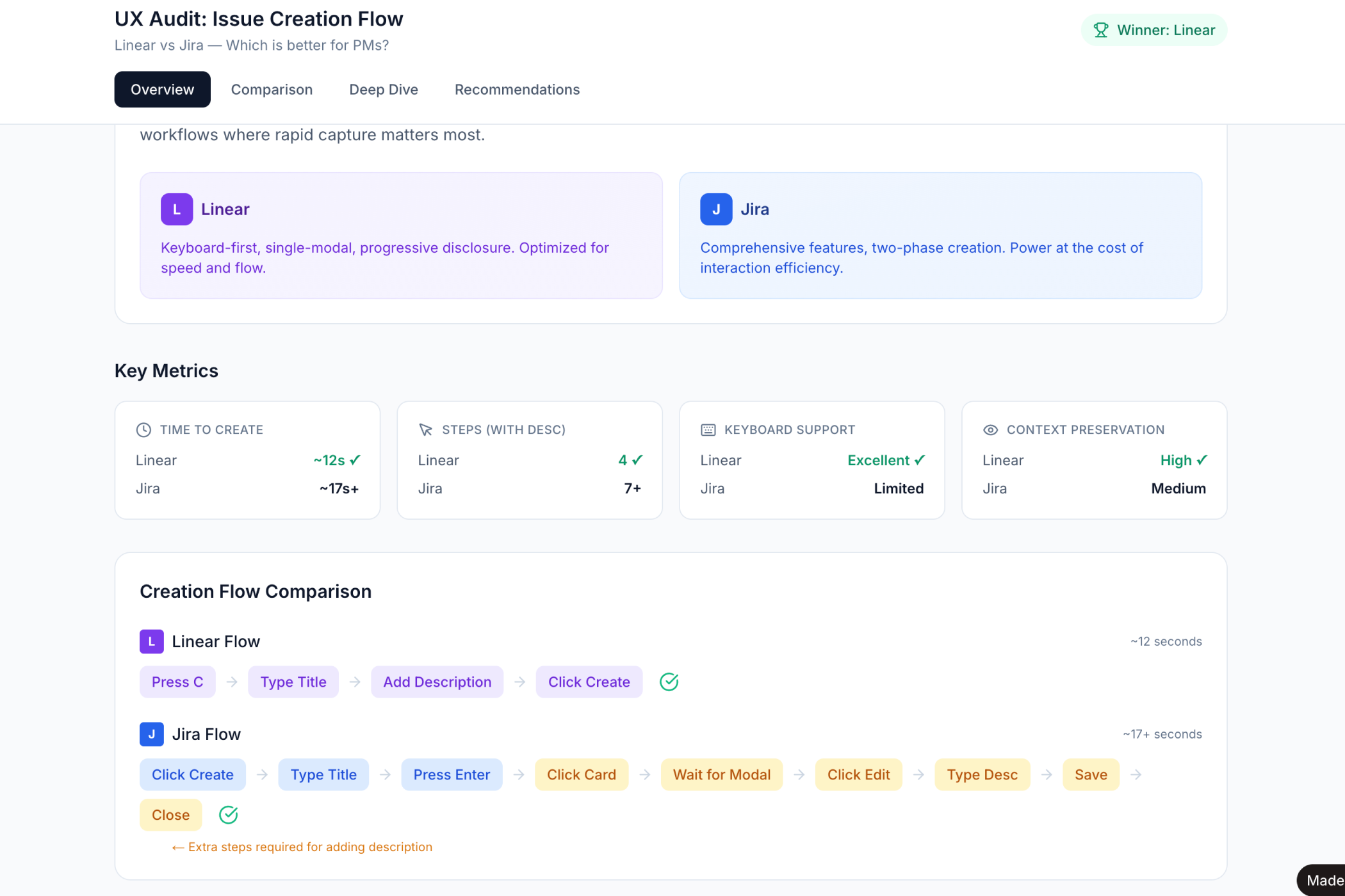
"How does Linear handle task creation differently from Jira?"
The response reveals philosophical differences. Linear optimizes for speed: minimal required fields, keyboard shortcuts, inline editing. Jira optimizes for configuration: comprehensive options, modal dialogs, explicit categorization (Is either approach wrong? Neither is wrong.).
Neither is wrong. Understanding these patterns helps you articulate what you want. "We want Linear's speed but need Jira's auditability" becomes meaningful rather than contradictory.
→ See the Linear vs Jira UX audit
Prompt 4: "What accessibility issues might this design have?"
Accessibility is not optional for modern products. But most PMs do not know WCAG standards. I certainly did not before asking this question regularly.
You learn about touch target sizes (44px minimum for mobile). Color contrast ratios (4.5:1 for normal text). Focus states for keyboard navigation. Screen reader considerations.
This knowledge compounds. After asking about accessibility on twenty features, you start noticing issues before the AI flags them (Does repetition help? Yes, the knowledge compounds.).
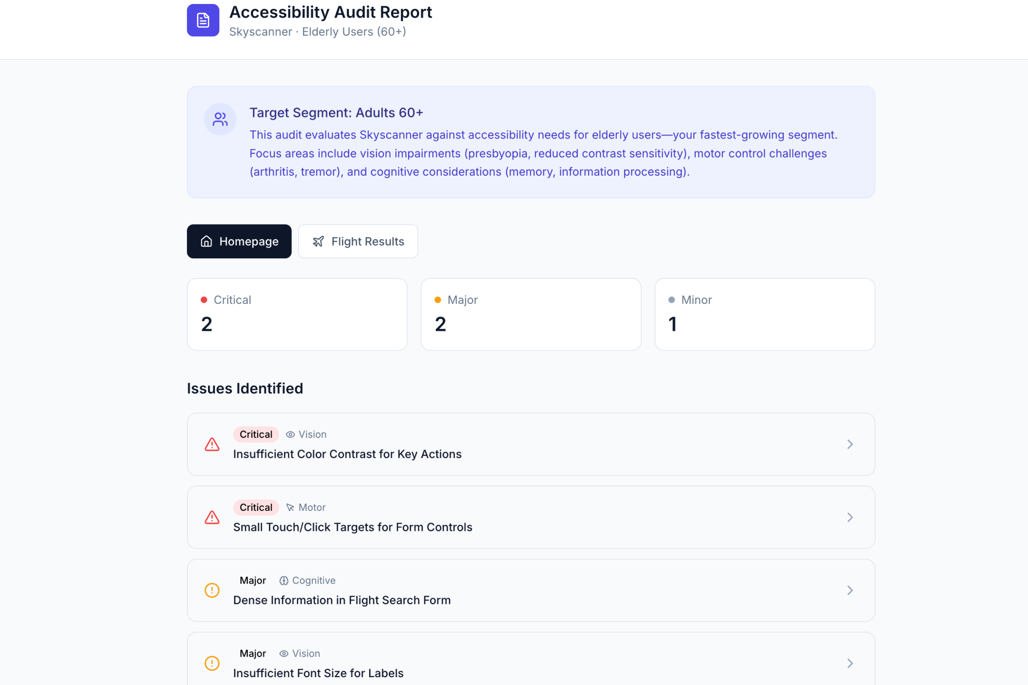
→ See the Skyscanner accessibility audit
Prompt 5: "What is the information hierarchy here and how could it be improved?"
This prompt teaches you to see like a designer.
"What is the information hierarchy on this dashboard? What should users see first, second, third?"
You learn about visual weight and how size and color draw attention. About spacing and how proximity groups related elements. About typography scale and how heading sizes create structure (Is this the "first, second, third" part? Yes, it is what should stand out first.).
After using this prompt regularly, I catch hierarchy issues in real products. I notice when key actions are buried. I see when too many elements compete for attention.
The Pattern That Emerges
Notice what these prompts have in common. They are questions, not commands. They explore before executing. They surface trade-offs (So what is the pattern? Questions that explore trade-offs.).
The basic gist is this: the PM who asks "show me three variations" learns more than the PM who says "build this."
In Short
Design literacy compounds. Each prompt teaches something. Each variation expands vocabulary. Each comparison sharpens judgment.
After a few months, you stop saying "I am not a designer, but..." and start saying "I prefer this approach because..."
→ Try these prompts on your next feature