On this page
Product Design
Build Design System
Feb 4, 2025

Build a cohesive brand identity with colors, typography, and imagery. Learn how to create a visual system with this step-by-step guide to design systems.

Your design files look fine on their own, but together? Something feels off. The colors don’t match, the typography is inconsistent, and the icons seem out of place. What’s missing? A design system.
At first, building one seems simple: pick colors, define fonts, and create reusable components. But the reality? It’s messy. Teams use inconsistent elements, Figma files don’t align with code, and debates over spacing and layouts seem endless. It’s frustrating and time-consuming—but it’s also worth it.
This guide will help you cut through the chaos and build a design system that actually works. You’ll learn how to:
Start small and address inconsistencies step by step.
Collaborate with developers to align designs with code.
Get buy-in from your team, even when they resist change.
Design systems take effort, but the payoff is worth it: streamlined workflows, better collaboration, and designs that just make sense. Let’s get started.
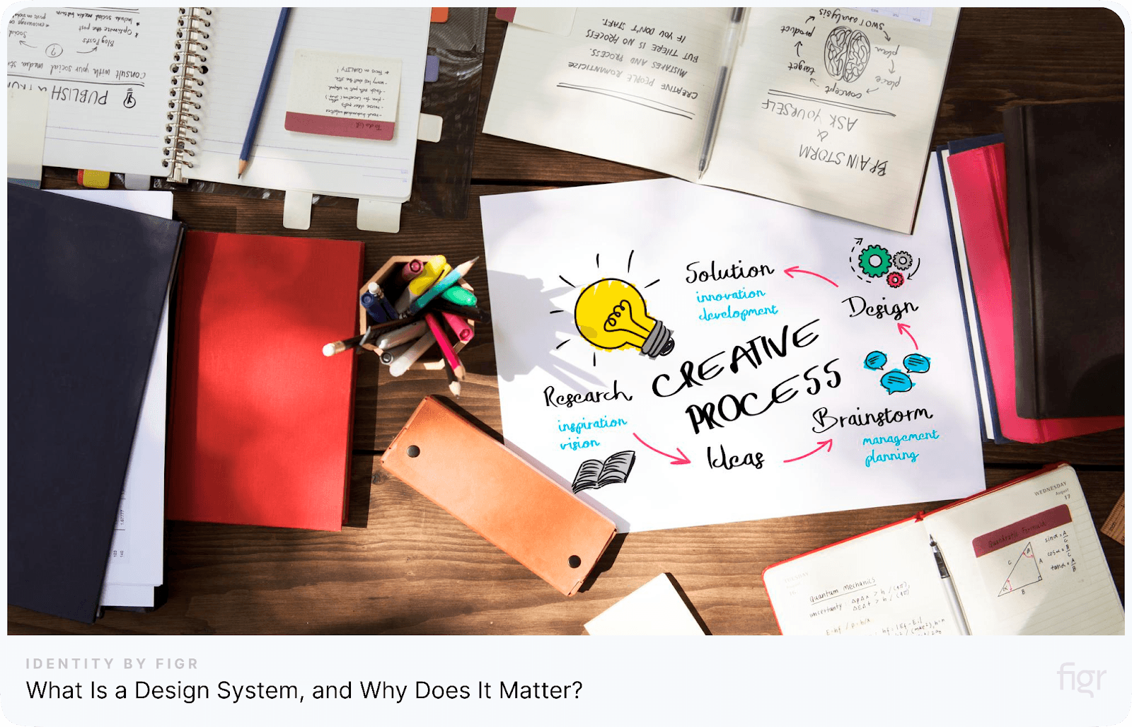
What Is a Design System, and Why Does It Matter?
Let’s say, you’ve joined a fast-growing company, and design requests are piling up. At first, things seem manageable—a button here, a text style there. But soon, you notice something’s off. Every feature looks slightly different, and it’s becoming harder to maintain a consistent look across the product.
This is where a design system helps. Start small. Maybe it’s just standardizing your primary button or locking in text styles. Document those choices, share them with your team, and make sure everyone sticks to them. Slowly but surely, you’re building a shared system—a library of reusable components, tokens, and guidelines.
At a growth stage, having a design system isn’t just about looking good—it saves time, keeps the product clean, and helps everyone work smarter.
Think about it:
You’ve been asked to launch a new feature. Suddenly, you’re staring at 20 screens, thinking, “Great, now I have to fix every single button and text style.” It feels like hours of work ahead, right?
Now imagine this—you have a design system in place. Instead of tweaking and adjusting each individual element, you have a library of standardized, reusable components already set up. Need a button? Grab one from your design system. Text style? It’s already defined. No more endless adjustments—just plug and play. It saves you time, and ensures everything looks consistent and polished.
Now, picture this. A new team member joins and asks, “Hey, which heading style are we using again?” You hand them your Figma files, only to realize there’s no documented standard. Now, you’re explaining it all over again. These interruptions keep happening, taking up your time and slowing you down. Without a clear guide, you’re stuck in this loop.
And developers? They face their own headaches. A dev hardcodes the spacing and font sizes for a form. A few weeks later, the design team changes the spacing scale, and suddenly, they’re revisiting every form to fix things manually. It’s messy, time-consuming, and totally avoidable.
This only gets worse when your startup scales. New designers and developers join, and onboarding becomes chaotic. Everyone’s asking the same questions: “Which components should I use?” “Where can I find them?” Without a design system, senior team members spend more time explaining than creating. Productivity takes a hit.
That’s the real scope of a design system—it saves time, keeps things consistent, and makes everyone’s life easier. With it, you get to focus on what you actually love—designing great user experiences—without all the back-and-forth.
Is Your Team Ready for a Design System? Here’s How to Tell
Let’s be real for a second: building a design system isn’t some quick fix. It involves defining your brand’s core elements, setting up reusable components, and ensuring consistency across all projects. It also brings with it a lot of planning, decision-making, and collaboration.
Signs You Need One:
1. Design Inconsistencies
You’ve probably noticed it by now—buttons that look different across screens, fonts that don’t match, or icons that don’t quite fit. It’s like your design is trying to be everything at once but never quite hitting the mark. That’s a big sign you need a design system. It’s the structure that brings everything together, making sure all your elements are consistent and cohesive.
2. Time-Consuming Design and Development Handoffs
Ever spent hours explaining your designs to developers? Or worse, had to tweak the designs over and over to make sure they align with the code? It’s frustrating, and it eats up time. With a design system, everything’s documented. So when you hand off your work, it’s crystal clear, making the process smoother and faster for everyone.
3. Challenges in Scaling Your Product or Team
Your product is growing, and your team is expanding. New features are introduced, more people join the team, and everything starts to feel chaotic. If this sounds familiar, a design system is what you need. It acts as your blueprint, helping you scale your product without losing control.
4. Inefficient Collaboration Between Teams
Have you ever worked with a team where everyone does things their own way? Design teams, development teams, product teams—it can feel like they’re all speaking different languages. A design system brings everyone onto the same page. It creates a shared framework that makes collaboration between teams much smoother and faster.
5. New Team Members Are Always Lost:
A new designer joins your team and asks, “Which font are we using for headers?” You go to your Figma file, and there’s no clear style guide. It’s a mess. Onboarding takes longer than it should, and that slows everyone down. A design system makes it easy for new team members to get up to speed, because everything is already organized and ready to go.
Signs You Might Not Be Ready (Yet):
For Designers:
Feeling Overwhelmed or Confused: It may be too early if you're unsure where to start or feel overwhelmed by the complexity of creating a design system. A design system requires clarity and structure, and trying to build one without a clear understanding of your design language can create more confusion than solutions.
Rapid Product Evolution: If your product is evolving quickly, locking in specific design patterns too early could slow down innovation. You might find yourself constrained by rules that are too rigid for a product that's still in flux, stifling the creativity needed to adapt as your product evolves.
For Teams:
Experimenting with UI Patterns: If your team is still experimenting with different UI patterns and hasn’t settled on a consistent design approach, it’s better to wait. Building a design system without a stable design language can lead to inconsistencies in the system itself, as it’s based on patterns that are still in development.
Lack of Stable Design Language: If your team hasn't established a common design language, trying to create a design system can lead to confusion. A design system works best when there’s an agreed-upon visual and functional language to work from. Without this foundation, a design system can become more of a burden than a benefit.
Actionable Task:
Take a moment to reflect on your team’s current pain points. Write down any recurring issues that slow down your workflow or create inconsistencies. For example:
"Developers frequently ask for button specs."
"Designs aren’t consistent across different platforms."
"Onboarding new team members takes too long."
Next, ask yourself these questions:
Is your current workflow slowing you down or creating inconsistencies?
Are there repetitive tasks, miscommunications, or missed details that cause delays and confusion?Is your team spending too much time on repetitive tasks instead of designing new experiences?
Are you redoing work that could be standardized, or are manual adjustments consuming time that could be better spent on innovation?
Reality Check: Time for Some Reflection
A design system isn’t just a quick fix—it’s an investment that will change the way you work long term. The benefits of a design system are huge, but let’s break it down into what really matters for you as a designer.
Speed to ship faster: With pre-built components and clear rules, you can build interfaces in no time. No more wasting hours on small details. You can get creative faster.
Ensures consistency: Your designs stay the same everywhere. From web to mobile to smartwatch, users always get the same feel. It’s a smoother experience for them.
Improves teamwork: Everyone's on the same page. With the system in place, you spend less time explaining and more time designing. It makes collaboration easy.
Accelerates workflows: The rules are clear, and everything is reusable. This means you can focus on what matters, without getting stuck in endless back-and-forth.
Scalable updates: Change something once, and it's done across all screens. It’s super fast to roll out updates, and they stay consistent.
Predictable user experience: Your users already know what to expect. Everything looks the same across platforms, so they feel comfortable and know how to navigate.
Creative freedom: A design system isn't a limitation, it’s a tool. It frees you from the boring stuff so you can focus on pushing boundaries and being creative.
Inspiration from Industry Leaders:
Now that we have seen why a design system is important, let’s take a look at some real examples.
You know that feeling when you're working on a project and you keep running into the same design problems over and over again? Airbnb totally got that. They were all over the place with their designs, different styles on every platform. It was a mess!
To fix it, they built this awesome system called the Design Language System, or DLS for short. Basically, it's like a giant library of ready-to-use design parts – buttons, text boxes, the whole deal. This saved them a ton of time and made sure everything looked and felt like Airbnb, no matter where you saw it.
Google faced a similar problem but on a much bigger scale. Imagine trying to keep hundreds of products looks and feels the same – that's their challenge. They came up with Material Design, which is like a super strict set of rules for how everything should look and behave.
Diving Deep: Your Design System Audit
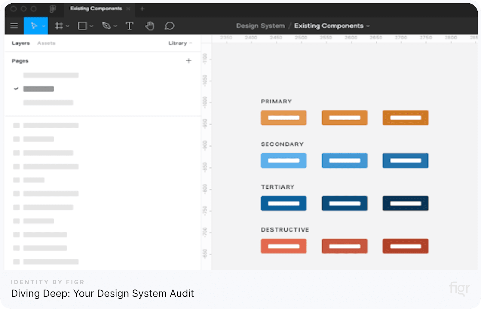
Source: deque
Okay, so you're convinced a design system is the way to go. Awesome! But before you start building, let's take a step back. We need to understand what you already have.
Start by collecting all your design files—whether they’re in Figma, Sketch, or your tool of choice. Look through each one and make a list of the recurring UI components. Buttons, forms, modals—if it’s something you’ve used more than once, add it to the list.
Here's how to get started:
1. Gather Your Design Files: The Starting Point
Grab all your existing design files – Figma files, Sketch files, whatever you use.
Start browsing through them. What do you see? Buttons? Text fields? Dropdowns? Make a list of all the recurring UI components you can find.
Actionable Task: Take screenshots of key components for quick reference later.
2. Identify Inconsistencies Across Components:
Now, let’s get down to the details. Start checking for inconsistencies in the components you’ve listed:
Buttons: Are they all the same size and shape? Are there multiple versions of the same button style, or even different shades of the same color?
Text Styles: Do your headings have the same font size and line spacing? Are you using different weights or styles in places that don’t make sense?
Spacing and Alignment: Do your elements sit well together, or are there gaps that make things look messy? Are margins and padding consistent?
Actionable Task: Create a quick prototype to see how consistent components look together.
3. Prioritize the Key Components for Standardization:
Not everything needs to be fixed at once. Start by focusing on the most important components:
High-Frequency Components: Look at elements that appear often across your design—things like buttons, input fields, or navigation bars. These need consistency.
High-Impact Components: Focus on elements that directly affect the user experience. For example, your primary CTA (Call to Action) button should be standardized first, as it's the most crucial element.
Actionable Task: Use a simple scoring system to prioritize components based on frequency and impact.
4. Document Your Findings in a Clear Guide:
Start by making a simple spreadsheet or doc as a guide to design system. List all the components you found, call out any inconsistencies, and add a column for priority. Trust me, marking what needs urgent attention will make life easier when you start fixing things.
Want something more visual? Use a table with columns like Component Name, Inconsistencies, and Priority Level. Adding a color legend (red = critical, yellow = moderate) helps you quickly see what’s broken and what can wait.
5. Collaborate with Your Team for a Unified Approach:
Here’s a fact: building a design system isn’t a one-person job. You’ll need input from designers, developers, and even product managers. Everyone has a unique perspective, and involving them early means fewer headaches later.
Set up a quick review session with your team. Walk them through your findings and get their thoughts on what should be standardized first. This way, everyone’s on the same page before you start making changes.
Action Step: Block a 30-minute team review—grab coffee, share screens, and figure out next steps together.
6. Plan for Ongoing Iteration and Updates:
Your product won’t stay the same forever, so why should your design system? This audit isn’t a “do it once and forget” task. It’s something you’ll need to revisit regularly to keep everything consistent.
Think about setting up quarterly or bi-annual reviews. It’ll keep your design system in check and help you spot issues before they pile up.
Pro Tip: Make these reviews a habit—it’s easier to do small updates regularly than one massive overhaul later.
7. Showcase the Long-Term Benefits for Your Team:
By now, you’re probably thinking, “Is this really worth it?” 100% yes. Once you finish the audit, your team will feel the difference:
Better Collaboration: Everyone will be on the same page, making cross-team work smoother.
Faster Design Process: You won’t waste time reinventing components. Everything you need will already be there.
Consistent User Experience: A polished, unified design system means a seamless experience for your users.
Bottom line? This audit sets the foundation for a design system that not only works but makes your whole team’s life easier. Give it a shot—you’ll thank yourself later.
Start Small, Think Big: Your Design System v1.0

Starting your first design system feels like a big task, right? The key is not to get caught up in perfection.
Version 1.0 isn’t about covering everything—it’s about building a solid base you can expand later. In this guide to design system essentials, we’ll walk through exactly what you should focus on for your initial version.
Keep It Simple: Focus on Core Tokens
Start with design tokens—these are the building blocks of any design system. Focus on key tokens that affect visual consistency across your product. Here’s what your v1.0 should include:
Colors: Define primary, secondary, and neutral palettes. Keep it minimal, but cover major use cases like backgrounds, text, and buttons.
Typography: Choose your font styles—heading, subheading, body, and captions. Ensure you specify font size, weight, and line height for each.
Spacing: Define consistent spacing rules for padding, margins, and grids. Use a fixed scale (e.g., 4px, 8px) to maintain uniformity.
Why focus on tokens first? It establishes a consistent language for your team, ensuring everyone stays aligned visually.
Start Small with High-Impact Components
Once your tokens are ready, move on to the components. Don’t aim for every possible UI element—focus on high-impact, frequently used ones:
Buttons: Every product relies on buttons, so standardize their styles—primary, secondary, disabled, and hover states.
Input Fields: Define basic input fields, dropdowns, and checkboxes. These elements show up in most user interactions, so keeping them consistent boosts usability.
Here’s a pro tip: Don’t forget to document how these components behave—what happens on hover? How do error states look? Simple guidelines like these will save your team headaches later.
Actionable Takeaway: Scope Your v1.0
Before jumping into design, write down your v1.0 scope. Start with something like:
Colors: Primary, secondary, background, and text
Typography: Headings, body, captions (include font size, weight, line height)
Components: Buttons (primary, secondary), input fields (text, dropdown, checkbox)
Stick to this manageable scope. It keeps your process focused and helps you deliver faster. Over time, you can expand your guide to design system by adding more components and patterns.
Level Up Your Design System: The Right Tools for the Job

Okay, you've laid the groundwork – you know what you want to build and why you need it. Now, let's talk about the tools that will help you bring your guide to design system to life.
Design Tools: Your Starting Point
First things first—you need a design tool that makes creating reusable components and tokens (like colors, typography, and spacing) effortless. These are some of the best options:
Figma: Known for its powerful Team Library, Figma lets you build shared components and tokens that your team can access in real-time. Plus, the collaboration features are top-notch.
Sketch: If you’re on macOS, Sketch is a solid choice. You get reusable symbols and consistent styles, which makes it great for building scalable systems.
Adobe XD: Looking for seamless prototyping and integration with other Adobe tools? XD has you covered.
Quick tip: Once you’ve picked a tool, create dedicated folders for tokens, typography, and components to keep things clean and easy to manage.
Documentation Tools: Keep Everyone on the Same Page

Source: Notion
A design system without proper documentation? That’s a recipe for chaos. Good documentation tools ensure your team knows how to use every component correctly. Here’s what you can use:
Notion: This one's simple, clean, and great for organizing style guides and component rules. Plus, it’s easy to share with your team.
Figr Identity V2: Honestly, if you want to take things up a notch, this tool is gold. Figr Identity V2 doesn’t just document your system—it helps you visualize styles live, offers customization control, and ensures that your deliverables are always production-ready.
Figma’s Built-In Libraries: If you’re already using Figma, you can start with its built-in docs feature for quick, internal notes.
Collaboration Tools: Bridging Design and Development
Here’s the thing—your design system isn’t just for designers. Developers need to use it too, and having the right collaboration tools makes all the difference.
Storybook: This one’s a favorite for dev teams. It lets them test and see components in isolation, so there’s no confusion when they start coding.
Figr Identity V2: Beyond being a documentation tool, Identity V2 boosts collaboration by delivering ready-to-use files, automating component updates, and offering live style previews. Basically, it cuts down the back-and-forth, which means faster launches.
Ready to Set It Up?
Now that you know the tools, here’s a simple setup guide:
Pick a design tool (e.g., Figma or Sketch) and create folders for tokens, typography, and reusable components.
Set up a documentation system (use Notion or Figr Identity V2) to maintain clear style guides and design rules.
Integrate a collaboration tool like Storybook or Identity V2 to ensure smooth handoffs between your design and development teams.
The right setup not only makes your design system more efficient but also keeps everyone—designers, developers, and stakeholders—on the same page.
Maintaining Your Design System
Let’s go over a few tips to keep your design system healthy:
1. Review It Regularly
Every few months, sit down and go through your design system. Are there any outdated components? Are new ones working well? A quick review helps you catch issues before they pile up.
2. Ask for Feedback
Don't just leave the design system to the designers! Get feedback from developers, product managers, even your marketing team. What's working well? What's causing headaches?
3. Document Everything
Keep your documentation updated. No one wants to hunt for answers. Make sure everything is clear, concise, and easy to find.
4. Be Open to Change
Your product is constantly changing, and so should your design system. Don’t hesitate to tweak or replace things. It’s better to evolve than to hold onto something that no longer works.
5. Celebrate Wins
When your design system makes something faster or easier, call it out! Sharing success stories motivates your team to stick with it.
Now, go forth and build amazing things!
High Five! You Built a Design System!
You've officially entered the exciting world of design systems.
But here’s the thing: building it is only half the story. Like any well-structured framework, design systems need a little TLC to stay useful and effective. Think of it as a toolkit that helps your team create consistent, polished designs without starting from scratch every time.
If you’re serious about leveling up your design system, you’ve got to check out Figr Identity V2. Honestly, this plugin can totally change how you work. Whether you're figuring out how to start a Figma project with a design system 2025 or just trying to clean up your current setup, this tool makes everything smoother. Here’s how:
Create consistent tokens for all your styles with one click: You’ll get perfect color schemes, typography, radius, spacing, effects, stroke, and grids without the hassle.
Pick from 80+ components: Build your designs faster than ever with ready-to-use components in tons of variants and sizes.
Keep everything organized: With folders, libraries, and clear documentation, you’ll never lose track of your system.
Collaborate like a pro: Designers and developers can easily hand off work, and all your updates will be reflected instantly.
Ready to experience it for yourself? Let's go!
Join our newsletter
Get the latest design news and insights


© 2025 A Product of Figrfast systems Private Limited. All rights reserved